Dolphin Fin is a really interesting gray color that is hard to put your finger on. It’s the kind of gray that you stare at to try to figure out what color it actually is, before you decide that it must be gray.

Don’t worry though, I’ve got pictures to help you form your own opinion!
Let’s talk undertones, take a look at Dolphin Fin in real life, explore a warm and cool color palette, and finally, dig up some dupes!
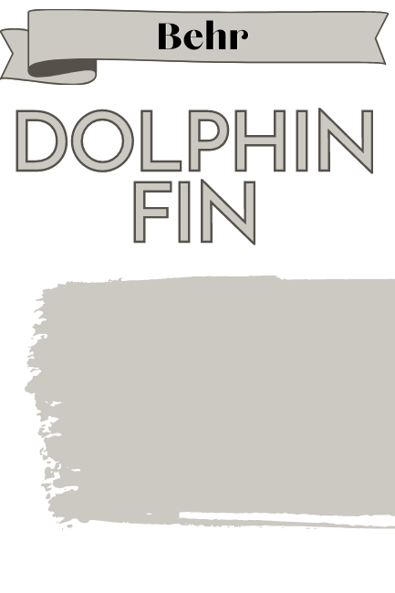
What Color is Behr Dolphin Fin (790C-3)
Dolphin Fin is a gray paint color with just a hint of beige. Sometimes you can see the warmer greigey tones, sometimes it looks like a perfectly balanced gray, and sometimes it can look a little blue/silver.
What Are the Undertones of Dolphin Fin
I went way down the rabbit hole with this one y’all, in the name of…science? Obsession? Stubbornness? (Is that a word?)
I don’t know.

At first glance, Dolphin Fin is what I consider a greige paint color. Compared to many other gray paint colors, it definitely leans warm on the swatch.
What doesn’t make a lot of sense, is that it very often has blueish undertones on the wall (occasionally a little green). If you were to paint over yellow, it would even look purple while you were doing it.
I even read from other color experts who describe Dolphin Fin as a cool gray.
Why? How?!
I don’t know. I am officially raising the white flag on this one. I tried Dolphin Fin over swatches of all kinds of different colors, and it always looks pretty much the same.
I can agree that it very often does look cool on the wall, but I hate not knowing why.
Regardless, sometimes Dolphin Fin does look how you would expect too. It can look greige or even almost beige.

Best guesses:
- Extra sensitive to natural light. Potentially a perfect blank canvas?
- Choose your trim thoughtfully, because I can only think that this and your lighting are the big difference makers with this one.
Undertones in a nut shell: Confusing. Most often, Dolphin Fin looks like a true gray.
Is Dolphin Fin Warm or Cool
In my opinion Dolphin Fin has almost equal chance of looking warm or cool.
LRV and RBG of Behr Dolphin Fin
The LRV (Light Reflectance Value) of a color indicates on a scale of 0 – 100 how much light a color reflects (or doesn’t reflect). True black has an LRV of 0 and pure white has an LRV of 100.
In the paint world, we are working in a range of about 3 – 93 because no paint color is purely black or completely white.
The LRV of Dolphin Fin is 59.

At 59, Dolphin Fin is in the LRV range that most whole-home colors are.
The RGB of Dolphin Fin is: Red 204, Green 202, Blue 193.
Based on the RBG the hex value for Dolphin Fin is #CCCAC1.
Dolphin Fin Color Strip by Behr
You can find Dolphin Fin on the Behr color strip that runs from Irish Mist (an off-white) to Black Bean:
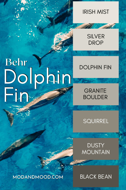
Here are the rest of the colors from this strip:
- Irish Mist (790C-1)
- Silver Drop (790C-2)
- Granite Boulder (790D-4)
- Squirrel (790D-5)
- Dusty Mountain (790D-6)
- Black Bean (790D-7)
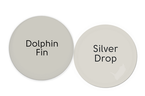
Lighter Version of Dolphin Fin
One shade lighter than Dolphin Fin on the same color strip is the shade Silver Drop.
You can read my whole post about that color here: Behr Silver Drop Will Keep You Guessing!
Silver Drop is very much like Dolphin Fin in terms of sometimes looking greige and sometimes looking silver.
Darker Version of Dolphin Fin
The shade one darker than Dolphin Fin on the same color strip is Granite Boulder. From what I have seen, Granite Boulder is a tiny bit more likely to have a green undertone than Dolphin Fin is.
Behr Dolphin Fin in a Warm and Cool Color Palette
Just this once, I decided to make both a warm and cool color palette for Dolphin Fin. Amongst warm colors, Dolphin Fin should look cooler and more gray/silver. With cool colors, it should lean a little warmer and sandier.
Making Dolphin Fin Look Warmer – Cool Coordinating Colors
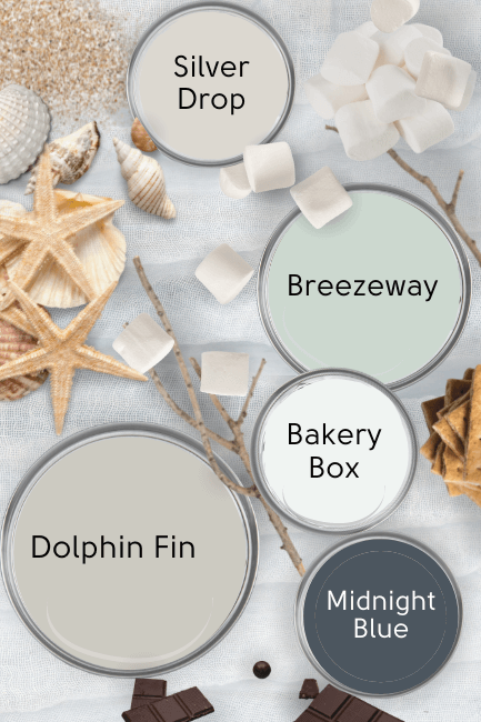
Theoretically, in a color palette like this one (that features cool coordinating colors) Dolphin Fin should lean warmer and a little more beige.
Pleeease take this advice with a grain of salt, and test your colors, because I don’t really understand why it looks blue-ish in the first place. – Sincerely, Me.
Behr Breezeway
Breezeway is a fresh, beachy green that coordinates beautifully with Dolphin Fin.

If you like how this former Behr color of the year looks on paper, you will probably like Sherwin Williams Oyster Bay in real life.
Behr Bakery Box
Bakery Box is a cool and crisp white that should help Dolphin Fin look it’s warmest.

Behr Midnight Blue
Midnight Blue is a classic navy blue that should go with almost anything you already have. I like it with Dolphin Fin because every coastal palette needs a nautical navy! (A naut-y navy! … I’ll see myself out.)
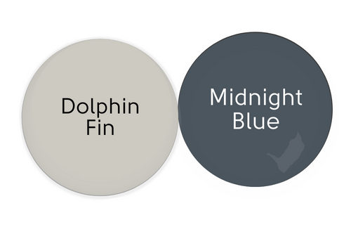
For something similar, you might also like Benjamin Moore Hale Navy.
Behr Silver Drop
We’ve already talked about Silver Drop of course, but it is a great color to consider using alongside Dolphin Fin if you ever want something just a touch lighter.
These two don’t contrast enough for one to be a feature color, so I would use it when you want to paint a smaller or darker space.
Making Dolphin Fin Look Cooler – Warmer Coordinating Colors
While this color palette is warm, it should actually help Dolphin Fin look cooler and more silver/blue/gray.

Behr Canyon Dusk
Canyon Dusk is actually pretty similar to the 2023 Color of the Year from Sherwin Williams: Redend Point.
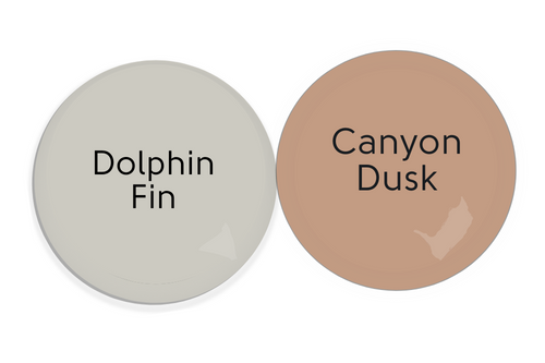
Because orange and blue are opposites on the color wheel, Canyon Dusk should emphasize the silvery blue tones of Dolphin Fin.
Irish Mist
You probably recollect that these two are on the same color strip! Behr Irish Mist is an off white that obviously works very well with Dolphin Fin, but it also tends to stay a touch warmer.

Behr Swiss Coffee
I don’t know that Swiss Coffee would be my first choice for white with Dolphin Fin, but it is a good way to keep it looking lighter and cooler.

Here you can see the Behr version of Swiss Coffee alongside several others: Swiss Coffee Paint Colors Compared (Are They All the Same?)
Jojoba
Okay, so Jojoba isn’t technically a warm color… It is a warmer green though! A sage color will always work well with other neutrals – including Dolphin Fin!

Behr Intellectual
Intellectual is a dark gray brown similar to Sherwin Williams former color of the year Urbane Bronze.
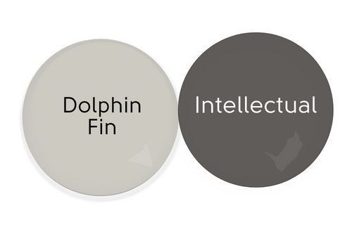
This color would be a nice trim option on an exterior, or an unexpected choice for a feature wall, while still being very neutral.
Complementary Color for Dolphin Fin
The official complementary color for Dolphin Fin (the color directly across the color wheel) is a blue gray. The Behr shade Glitter is a very close match.
Behr Glitter (N540-2)

This should highlight the underlying beige tones in Dolphin Fin.
What Trim Colors Go With Behr Dolphin Fin?
If you already have wood trim in your home, you can definitely still use Dophin Fin on the walls, but be aware that the warmth of wood is very likely to make Dolphin Fin look more blue.
Here are a few of Behr’s popular whites that you might be considering for trim:
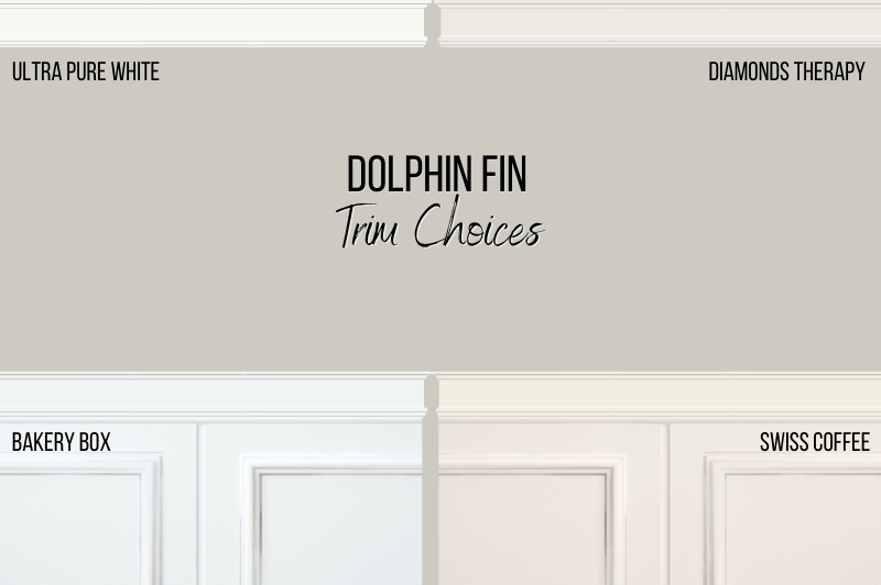
White Paint that Goes with Dolphin Fin
Ultra Pure White
Ultra Pure White is supposed to be the cleanest and brightest white available across all of the most popular brands. It’s a top choice for trim for that reason!
A color like Ultra Pure White that does not have much by way of undertones will allow Dolphin Fin to do what it wants to do in your space. This could also mean that it looks different day to day or even depending on the time of day, so definitely give it a good old test first.
Bakery Box
We already talked a little about this white earlier, but it is a cool and bright white. This one should help Dolphin Fin stay looking warmer.
Diamonds Therapy
Diamonds Therapy is a pretty neutral white but it’s a little lower contrast than something like Ultra Pure White. I describe this one as an “Ikea white” because it is a bang on match for the stock white furniture from Ikea.
Swiss Coffee
Swiss Coffee as we talked about before, should keep Dolphin Fin looking a bit cooler and more silver or blue-gray.
Behr Dolphin Fin in Your Home’s Interior
Let’s hop right to it and look at some real homes shall we?
I am so happy to share that I have allll kinds of different looks to Dolphin Fin today. Don’t you love it when you can really see the color?
Behr Dolphin Fin in a Living Room
Leah from @happinessandhomedecor really came through for us with the Dolphin Fin-spiration.
Here it is in her living room:
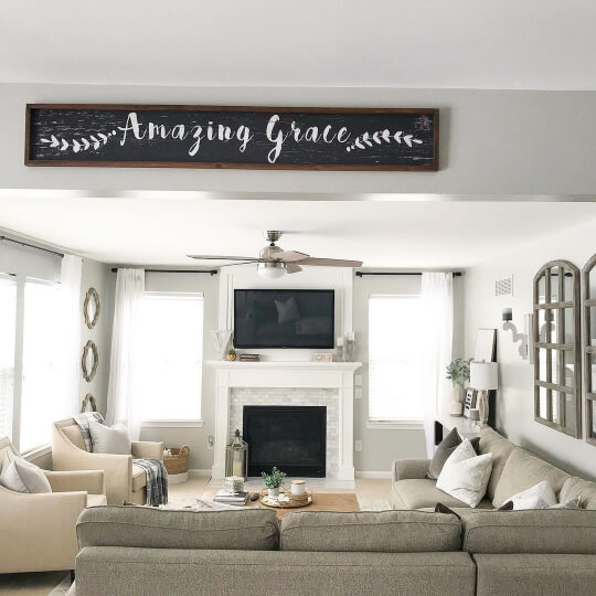
Now, Dolphin Fin does look very cool gray in this particular photo, and in most of Leah’s photos. I think part of that is a camera or editing choice because all of the photos are quite cool, so take it with a little baby pinch of salt.
Here is one that I found where the color looks a little warmer, but it is still very much gray:

Under the windows is the best glimpse of the color.
Hopping over to Steph’s place (@s_j_t_home) we have a great look at the full spectrum of Dolphin Fin, all on one wall!

If you take a good look at that photo, you will see that the color looks much warmer and more beige on the left side, and more silver-gray on the right.
Here is a cooler looking shot from the same room:

And something that looks greige and gray at the same time:

Behr Dolphin Fin in the Dining Room
Steph also carried Dolphin Fin into her dining room, where again it looks pretty silver:

Behr Dolphin Fin in a Bedroom
Heading on over to Jessica’s place (@jessraemac5) we can see Dolphin Fin at work in this bedroom/nursery.
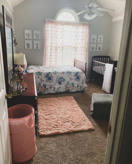
With the blinds closed this is a bit of a darker look to Dolphin Fin, and a good example for lower light spaces.

This is also our first glimpse of seeing Dolphin Fin look a little green. I think this is due to the green influences in the room, but also because pink is complementary to green, so it draws that out.
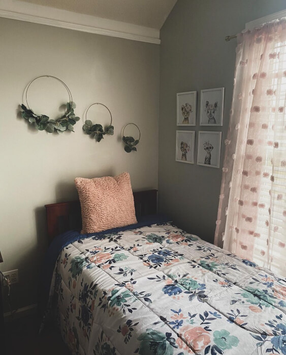
I have one more bedroom to show you, this time at Mary’s house (@marylynchristina):

In this room the pink is much softer, but Dolphin Fin still looks a bit blue-green.
Behr Dolphin Fin with White Kitchen Cabinets
Back at Leah’s place we get to see how Dolphin Fin will look with white cabinets.
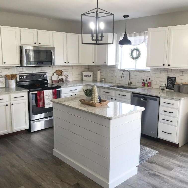
The color here is a fairly true white. It is Benjamin Moore Simply White, which is actually a really bright white, but it’s also pretty warm. We would expect then that Dolphin Fin would look cool like it does.

With cooler white cabinets you might be able to get the warmer side of Dolphin Fin to come out.
Unfortunately I don’t have any photos of Dolphin Fin on cabinets, if that’s something you are looking for, but I do have the dupe Sherwin Williams Repose Gray:

You should expect that Dolphin Fin will look a bit cooler than these cabinets though. That’s just what it does!

If you are looking for a neutral to use on cabinets, you might like my post: The Best Mushroom Paint Colors for Kitchen Cabinets
Behr Dolphin Fin on an Exterior
Again we will have to look to the dupe Repose Gray for a glimpse at how Dolphin Fin will look on an exterior:
I actually think this time the comparison is pretty solid. The baby blue shutters are close to the complementary color for Dolphin Fin, and this is how you can expect the color to look on your exterior.

Dolphin Fin Compared to Other Gray Paint Colors
If you aren’t interested in how Dolphin Fin stacks up against other popular grays, feel free to skip to the dupes.
Behr Dolphin Fin vs Sherwin Williams Agreeable Gray
You can see that Agreeable Gray has a similar LRV, but looks much more greige than Dolphin Fin.

This definitely holds true in real life. Agreeable Gray is very much greige and never a cool silver.
I cover this color a little more in my post: Accessible Beige vs Agreeable Gray (How to Choose!)
Behr Dolphin Fin vs Chic Gray
Behr Chic Gray is technically a bit warmer than Dolphin Fin (think orange color family rather than yellow), but it is a tiny bit less saturated so it is still solidly gray.

These colors are very similar! Both can range in appearance from gray to greige, but I have not seen Chic Gray ever looking blue-ish like Dolphin Fin can. If I had to choose I think I prefer Chic Gray, because it appears taupey and warm a little more often than Dolphin Fin does.
Behr Dolphin Fin vs Classic Silver
Classic Silver is a green-based gray and much darker than Dolphin Fin.

Classic Silver is pretty similar to the sage gray of Benjamin Moore Fieldstone.
Behr Dolphin Fin vs Dolphin Gray
Dolphin Gray is much darker than Dolphin Fin, and it’s almost completely gray. There is very very little actual color in it.

To my eyes, I would expect Dolphin Gray to have a taupey undertone that verges on purple, but I have not actually seen it much in real life. It does look similar to Benjamin Moore Sterling Silver to me.
Behr Dolphin Fin vs Benjamin Moore Revere Pewter
Revere Pewter is much more yellow than Dolphin Fin. It is a true greige and reads beige much more often than Dolphin Fin does.
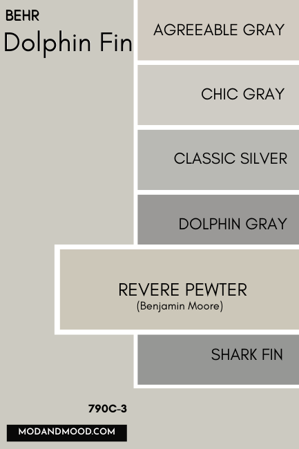
Revere Pewter can look blue if it is paired with very orange tones of wood, but I would not say that it ever looks truly gray or silver.
Behr Dolphin Fin vs Shark Fin
Shark Fin is another Behr gray that is darker and technically cooler than Dolphin Fin.

Shark Fin is a little bit like Dolphin Fin, in that the undertone varies a lot. It can appear anywhere from a true mid-toned gray with no undertone, to a mushroom color with either a green or purple undertone.
Behr Dolphin Fin vs Silver Bullet
Behr Silver Bullet is a cool gray that often looks blue. Despite how Dolphin Fin looks sometimes, you can see that it is clearly much warmer than Silver Bullet.

Behr Dolphin Fin vs Silver City
Silver City is a green-based gray that is cooler and less saturated than Dolphin Fin.

Silver City is pretty similar to Sherwin Williams favorite Sea Salt.
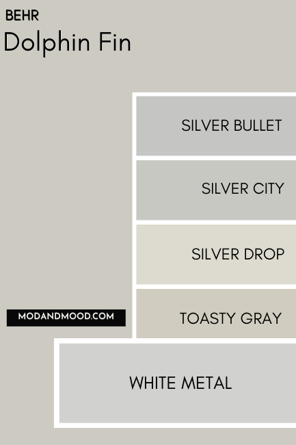
Behr Dolphin Fin vs Silver Drop
As you may remember, Silver Drop is one shade lighter on the same color strip as Dolphin Fin:
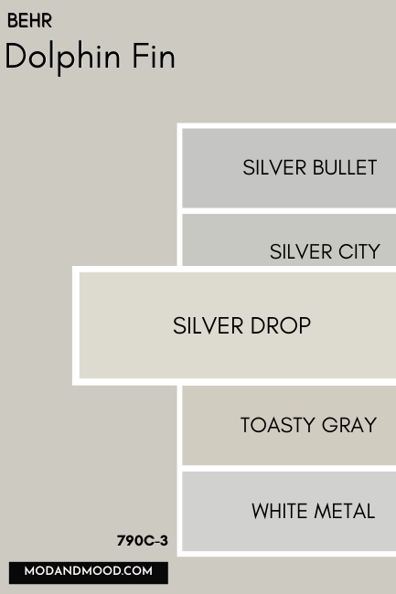
Behr Dolphin Fin vs Toasty Gray
Behr Toasty Gray is warmer and more saturated than Dolphin Fin, making it more greige. It’s also a little bit lighter.

I really love Toasty Gray in real life. It gives classy, neutral, expensive vibes.
Behr Dolphin Fin vs White Metal
White Metal is the lighter version of Silver Bullet, so not only is it cooler and more blue than Dolphin Fin, it is also a good bit lighter.
White Metal can have a slightly purple undertone.
Dolphin Fin Dupes
Finally we get to take a look at some dupes and doubles for the fan favorite Dolphin Fin!

Benjamin Moore Dolphin Fin Equivalent
The closest color match to Dolphin Fin that Benjamin Moore carries, is the shade Nimbus.
Benjamin Moore Nimbus (1465)
Nimbus is just a smidge lighter and warmer than Dolphin Fin. Too close to call in my opinion! It’s actually a pretty popular Benjamin Moore color in its own right.

Valspar (Lowe’s) Equivalent to Dolphin Fin
I wasn’t 100% happy with any of the color matches that Valspar offers, so I chose three that all offered something different.
(I know, I’m extra. I can’t stop myself when it’s not quite right!)
Valspar Bay Sands (5008-1B)
Bay Sands is the closest overall color match to Dolphin Fin that Valspar offers. It is slightly more beige but the LRV is about right.

So why couldn’t we leave it at that?
Bay Sands, while a nice color, is not really serving the same look as Dolphin Fin. It’s looking a little more Revere Pewter in nature.
Here are two lighter options that are less yellow:
Valspar Silver Thistle Down (8006-4B)
Silver Thistle Down is a bit lighter and more of a plain gray compared to Dolphin Fin.

Valspar Moon Shot (8005-2B)
Moon Shot has a subtle whiff of violet that creates a really nice taupe, but as a result you can clearly see that it’s warmer than Dolphin Fin.
Dolphin Fin Sherwin Williams Equivalent
You already know from earlier that the Sherwin Williams dupe for Dolphin Fin is the ever popular Repose Gray!
Dolphin Fin vs Sherwin Williams Repose Gray (SW 7015)
Repose Gray is the tiniest bit warmer than Dolphin Fin. I find that the major difference between these two, is that Repose Gray won’t ever look overly cool or blue in my opinion.

I don’t have a whole post for Repose Gray yet, but you can read more about it in this one: Sherwin Williams Light French Gray VS Repose Gray (Solved!)
Dolphin Fin Pros & Cons
In conclusion, if you don’t want blue-gray or beige, don’t pick Dolphin Fin. Try to be okay with the full spectrum of color, particularly if it’s in your whole house.
Here are a few pros and cons for this blessed Behr shade:
Pros
- Great LRV level that is perfect for your whole home
- A true chameleon that is heavily influenced by other colors, white choice, etc.
- Works well with almost any other color
Cons
- Unpredictable and should definitely be tested in large swatches
I don’t really have a lot of other cons for this one. Any other downsides just stem from it being unpredictable.
Not the one for you? Let me help!:


