Looking for the perfect mid-toned gray green that is just the right amount of neutral? Oyster Bay by Sherwin Williams might just be the one!

Here we will see Oyster Bay in real homes, pick out some coordinating colors, discuss trim, and of course, check out some dupes!
What Color is Sherwin Williams Oyster Bay (SW 6206)
Oyster Bay is a mid-toned gray green color. It reads somewhere in between aqua and gray.
LRV of Sherwin Williams Oyster Bay
The LRV of Oyster Bay is 44.
What does that tell us?
The LRV (Light Reflectance Value) of a color indicates on a scale of 0 – 100 how much light a color reflects (or doesn’t reflect). True black has an LRV of 0 and pure white has an LRV of 100.
In the paint world, we are working in a range of about 3 – 93 because no paint color is purely black or completely white.
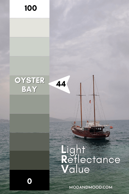
At 44, Oyster Bay absorbs slightly more color than it reflects. It is a little bit darker than many whole-home paint colors that tend to have an LRV between 50 and 65, but not by much.
What Are the Undertones of Oyster Bay?
Oyster Bay has cooler blue-green undertones than you might expect from the swatch. Technically it’s in the yellowy-green color family, but the gray gives it an extra dollop of coolness.

So, Is Oyster Bay Warm or Cool?
I would say that Oyster Bay is neutral. It can look cooler than you expect, and have cool blue undertones, but against truly cool greens or blues, it will look warm.
Sherwin Williams Oyster Bay Color Strip
Here are all of the shades from the oh-so-popular Oyster Bay color strip.

- Spare White
- Sea Salt
- Comfort Gray
- Oyster Bay
- Acacia Haze
- Retreat
- Pewter Green
- Ripe Olive
Lighter Version of Oyster Bay
One shade lighter than Oyster Bay on the same color strip is the color Comfort Gray. To be honest, I don’t see many people using this shade, but it’s a perfect compromise with a higher LRV.
Darker Version of Oyster Bay
Acacia Haze is one shade darker than Oyster Bay on the same color strip. However, Sherwin Williams actually slotted in Acacia Haze after the fact, and Retreat was the original shade darker. Take a look at both if Oyster Bay is just a little light for you!
Sherwin Williams Oyster Bay Color Palette
I actually have two color palettes for you today: My original whatever-I-wanted color palette, and then a “popular pairings” one.
This first color palette features my picks for colors that coordinate beautifully with Oyster Bay:

Coordinating Colors for Oyster Bay
Let’s take a look at these colors together:
Sherwin Williams Oyster White
I mean, why not stay on theme?
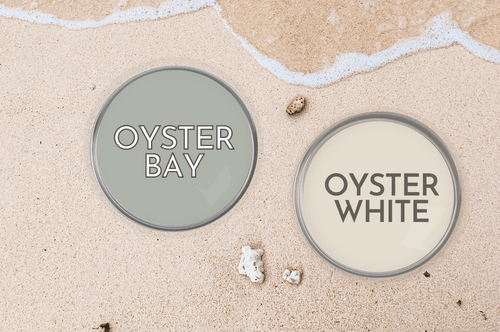
Oyster White is a beautiful, creamy, neutral off white. This would work great whether you want to use Oyster Bay as an accent color, or if you just need a lighter color for certain spaces.
I love these two on their own, and together!
Sherwin Williams Analytical Gray
Analytical Gray is a greigey sort of mushroom color that doesn’t get nearly enough love! This one is soothing and sandy next to Oyster Bay.

Benjamin Moore Soot
Soot is a beautiful, almost black, gray blue paint color. It pairs really well with almost anything, but I especially like it with the gray green of Oyster Bay.

Benjamin Moore Simply White
Simply White is actually the color of the exterior in that color palette. This creamy white is surprisingly bright. It’s a nice touch of warmth with Oyster Bay, while still being a pretty crisp white.

Popular Sherwin Williams Colors with Oyster Bay
For the second palette, here are all of the colors that people most often pair with Oyster Bay:
Oyster Bay and Alabaster
Alabaster is one of Sherwin Williams most popular whites. This is a low contrast white to pair Oyster Bay with if you want a subtle creamy trim color.
Oyster Bay and Agreeable Gray
Agreeable Gray is a greige color by Sherwin Williams that would work just as well as Analytical Gray with Oyster Bay. In fact, it works with almost any color!

Sea Salt with Oyster Bay
You can definitely pair Oyster Bay with it’s lighter counterpart Sea Salt. Sea Salt is perfect in spaces that you want to keep light and bright, like a spa bath, and Oyster Bay is great in grounded spaces like your bedroom or study.
Oyster Bay’s Complementary Color
The “official” complementary color for Oyster Bay is a mid-toned gray blue with purple undertones. I would suggest using Soot if you want to skip the purple and use an ultra dark gray-blue.
For something a little more accurate but not overtly purple, try Sherwin Williams Cloak Gray or Perle Noir:

What White Trim Colors Go With Sherwin Williams Oyster Bay?
For me personally, I would probably go with either Pure White or Snowbound for trim with Oyster Bay. Both are neutral true whites by Sherwin Williams with a bit of softness.

Alabaster is a softer, warmer option that will help your Oyster Bay walls seem a little bit lighter.
For a crisp option, try Sherwin Williams Extra White.
Sherwin Williams Oyster Bay for Your Home Interior
Let’s take a look at SW Oyster Bay in real homes!
Sherwin Williams Oyster Bay in a Bedroom
First up, we have this bedroom designed by Lindsay & Dustin (@silo.hill):

If you like the color strip, you will love this home! They have also used Acacia Haze and Pewter Green.
Here is the same room, but where Oyster Bay looks a little bit lighter:

Sherwin Williams Oyster Bay in a Laundry Room
We don’t often get a sneak peek at what a laundry room will look like with any particular color, but today we do!

Ravishing Rooms (@ravishingrooms) used Oyster Bay for this laundry room update.
They opted to refinish the existing cabinets and it made all the difference!

They also left the existing white countertop, and repainted the small backsplash and front trim to match. (Was originally wood like the cabinets.)
Peel and stick wallpaper adds new interest to the back wall:

One more, because why not? :

Sherwin Williams Oyster Bay in the Living Room
I haven’t managed to collect a photo of Oyster Bay in a living room, so here is a dupe:

In this airbnb getaway (@northmountainhouse), the owners chose Benjamin Moore Misted Green for the fireplace wall. We will talk about the subtle difference in just a minute, but this is pretty close to how Oyster Bay will look.
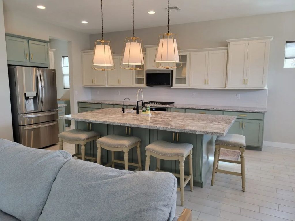
Sherwin Williams Oyster Bay in a Kitchen and on Cabinets
Moving on to the kitchen, here we see Oyster Bay on the oversized island in Morgan’s (@morgan.baswell) fabulous modern farmhouse kitchen:

Morgan’s perimeter cabinets are Sherwin Williams Pure White.
Here Oyster Bay looks quite light:

I like how Morgan used Oyster Bay on her island with white cabinets. For me personally, I think I would go with a slightly darker gray green if I was to use a similar color on all of my cabinets.
Oyster Bay Walls With Oak Cabinets
Green is always a great choice with oak cabinets! As long as you don’t go too teal or forest green, it stays pretty modern, and the tones are super complementary.
Here’s a mockup of how Oyster Bay would look with existing honey oak cabinets:

Sherwin Williams Oyster Bay on Your Home’s Exterior
Here is a fabulous look at Oyster Bay on an exterior, thanks to Realtor Jenn (@jennsellsmoore):

Here is a close up look:

Jenn didn’t say what the door color is, but I think it looks like Retreat. (Two shades darker than Oyster Bay.) I love how this gray green looks with the brick!
Oyster Bay on a Front Door
Back at our friend Morgan’s place, we see Oyster Bay on the front door of her creamy white farmhouse.

The exterior here is Benjamin Moore Simply White.
Here’s a look at night, where you can still make out the soft gray green of the front door:

Oyster Bay Compared to Other Gray Green Paint Colors
Let’s talk about how Oyster Bay stacks up compared to similar colors that you may be considering.
Let’s start with the shades from the same color strip.

Sherwin Williams Oyster Bay vs Sea Salt
Sea Salt is two shades lighter than Oyster Bay, and you can definitely see it. Here is Sea Salt in a bedroom:

Sea Salt reads almost like an off-white here, but with obvious green tones.
Sherwin Williams Oyster Bay vs Comfort Gray
Comfort Gray is just one shade lighter than Oyster Bay.

In my opinion, Comfort Gray reads slightly cooler and more gray than Oyster Bay, as well as the other colors on this strip.
Sherwin Williams Oyster Bay vs Acacia Haze
Acacia Haze is one shade darker than Oyster Bay. These two are super similar, so you can choose based off of whether you want a lighter or moodier shade.
Sherwin Williams Oyster Bay vs Contented
SW Contented is warmer and lighter than Oyster Bay. It is also a little less gray.

Sherwin Williams Oyster Bay vs Quietude
Quietude is a lot more blue than Oyster Bay, and also more saturated (less gray).

If you like these shades, I do have a post about Window Pane.
Sherwin Williams Oyster Bay vs Rainwashed
Rainwashed is one shade lighter than Quietude on the same color strip, so it is also cooler and less gray, in addition to being significantly lighter.
Sherwin Williams Oyster Bay vs Silvermist
SW Silvermist is a touch more gray than Oyster Bay, and a LOT cooler. It is way on the blue end of green, as opposed to Oyster Bay which is on the yellow end.

Dupes for Sherwin Williams Oyster Bay from Other Brands
Let’s take a look at colors from other brands that will get you the same look and feel as Oyster Bay!
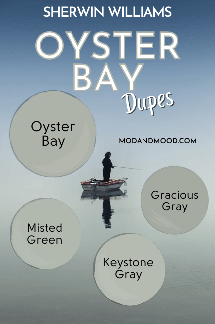
Benjamin Moore Oyster Bay Equivalent
The closest color match from Benjamin Moore for Oyster Bay, is the color Misted Green.
Benjamin Moore Misted Green (2138-50)
Misted Green is a popular Benjamin Moor color in its own right. It is slightly lighter than Oyster Bay, and a touch cooler.

Overall, these two are very very similar.
Valspar (Lowe’s) Equivalent to Oyster Bay
From Valspar, the best dupe for Oyster Bay is the color Gracious Gray.
Valspar Gracious Gray (8004-32D)
Gracious Gray is a bit deeper than Oyster Bay, but otherwise a very good match. It is in the exact same green area on the color wheel.

Oyster Bay Behr Equivalent (Home Depot)
From Behr, the best dupe for Oyster Bay is the color Keystone Gray.
Behr Keystone Gray (HDC-AC-21)
Keystone Gray is a little bit lighter and cooler than Oyster Bay:

Let’s summarize the dupes:

Ooh la la, those are some nice colors!
Oyster Bay Final Moody Musings
That’s all I have on Oyster Bay for now! This is a great mid-toned color for just about anything.
Not the one? Call me the green queen! Here are other great posts you will like:


