Benjamin Moore Dune White is a gentle off white with a warm, but fairly neutral, undertone.

This color is perfect if you are looking for a slightly creamy white without yellow undertones, that can read either white or off-white, depending on the lighting.
About Dune White – According to Benjamin Moore
Before we get too far into this, Dune White and Glacier White by Benjamin Moore, are one and the same color. Glacier White gets a little more press because it was in Benjamin Moore’s color trends for 2025, but rest assured, these colors are the same.
Benjamin Moore describes these colors as:
“A versatile off-white with hushed cream undertones.” – Benjaminmoore.com
This leads me to some Benjamin Moore beef that I just have to get out of the way. I don’t think that anybody should be trusting whatever computer generated images they have on their site, and this color is a perfect example.
When you look up Dune White, this is the photo that they have:

What color is that? Certainly not this color:

This same fireplace photo comes up for most of their white paint colors, but adjusted to what should be, something representing the color. Oftentimes it is quite buttery compared to how the color should look.
The joke here is that when you search Glacier White, the color loads as this:

Which is another color entirely. Here it looks almost like a gray-green off-white.
There is a secondary image on the page that loads for any and all paint colors, and is meant to be a computer generated version of the color in all different lighting. In the case for Dune White and Glacier White the color is the same as each other, but again, not accurate for the color in question. (In my opinion.)

You can see that this is definitely a gray color, and I would not say that Dune White or Glacier White ever looks gray.
Anyways, that’s just something I had to get off my chest because I find it highly annoying. You would think with the deep pockets of a major paint brand, they could have developed a tool that was at least kind of accurate. (Allegedly, in my opinion.)
Exploring the Undertones of Dune White
I find that Dune White has a pretty neutral beige undertone. If you were to use it as the only white in your space, you will find that it reads like a true white, but with a hint of warmth.

Its undertone will look strongest next to cool or gray whites, as well as very bright whites. When this is the case, you may find that it has a slightly peachy undertone. (This is the nature of beige colors in general.)
The LRV of Dune White is 80.

I wasn’t able to get permission for photos to share in time for this post, so instead I used my handy dandy dropper tool on some photos to grab the underlying color. Here you can see all of the different undertones that Glacier aka Dune White pulled:

All in all, pretty neutral. You can see that it has a peachy-beige undertone when really pressed. If you hate peach or pink, you may want to look elsewhere. If you hate yellow, this off-white is a great option! I haven’t seen it looking buttery (except in that questionable Benjamin Moore stock photo!).
Dune White vs Benjamin Moore Swiss Coffee
You might be wondering how Dune White compares to Benjamin Moore’s Swiss Coffee, as both are creamy white.
Dune White is an off white, with an LRV of 80, where Swiss Coffee is technically a true white, with an LRV of 82.
That being said, both colors are sort of in a gray area, because the line between white and off white is roughly around the 80 LRV mark.

In fact Benjamin Moore and Sherwin Williams measure LRV slightly differently, so even at 80, Dune White is more in line with an LRV of approximately 82 in Sherwin Williams.
You may even find that visually, Swiss Coffee looks more off-white than Dune White, because it is a little less neutral.

Swiss Coffee is a little bit lighter than Dune White, but also a little more saturated (less gray). Its undertone leans ever so slightly more yellow than the beige of Dune White, but it is pretty similar.

You may want to make sure that this is the Swiss Coffee color you are thinking of, because several brands have a color by that name.
Dune White vs Benjamin Moore White Dove
In real life, Benjamin Moore White Dove and Dune White are very similar at first glance. White Dove is lighter than Dune White with an LRV of 83, but the undertone is about the same, and both are a neutral version of creamy white.

On paper, Dune White is a hair warmer than White Dove.
Benjamin Moore Dune White vs Sherwin Williams Alabaster
If you want to get the same look as Dune White in Sherwin Williams, look no further than the fan favorite shade Alabaster.
Dune White (aka Glacier White) was actually my pick for a Benjamin Moore Alabaster dupe:

Despite what it looks like here, Alabaster is a little lighter and warmer than Dune White.

Here is a totally desaturated version of these two, so that you can see the depth difference:

While Alabaster does have a beige undertone that is VERY similar to Dune White, it is marginally more likely to look yellow.
Benjamin Moore Dune White In a Color Palette
Here are a few coordinating colors that I recommend pairing with Dune White:

Try Dune White with Benjamin Moore Caldwell Green
Caldwell Green is a medium to dark sage green that would pair beautifully with Dune White:

Against this sultry sage, you can expect Dune White to look quite white and neutral. If you want the off-white look, add elements of true bright white to your space, or use a truer white on your trim.
Neutral Paint Color to Use with Dune White
If you want to pair Dune White with a coordinating neutral, try the subtle greige of Benjamin Moore Collingwood.

Collingwood is on the lighter end of whole-home neutrals, with an LRV of 62. It tends to stay quite cool-beige or gray, and does not often look peachy or especially warm.
You can expect Dune White to look true white in comparison, but it will stay a little warm next to the slightly cooler tone of Collingwood.
If you like this color, you will also like Benjamin Moore Classic Gray, which is a tiny bit lighter and warmer. (Not sure I would use that with Dune White however, because there would not be enough contrast.)
Pair Dune White and Mt Rainier Gray
For a modern nod to “French Country” I like the idea of pairing a creamy off-white like Dune White with a soft blue such as Mt Rainier Gray.

Mt Rainier Gray is a very subtle gray-blue, but it is definitely blue, and not a silvery gray like some.
A blue like this is very complementary to the underlying beige undertones of Dune White. If you like this blue, you will also like former color of the year: Sherwin Williams Upward.
Benjamin Moore Recommends These Coordinating Colors
Here are the coordinating colors that Benjamin Moore recommends you use with Dune White:

I always pick my suggestions before I peak at theirs, and this time they are pretty similar.
Pair Dune White and Benjamin Moore Yorktowne Green
While Benjamin Moore also recommends pairing Dune White with a deep gray green, they went with the teal-leaning Yorktowne Green:

The blue undertone in the teal of Yorktowne Green is complementary to the beige in Dune White. Because this color is so dark, you should expect Dune White to look like a pretty true white in comparison.
Use Dune White with these Neutrals
Benjamin Moore has not one, but THREE neutral paint colors in their coordinating color palette for Dune White. They are Ashen Tan, Wind’s Breath, and Devonwood Taupe.

Ashen Tan is a greige that ranges in appearance from quite gray to slightly taupe. Because it leans more beige, you may find that Dune White looks slightly cooler in comparison.

Devonwood Taupe is not a super popular neutral by Benjamin Moore. I haven’t actually seen this one in real life, so I can’t comment too much on its undertones. Because both colors are very neutral, they could definitely be used together.
You can expect Dune White to look quite bright and true white in comparison because it is quite dark.

Wind’s Breath is a very popular neutral by Benjamin Moore. It has an LRV of 70, so it is right on the line of off-white and light neutral. I don’t know that the contrast is really enough for me to use these together, but perhaps you could if you wanted a monochromatic moment.
You might like Dune White as a trim color with Wind’s Breath for a subtle contrast. In terms of color, Wind’s Breath is a near perfect darker version of Dune White. So you may also like it as an alternative.
Here is another look at all of the coordinating colors we just talked about:

Dune White on Kitchen Cabinets
I very unfortunately don’t have photos of Dune White (or twin color Glacier White) on kitchen cabinets. So we will have to look at some examples that are pretty close.
(For real pretty close, not like Benjamin-Moore’s-website-close.)
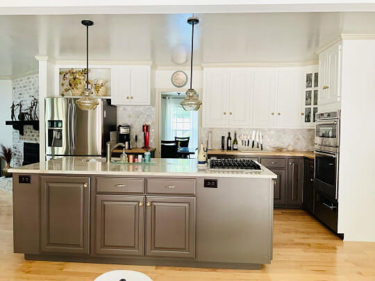
I am actually not sure what the exact paint color on these perimeter cabinets is, but I do know that it is very close to how Dune White will look:

The island is Sherwin Williams Peppercorn.
This first photo is a brighter look, and the next one is in softer lighting:

(I do think this photo was also warmed up a touch.)
Here is White Dove on cabinets in a wall unit, where it looks a little darker and more like Dune White:

Next we have a photo of Sherwin Williams Alabaster on kitchen cabinets, where the undertone looks most similar to Dune White:

Here is a picture of the whole kitchen, but you should expect Dune White’s undertone to be slightly peachier than this:

If you have a good eye, you can kind of see how the island here has a slightly more yellow undertone than the other examples I have shared, which is what you would expect from Alabaster.
Here is one more Alabaster example, where the warmer and darker trim of Sherwin Williams Wool Skein helps the color look pretty white.
The lower cabinets and island are Swiss Chocolate, which appears to be a Valspar color, because Sherwin Williams and Benjamin Moore do not have a color by that name.
Finally, here is a kitchen that I have color adjusted to be pretty accurate to Dune White:

I hope this helped you decide if Dune White is the color you need in your life!
Not the one? Here are some other options:


