Sherwin Williams has a LOT of creamy whites. Possibly more than every other paint brand! Not every creamy white has a nice neutral beige undertone however, so today we will highlight a few of my favorites that fit the bill!

This post may contain affiliate links. Should you choose to make a purchase through one of my links, I may receive a small commission at no cost to you. I only recommend products that I use.
What are the Undertones of Beige Whites?
Before we get into the list, I wanted to make a quick note about the undertones that you will see with these colors. Each of these whites will have a beige undertone of course, but it is subtle.
Beige is in the orange color family. There is no two ways about it. You will find all beige paint colors in the same section of the color wheel.

What this means is that a super light beige undertone may sometimes appear as a hint of peach. If you hate peach, you probably won’t like any white with a beige undertone.
How to prevent the undertone from reading peach instead of beige?
Avoid avoid avoid using any of these whites alongside a clean bright white. Problem solved. This may mean that you need to be thoughtful about white countertop and backsplash choices as well. Many are not truly bright whites so you should be able to find light materials that still work very well.

I would not personally use a contrasting white ceiling color with any of these white paints either. It would be best to use the same color as your walls on the ceiling. (I will go over trim options at the end!)
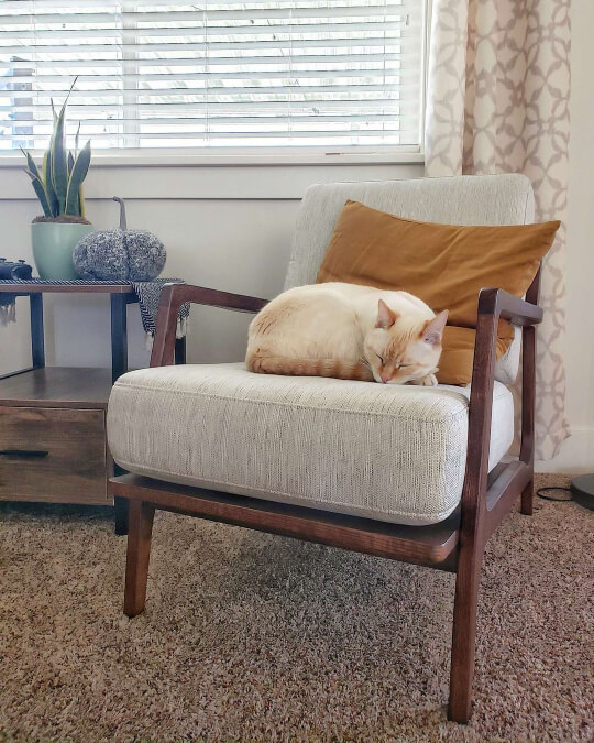
Fan Favorite – Sherwin Williams Shoji White
Shoji White is one of my favorites beige whites, but more importantly, it is the favorite of many home decor lovers.

This creamy off white reminds me of expensive Victorian plaster, or french country chic.

You can see that against a cleaner white trim the undertone of Shoji White is more obvious.
It does not have a yellow undertone at all, its undertone is a perfect creamy beige. Here it looks as white as it ever will, because it has been used on walls, trim, and ceilings.

Of all the colors on this list, Shoji White probably does lean the most peach/pink and the least gray. This is relative though, as each of these white paints is still very neutral.
(If you are at all curious, I do have a post about Shoji White vs Alabaster.)
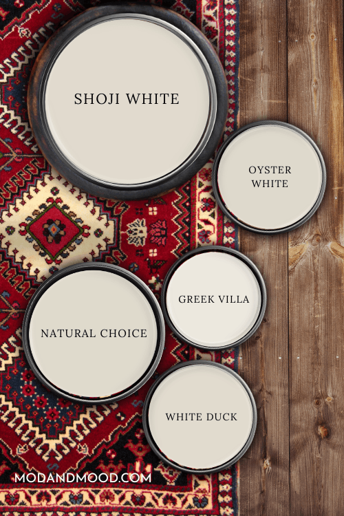
The LRV of Shoji White is 74. We will be referring back to this again, so here is a handy dandy chart:

Narrow down your short list to the perfect beige white for you, with peel and stick samples from Samplize!
Samplize is honestly the best way to test white paint colors against each other, because sometimes sample pots can’t be formulated exactly right for white. Samplize creates their samples with two coats of real paint, so that problem is solved!
Start by grabbing your samples for the two most popular colors on this list: Shoji White and Greek Villa.
Sherwin Williams White Duck
White Duck is another creamy off white that is clearly not a bright white, but is still very neutral.
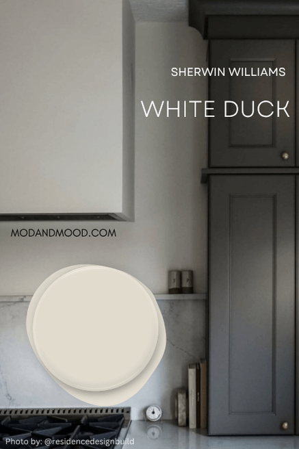
It doesn’t ever look like any other color besides creamy white with a hint of beige. If you are particularly sensitive to peach undertones, you may still notice it with this color, and a brighter white might be a better option.

If you squint at the trim below the window in that last photo, you can kind of see the most peachy that this color will look.
Like Shoji White, White Duck has an LRV of 74. These colors are very nearly identical:
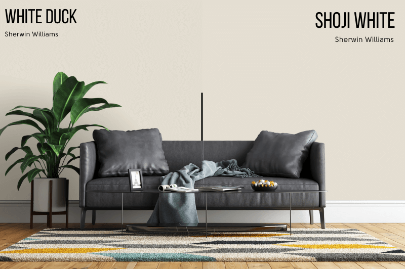
What is the actual difference?
Shoji White is a hair warmer than White Duck.

True White with Beige Undertones – Sherwin Williams Greek Villa
If you are looking for a true white paint color with a hint of beige and not a creamy off-white, you will love Sherwin Williams Greek Villa!

Greek Villa can read like a totally true plain white, or subtley creamy. It does not have a yellow undertone at all.

Here is a good look at the undertone of Greek Villa where it is contrasted against a brighter, cooler white.

You can see how the color would read completely white if it was the same shade on the trim and door.
Here is an example where Greek Villa looks like a bright white because it is the only white:

This gorgeous true white is the first one that I would think of if someone wanted a creamy white with no yellow undertones that isn’t quite an off white.
Sherwin Williams Natural Choice
In my opinion Natural Choice has the sunniest undertone on this list. It’s not yellow, but it’s not as peach as others on this list either.

Natural Choice is another off-white, and it has an LRV of 73.

Here is a better look at the undertone of this beigey-white:

You can see that against the true white trim, the undertone of Natural Choice still looks perfectly beige. In rooms where it is used as the only white, it stays looking pretty light and white.
Natural Choice is often recommended as a darker alternative to the uber popular Sherwin Williams Alabaster.

You can see a thorough comparison here: Sherwin Williams Natural Choice vs Alabaster (Which to Choose?)
If you are wondering why Alabaster isn’t on the list, it’s because Alabaster does typically have a beige undertone, but it can also look yellow on occasion. For that reason, I would not choose it myself for a beige white.
Sherwin Williams Oyster White
Oyster White is probably my favorite beige white on this list. I find the undertone to be beige, but super neutral.
Oyster White is probably the least likely color on this list to look peach, but it isn’t so far the other way that it looks yellow. The secret is that it is actually a touch more gray.
Here on an exterior you can see that it looks oh-so creamy, but there is no specific undertone that you can pick out besides neutral beige.
In this next photo you can see that Oyster White is definitely an off white, but again it looks super neutral:
The same goes for this living room:

Against the almost peachy-white of the drapes, Oyster White looks more gray.
Finally we can peep the undertone a little bit more in this cozy living room:

To be truly unbiased and fair, I will point out that none of these savvy home owners or designers used Oyster White with a bright or cool white, so the undertone is more subtle.
This is exactly why I recommend that you do the same with any of these colors!
What Trim Color Goes with a Beige Undertoned White?
Ready to choose a complementary trim color for your favorite new beigey-white?
The first and most obvious choice should be the color itself! You can achieve subtle contrast by using your same wall color on the trim, but in a different sheen. You might remember seeing that done successfully in a few examples in this post. (Scroll on back to Shoji White, Natural Choice, and Greek Villa!)

If this is too much for you, I recommend using Greek Villa as your trim color if you go with one of the off-whites on this list.
For a truer white that isn’t too bright or cool, try Sherwin Williams Pure White or Snowbound.

Pure White has a subtle warm undertone that is mellowed by a hint of gray. Snowbound technically has a deeper almost-pink undertone, but it reads very much like a true white (especially in small amounts like on trim).
I hope you found the perfect white with just a hint of beige here! This is just a short list of my favorites, so no offense taken if they aren’t your style.
Here are a few more options if you are still on the hunt!