If only there were a natural choice when choosing between Sherwin Williams Natural Choice and Alabaster! If the color name hasn’t made your decision for you, let’s take a look at all the differences (and similarities!) between these two colors.

Sherwin Williams Natural Choice and Alabaster First Impressions
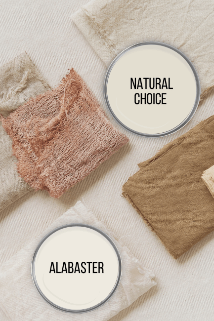
First lets take a look at the colors individually. Here are the swatches for both Alabaster and Natural Choice:
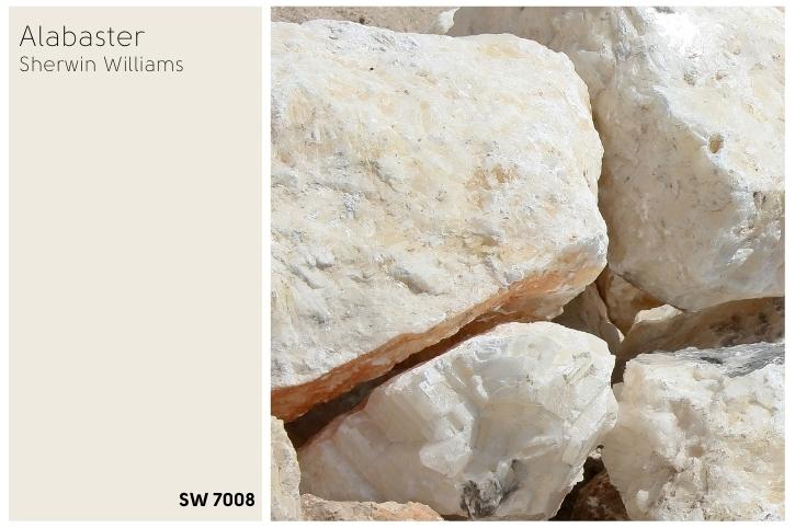

Honestly when the colors aren’t directly beside each other, the difference is pretty subtle.
Remember that the true white of your screen isn’t achievable in paint, so neither of these colors are as dark or as creamy as they appear against digital true white.
Even knowing this, I was pretty startled to see these colors in real photos!
Natural Choice vs Alabaster Color Properties
Here is a handy dandy graphic that I whipped up to help you visualize the differences that we are going to talk about:

Natural Choice vs Alabaster LRV Difference
The LRV of a color indicates on a scale of 0 – 100 how much light a color reflects (or doesn’t reflect). True black has an LRV of 0 and pure white has an LRV of 100.
In the paint world, we are working in a range of 3 – 93 because no paint color is purely black or completely white.
True white paint colors range from about 82 – 93.
Technically Alabaster is actually a white paint color, and Natural Choice is an off-white.
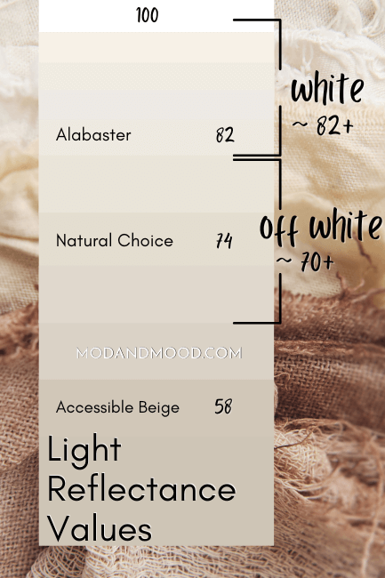
Alabaster has an LRV of 82, so it is right on the edge of white and off-white.
Natural Choice has an LRV of 74, which is about average for off-white paint colors. I would say that in a well lit room, Natural Choice stays in the off-white range. The only time that it would read “white,” is when it is the only white in a room.
Natural Choice vs Alabaster – Comparing Undertones
Natural Choice and Alabaster both have neutral beige undertones. Like all beige paint colors, they fall somewhere in the orange region of the color wheel. Don’t let the sound of that scare you! Every white, beige, gray, black, etc. is somewhere on the color wheel.
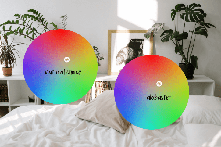
Side by side it’s nearly impossible to see where the difference is on the color wheel, so let’s put them together:
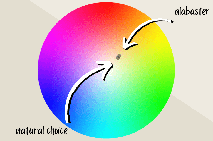
I would say that the undertones of these two colors are nearly identical. Alabaster is a little bit warmer, but it’s also a lot lighter, so by eye the difference is negligible.
Remember! These photos have zero light reflecting off of the walls. So the colors appear darker than they will in your house with a light source.
Natural Choice vs Alabaster – Are They Warm or Cool?
Because Natural Choice and Alabaster are in the mustard area of the color wheel, they are warm colors.
Sometimes less saturated whites in the orange and red range can look pretty neutral, or even gray, but I think both of these do read warm.
Having said that, they are neutral enough to work with a good variety of other colors.
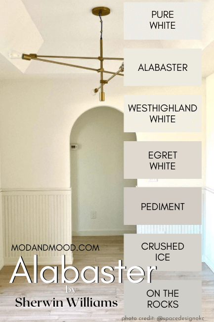
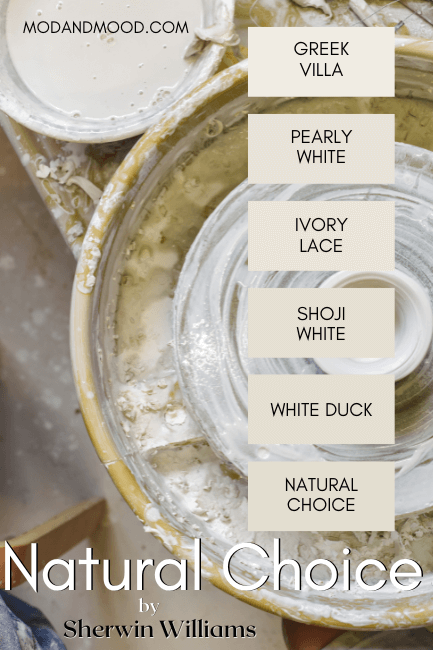
Natural Choice and Alabaster on Their Sherwin Williams Color Strips
Sherwin Williams’ color strips are a little confusing – or at least confusing when it comes to whites.
They rarely organize white colors from light to dark, and instead group them into collections.
Here is the Alabaster color strip:
Here is the Natural Choice color strip:
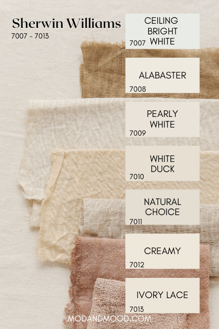
You may have noticed that Alabaster is color 7008 and Natural Choice is 7011, but that does not mean that Natural Choice is four shades darker than Alabaster! In fact color 7013 is lighter than Natural Choice:
All of that to say that you can’t really compare the color strips because there isn’t a lot of reason behind them.
Natural Choice and Alabaster in a Color Palette
Here is a palette of similar tones and a couple of complementary colors:

Palette Colors – Left to Right
Benjamin Moore Chantilly Lace – My favorite white of all time. I used it here because it’s a nice clean white.
Sherwin Williams Natural Choice
Sherwin Williams Taupe of the Morning – A beautiful neutral tan-taupe color.
Sherwin Williams Drizzle – I was inspired by the glass in the building. A beautiful soft blue green goes great with these sandy colors.
(You might also like Aegean Teal.)
Sherwin Williams Urbane Bronze – A beautiful deep neutral brown. This color is super popular for exteriors, especially for trim. If you are looking for an exterior color scheme, Alabaster with Urbane Bronze would be really beautiful.
Natural Choice with Alabaster Trim
I have not always been an Alabaster-for-trim lover. I can now agree that there is a time and place for a softer white on trim, but I still don’t think that Alabaster is often the answer.
I still do love a good contrast, and a nice crisp trim white. That being said: If you want something softer and monochromatic, then Alabaster trim may suit you.
So how do Alabaster and Natural Choice work together?

By painting the trim in Alabaster or even in Natural Choice itself, the color on your walls will look much more white. If you want to bring out the creamier tones, consider painting your trim a brighter white.
I personally think something like Snowbound would also be a good choice with off white walls like Natural Choice. It’s a little bit lighter and more neutral, but it’s not a cool or super bright white.
Check out this post for many more white-on-white color schemes:
Natural Choice or Alabaster Accent Wall
If you are looking to paint your home with a single color and have an accent wall, either SW Alabaster or Natural Choice would be a great choice for your main paint color.
The contrast between these two colors isn’t enough to have one as an accent wall. Try going with Alabaster and selecting something a few shades darker than Natural Choice for the accent color.

It’s way more fun to go wild with color on an accent wall anyway. It’s such an easy change to make if you get tired of it!
If you want to stick with neutrals, go with a sophisticated natural tone in a medium or dark shade. Something like SW Taupe of the Morning would be a nice neutral color to contrast with Alabaster. If you want to go bolder, try Urbane Bronze.
Natural Choice and Alabaster with Other Popular Colors
Here is a coordinating palette with some other colors that are all the rage:

Sherwin Williams Sea Salt – This might be my favorite whole home paint color right now. It’s such a soft soothing color, but still very light.
Sherwin Williams Cavern Clay – One of the best terracotta colors by Sherwin Williams. I love terracotta with all of the greens that are popular right now, and of course, it looks great with warm whites and tan too!
Benjamin Moore Manchester Tan – Manchester Tan is a warm tan color that is more towards the beige. It works well with warm whites like Alabaster.
Benjamin Moore Vintage Vogue – Another new favorite color. Vintage Vogue looks green until it’s beside a truer green and then it looks almost brown! It’s a true chameleon which I love. Vintage Vogue would look amazing with either Alabaster or Natural Choice.
When to Choose Alabaster or Natural Choice?
In a very bright room, Alabaster will be closer to a true white and might wash out at times. If you want your home to be a little warmer and stay creamy, then make the Natural Choice. (Last one, sorry!)

In bright daylight, even Natural Choice will look pretty darn white.
I just did a profile on Behr’s Diamonds Therapy, which has an LRV of 80, and was shocked to see the swatch looking straight white in my home.
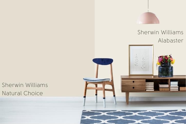
I cruised all over Instagram to share some inspo with you, but I ran into problems. Natural Choice is pretty hard to find, and when I did find it, it was often a color “similar to Natural Choice” and it just didn’t look right.
Here is one of the few examples of Natural Choice that I think is pretty accurate:
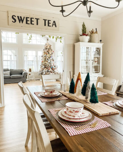
You’re going to want to follow Tammy Kate if you are into farmhouse white! Her house is a dream. (Also tidy, which is a fantasy…)
Always keep in mind when looking at inspiration photos:
- The color could be credited wrong
- It could be an inaccurate color match
- Photos could be filtered and brightened
- Their lighting is not your lighting
Looking for a more Alabaster comparisons?


