Sherwin Williams Natural Choice is a newer favorite amongst creamy off-whites. This is a great option if you are torn between an actual white paint color and a neutral.
Let’s take a look at Natural Choice in a color palette, visit it inside real homes, and finally, see some dupes!
What Color is Sherwin Williams Natural Choice? (7011)
Natural Choice is a creamy off-white paint color with a beige undertone that is balanced by a hint of gray.
Is Natural Choice a greige?
In my opinion, Natural Choice is too warm to be considered a greige. It is instead somewhere between off white and beige – just not a super warm beige.
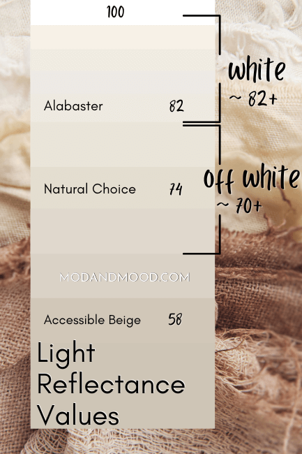
LRV of Sherwin Williams Natural Choice
The LRV of Natural Choice is 73.
What does that even mean?
The LRV (Light Reflectance Value) of a color indicates on a scale of 0 – 100 how much light a color reflects (or doesn’t reflect). True black has an LRV of 0 and pure white has an LRV of 100.
In the paint world, we are working in a range of about 3 – 93 because no paint color is purely black or completely white.

At 73, Natural Choice is squarely in off-white territory. Most neutral colors with LRVs between 70 and about 82 are classified as off whites.
What Are the Undertones of Natural Choice?
Natural Choice is a creamy beige off-white with a little bit of gray. It is more likely to flash a bit peach than yellow. (This is pretty normal with beige paint colors.) I go back and forth on whether it can have a hint of a yellow undertone, or if it just looks “warm.”

If you are quite opposed to yellow, I might give this one a pass and look at Oyster White or Dove Wing instead, but wait to decide until you see real homes in just a minute. “Yellow” can be quite subjective. There are some people for whom off-white always reads yellowy.
Is Natural Choice Warm or Cool?
Natural Choice is a warm to neutral paint color. It does not ever look cool. (This is why I would not call it a greige.) It will look more neutral or gray in comparison with super warm beiges or whites. For example, here it is with Kilim Beige:

You can see that in comparison it does look more neutral or gray, but still not cool.
The Sherwin Williams Natural Choice Color Strip
Sherwin Williams does not include Natural Choice in any of the traditional light-to-dark color strips. Instead it is in this collection of off-whites:

The other colors in this collection are:
- Greek Villa
- Pearly White
- Ivory Lace
- Shoji White
- White Duck
Natural Choice most closely fits into the Useful Gray color strip:
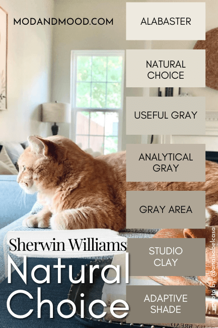
This one is definitely a little bit too gray (but if you like it, I have covered Studio Clay and Adaptive Shade). Natural Choice almost fits into the Accessible Beige color strip:

…but it’s not quite warm enough. In the end, Useful Gray was a slightly closer match.
Lighter Version of Natural Choice
I have compared Natural Choice at length with the ever popular Sherwin Williams Alabaster in my post Sherwin Williams Natural Choice vs Alabaster (Which to Choose?).
The truth is that Alabaster is quite like a lighter version of Natural choice.
Alabaster itself is on the darker end of white, so this is a subtle, lighter shift.
Sherwin Williams Natural Choice in a Color Palette
Here is a color palette that I put together for Natural Choice:
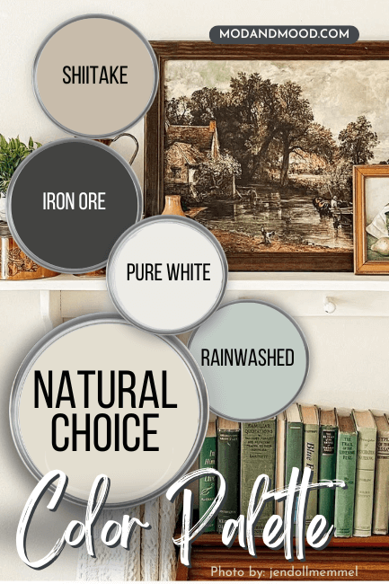
Coordinating Colors to Use With Natural Choice
If you noticed that this palette is very similar to the one I made for Sherwin Williams Steamed Milk – No you didn’t. (I like what I like, baby!)
Sherwin Williams Shiitake
Shiitake is a warm beige color that will pair nicely with Natural Choice. Just like with Kilim Beige, this combo will keep Natural Choice looking really neutral.

This one is also on my list of The Best Mushroom Paint Colors for Kitchen Cabinets.
Sherwin Williams Iron Ore
If you want Natural Choice to stay looking creamy, try pairing it with something a little cooler like Iron Ore.

Iron Ore tends to be a chameleon, but most often it reads like a cool charcoal with a subtle blue undertone, which will be very complementary for Natural Choice.
Iron Ore is also on my list of favorite Dark and Moody Exterior Colors From Sherwin Williams.
Sherwin Williams Pure White
I went back and forth on what white to use in this palette, but ultimately settled on the fail-safe Pure White:

Pure White has a lot in common with Natural Choice! It is a warm white that is neutralized by a little helping of gray. I like Pure White with Natural Choice because it is a little bit more contrast than Alabaster.

That being said, I think that Pure White, Greek Villa, White Flour, or Benjamin Moore Simply White, would all be great trim whites with Natural Choice.
Sherwin Williams Rainwashed
Rainwashed is a beautiful gray blue-green color that will bring cool tones into your space in the subtlest of manners.

Rainwashed will balance and uplift the warm tones in Natural Choice.
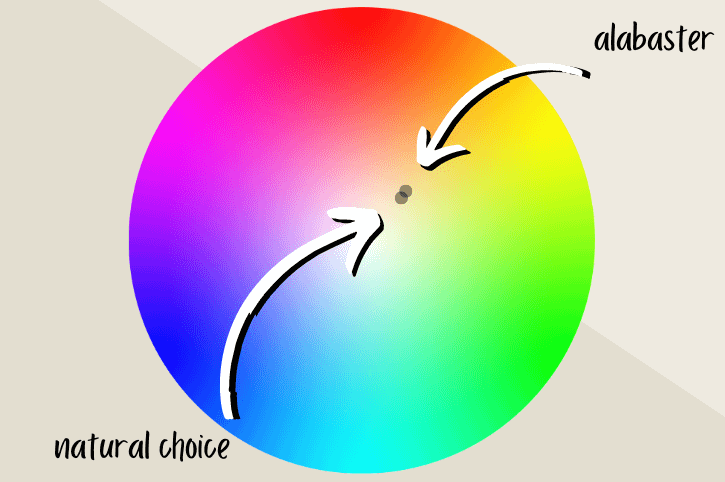
Complementary Color for Natural Choice
The science of complementary colors is very simple: Whatever shade is directly across the color wheel is the “official” complement to any given color.
For Natural Choice, this is a gray blue with a hint of periwinkle. Sherwin Williams Upward is a pretty good toned-down version that is more dusty blue than purple.

Sherwin Williams Natural Choice for Your Home’s Interior
Here are some real life examples of how Natural Choice can look in your home.
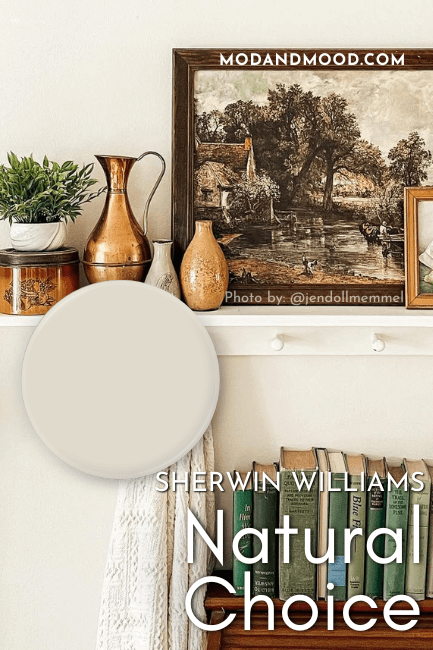
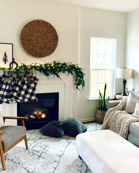
Natural Choice in the Living Room
Jen (@jendollmemmel) ended up in the same place I did: Pure White with Natural Choice!

There is a filter on some of these photos, so I’m showing the most accurate ones first. I think the photo above is a pretty good look at how Natural Choice usually looks on the walls.
This one is also fairly accurate:

These next two photos are a little bit warm:

For more white pairings, check out my post: White Walls with White Trim? (Alabaster with Pure White & More!)

Ana Isabel (@anaisabelcasa) also used Natural Choice in her living room:

From what I can tell, Natural Choice is the color on the trim and ceilings as well:

While the cabinets do look close to the wall color, they are actually Benjamin Moore Revere Pewter.
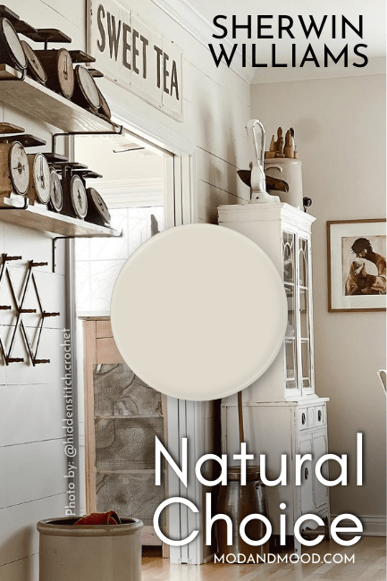
Sherwin Williams Natural Choice in the Dining Room
Jen used Natural Choice in her dining room as well as the living room:

Again, I think there is a bit of a filter on the photo, but it gives an idea.
Sherwin Williams Natural Choice in the Bathroom
Erin from @erinchristineinteriors used Natural Choice on the walls in this bathroom:

Holly (@hollycollinsplusfive) chose Natural Choice for the shiplap in this bathroom:

I’m not sure if it’s the same color on the vanity, but it looks closer to Sherwin Williams Jogging Path to me.
Sherwin Williams Natural Choice on Kitchen Cabinets
Unfortunately for us, I wasn’t able to find Natural Choice on cabinets, so we will have to take inspo from the very similar Shoji White. Here is a quick look at the difference:
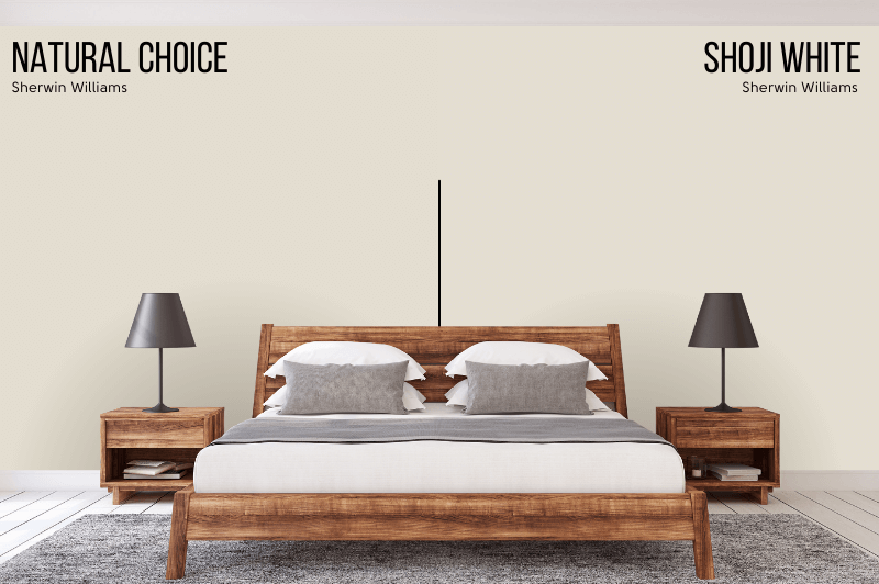
You might not be able to see the difference depending on your screen, but Shoji White leans slightly more red than Natural Choice.
Here is Shoji White in a kitchen by @oakstorydesign:

The island here is Benjamin Moore Carolina Gull. You can see the slightly peach undertone here, which is a touch stronger with Shoji White, so Natural Choice might read a hint more neutral.

The reason it looks so white here, is because it is the only white in the space.
Sherwin Williams Natural Choice on an Exterior
For exteriors, let’s start with the boldest and most saturated that Natural Choice will look outside:

Summer, of @summerblaiseinteriors, chose Natural Choice for this brick makeover.

The color is so beautiful and creamy!
Here is the absolute most yellow that I have seen Natural Choice look:

Even so, I think it reads more “creamy” than actual yellow. Here it looks pretty darn white:

If you like this, you will love my post: Stunning White Paint Colors for Classic Brick Exteriors
Dupes for Sherwin Williams Natural Choice From Other Brands
Want to get the look of Natural Choice from another brand? I’ve got you!

Benjamin Moore Natural Choice Equivalent
The best color match from Benjamin Moore, is their shade Fossil.
Benjamin Moore Fossil (AF-65)
Fossil is a hair lighter than Natural Choice, a whiff more saturated, and a sprinkle warmer.

Overall, pretty imperceptible.
Valspar (Lowe’s) Equivalent to Natural Choice
If you are planning to purchase your paint at Lowe’s, ask for Valspar’s shade Salute.
Valspar Salute (7006-12)
Salute is a little bit darker than Natural Choice and a tiny bit more gray:

Still a really great dupe!
Natural Choice Behr Equivalent (Home Depot)
Over at your friendly neighbourhood Home Depot, you can get a Natural Choice lookalike with their shade Confident White.
Behr Confident White (GR-W12)
Confident White is a tiny bit lighter and a tiny bit more yellow than Natural Choice:

Again you can barely tell the difference! I’m super proud of these dupes, I think they are some of the closest that I’ve found!

Thanks so much for reading! I hope this helped clear the muddy waters of the off-white paint world.
Not quite right? Check out these other posts:


