Sherwin Williams does soft whites very well, and two of the most popular are Alabaster and Shoji White.
Alabaster is a tried-and-true classic, and Shoji White is more of an up-and-comer.
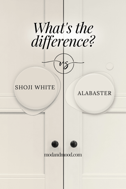
The major difference between Shoji White and Alabaster, is that Alabaster is still technically a white paint color, where Shoji White is an off-white. Both are creamy and neutral. Side by side, Alabaster will look white, and Shoji White will look like a very light beige.
If that’s all you came for, there you have it! But let’s see some details shall we?
Quick note:
I have reviewed each of these colors in detail.
Check out my posts: Luxurious Alabaster and Shoji White Review (It’s not greige!)
This post may contain affiliate links. Should you choose to make a purchase through one of my links, I may receive a small commission at no cost to you. I only recommend products that I use.
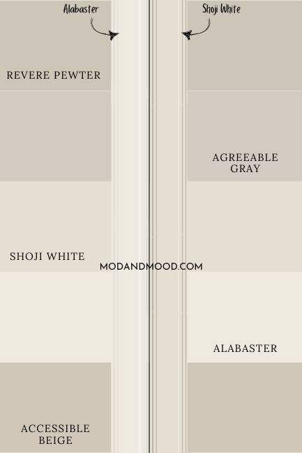
Comparing Sherwin Williams Shoji White vs Alabaster Swatches
Here is a side by side comparison of the Alabaster and Shoji White swatches.
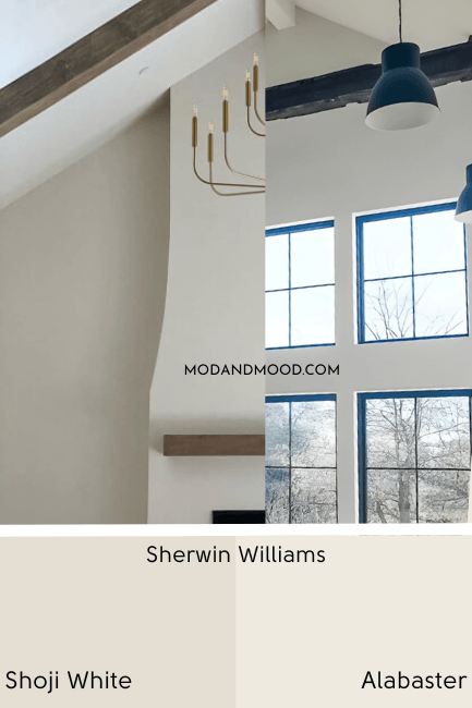
You can see that Alabaster looks white, and Shoji White looks beige in comparison, as expected.
Shoji White and Alabaster LRVs Compared
The LRV (Light Reflectance Value) of a color indicates on a scale of 0 – 100 how much light a color reflects (or doesn’t reflect). True black has an LRV of 0 and pure white has an LRV of 100.
In the paint world, we are working in a range of about 3 – 93 because no paint color is purely black or completely white.

The LRV of Alabaster is 82.
The LRV of Shoji White is 74.
In practical terms that means that Alabaster is still technically a true white paint color (albeit a creamy one) and Shoji White is decidedly off-white.

The Color of Alabaster Vs the Color of Shoji White
Besides the obvious lighter/darker difference between these two, how do they compare in terms of actual color?

The difference is so so subtle, allow me to point it out!
Shoji White is ever so slightly more red than Alabaster, and it’s also not quite as gray.
This means that Shoji White could look slightly peach in comparison to Alabaster, or Alabaster can look slightly more yellow than Shoji.
These colors are both squarely in the area of the color wheel that you will find practically every beige under the sun, so truly, they are neutral.
Get a first-hand glimpse of the difference between these two with peel and stick samples from Samplize! Samplize makes their samples with two coats of real paint, so you know it’s color accurate.
White paint colors are really hard to blend accurately into sample pot sizes, so Samplize is a great choice for testing without that question mark. Here is the sample for Alabaster, and here is Shoji White.
Shoji White vs Alabaster on an Exterior
Let’s take a look at how these two compare in real life situations, beginning with exteriors.
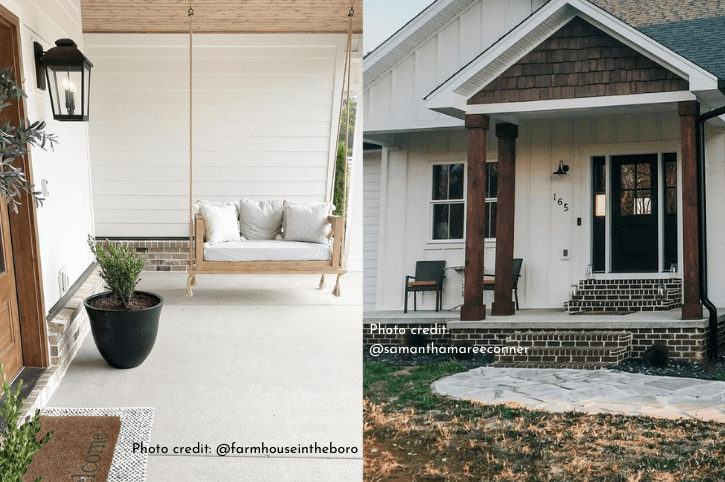
I tried to choose the exteriors that were the most comparable, but of course the lighting and conditions won’t be totally the same.
You can see that Alabaster looks brighter and creamy, where Shoji White looks more beige (almost a little peachy in this image).
Here is one with more similar conditions, but Alabaster is on siding and Shoji White is on brick:
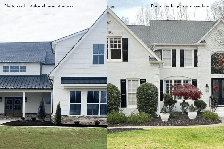
I personally find that exteriors are very nuanced, because every color is brighter outside, and whites reflect a lot of color.
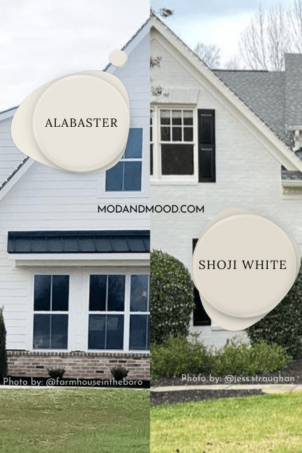
Just to be fair, here are a couple of brick exteriors where Alabaster actually looks like the darker color.

This first one is Alabaster.
Next we have Shoji White:
I will say that you can see how Alabaster, even though it looks darker, is darker in a gray way, and not as beige as Shoji would look.
If you are painting brick, you will want to read this post: Stunning White Paint Colors for Classic Brick Exteriors
Shoji White vs Alabaster on Cabinets
The next debate for today: How do Shoji White and Alabaster compare on cabinets?
I have some really good photos to show you here. Probably the best of the bunch in terms of seeing the difference!

Finally you can plainly see that Shoji White is definitely darker and more beige, where Alabaster looks more bright.
Were these kitchens not side by side, Shoji would absolutely look white, but deeper, if that makes sense:

To make either of these colors look their absolute whitest, they NEED to be the only white.

Either of these colors are beautiful on cabinets!
Alabaster is a more traditional white choice, whereas Shoji White won’t ever be confused with manufacturer’s white.
(Which could be good or bad depending on how you look at it.)
Alabaster or Shoji White for Walls?
Comparing Shoji White to Alabaster on walls, is like comparing apples to apples. Like comparing a honey crisp to a gala apple. (Can you tell those apart, because I absolutely cannot!)
When either Alabaster or Shoji White is used as the only white in the space (we’re talking trim, ceilings, etc.) they will both look like soft whites.
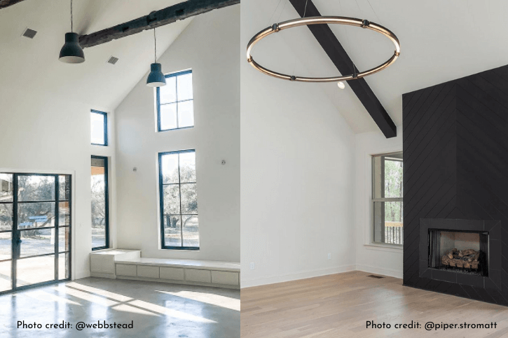
Take a guess at which is which. I’ll wait…
Alabaster is on the left, and Shoji White is on the right.
I would say that Alabaster if you really look, does look “brighter” and maybe a hair more yellow than Shoji White. In this comparison, Shoji comes out on top as the more neutral of the two.
Here’s one more, same houses:

They both look neutral, they both look white. Throw a dart to choose!
Both of these spaces are still empty, so if you intend to bring a lot of bright white decor or furniture in, that will effect how you see the colors.
Shoji White would definitely look off-white beside Ikea white furniture, but you could get away with a cream sofa, for example.
Here’s another comparison, just because it’s fun how similar these homes are:

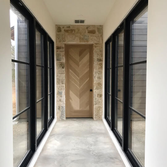
Which is which? If you have a keen eye for photo credits, you might already know. (Cheater!)
The first photo is Shoji White, and the second is Alabaster.
Can You Use Shoji White and Alabaster Together?
Sure you can. Just remember if you use Alabaster for trim with Shoji White, your walls will look off-white.

The white on Brandi’s trim is a little brighter than Alabaster, it’s Sherwin Williams Snowbound, but the visual still helps. If you cover the trim, Shoji White looks pretty white. It’s the contrast that helps you see that it’s actually cream.
Shoji White or Alabaster for Trim?
Traditionally only a true white would be used for trim, but off white and beige trim colors are having a moment!
I would not use Alabaster for trim with true white walls, because it is too dark to look white in comparison, and not dark enough to contrast. This could be a good spot to use Shoji White, because it would be a contrasting creamy trim color.
Either Shoji White or Alabaster work as trim choices with many neutral wall colors, but Shoji White is a low contrast option, and you would need to be mindful that the undertones work together.
With darker colors, Alabaster is a still-soft but higher contrast more traditional trim option. It is not a great choice for most gray or blue paint colors (in my opinion) because it can look yellow in comparison (Shoji White would also not be right).
Alabaster and Shoji White would work really well together in a monochromatic neutral color scheme. Maybe something like this:

I’ll link a few of these colors below.
Shoji White or Alabaster – Which is the Better Color?
Which is the better color depends on what you are painting and what your goal is.
Either of these colors work for cabinets and walls:
- If you want light and bright, choose Alabaster.
- If you want soft and subtle, choose Shoji White.
For exterior brick or stucco, I would lean towards Shoji White. For siding, I would probably want a whiter white, like Alabaster.
Hope you loved this post and it helped you choose! Here are related colors from that neutral palette:

