Sherwin Williams St. Bart’s is a gorgeous mid-toned blue with just a hint of a rich tealy-green undertone. Let’s take a look at 7 coordinating colors for St. Bart’s, and see it in real lfe!
What Color is Sherwin Williams St. Bart’s? (Let’s Talk Undertones!)
St. Bart’s is an aquatic blue color on the darker end of mid-toned. It typically has a teal undertone, but it can range in appearance from a sea blue-green to a slightly toned down sky blue.
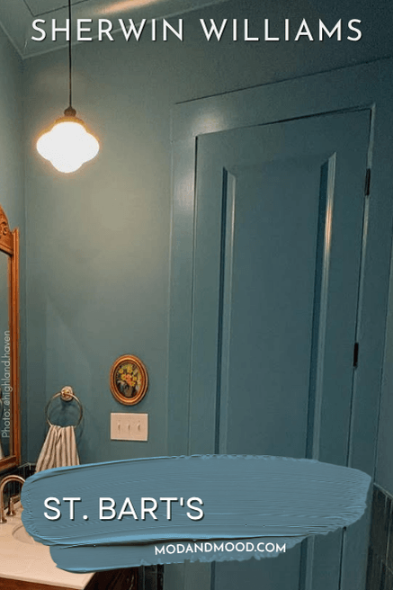
There is a little bit of gray in St. Bart’s, which stops it from getting too poppin’, but it’s not enough that I would say the color has a gray undertone, or looks particularly smoky. The gray just adds a bit of balance.
St. Bart’s LRV
The LRV of St. Bart’s is 18.
What does that mean?
The LRV (Light Reflectance Value) of a color indicates on a scale of 0 – 100 how much light a color reflects (or doesn’t reflect). True black has an LRV of 0 and pure white has an LRV of 100.
In the paint world, we are working in a range of about 3 – 93 because no paint color is purely black or completely white.
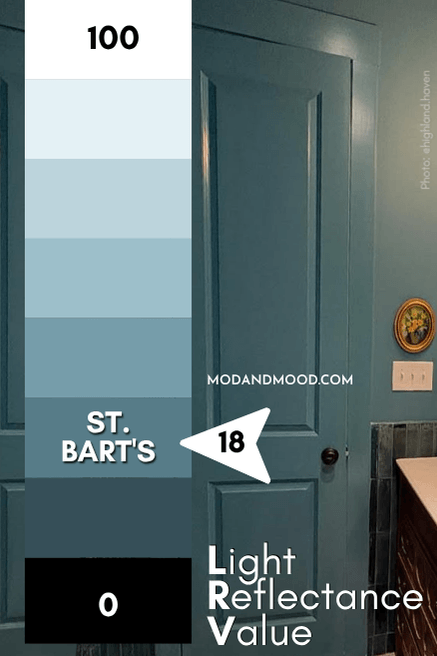
My rule of thumb is that truly dark paint colors typically have LRV’s of 10 or less. At 18, St. Bart’s is on the darker end of mid-toned, but not quite a dark paint color. It’s not ever going to look navy, for example.
St. Bart’s in the Sherwin Williams Color Strip
Sherwin Williams does have St. Bart’s in a collection of similar shades, but they do not have a light to dark color strip. I have cobbled together my own to give you some ideas for lighter and darker versions, or for coordinating colors that are similar.
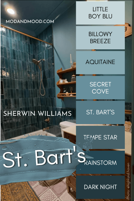
The shades that are similar to lighter and darker versions of St. Bart’s are:
- Little Boy Blu
- Billowy Breeze
- Aquitaine
- Secret Cove
- Tempe Star
- Rainstorm
- Dark Knight
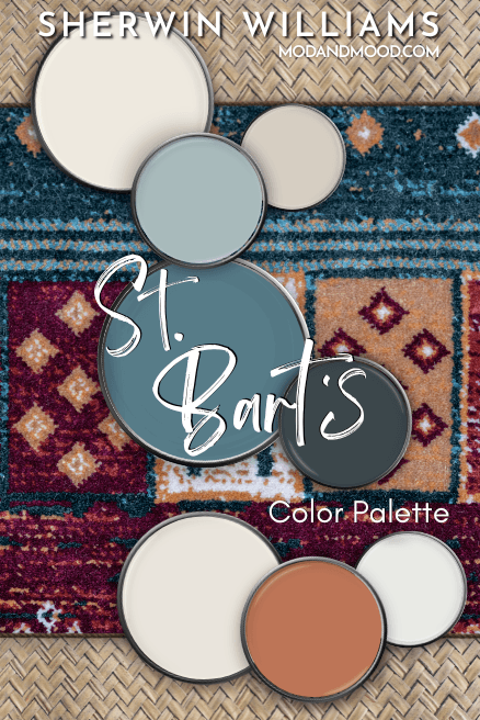
Sherwin Williams St. Bart’s in a Color Palette
Here are the coordinating colors that I recommend for St. Bart’s.
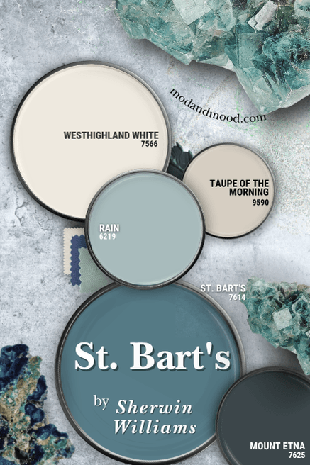
Coordinating White Paint Color for St. Bart’s
Sherwin Williams Westhighland White is a true white with a creamy undertone that is complementary to St. Bart’s.
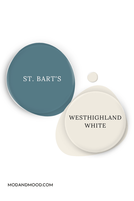
Westhighland White is also my dupe for Benjamin Moore Swiss Coffee at 75%.
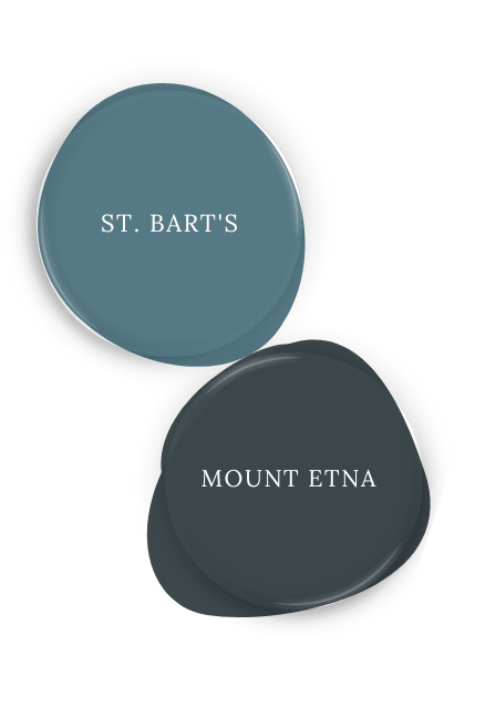
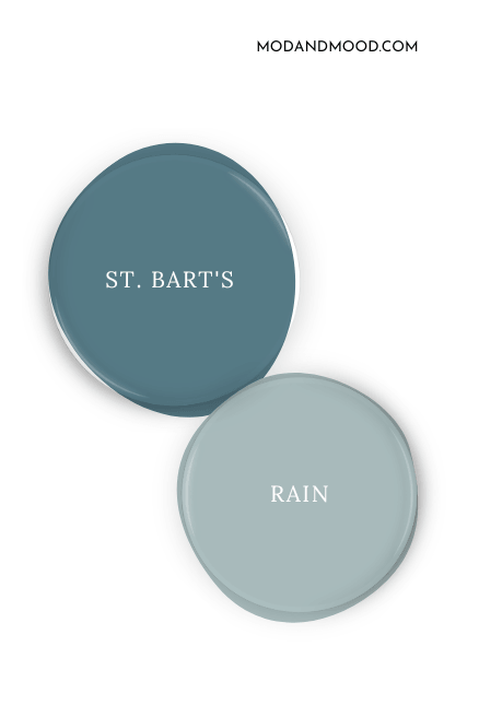
Try St. Bart’s with Sherwin Williams Mount Etna or Rain
Mount Etna is similar to a darker, more subdued version of St. Bart’s. This deep blue green can look close to black, but it has saturated teal undertones.
Sherwin Williams Rain is a beautiful coordinating light blue to use with St. Bart’s. You could also use a gray green paint color instead.
Neutral Paint Color to Use with St. Bart’s
Most beige colors are complementary to blues like St. Bart’s. This also means that blue will emphasize the yellow or orange tones in beige colors, so for that reason I wanted to include a neutral that isn’t quite complementary.
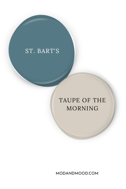
I went with Sherwin Williams Taupe of the Morning because it isn’t likely to yellow. The undertone of Taupe of the Morning is likely to keep St. Bart’s leaning slightly more teal rather than true blue.
Sherwin Williams Recommends Using St. Bart’s with These Coordinating Colors
Here is the coordinating color palette that the pros at Sherwin Williams suggest for St. Bart’s:
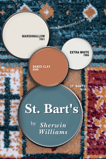
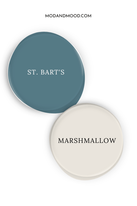
We were sharing brain cells when it comes to Sherwin Williams Marshmallow! This white paint color is pretty similar to my choice of Westhighland White.
They also recommend using the true cool white of Sherwin Williams Extra White, and the terracotta shade Baked Clay.
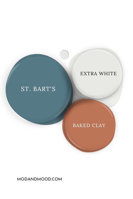
Here is another look at all of the coordinating colors for St. Bart’s:
Sherwin Williams St. Bart’s for Your Home’s Interior
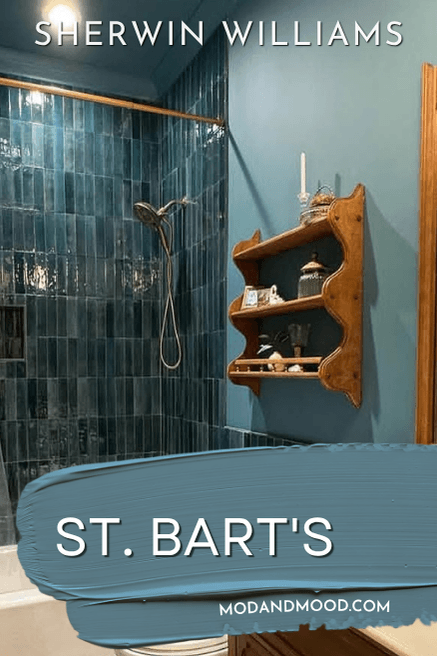
St. Bart’s isn’t all that popular, so I don’t have too many examples for you, but I do have the room that inspired me to write this post in the first place!
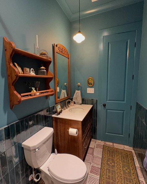
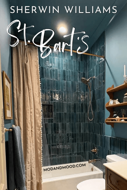
This bathroom @Highland.haven stopped me mid-scroll because the color is soooo beautiful. The homeowners used St. Bart’s in a color drench situation, with the same color in different sheen on the walls, trim, and ceilings.
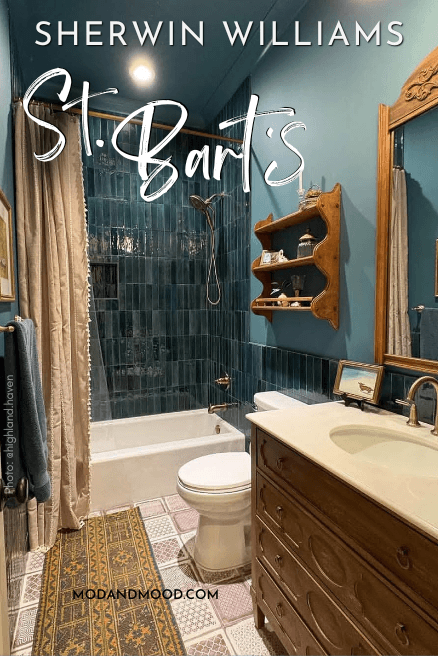
The color looks amazing with the stacked teal tile in the shower.
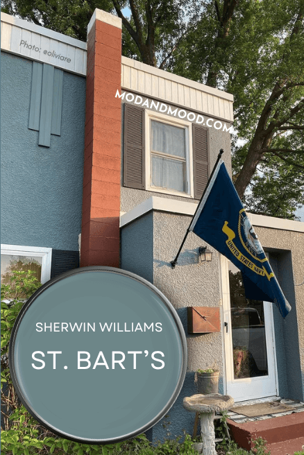
St. Bart’s on an Exterior
I was able to find an exterior that is very close to St. Bart’s and I edited the color slightly to be more accurate.
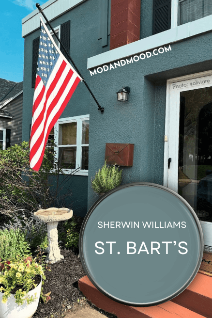
This is how you can expect St. Bart’s to look outside. At its boldest and brightest, it will probably lose the green undertone and look a bit more vibrant.
That’s all for this post! Thank you so much for reading until the end, that really helps my blog!
Still undecided on your color choice? I’ve got more!