Sherwin Williams Debonair is a mid-toned smoky blue that screams sophistication.

Here we will talk about undertones, take a look at Debonair in a color palette, and see the coordinating colors that Sherwin Williams recommends.
What Are the Undertones of Sherwin Williams Debonair?
I find that Debonair most often looks how you would expect. It has a little bit of gray in it, which gives it a touch of depth. It can, on occasion, have a slight teal undertone.

Debonair is quite likely to look teal in comparison to true saturated blue colors and cool grays.
The LRV of Debonair is 34, so it is right in the mid-toned color range.

Debonair in Real Life
Thanks to Lindsay and Dustin from @silo.hill, we do have a few pictures of Debonair in a real home.

They used Debonair to color drench this upstairs bathroom. In the first photo we get a good look at a normal appearance for Debonair.
In this next photo we see the color looking a little more teal:

Finally we see the color where it looks a little more denim blue:

To help you visualize Debonair on kitchen cabinets, I will have to show you the similar color Benjamin Moore Water’s Edge (aka Van Courtland Blue):

Despite not being exactly the same color, this is pretty accurate to what you can expect from Debonair:

This is actually my dupe for Debonair from Benjamin Moore. To see the rest, check out my post: Dupes for Sherwin Williams Debonair from Other Brands
If you like these colors, you will also like Farrow & Ball De Nimes:

…which you can see in my post: Color Drenching Will Make Any Space Luxurious (And It’s Easy!)
Sherwin Williams Debonair in a Color Palette
I decided to go with a sort of water themed cool-toned color palette for Debonair. Something that can go from coastal to french country, seamlessly.

Coordinating White Paint Color for Debonair
For a crisp but creamy white to pair with Debonair, try Sherwin Williams White Snow.
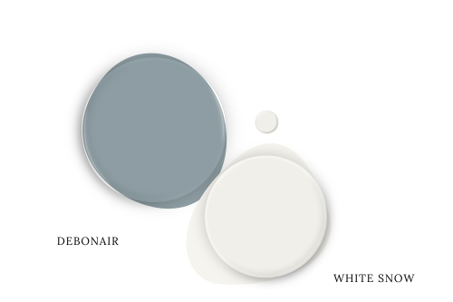
White Snow is the closest thing that Sherwin Williams offers to the fan favorite Benjamin Moore Simply White.
This white is nice and bright but still has a forward creamy undertone. A creamy white is complementary to the “powder blue adjacent” color of Debonair.
Be aware that a cool white may make Debonair read a little more green.
Try Debonair with Benjamin Moore Azores
I couldn’t find exactly the right green by Sherwin Williams, so instead I opted for the Benjamin Moore color Azores.
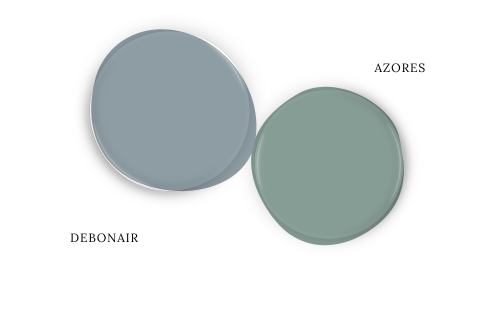
Azores is a true teal color that reads a bit brighter in real life than it does in this color palette. I like the idea of using a green with Debonair, because it will keep it looking quite blue.
If you wanted to emphasize the tealy undertone of Debonair, you might try pairing it with something more blue, such as the timeless Benjamin Moore Hale Navy.

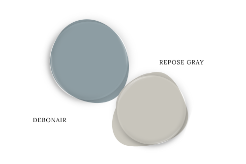
Neutral Paint Color to Use with Debonair
Warm neutrals are more on trend, but I liked the idea of using a gray with Debonair.
Sherwin Williams Big Chill is quite silvery, but it can technically still have some warmth in the form of a slightly taupey undertone.

You might also like Sherwin Williams On the Rocks.
Technically a taupe color would be the “official” complementary color for Debonair, so if that is the route you want to go, you could try Sherwin Williams Repose Gray.
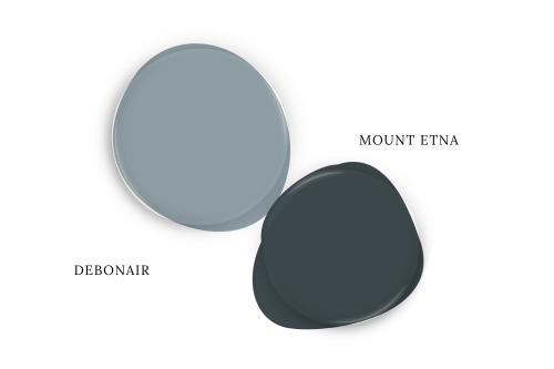
Pair Debonair and Sherwin Williams Mount Etna
Mount Etna is a deep and mysterious muted teal. I like it because it’s almost like a much much darker version of Debonair.
Sherwin Williams Recommends These Coordinating Colors
Here are the colors that Sherwin Williams suggests you use with Debonair:
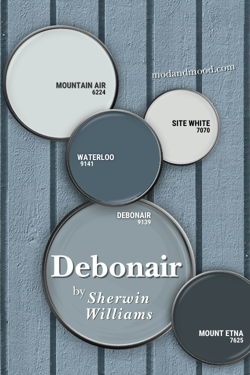
I left in Mount Etna because it looks nice there.
Pair Debonair and Sherwin Williams Site White
Site White is technically an off-white, with an LRV of 73. This color most often looks like a true light gray or a cool white.

This gray white is not too far from my pick Big Chill.
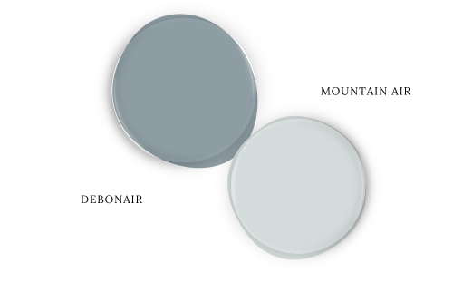
Use Debonair with Mountain Air
Mountain Air is a very light blue and technically an off-white as well, with an LRV of 73 again. This color most often looks like a very light and muted “Tiffany blue.”
This was also one of Sherwin Williams picks to use with Whirlpool.
Try Waterloo with Debonair
Waterloo is a saturated deep teal paint color that is two shades darker than Debonair on the same color strip.

This color tends to look teal most of the time, where Debonair only does sometimes.
I suspect that this pairing will make Debonair look more gray-blue and less teal.
What is the Difference Between Debonair and Stardew?
Stardew is one shade lighter than Debonair on the same color strip:

Because Stardew is lighter than Debonair, it may look slightly aquatic at times, but it tends to stay dusty blue, and isn’t dark enough to ever read “teal” (in my opinion).
Thank you so much for reading until the end, that really helps my blog!
I hope this helped give you some ideas on what colors to use with this sophisticated blue.
Not the one? I’ve got more!


