Whirlpool is a beautiful mid-toned blue color with the slightest gray and green undertones. This murky sea-inspired blue is beautiful anywhere from exteriors to kitchen cabinets.

Today we will talk all about Whirlpool’s undertones, go over coordinating color ideas, and see some dupes!
What Are the Undertones of Sherwin Williams Whirlpool?
Whirlpool ranges in appearance from a light robin egg blue to a mid-toned ocean blue. It can appear a little powdery gray-blue at times, but it does normally maintain the slightest green undertone.

Here is a pretty typical lighter look for Whirlpool:
And a slightly darker look from the same room:

The walls in this living room are Sherwin Williams Whitetail, and the trim is High Reflective White.
Here is a look at the whole color strip from Sherwin Williams for Whirlpool:

I am not all that much of a blue girly – it’s just not a color that I gravitate towards – but I am loving these murky blue grays with the whisper of underlying green!
I have seen Whirlpool in fairly bright natural light most of the time, so I was surprised at how dark it is on paper, with an LRV of 29.

The LRV (Light Reflectance Value) of a color indicates on a scale of 0 – 100 how much light a color reflects (or doesn’t reflect). True black has an LRV of 0 and pure white has an LRV of 100.
In the paint world, we are working in a range of about 3 – 93 because no paint color is purely black or completely white.
At 29, Whirlpool is in the middle of the mid-tones! Most whole home paint colors have LRVs from approx 45 to 68, and most truly dark colors have LRVs of 10 or less. That creates a mid-range somewhere between 11 and 45, and Whirlpool is perfectly in there!
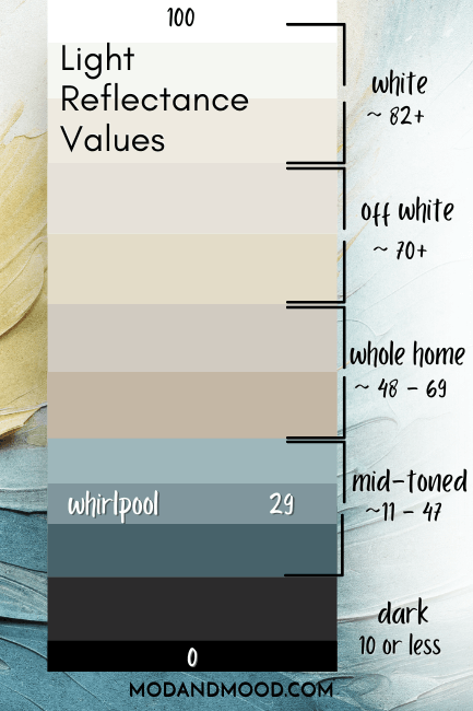
Please excuse that the chart is not proportional between light and dark colors. I’m just winging it over here.
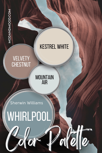
Sherwin Williams Whirlpool in a Color Palette
Here are the colors that I think work really well with Sherwin Williams Whirlpool:

Coordinating White Paint Color for Whirlpool
I decided to take some inspo from Bonnie (@owcustomhomebuilders) who was kind enough to share some of her photos!

She used the creamy white of Sherwin Williams Whitetail in her whole home, and it looks great alongside Whirlpool.
Whitetail is quite a creamy white and it doesn’t have as much gray in it as other favorite whites such as Alabaster or Pure White.
If you like the look of this color, you will also like Benjamin Moore Simply White.
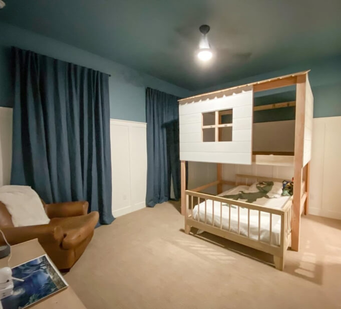
Here is another look at the Whitetail and Whirlpool combo in a bedroom:

In this photo the color looks more blue, but here is one where it looks a little more green:
Try Whirlpool with Sherwin Williams Tempe Star
Sometimes monochrome is just the answer! I really love the darker shades from this color strip, such as Tempe Star, and coordinating with the lighter version Whirlpool, is kind of a foolproof way to use one!

You might also like Whirlpool with Sherwin Williams Endless Sea, which is a deep teal-navy.
Neutral Paint Color to Use with Whirlpool
If you are sick of standard grays and beiges, why not try Whirlpool with a more clay-leaning neutral such as Likeable Sand? :

Likeable Sand is on the same color strip as former color of the year Redend Point. It is also my pick for a Sherwin Williams dupe for the popular Farrow & Ball color Setting Plaster.
The warm pinky-clay undertone of Likeable Sand makes it a near perfect complementary color for the slightly green-leaning blue of Whirlpool.
For a more “traditional” neutral wall color to use with Whirlpool, I like Worldly Gray:

Worldly Gray is like a very light mushroom color, and it is a nice natural shade without being overly warm.
Worldly Gray is also on my list of Best Trending Taupe Paint Colors.

Sherwin Williams Recommends These Coordinating Colors
If you’ve been scrolling around here before, you already know that I pick my own coordinating colors before I peak at Sherwin Williams’ picks, and this time we were fully on the same wave length!
Pair Whirlpool and Sherwin Williams Velvety Chestnut
I really like this recommended pairing for Whirlpool! The warm clay brown of Velvety Chestnut is very complementary to this blue hue.
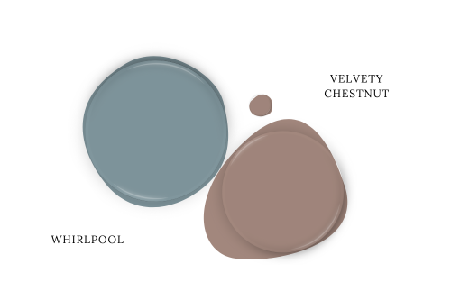
I will say that Velvety Chestnut has approximately the same LRV as Whirlpool, so it wouldn’t be the best choice for a whole home color.
For that you could select a lighter shade from the same color strip such as Doeskin or Unfussy Beige, which are actually not far off from my pick Likeable Sand.
Or…you could try the other Sherwin Williams suggestion Kestrel White!

Technically Kestrel White is a little too dark to even be considered an off-white, with an LRV of 68.
This light neutral is a traditional beige without being overly warm. It does often come across as a creamy off white.
You might also like a pick from my post: All Time Favorite Sherwin Williams Whites with a Hint of Beige
Use Whirlpool with Mountain Air
Mountain Air is a gray blue that is light enough to be considered an off-white.

This color ranges in appearance from a very light silvery-gray to a light tiffany blue. This is like a lighter version of the same color range that Whirlpool gives, so that makes these two a great match!
If you like this color, you will also like Behr Light French Gray (not to be confused with the very different Sherwin Williams color by the same name!)
Here is another look at all of the coordinating colors from this post:

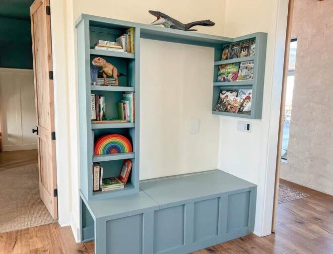
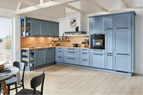
Whirlpool on Kitchen Cabinets
Here is a good idea of how this color will look on kitchen cabinets:

Because most cabinets are finished in a higher sheen, you may find that the color reflects a little more blue in natural light than you might expect.
In that case, Whirlpool can look more like this:
If you are here looking for a cabinet color, you might also like Sherwin Williams Foggy Day for a similar vibe:

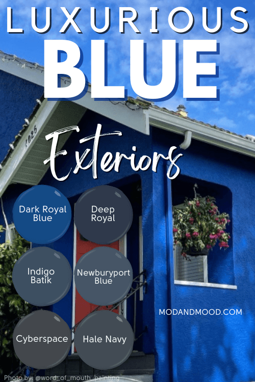
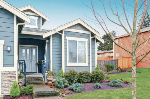
Sherwin Williams Whirlpool on an Exterior
Whirlpool most often makes the short list for exteriors, so I wanted to show one of those here:

Outside Whirlpool can range in appearance from quite true blue to slightly aquatic. This is a great blue for exteriors because it has all the classic appeal of blue, but with a little extra depth.
What is the Difference Between Whirlpool and Grays Harbor?
When I was first looking at Whirlpool, I was curious how it stacks up against Sherwin Williams Grays Harbor. That is another blue with a slightly green undertone.

Turns out they are actually not that similar on paper. Grays Harbor is much darker and more gray than Whirlpool:

As it turns out, I am not always the best judge of color!
Whirlpool is a little more similar to Foggy Day (as I mentioned earlier) which is a lighter version of Grays Harbor:
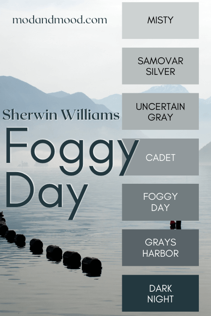
…But Foggy Day is still more gray. In terms of LRV, Whirlpool would be the most similar to Cadet on this color strip:
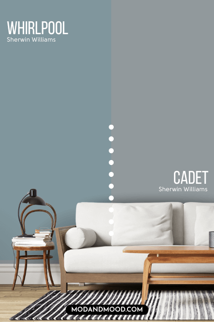
Whirlpool Vs Smoky Azurite
While Cadet makes Whirlpool look bright and saturated in comparison, Sherwin Williams Smoky Azurite makes Whirlpool look more gray.

In comparison to Whirlpool, Smoky Azurite is a bolder and cooler blue. It does still have a very slight green undertone compared to other blues, but it tends to stay pretty blue.
I would class Smoky Azurite as a very useable sky blue color.
Dupes for Sherwin Williams Whirlpool from Other Brands
Can’t get yourself down to a Sherwin Williams store? I’ve got you! Here are some dupes for Whirlpool from other popular brands:

Benjamin Moore Equivalent for Whirlpool
Benjamin Moore brings us the very closest dupe for Whirlpool with their shade Amsterdam.

On paper these two colors are virtually identical. Technically Amsterdam is a little less green and more gray than Whirlpool. On the wall I would say that it tends to look the same, or slightly more gray.
Best Behr Color Match for Whirlpool (Home Depot)
If you are looking to get your paint at Home Depot, Behr has a great dupe for Whirlpool with their shade Rainy Season.

Rainy Season is a little bit lighter than Whirlpool but otherwise the colors are virtually indistinguishable.
Valspar (Lowe’s) Version of Whirlpool
Over at Lowe’s the best color match for Whirlpool is the color Cottage Door.

Cottage Door is darker than Whirlpool and a tiny bit cooler. It was hard to find real life examples of this color without heavy filters, but from what I saw this color is just a little more likely to look gray.
Here is another look at all of the dupes for Whirlpool:

Thank you so much for reading until the end! That really helps my blog.
I hope this helped you decide if Whirlpool is the right color for your next project.
Not quite right? I’ve got more!