If you’re trying to pick the perfect true white, you have likely heard the names “Pure White” and “Extra White” over and over again!

Here we will take a look at Sherwin Williams most popular quintessential white paint colors : Pure White and Extra White.
We will see each of them in real homes, and talk about the technical differences. Let’s go!
Is Pure White or Extra White More Popular?
It doesn’t take long to see that the biggest difference between Pure White and Extra White, is that Pure White is by far more popular for walls.
Extra White is the top choice for ceilings. Trim is probably a 50/50 split between these two colors.

Undertones of Extra White and Pure White
Before we begin, please don’t mistake the nit-picking here. Both Pure White and Extra White are true whites. When they are the only white in your space, they will look white.
The major difference between Pure White and Extra White, is that Pure White can look slightly creamy next to cleaner, brighter whites, but Extra White never will.
Here is a good example where Pure White looks a bit creamy in comparison to the very bright, cool white tiles:

There are other photos of this very same kitchen where the contrast is a little less obvious. (Thanks so much to @prodigiouspainting for sharing their photos with us! You will see them a lot in this post.)

I can’t show you the difference between Extra White and a bright white in this same way, because it doesn’t really exist. It’s possible that Extra White could look slightly darker than a very bright white tile, but unlikely.
Pure White has a warm undertone, and Extra White has a totally clean white undertone.
Here is the warmest look of Extra White:

I’m actually pretty sure the slight warmth here is reflections off of the trees outside. Here is a near identical photo where it looks crisp again:

Any undertone-less white may be more susceptible to other influences in the room than one with a little more color to it.
Just to be fair, here is the warmest look of Pure White:

There is definitely warm light at play, but it does still look warmer than Extra White ever would.
Technical Differences Between Pure White and Extra White
Here you can see both of these whites marked on the color wheel:

While I would not say that Extra White has a green undertone, that is the color family it is from. If it is going to have any undertone, it might be slightly cool and gray.
I do think it may be a little more likely to reflect green than other whites. That was my experience with Chantilly Lace which is technically quite similar.

Extra White is a hair lighter than Pure White, with an LRV of 86, vs Pure White at 84. Two whole points sounds like a lot, but the difference is usually negligible:

The LRV of a color indicates on a scale of 0 – 100 how much light a color reflects (or doesn’t reflect). True black has an LRV of 0 and pure white has an LRV of 100.
In the paint world, we are working in a range of about 3 – 93 because no paint color is purely black or completely white.
Here is a look at the two colors side by side. Extra White is on the trim and door and Pure White is on the walls:

It’s tricky to see the difference, but if you look in the shadows they tell the full story.
Here I have turned up the saturation to make it more obvious:

Of course that made the photo look a little weird, but above the door is a less extreme look at the difference.
In other parts of this home (painted by @lc.painting.llc) it’s nearly impossible to tell the difference from a photo:

How Pure White and Extra White Compare Inside Real Homes
It doesn’t matter how many times I’ve seen each of these colors, it’s very difficult to tell Pure White’s brightest look from that of Extra White. On the same wall would be a different story, but when a photo is taken it is hard to compare the exact lighting etc.

Sherwin Williams Pure White vs Extra White in the Bathroom
Marissa from @in_vest_homes routinely uses Pure White in her luxurious flip projects. Here is a bathroom with Pure White on both the walls and trim:
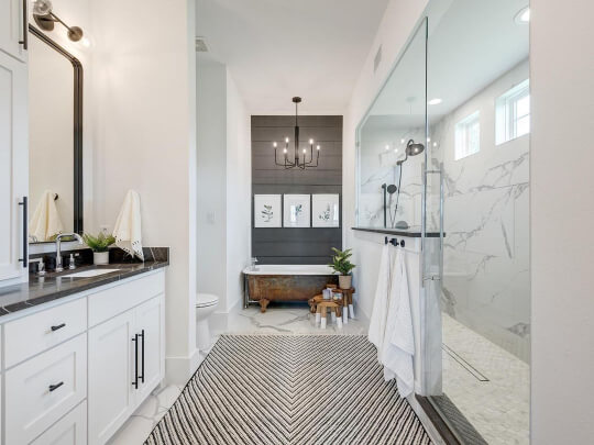
The back wall is Sherwin Williams Cyberspace. You can see that Pure White looks very white. Any actual color is down to the lighting.
Jessica chose Extra White for all of the walls and trim in her new build @thehouse_on2060. Here it is in the bathroom:

The pops of black are Sherwin Williams Tricorn Black. Again, the color looks very white.
I’ve studied both of the photos, and I don’t think I could confidently pick out either color.
Pure White Compared to Extra White on Trim and Woodwork

I mentioned earlier that these colors are both popular for trim, so let’s take a look!
Lucky for us we have a totally fair comparison! I have good pictures of both Extra White and Pure White on trim with SW Alabaster walls.

You can see that the contrast against Alabaster is much stronger because Extra White is that little bit cooler and lighter.

Pure White is still more white than Alabaster, but it brings out a subtle neutral undertone in the walls rather than a heavy cream look.

You can see more details on these and other white-on-white combos here.
Comparing Extra White and Pure White on Kitchen Cabinets
Here is a direct comparison of Extra White on upper cabinets and Pure White on lower cabinets:

Extra White isn’t as popular as Pure White and Alabaster for cabinets. Maybe because if you wanted a totally plain white you might choose a factory finish?
For the first comparison photo I used Pure White with the slightly warmer look, but here is a crisper comparison:

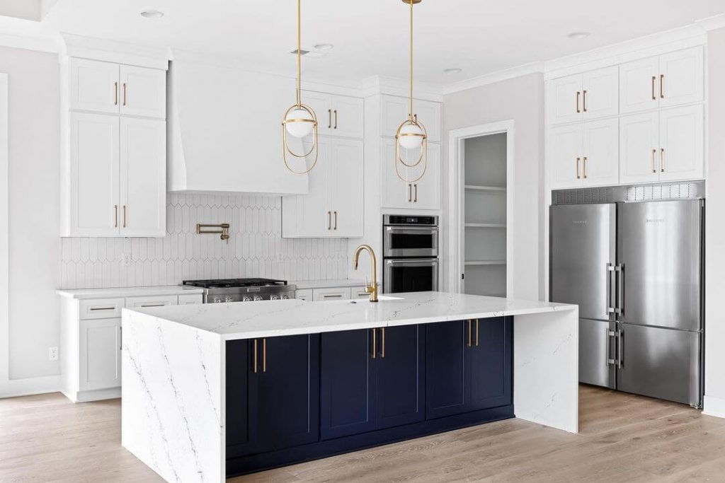
How fun is it that we have both whites with navy lower cabinets?
Here is Extra White upper cabinets with Benjamin Moore Hale Navy on the lowers:

Here is another angle of this kitchen from GR Fine Finishes (@grcabnetpainting):

The lighting here is super warm in the whole room, but you can see that the cabinets are a clean white.
Here is another look at Extra White on cabinets, so you can get the true brightness of it:

Here is a cool-as-a-cucumber look to Pure White, with the island in SW Naval.
Pure White also looks pretty white here…

…but if you compare to the tile, you can see that it is a little softer. (Lower cabinets are SW Basil.)
Against this cool light gray, you can definitely see the warmth in Pure White here:

Pure White and Extra White on Both Walls and Trim
Here is an example of all-white looks using both Extra White on the left, and Pure White on the right:

Pure White looks very true to tone in this picture, but the Extra White photo I believe has a filter on it. (The slight pink cast here is not something that you would see with Extra White, and you can see that it carries onto the floor.)
Here is a clearer example of all-Extra-White-everything in this beautiful office by @johnaskewcustomhomes:

So beautiful and bright!
Here is one more of all Extra White:

Jake and Candi used Pure White for all of the walls and trim in their remodel:
Head over to their IG @bridlewoodacres if you want to see more inspiration, because there is a lot!

Is Pure White or Extra White Better for Exteriors?

In my opinion, the extra reflectiveness of Extra White shows up outdoors, and it can make the color look slightly more gray. We see that here on the siding of this home:

This particular example is a little extreme, but Extra White will look cool outdoors:

Here is a stucco house in Extra White, which will have less reflection:

Pure White also looks very white outside, but with a hint of softness. We see that here at Bailey’s (@clarkansaslove) house:


In the name of fairness, here it is on stucco as well:

To be honest, I feel like in this case you could easily confuse Pure White for Extra White. It looks quite cool here!
On this project by Headwaters Painting (@headwaters_painting_llc), Pure White looks about as warm as it ever does outside:
So…
Is Pure White or Extra White the Superior White?
My personal preference would be to use Pure White over Extra White.
- Pure White is complementary to a wider range of other colors in terms of trim. I also like the subtle warmth!
- I would choose Pure White for walls over Extra White because I feel like Extra White lacks depth.

- If you want maximum bright white impact, you will prefer Extra White.
- Extra White would be a better choice for trim with any purple-leaning taupe or gray paint colors, as well as lighter blue paint colors. In those situations you may find that Pure White looks more creamy than you intended.
Well that was a lot of info! Thank you so much for reading until the end, that really helps my site!
Not ready to decide? I’ve got you! :


