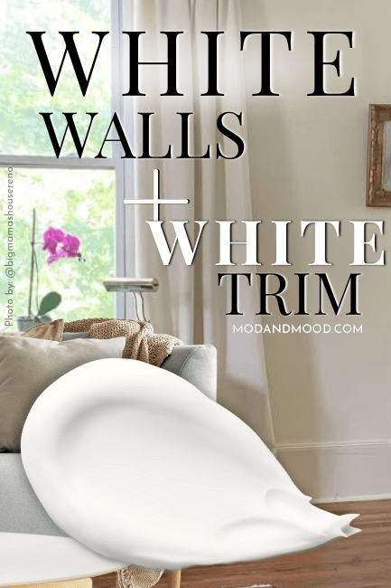
If there is one trend that has me in a hold, it’s Accessible Beige trim with beautiful white walls. I think it looks expensive, classy, interesting, and –maybe I’m delusional – timeless.

Yes okay, perhaps there will be a time when beige is once again relegated to old cans of paint behind a door in our basements…but today isn’t that day, Baby!
Here we will see exactly this look, with a variety of different white wall colors!
This post may contain affiliate links. Should you choose to make a purchase through one of my links, I may receive a small commission at no cost to you. I only recommend products that I use.
Accesible Beige Trim and Sherwin Williams Pure White Walls
This is actually the most popular combo, if my perusing of the internet is correct!
Why Pure White?
Pure White is a true white paint color that is equal parts warm and gray. The result is a fabulous neutral white that is a softer toned-down version of a bright white.

You might like Pure White the best for your walls if you want Accessible Beige to look warmer and not too dark.
Pure White isn’t the brightest white ever, so it will lower the contrast between your walls and trim compared to using something like Sherwin Williams High Reflective White or Benjamin Moore Simply White.
Because Pure White is a touch gray, it will allow Accessible Beige (which is quite greige) to lean into it’s warmer beige look.
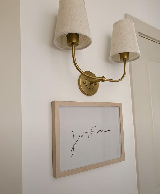
For the first home using these colors, we head over to Samantha’s place: @oliveandoakhome:

You can see that Pure White looks warm and creamy, and the Accessible Beige trim is pretty subtle. In the low light of the hall, the contrast is more obvious.
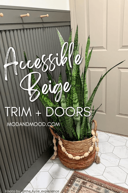
When it came time to update her mud room, Samantha went with the same contrasting beige trim look:

The black on the cabinets is Sherwin Williams Black Magic.
I actually asked her if there was a reason she painted all the trim in this space with Accessible Beige, and only the doorways in the living room…

…but it turns out I’m just a silly pants, because only this doorway in the main area is painted in Accessible Beige, as it leads into the hallway where all the trim and doors are.

So really it’s a genius little tie-in!
Moving on to our next home, Kylie (@the_kylie_experience) went with the same Pure White and Accessible Beige color scheme:

Here in the bright artificial light, the walls look much more like a cool white:

…but I wouldn’t say that this is a typical look for Pure White.
Kylie also did an Urbane Bronze moment with white walls and Accessible Beige on the door and casing:
That sounds like a lot, but it turned out so great!
Trying to visualize this trend in your space? If it was me, I would order a large format peel and stick sample from Samplize! You could chop it into a few pieces and cover the trim in different places around your home. These samples are color accurate (with two coats of real paint!) and they can be stuck and re-positioned all over the place.
Behr Swiss Coffee with Accessible Beige Trim
Not to be confused with any number of Swiss Coffee paint colors, the Behr version is the one that Lara from @nest_on_nightingale selected for her walls. She finished the look for us with Accessible Beige on the trim and doors.

Why Behr Swiss Coffee?
Swiss Coffee is an extra creamy white with a little bit more depth, so it will have Accessible Beige leaning a bit more gray, and the contrast will be bumped down a bit.

If you like this white and want to stick with paint from Home Depot, my Behr dupe for Accessible Beige is Cappuccino Froth:

Here you can see that Swiss Coffee looks very warm and creamy, and the Accessible Beige trim has a soft gray look:
This theme carries on throughout the house. The contrast is subtle and elegant:

Accessible Beige Trim with Sherwin Williams Alabaster Walls
Finally we have the OG favorite creamy white Alabaster on walls with Accessible Beige trim. This was actually a tougher find than I thought it would be!
Why Alabaster?
Alabaster is a soft and creamy white that most often has a neutral beige undertone. Alabaster approaches off-white territory, so it will keep Accessible Beige looking nice and light in comparison.
These warm neutrals are from almost the exact same area of the color wheel, so they coordinate beautifully together.

Lindsay and Dustin from @silo.hill used Alabaster on the walls in their bathroom and Accessible Beige on the board and batten.
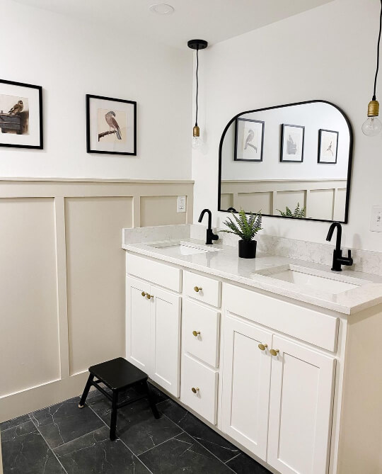
The vanity is a color from the manufacturer, but you might like Sherwin Williams Dover White as an alternative.
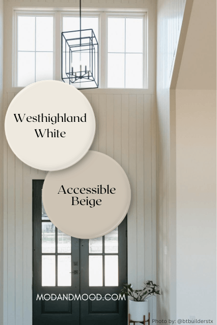
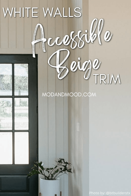
Sherwin Williams Westhighland White Walls with Accessible Beige Trim
This is a recent addition to this post, and I did take some liberties here. The team at @btbuilderstx used Accessible Beige for this statement front entrance, with Westhighland White on all of the adjoining walls.
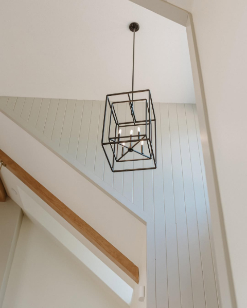
So while it’s not technically(?) trim, there is some…and you get the idea!
Accessible Beige will look it’s most gray against Westhighland White, because the undertone in this white is warmer again, which cancels out some of the warmth in the beige.
Well there you have it! Four beautiful white pairings to consider with Accessible Beige trim. Most importantly: Whatever white you choose, it will no doubt be gorgeous with this go-with-everything beige!
Need more inspo? You will love these posts: