Dover White and Alabaster are both creamy white paint colors that appear to have similar undertones at first glance. Here we will look at the differences between these Sherwin Williams shades, both technically, and in real life!

This post may contain affiliate links. Should you choose to make a purchase through one of my links, I may receive a small commission at no cost to you. I only recommend products that I use.
Technical Differences Between Dover White and Alabaster (Undertones and LRV)
The main difference between Alabaster and Dover White, is that Alabaster is more muted. It has a little bit more balancing gray in it, where Dover White is a very saturated creamy white.

This comes across as a creamy beige undertone with Alabaster, and a yellow to peach undertone with Dover White.

An LRV of about 82 and up is considered a true white paint color, so both Alabaster and Dover White are technically true whites.
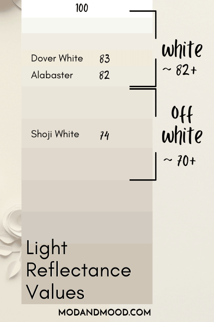
Both colors toe the line of white and off white. I would say that Dover White looks like a creamy off white nearly 100% of the time and rarely like a true white, where Alabaster is about 50/50.
The surest way to see what either of these colors will do in your home, is by comparing them with peel and stick samples from Samplize!
Samplize uses two coats of real paint to make their samples, so you know you’re getting the exact right color. Grab a sample of both Dover White and Alabaster, and you can happily go about sticking and repositioning them all over your home!
On paper, Alabaster is darker than Dover White, with an LRV of 82 vs Dover White’s 83. I don’t personally find that translates in real life because Dover White is so much more saturated.
How Dover White and Alabaster Compare Inside Real Homes
Let’s take a look at both of these colors in real life!
Comparing Alabaster and Dover White on Cabinets
The most popular place for people to use Dover White, is on kitchen cabinets (I even have a dedicated post about it!) where Alabaster is popular just about everywhere!
Here are some kitchens where we can compare the colors:

Yes, the lighting isn’t exactly the same in this side by side, but the upper cabinets give you a fabulous idea of the difference between these colors.
You can see that Dover White has a much stronger undertone that is somewhere between peach and yellow, where Alabaster just looks creamy and the undertone is hard to place.
Here is another comparison with low natural light on both sets of kitchen cabinets:

Dover White has a more yellow undertone here, and Alabaster is giving a strong beige. Alabaster only looks this “dark” and beige because it is paired with a bright true white on the ceiling.
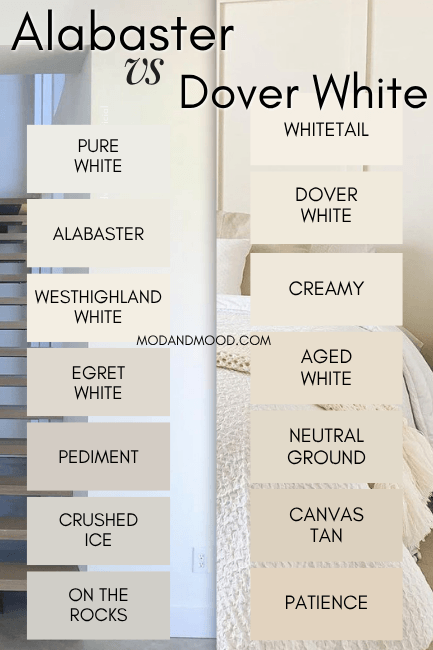
For more white on white pairings, check out this post: White Walls with White Trim? (Alabaster with Pure White & More!)
Here is a look at Alabaster where it has a very strong undertone that is more similar to Dover White:

This is in warm artificial lighting, but it still looks very creamy.
Here is Dover White looking a bit more white than usual:

Even though these colors are different, there is a decent amount of overlap.
Is Alabaster or Dover White Better with Honey Oak Cabinets?
Speaking of kitchen cabinets, what about a kitchen wall refresh where there are existing honey oak cabinets?
The good news is that the younger crowd is actually starting to love honey oak again, so you don’t have to do a whole lot! What you do want to do, is choose an undertone that is more harmonious to the oak.
In this case I do believe that Dover White is the better choice:
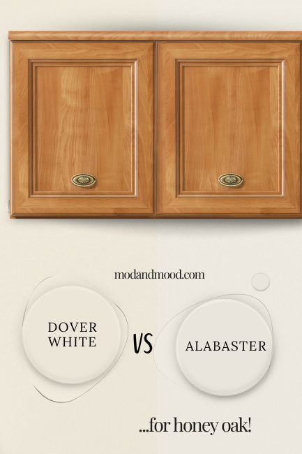
Don’t get me wrong, Alabaster does work too! I just think that Dover White looks better, and there is always a risk that Alabaster looks a bit cool-toned in comparison to very warm cabinets.
Dover White vs Alabaster on Board and Batten
If you are looking for a creamy white paint color for either wood trim or some kind of feature wall, here are a couple of examples:

There is no natural light in this hallway and soft white lightbulbs, so Alabaster looks its darkest and warmest. Again it is looking creamy and beige. In this photo the undertone is probably the most similar to Dover White, but Alabaster still looks fairly neutral.

In the bright natural light of this bedroom we see the truest form of Dover White: Creamy, with a fairly strong undertone.
While this is a typical look for Dover White, the undertone is probably enhanced slightly by the blue-green on the wall above it.
To be as fair as possible, here are Alabaster walls in similar lighting with a teal color:

Because the trim here is a true white, you can spot the undertone of Alabaster, but it’s still fairly white compared to Dover White.
Dover White vs Alabaster on More Walls
Here we have Dover White on the lower part of these dining room walls, where it looks very white.

I do think the photo is brightened, so bear that in mind! Dover White is helped to look more white by using it as the only white in this space. It would look creamy if there was trim anywhere in a true white.
(The upper wall color looks quite similar to Smokey Taupe, or possibly Accessible Beige.)
Here is Alabaster where it is also the only white, and it also looks very white:

Is Alabaster or Dover White Better for Trim?
The easiest answer to the question of trim is probably “Go with Alabaster,” simply because it is a truer white.
You can see here that because Dover White is so warm, it can make a lot of neutrals look very gray, and emphasize purple or green undertones:
Where Dover White may be the correct choice for trim, is with very warm wall colors such as Casa Blanca.
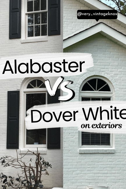
Dover White vs Alabaster on Exteriors
Typically Alabaster looks fairly white outside, where Dover White maintains a stronger creamy tone:

Alabaster does generally look quite soft still.
Here is Alabaster looking it’s most creamy outside:

And here is Dover White looking very creamy:

Here Alabaster looks more neutral with a beige undertone:

And here is about as neutral as Dover White gets:

Any strong undertone in this picture is from reflection more than anything.
If this is the kind of content you are after, check out my post: Stunning White Paint Colors for Classic Brick Exteriors
Is Alabaster or Dover White Better?
Finally, is Alabaster or Dover White the better white paint color? You already know what I’m going to say: It depends on what you are looking for.
- If you want a consistent cream, go with Dover White.
- If you want a creamy white (emphasis on white) with a more neutral undertone, choose Alabaster.
If what you really want is a totally biased opinion, I prefer Alabaster. I am more of a subtle cream girly, and not big on peach or yellow.
Here are some more white paint colors that you might like:


