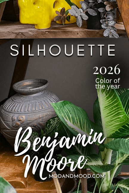
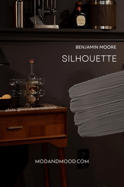
Benjamin Moore Silhouette is a beautiful deep brown that isn’t close to black but isn’t quite mid-toned either. This chocolate charcoal has just enough gray to keep it balanced and neutral, and just enough warmth to keep things rich and cozy!
Here we will talk about how this 2026 color of the year is hitting all the right notes! We will go over undertones, get coordinating color palette ideas, see it in real homes, dish out the dupes from other brands, and finally look at a couple of comparisons!
Head over here to see all of the 2026 colors: New Paint Colors of the Year for 2026 from Every Brand (And a Look Back!)
What Color Benjamin Moore Silhouette (AF-655) is, and Why it’s Perfect for 2026
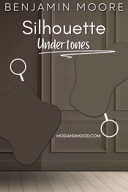
Silhouette is a deep brown with a hint of charcoal, and it has undertones ranging from earthy to chocolate.
I was delighted with this pick for 2026 Color of the Year from Benjamin Moore, because I think it is very on trend. (Unlike the Sherwin Williams pick, which I’m pretty “meh” about!)
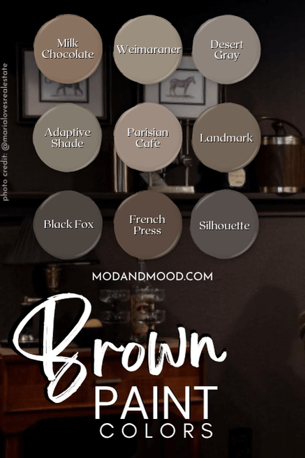
I had actually just published a post with my favorite brown paint colors only two days before the announcement, and you bet that Silhouette was on the list! (It’s also in my color drenching post!)

Silhouette is a great warm alternative to black, but it can do the same job. Most paint colors are trending very warm, and over the next few years, I think we are going to see a lot more nature-inspired hues.
What Are the Undertones of Benjamin Moore Silhouette?
As I mentioned, Silhouette has undertones ranging from earthy to chocolate. On the chocolate side of the spectrum, Silhouette can have quite warm, almost red or berry undertones.
On the earthy side, Silhouette can have a slightly flatter brown tone, that leans almost to green, but stops just short.
I wouldn’t classify the gray in Silhouette as an undertone necessarily, because it’s pretty up front, but you should know that the gray is definitely there. I recommend using Silhouette in lower sheens like flat and eggshell, because the reflectiveness of a higher sheen will make the color appear more gray, and it loses its depth somewhat.
The gray certainly isn’t all bad, because it helps to keep Silhouette very neutral!
The LRV of Silhouette is 10.18, which puts it right on the line between dark and mid-toned. My rule of thumb, is that truly deep dark paint colors have LRVs of 10 or less.
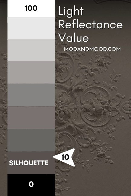
I think you’ll find when we get to real homes, that this color really does fluctuate between looking dark and moody, and…not.
Silhouette in the Benjamin Moore Color Strip
I don’t love the color strip that Benjamin Moore has put together for Silhouette, if only because the shades seem to be very loosely related.
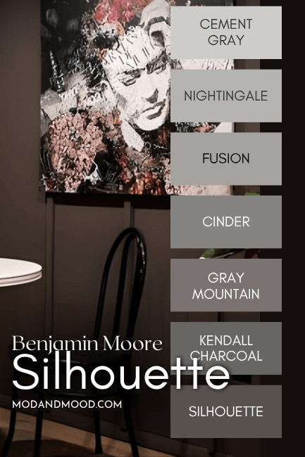
It’s almost like this color strip was an afterthought. Here are all the shades over the plain background of Silhouette, so you can kind of see the variations in undertone:

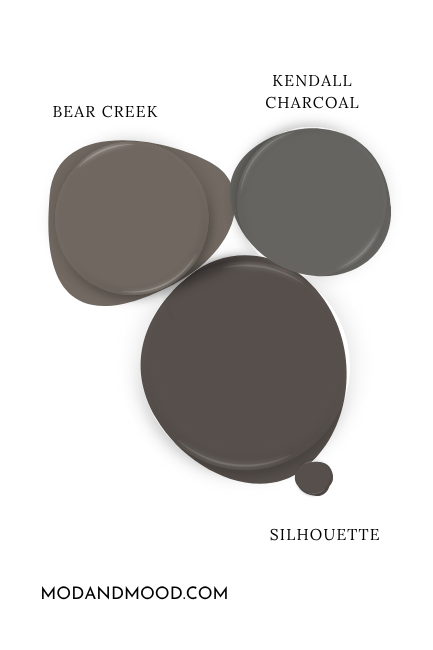
One shade lighter than Silhouette on this color strip is Kendall Charcoal, which is actually quite a popular color.
Benjamin Moore Silhouette (AF-655) vs Kendall Charcoal (HC-166)
I don’t really find Kendall Charcoal to be a lighter version of Silhouette. Kendall Charcoal is a warm charcoal, but it is much more gray than Silhouette, and it definitely looks it.
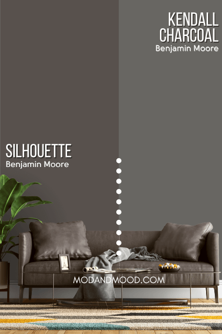
While the undertone of Kendall Charcoal is warm for a gray paint color, it is much cooler than Silhouette. Think more of a neutral beige-brown, and not a rich berry.
For a true lighter alternative to Silhouette, Benjamin Moore Bear Creek comes pretty close.
Benjamin Moore Silhouette in a Color Palette
For this color of the year, I put together a palette of colors that not only complement Silhouette, but are also trending on the horizon.

Neutral Paint Color to Use with Silhouette
I chose two beautiful neutral paint colors for Silhouette that are complementary in different ways.
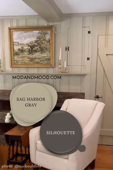
Sag Harbor Gray is a mid-toned neutral that surprises on the wall. From the swatch, you would think that it’s a plain jane beige:

…but this color actually has a delightful sagey undertone!
Green is also complementary to the warm red/berry undertones in Silhouette.
Sherwin Williams Repose Gray is a versatile gray with a taupey mushroom undertone.
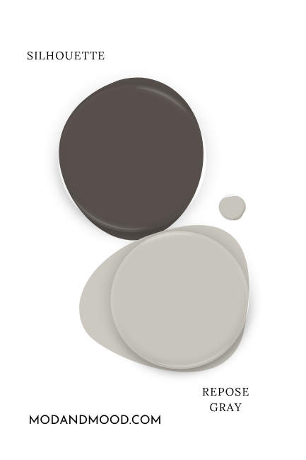
I like this color because it’s not exactly a lighter version of Silhouette, but the colors have the same qualities. Both are warm neutrals with a heavy gray influence. This is a great choice if you aren’t ready to go all-in with overtly warm colors.
Coordinating White Paint Color for Silhouette
For a white choice to pair with Silhouette on walls, cabinets, trim, or anything in between, I think the timeless warmth of Benjamin Moore White Dove is a safe bet!
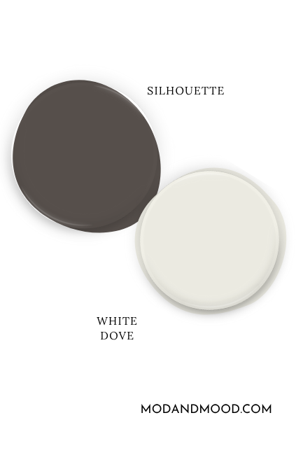
White Dove has a creamy beige undertone, but most often reads like a classic true white with a subtle warmth.
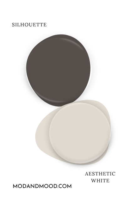
For something a little less subtle, you might like the off-white of Sherwin Williams Aesthetic White. It has an interesting warm undertone that is more purple/red leaning like Silhouette.
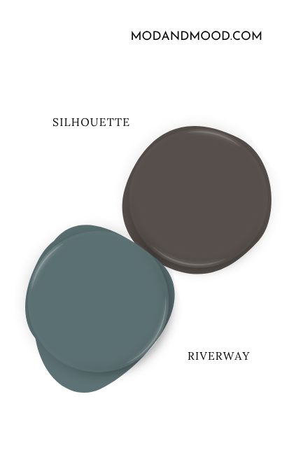
Try Silhouette with Sherwin Williams Riverway
Another trend that I have been noticing, is a lot more interest in teal. Chocolate brown and teal is actually a pretty classic combination, and Silhouette with Riverway is a very moody and modern way to achieve it.

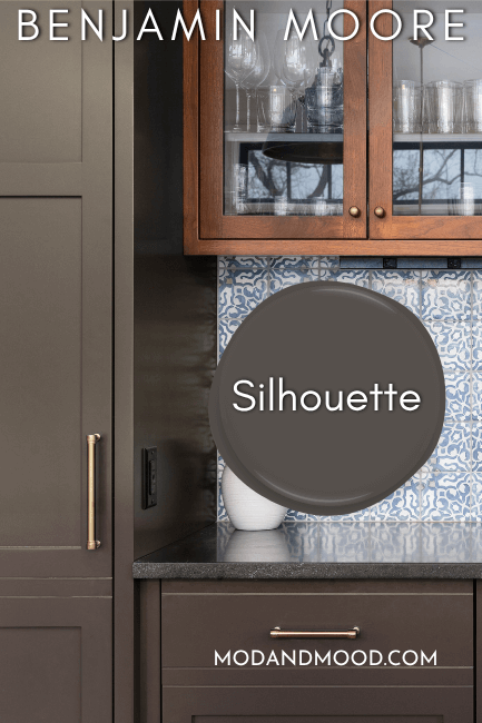
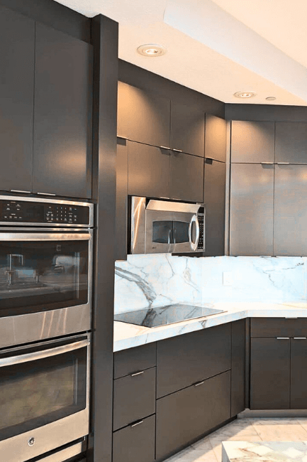
Benjamin Moore Silhouette on Kitchen Cabinets
On kitchen cabinets, you should expect Silhouette to almost read like a shade of wood at first. I think when there is a deep brown on cabinets, that’s just what your brain says it is!
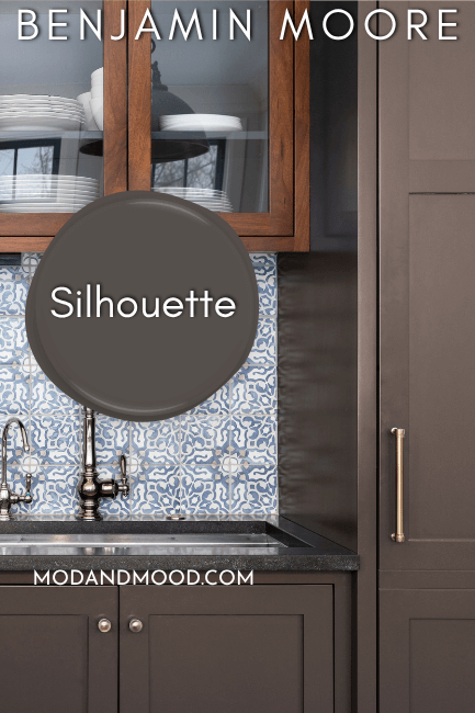
Silhouette is also likely to lean a bit more gray on cabinets, thanks mostly to the higher sheen of cabinet paint.
Here is a kitchen in the slightly darker color Benjamin Moore Night Horizon, but I lightened it up to look like Silhouette:
Silhouette on the Walls
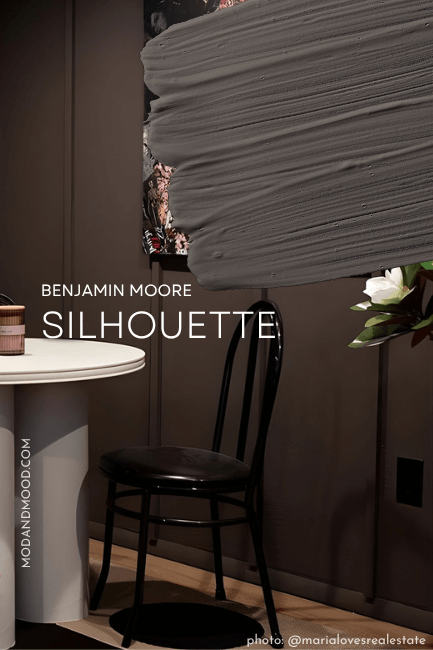
In a nice matte finish, you can expect Silhouette to read its absolute richest. We see that here in the beautiful design by Maria Friström of @marialovesrealestate:
The color definitely looks its darkest here, in the low light of this color drenched space.
I love how warm and chocolatey the undertone of Silhouette looks in this space.
Over at @magical_manor we see Silhouette in all its quirky Victorian glory:
The color on the door is Benjamin Moore Pinch of Spice.
And finally, a good look at a lighter side to Silhouette:
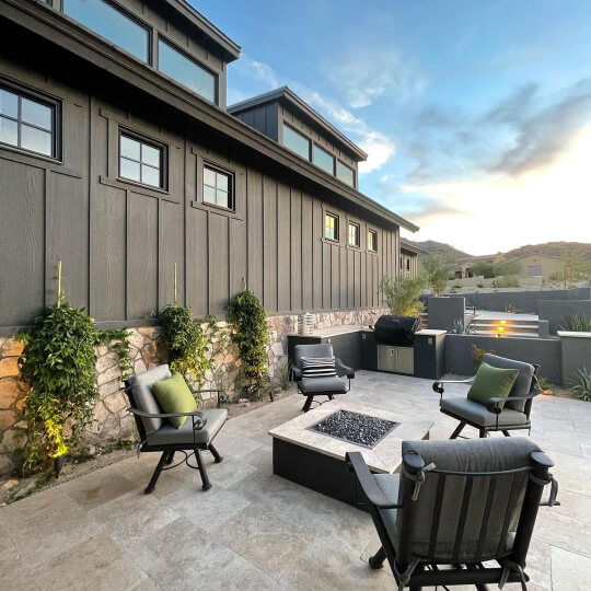
Silhouette for Your Home’s Exterior
Silhouette is a nice, unoffensive, darker brown for your exterior. I say darker because like all colors, it will look lighter outside, and it is already on the line between dark and deep mid-toned.
I definitely wouldn’t pick Silhouette for your exterior if you want something close to black.
Here is an exterior by Headwaters Painting (@headwaters_painting_llc) where they didn’t list the color, but it looks just like Silhouette:
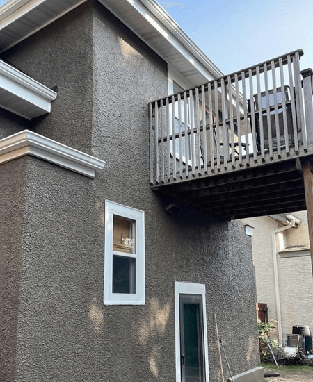
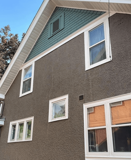
In this first photo the color looks more like Silhouette’s most neutral gray face. Next we see it looking a little warmer:
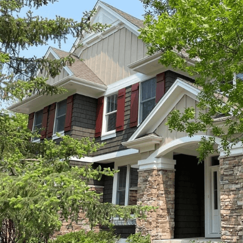
Here is another exterior with cedar shakes in a color that looks like Silhouette:
Finally on the darker side of how Silhouette could look, here is an exterior in Sherwin Williams Iron Ore where it looks uncharacteristically brown:
The color is leaning a touch too green here, so try to imagine it just a little bit warmer.
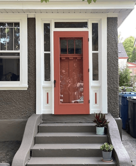
Silhouette on Shutters
Finally for exteriors, we have a great example of how Silhouette will look on shutters:
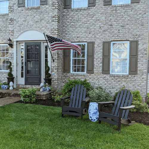
The color on these shutters was already on the house when Mara moved in, but it looks like a near perfect match for Silhouette. The trim around the door is Sherwin Williams Shiitake.
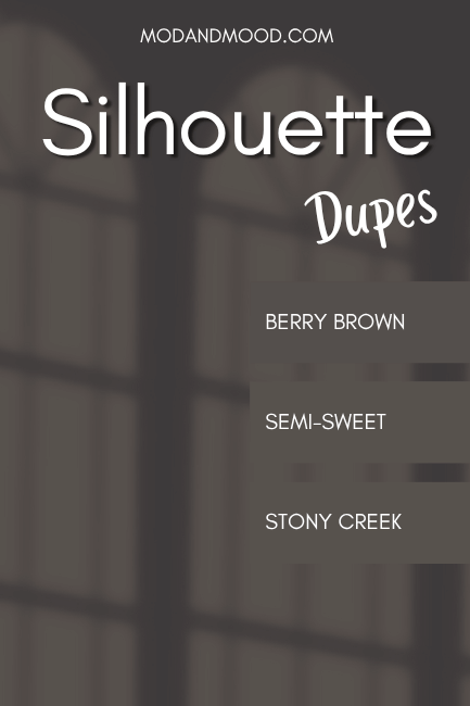
Dupes for Silhouette from Other Brands
Can’t make it to Benjamin Moore? Here are the best options to get the Silhouette look in other brands:
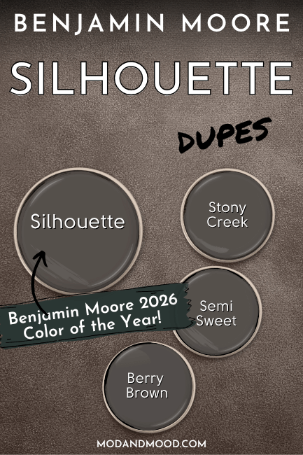
Silhouette in Sherwin Williams
From Sherwin Williams, the best color match for Silhouette is the color Stony Creek:
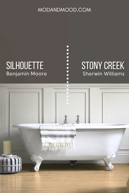
Stony Creek is a tiny bit cooler and more gray than Silhouette. This makes it a little more likely to look true brown or earthy toned, and less likely to have the warmer undertone of a true chocolate brown.
Alternative Sherwin Williams Dupe: Manor House
For a lighter but warmer option, Sherwin Williams also has the color Manor House:
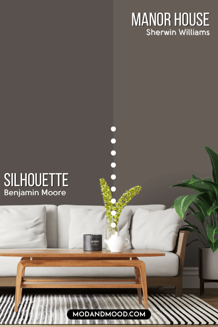
This option is obviously a good bit lighter than Silhouette, but I find that the overall effect is very similar. I wanted to include it because I actually find these colors to look very much alike in real life, and not everyone will want the slightly cooler tone of Stony Creek.
The Best Behr (Home Depot) Color Match for Silhouette
From Behr, the best dupe for Silhouette is their shade Berry Brown.
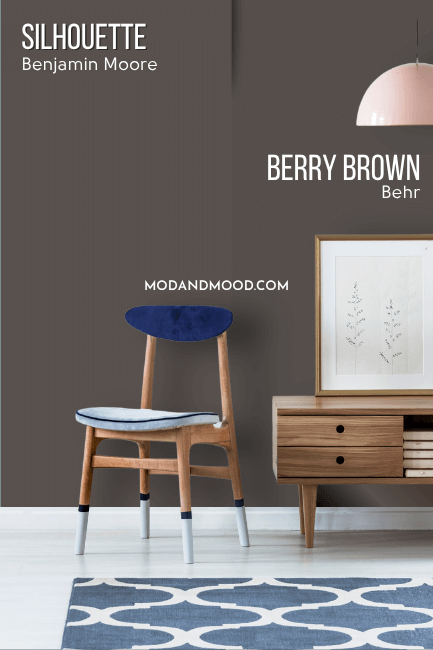
Berry Brown is just a hair darker and a sliver more charcoal than Silhouette. I like this color a lot, but that’s not a surprise, because it does very much look like Silhouette!
Silhouette Valspar Equivalent
Over at Lowe’s, the best color match for Silhouette is the shade Valspar Semi-Sweet:
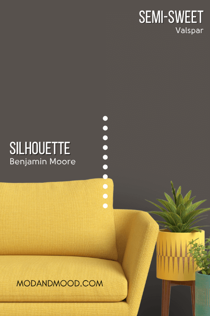
Valspar Semi-Sweet is almost identical to the Behr dupe on paper, but I did find that in real life it may tend to look charcoal just a little more often.
Here is another look at each of the dupes:
Finally before we move on completely, here are a few popular colors that are similar, compared to Silhouette.
Benjamin Moore Silhouette vs Sherwin Williams Urbane Bronze
Urbane Bronze is very similar to Silhouette, but it looks the most similar on paper:
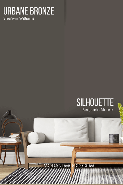
Urbane Bronze in real life has a tendency to look equal parts brown and charcoal, where Silhouette definitely reads more brown. The undertone of Urbane Bronze, as the name suggests, is a little cooler and more bronzey than Silhouette. It can sometimes have a greenish undertone, and Silhouette doesn’t quite get there.
Urbane Bronze does not have the warm red or berry undertone that Silhouette has, which prevents it from looking like a true warm chocolate.
Benjamin Moore Silhouette vs Dragon’s Breath
Staying on track here, Dragon’s Breath is actually my Benjamin Moore dupe for Urbane Bronze, so it has the same range of undertones:
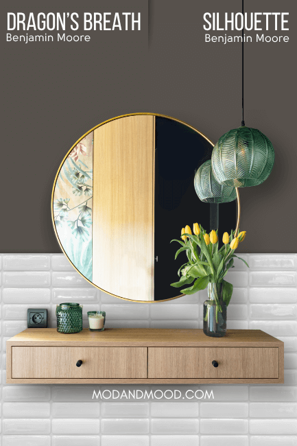
It is cooler and more gray forward than Silhouette. It also tends to be a chameleon, where I find Silhouette to be more predictable, with a narrower range of undertones.
Benjamin Moore Silhouette vs Sherwin Williams Black Fox
Sherwin Williams Black Fox was actually the color I expected to choose for my Sherwin Williams Silhouette dupe, but you can see that they are decently different:
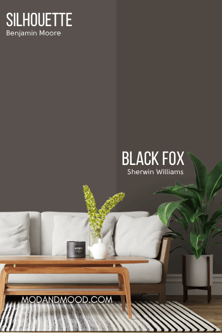
Black Fox is quite a bit darker than Silhouette, but it does have a similar undertone. The surprise is that despite how it looks here, I find that Black Fox looks charcoal more often.
I’m not sure if this is because people are using a higher sheen more often in Black Fox? Just for an example, here is that color on cabinets:
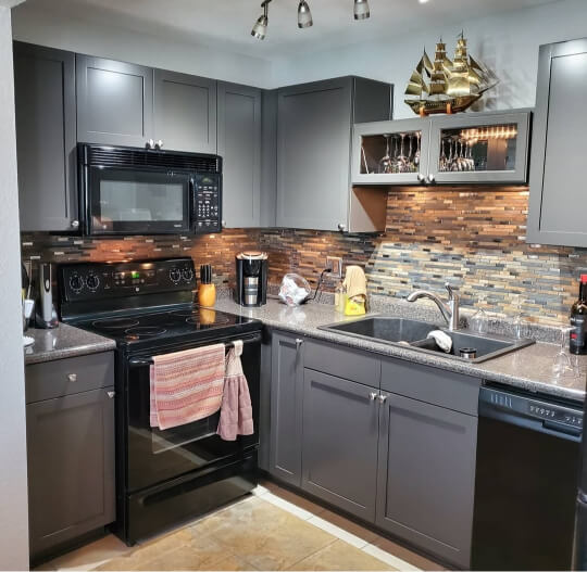
It’s hard to understand how we got here, but this super gray look isn’t unique to this kitchen. While it is cooler and more gray than Black Fox typically looks, I can’t really see Silhouette looking like this.
Well that’s all for this one! Thank you so much for reading until the end! That really helps my blog.
I hope this helped you decide if this Benjamin Moore color of the year ticks all of your boxes! Not sure? I’ve got you!