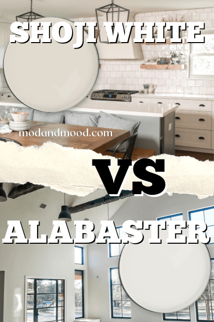
Sherwin Williams Alabaster is probably the most popular white paint color on the market, and has been for some time. In fact, I have a whole collection of posts about it!
Alabaster by Benjamin Moore (aka Atrium White) on the other hand, is not nearly as popular, but how do these same-name shades actually compare?
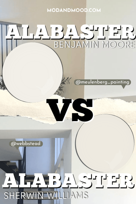
Today we will take a look at the visual and technical differences between Alabaster (Sherwin Williams) and Alabaster (Benjamin Moore), and see them in a few real homes!
Visual Differences Between Sherwin Williams Alabaster and Benjamin Moore Alabaster (Let’s Talk Undertones!)
Before we begin, I do want to confirm that Benjamin Moore Alabaster is the same color as Atrium White. So this post also covers Sherwin Williams Alabaster compared to Benjamin Moore Atrium White.
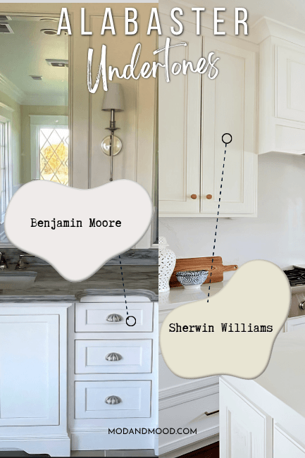
The most obvious difference between these two Alabaster paint colors, is that the Benjamin Moore version is lighter than the Sherwin Williams color.
The LRV (Light Reflectance Value) of a color indicates on a scale of 0 – 100 how much light a color reflects (or doesn’t reflect). True black has an LRV of 0 and pure white has an LRV of 100.
Benjamin Moore Alabaster has an LRV of 85, and Sherwin Williams Alabaster has an LRV of 82.
This may not sound like a significant difference, but in the paint world we can only achieve a max LRV of around 94.
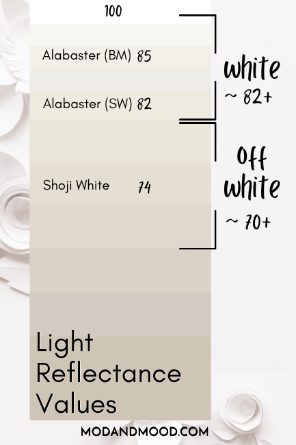
At 85, Benjamin Moore’s Alabaster is a true white that most often looks white. At 82, Sherwin Williams Alabaster is right on the line of true white and off-white. This color looks creamy more often than the Benjamin Moore color.
(Benjamin Moore Alabaster was one of my picks to get the look of 2026 Pantone color of the year: Cloud Dancer)
Undertone of Sherwin Williams Alabaster vs Benjamin Moore Alabaster
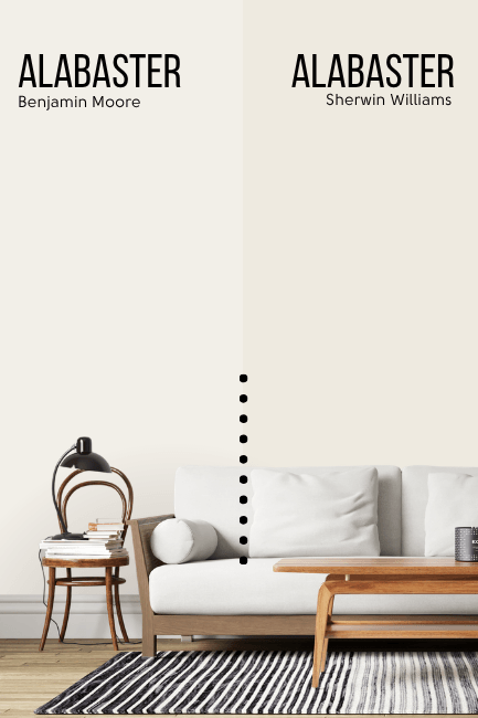
At first glance, the undertones of both Alabasters are pretty similar. We can see that here, when compared over the background of the cooler-toned color Sherwin Williams Extra White.
If you want to get very technical about the difference between these two Alabaster colors, the Benjamin Moore version is a tiny bit deeper into the orange color family.
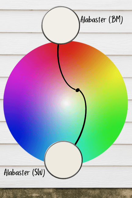
While Sherwin Williams Alabaster is closer to the yellow side of orange, Benjamin Moore’s version is slightly closer to red.
When it has a very strong undertone, the Sherwin Williams color has a slightly yellow undertone, and the Benjamin Moore color skews a tiny bit pink. Under scrutiny, the undertone of the Benjamin Moore color is actually more similar to Snowbound than it is to the Sherwin Alabaster.
I also thought that by eye, Sherwin Williams Alabaster looks a tiny bit more saturated, but after plotting them on a chart, I don’t think that’s true. These colors are about equal amounts gray, which is what keeps them neutral.
How Sherwin Williams Alabaster and Benjamin Moore Alabaster Compare Inside Real Homes
At their lightest, both Alabaster colors can look like true, totally white paint colors.
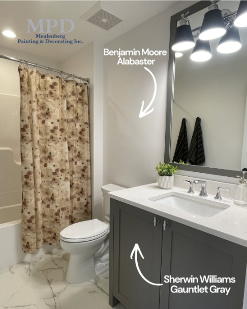
Here is Sherwin Williams Alabaster looking very white in a bathroom:

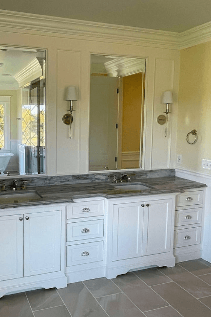
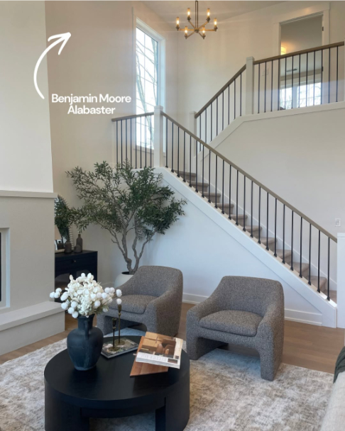
And the same from Benjamin Moore Alabaster:
so let’s take a look at stronger undertones instead!
With cooler white trim, the darker and creamier Alabaster by Sherwin Williams, can look a little bit yellow, as we see here:

At its darkest and creamiest, the Benjamin Moore version does have a slightly pink cast:
This example is a little extreme because the yellow on the walls is making the color look very pink in contrast. Here is another picture from the same room where the color does look white:
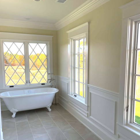
It’s the wainscoting, not the wall! (Obviously.)
Just to be fair, here is the Sherwin Williams Alabaster color looking more extreme when paired with the complementary Aegean Teal:

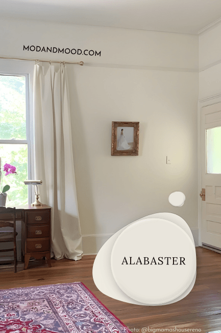
Here is a typical look for the Sherwin Williams Alabaster:
And a typical look for the Benjamin Moore Alabaster:
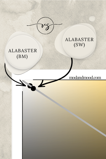
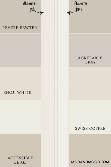
Here is a look at how each of these colors would look as trim with a variety of popular neutrals and off-whites:
Sherwin Williams Alabaster vs Benjamin Moore Alabaster on Exteriors
Where the two Alabasters look the most similar, is on exteriors! Here is the Benjamin Moore version:
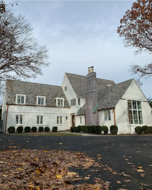
It’s not exactly yellow here, but definitely creamy!
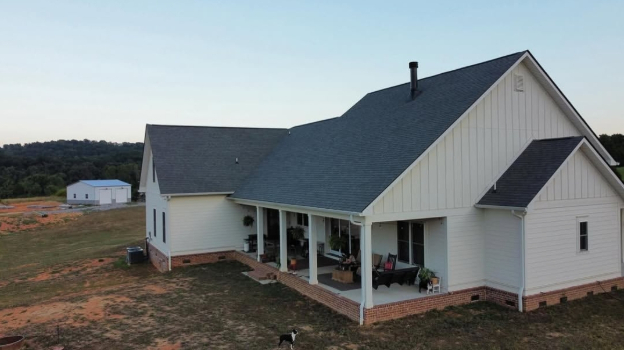
…and here is Sherwin Williams Alabaster, also on brick:

Just to be fair to the conditions, this is the Sherwin color not on brick, but in more similar lighting to the Benjamin Moore house:
It’s hard to mimic late day, overcast, and sunshine all at the same time. So that’s the best I could do.
Unfortunately that was all I had for Benjamin Moore Alabaster exteriors, but I do have a whole post of Sherwin Williams ones!
Is Sherwin Williams Alabaster or Benjamin Moore Alabaster Better?
In the end, it all comes down to undertone, and how bright you want your white paint color to be!
- Go with the Benjamin Moore version of Alabaster if you want a true white and subtle softness without yellow undertones.
- Go with the Sherwin Williams version of Alabaster if you want a creamy white color that is flexible between true white and off-white (or if you hate pink!).
Thank you so much for reading until the end! That really helps my blog. Still unsure on the best white paint color for you? I’ve got more!