Benjamin Moore Revere Pewter pioneered the notion of “greige” (gray and beige), but is this OG still the best of the best? Or has it been overtaken by bigger, better, neutrals?

Today we will look at the Benjamin Moore classic Revere Pewter in real homes, talk about undertones, get coordinating color ideas, compare it to other popular neutrals, and of course, show you some dupes!
What Color is Benjamin Moore Revere Pewter?
Revere Pewter is a greige (gray/beige) paint color on the lighter end of mid-toned. I would describe it as a light(er) mushroom color. It ranges in appearance from a light creamy beige to a medium cool greige with a slightly green or violet cast. It doesn’t often look all the way gray, but it can come close.

Like any color with a lot of gray in it, Revere Pewter does tend to be a chameleon, and it can vary quite wildly depending on lighting, flooring, and other factors.
What Are the Undertones of Benjamin Moore Revere Pewter?
I would say that the most common look for Revere Pewter is approximately equal parts gray and beige, with very subtle undertones that are hard to put your finger on.
When it does have an obvious undertone, it is most likely to have a green one.

It can also have a taupe look, with a little bit of a violet undertone.

It is much less common, but Revere Pewter can also look a little blue. I don’t have the best example of this, because it is usually under very specific circumstances. I would not choose Revere Pewter if you have a lot of orange toned wood floors, and I wouldn’t pair it with yellow or orange colors in general.

While not exactly an “undertone” Revere Pewter can also look suprisingly creamy:

If your eyes aren’t the best at picking out subtle undertones, here is an exaggerated look at what I’m talking about:

Revere Pewter LRV
The LRV of Revere Pewter is 55. What does that mean?
The LRV (Light Reflectance Value) of a color indicates on a scale of 0 – 100 how much light a color reflects (or doesn’t reflect). True black has an LRV of 0 and pure white has an LRV of 100.
In the paint world, we are working in a range of about 3 – 93 because no paint color is purely black or completely white.
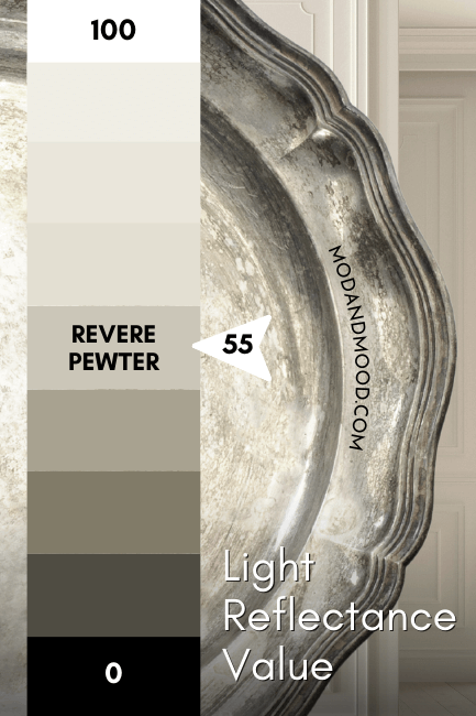
At 55, Benjamin Moore Revere Pewter is in the perfect LRV range where most whole-home favorites are found. It reflects a little bit more light than it absorbs, so it is on the lighter end of mid-toned.
Revere Pewter in the Benjamin Moore Color Strip
Revere Pewter is also known as Benjamin Moore Ice Formations (973). If you look up that color, you will find this color strip:
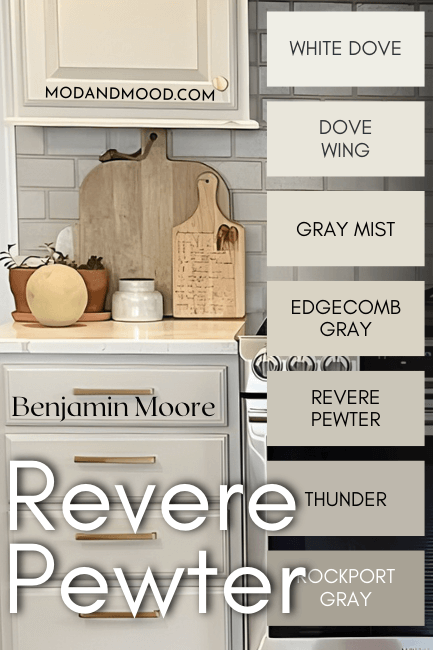
No surprise that a popular neutral would be from a color strip with lots of other big hits! The other colors in this collection are:
- White Dove
- Dove Wing
- Gray Mist
- Edgecomb Gray
- Thunder
- Rockport Gray
Benjamin Moore Revere Pewter in a Color Palette
While Revere Pewter shouldn’t be paired with very warm colors in the orange or yellow family, (unless you want it to look silvery-blue!) it isn’t as finicky to coordinate with as some other greige colors.
Here are the colors that I’m feeling with Revere Pewter at the moment:

Of course if you don’t like green, you can sub in almost any moody blue!
Coordinating White Paint Color for Revere Pewter
You can use any of your favorite white paints with Revere Pewter, but my suggestion will depend on your goal. For this palette, I went with the uber neutral Benjamin Moore Vanilla Milkshake:

This color kind of allows Revere Pewter to do whatever it wants to!
If you prefer to control the undertone a little more, select a white with an undertone opposite of what you would like to see (or avoid!). For example, if you like the more green look of Revere Pewter, choose a white with a subtle pink or purple undertone. (Try Sherwin Williams Snowbound or Ibis White.)

To avoid a blue undertone with Revere Pewter, or just to have it leaning more beige, select a cool-toned white. Don’t use a white with a very heavy cream undertone. (A little yellow might be okay, but avoid an orange or beige based cream.)
Try Revere Pewter with Benjamin Moore Oilcloth or Dark Olive
Oil Cloth looks quite gray on paper, but it is actually a medium sage green, and one of my dupes for Sherwin Williams Evergreen Fog!

Oil Cloth helps to emphasize the taupey mushroom undertone of Revere Pewter that I personally like the best. If you hate the violet undertone, you will probably prefer using blue as a coordinating color.
Same goes for Dark Olive! I love this pairing, and you should expect Revere Pewter to stay looking creamy beige to taupe.

If you prefer the green undertone of Revere Pewter, try it with purple-leaning blues such as Sherwin Williams Cyberspace or Perle Noir. On the lighter side, go for a peri-leaning powder blue like Benjamin Moore Blue Heather.

Neutral Paint Color to Use with Revere Pewter
Of course Revere Pewter most likely is your neutral choice, but I do love the similar tone of Sherwin Williams Natural Choice. It’s a subtle contrast, but perfect for mono-chromatic color drenching, or simply for spaces where Revere Pewter is that little bit too dark.

I have some good examples of this combo coming right up!
Benjamin Moore Revere Pewter for Your Home’s Interior
Let’s get to the good stuff, and admire Revere Pewter in some real homes!
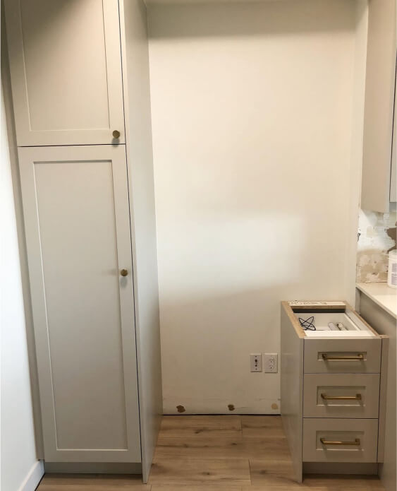
Kitchen Cabinets in Revere Pewter
I would like to start with a classic “Revere Pewter” look. We can see that here in this new kitchen by the team at Le Art Kitchens (@le.art.kitchens):

Here Revere Pewter looks like a perfect mid-toned neutral with equal parts gray and beige. After this, things get a little unpredictable!
Here is the same kitchen, where the color looks almost the same, but on the lower cabinets it does have a bit of a green undertone:

From another angle the color starts to get quite cool and gray looking:
Here we see Revere Pewter looking silvery, but with perhaps a hint of a taupey mushroom undertone:

And finally, back to classic:

Don’t take this one kitchen’s word for it, let’s see Revere Pewter at its creamiest, in this project by Bethany (@reclaimed_cottage):

While I would not say that this look is typical (the color looks very light here) it isn’t exactly unusual either. Here we see a similar light and creamy look in a project by Stoeck Interiors (@Stoeckinteriors):
While I do have a few kitchens with this almost off-white look, I would say that it’s more common on cabinetry than on walls.
Here is a light look again, where the cabinets look maybe a little more gray:

For her wall color, Ana (@anaisabelcasa) went with Sherwin Williams Natural Choice, and they end up looking like almost the same color. The result is a very beautiful creamy and monochromatic look.

Here is one more, where the color looks a little more silver, but the whole picture has somewhat of a “frosty” filter, so take that with a grain of salt.

Moving on to the most beige look of Revere Pewter, I have that on kitchen cabinets too! In this kitchen by the team at ThriveAll Projects (@thriveallprojects) we see an almost buttery tone:
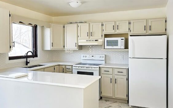
If the walls and ceiling above the cabinets were any other color, I think the camera (and our eyes) would pick up the color differently, but with that very warm tone, the whole things looks very warm.
Here the color looks more neutral:

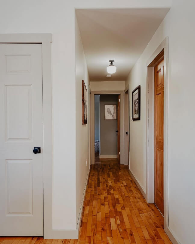
Revere Pewter on Walls
When it comes to walls, we see the most variation from Revere Pewter. It’s also where we see the green undertone the most. Let’s start with “typical” first:

Here we see Revere Pewter looking quite greige, or even a hair on the warmer side. In this next home, painted by the team at Chroma Custom Painting (@chromacustompainting), we get to see Revere Pewter serving all kinds of looks!

Starting off with something pretty typical, we see this similar greigey tone in a couple of rooms (sorry, I know the quality of the photos isn’t the best):

Then we transition into something with a little bit of a green undertone:

This is also a fairly normal look for Revere Pewter. It just has a slight green undertone here.
In this next room the green is bumped up a bit:

…and finally we see Revere Pewter looking like a cool silver with undertones from warm on the second storey, to blue and green on the ground floor.

Revere Pewter Trim and White Walls
Painting your trim beige or greige with white walls has become somewhat of a trend recently, and Hayley (@homefortheweilers) did exactly this in her home!
Revere Pewter suits this look super well! If you like this vibe you will also like my post: White Walls with Sherwin Williams Accessible Beige Trim


The white wall color is similar to Sherwin Williams Alabaster.
Revere Pewter on Furniture
Finally before we move outside, here is Revere Pewter on a wardrobe that was refurbished by Denise (@denisedgodbout).
You might recall glimpsing this piece earlier when we were talking about undertones! This is the best example that I have at the moment for that more violet undertone Revere Pewter can have, and it is still very subtle.
Here is one last look, but I wouldn’t say this picture looks particularly violet:

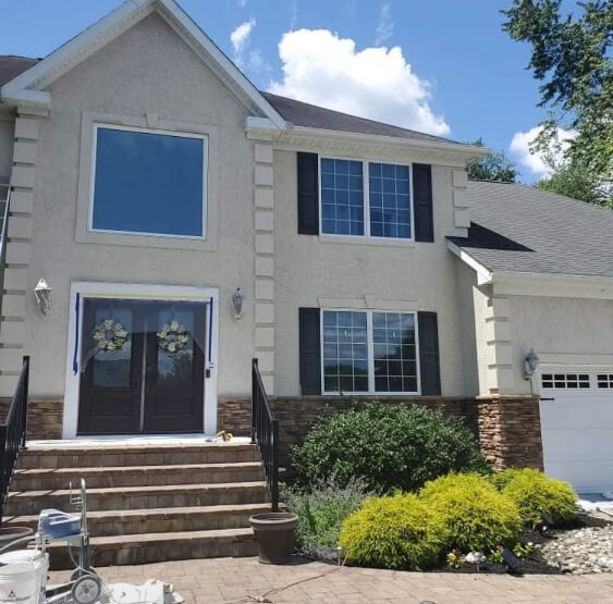
Revere Pewter on an Exterior
Moving outside, we should expect Revere Pewter to look its lightest outside. This is the case with almost any paint color. Here is a very standard look that you can expect if you choose Revere Pewter for your exterior:

The color here looks like a very light creamy beige. With all of the cooler tones outside (blue sky, grass, shrubs, etc) Revere Pewter does often lean more beige.
This is again a very standard Revere Pewter look.

I also have a house to show you where the color looks fairly typical, but with a touch of that green undertone that Revere Pewter can have:

The color still definitely looks greige, but on the cooler side. In this next photo I would say the siding looks normal for Revere Pewter, and it has less of the green look:

And here is something in between:

Benjamin Moore Revere Pewter Compared to Other Neutral Paint Colors
I know there are a million other neutral paint colors that you may be considering alongside Revere Pewter, but here are a few of the most popular comparisons.
Revere Pewter and Accessible Beige are both incredibly popular greige paint colors. Revere Pewter is by Benjamin Moore and Accessible Beige is a Sherwin Williams color.

These two have virtually the same LRVs as you can see. They also have some overlap in terms of appearance. They can both look like light taupey mushroom colors, or true gray-beiges.
So what’s the difference?
- Accessible Beige is warmer and more beige than Revere Pewter.
- Accessible Beige can have a pinky undertone that Revere Pewter never has.
- Revere Pewter can sometimes have a green undertone, but Accessible Beige does not.
Sherwin Williams Agreeable Gray and Revere Pewter are both greige paint colors, but as the name suggests, Agreeable Gray is more gray than Revere Pewter.

Agreeable Gray is a lighter, cleaner, more silvery greige. Revere Pewter is a little bit warmer and muddier, but this does give the color a bit more depth.
Agreeable Gray is a little more likely to have the violet undertone than Revere Pewter is, but both can have warm beige undertones. Agreeable Gray is less likely to lean green.
If you are curious how Agreeable Gray compares to Accessible Beige, I have a whole post for that!
Edgecomb Gray and Revere Pewter are both greige Benjamin Moore colors. As you saw earlier, Edgecomb is one shade lighter on the same color strip as Revere Pewter.

The beige in Edgecomb Gray is a lighter, creamier beige than that of Revere Pewter. Because of the difference in LRV, Edgecomb Gray can look almost like an off-white, but Revere Pewter does not.
While both colors can look silvery or true beige, Edgecomb Gray can have a slightly pink undertone, but Revere Pewter stops just short of that. Edgecomb Gray in return doesn’t really have a green undertone. (People say it does, but I disagree.)
Revere Pewter and Pale Oak are both greige Benjamin Moore colors. Pale Oak is a light neutral so it can look almost off-white, but Revere Pewter is mid-toned.

Both of these colors have a lot of overlap in terms of undertones, but Revere Pewter is more of a chameleon than Pale Oak is. Pale Oak can also have a pink undertone, but Revere Pewter doesn’t.
The major difference between these two is just that Revere Pewter is a good bit darker. At the end of the day they are pretty similar otherwise.
First of all, Benjamin Moore’s color named Sea Salt is a light greige, so it is not to be confused with the Sherwin Williams color Sea Salt which is a light gray green.
Revere Pewter and Sea Salt are both greige colors by Benjamin Moore, but Sea Salt is lighter:

Sea Salt is a hair more violet than Revere Pewter, and also more likely to look like a true silvery gray. Sea Salt is less likely to lean green, but I would not write it off completely.
Dupes for Benjamin Moore Revere Pewter from Other Brands
Whether you can’t get yourself to a Benjamin Moore store, or you just don’t want to, I have combed through hundreds of colors to bring you the very best dupes for Revere Pewter!

Let’s see the color matches!
Revere Pewter in Sherwin Williams
Sherwin Williams has a lot of great greige paint colors, but the best dupe for Revere Pewter is their shade Useful Gray.

Useful Gray is just a teeny tiny bit lighter and warmer than Revere Pewter.
Revere Pewter Equivalent in Valspar (Lowe’s)
Over at Lowe’s the best color match for Revere Pewter is Valspar Bay Sands.

Like the Sherwin Williams dupe, Bay Sands is just a little bit lighter than Revere Pewter. It is also just a hair more gray. Overall this is another fabulous dupe!
Best Behr Color Match for Revere Pewter (Home Depot)
At Home Depot, the best dupe to get the Revere Pewter look is Behr Fortress Stone.

Fortress Stone is a little bit darker than Revere Pewter. It runs the same range of undertones, but is perhaps a little more likely to look greenish.
Here’s another look at all of the dupes:

Thanks so much for reading until the end! That really helps my blog. I hope this helped you decide if the classic greige of Benjamin Moore Revere Pewter is the perfect neutral for your next project!
Still not sure? Here are some other posts you are sure to love:


