Benjamin Moore Stone Hearth is a classy neutral paint color with a very smooth look. This shifting taupe can have a variety of undertones, but it always looks beautiful!

Here we will take a look at Stone Hearth in real homes, talk about undertones, compare it to other popular neutrals, and of course, see some dupes!
What Color is Benjamin Moore Stone Hearth?
Stone Hearth is a taupey mushroom paint color that ranges in appearance from a true sunny beige to a very cool gray, and makes several stops in between!
The LRV of Stone Hearth is 48.45.
The LRV (Light Reflectance Value) of a color indicates on a scale of 0 – 100 how much light a color reflects (or doesn’t reflect). True black has an LRV of 0 and pure white has an LRV of 100.
In the paint world, we are working in a range of about 3 – 93 because no paint color is purely black or completely white.

At 48, Stone Hearth is perfectly mid-toned. It’s a bit darker than what I would say a “light neutral” is, but still in the range of most whole-home paint colors, which tend to have LRVs between 45 and 65.
This color would be classified as a true greige. It most often looks like equal parts gray and beige, with a slightly violet undertone.
Speaking of undertones! :
What Are the Undertones of Benjamin Moore Stone Hearth?
Like most greige paint colors, Stone Hearth is a chameleon, and its undertones are heavily influenced by other colors in the room. Against cooler tones like blue, or silvery gray, it will look its warmest and most beige.
At its coolest, Stone Hearth looks gray, or even blueish.
Stone Hearth in the Benjamin Moore Color Strip
Here are all of the colors in this collection from Benjamin Moore, including some big hits like Wind’s Breath:

- Wind’s Breath 981
- Cedar Key 982
- Smoky Taupe 983
- Stone Hearth 984
- Ranchwood 985
- Smoky Ash 986
- Buckhorn 987
Stone Hearth in a Color Palette
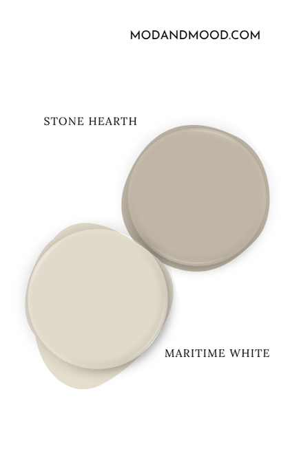
Here are the coordinating colors that I recommend using with Benjamin Moor Stone Hearth:
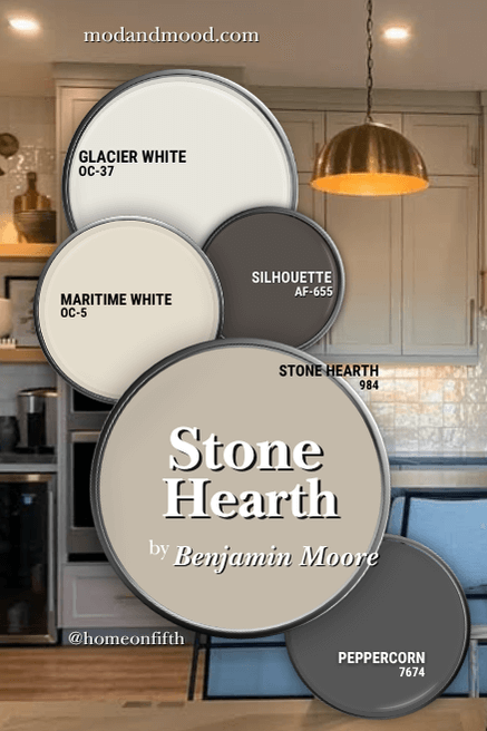
I’m not going to pretend that this combination is super exciting on paper, but I wanted to pick colors that allow Stone Hearth to be the star.
Coordinating White Paint Color for Stone Hearth
Glacier White (aka Dune White) is a muted white with fairly neutral creamy undertones. It is on the darker end of true white, with an LRV of 80, which puts it on the line between white and off-white.
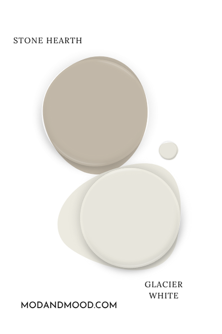
Maritime White is an off white. This color has fairly neutral creamy undertones, but it is more obvious in its creaminess. I chose this color because the undertone is very similar to Stone Hearth, and it complements it well.
You might consider using Maritime White on your walls if you are using Stone Hearth on your kitchen cabinets.
Finally, you might also like Stone Hearth with White Dove:

White Dove is an equally good white choice to Glacier White. It is also a little bit lighter. I just didn’t put it in the color palette because it’s already very popular, so I thought I would try something different.
Try Stone Hearth with Benjamin Moore Silhouette
Benjamin Moore chose Silhouette as their color of the year for 2026! This deep neutral brown has warm undertones that work well with Stone Hearth.
Silhouette is nice because it is warm, but it also has a nice dose of gray in it – just like Stone Hearth!
Pair Stone Hearth with Peppercorn
Sherwin Williams Peppercorn is a charcoal paint color that most often has cool blue undertones.
Benjamin Moore Stone Hearth for Your Home’s Interior
Now let’s see Stone Hearth in real life, where I do have a great variety of looks to show you!
How Stone Hearth Looks on Walls in Different Lighting
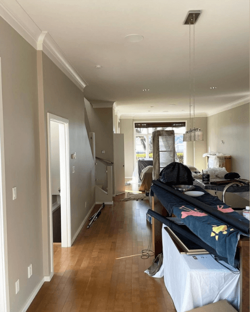
I love this first example of Stone Hearth, because you can see a few different undertones all in one! :
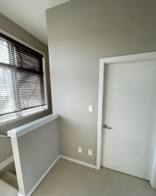
- In the stairwell you can see a darker true greige look
- On the biggest wall (near the bottom of the door) the color looks its most typical, and
- On the small half wall, you can see a more silvery look.
The team at Word of Mouth Painting (@word_of_mouth_painting) painted this entire house in Stone Hearth…with a twist!
“We painted all of the walls in Benjamin Moore Aura matte in CC-490 Stone Hearth. We then removed 75% pigment for the ceilings and the trim was a 1/8 strength of the same pigments. Overall this created a gorgeous tone on tone aesthetic that looks timeless yet modern and classy.” – Word of Mouth Painting
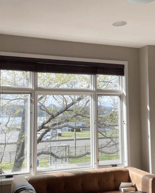
Stone Hearth in the Living Room
In this next photo of the same home, we see an almost green undertone, particularly above the window:

Other parts of the room look warmer, especially in the sun. In this next moment, this same room looks much cooler and more stone colored:
On another day the adjoining room looks a little different still:
I would say that the left side of the photo is fairy true to tone, and the right side looks a little closer to Benjamin Moore Manchester Tan.
If you do really like how the color looks on the left, you might also like Sherwin Williams Taupe of the Morning.
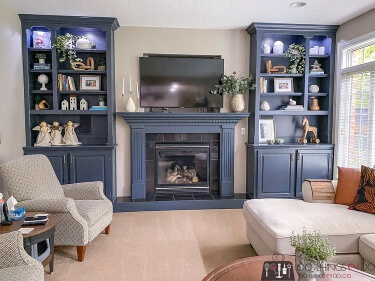
Moving on to this living room project by Shelley (100things2do.ca), we see Stone Hearth leaning a little beige, but mostly true to tone, against the much cooler Benjamin Moore shade Hale Navy.
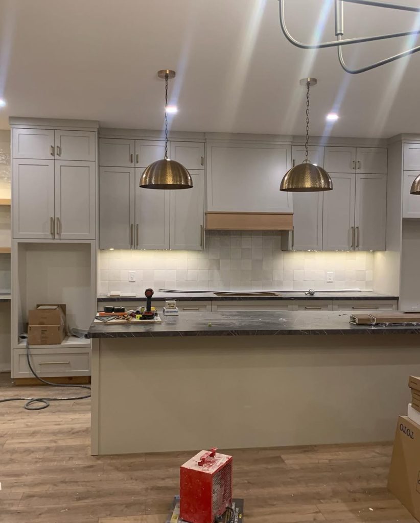
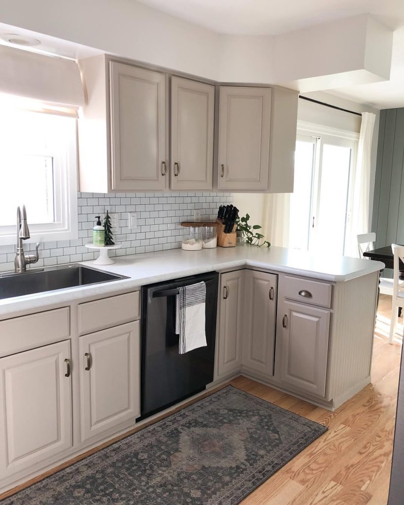
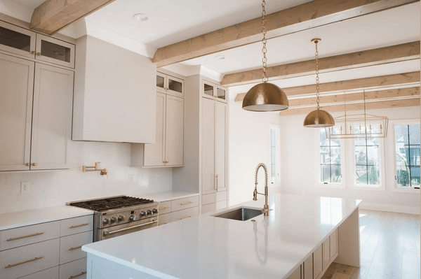
Stone Hearth on Kitchen Cabinets
Kitchen cabinets are probably the most popular place to use Stone Hearth! I have a few great examples including both new builds and a remodel.
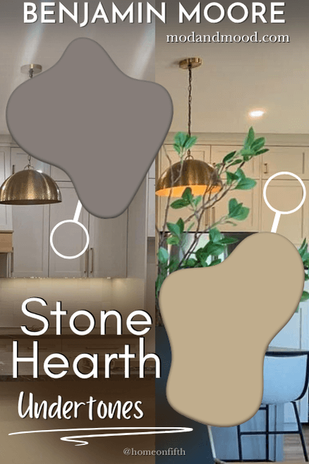
In this first kitchen by Tricia from @homeonfifth, Stone Hearth looks true to tone on the wall cabinets, but quite blue on the island in this photo. This picture is actually what made me include Peppercorn in the color palette earlier. It is a good color match to how the island looks in this light, and I love the effect!
In this photo you can see a little better how it is a trick of the light, but it does still look quite gray-blue on the island.
Here is one last look, this time in low artificial light, where the violet undertone is a little more obvious.
Speaking of that violet undertone, here it is again in a kitchen by Allison Kaye Interiors:
The color looks just a little bit darker here. I suspect because the white on the walls and ceiling is quite bright.
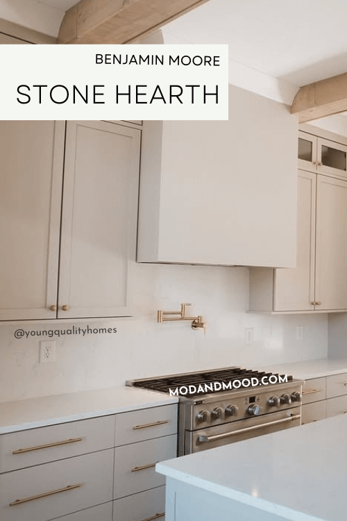
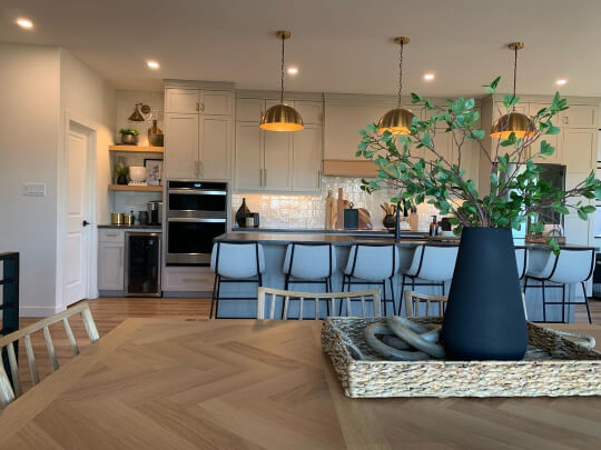
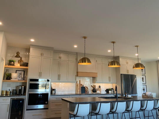
Finally we have another new build with Stone Hearth on the cabinets, this time by Young Quality Homes:
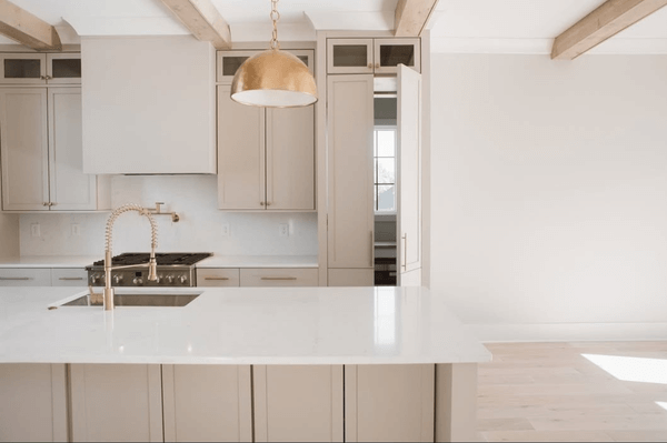
Stone Hearth is such a smooth and luxurious color!
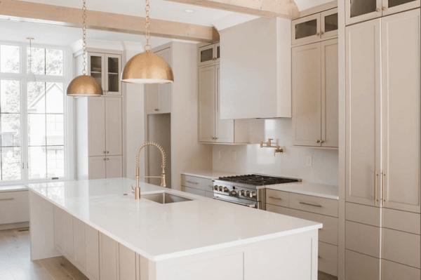
I would say that Stone Hearth looks pretty typical in all of these photos.
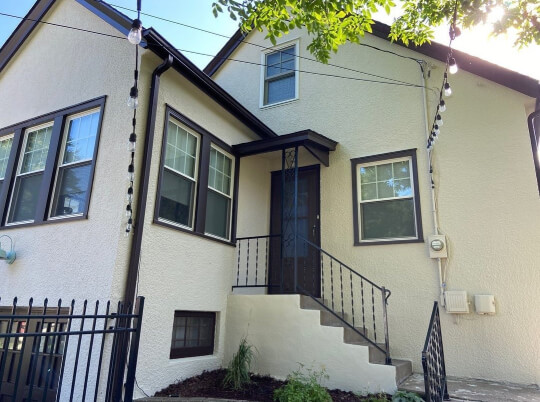
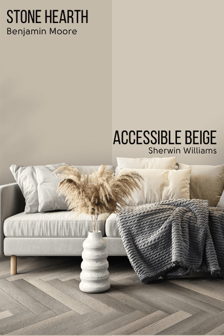
Stone Hearth for Your Home’s Exterior
I don’t have any real pictures of Stone Hearth on an exterior, so we will have to make do with Sherwin Williams Accessible Beige:
Accessible Beige is a little lighter than Stone Hearth, but this picture is pretty accurate to how the color will look outside:

You should expect that (like any color) Stone Hearth will look lighter outside.
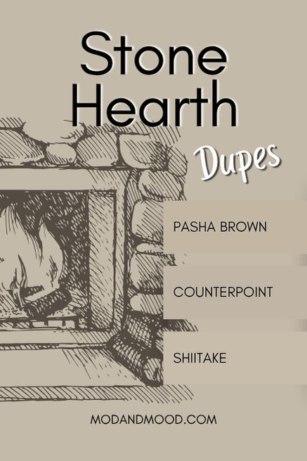
Dupes for Benjamin Moore Stone Hearth from Other Brands
Whether you can’t make it to Benjamin Moore, or you just don’t want to, here are the best alternatives and equivalents from other brands:

Stone Hearth in Sherwin Williams
The best Sherwin Williams equivalent for Stone Hearth, is the shade Shiitake.
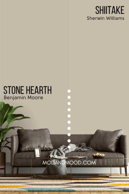
Shiitake is a little less gray than Stone Hearth, which makes it a little less chameleonesque. I find that the typical look for Shiitake is very much the same as Stone Hearth, but at its warmest, it is a bit warmer than Stone Hearth ever gets.
You can see more for yourself in my post: Sherwin Williams Shiitake is the Smooth Beige Wall Color You’ve Been Dreaming of (Plus Dupes!)
Behr (Home Depot) Equivalent to Benjamin Moore Stone Hearth
It was a little more difficult than I expected to find a dupe for Stone Hearth in Behr paint. I finally settled on Pasha Brown as the overall closest color match:
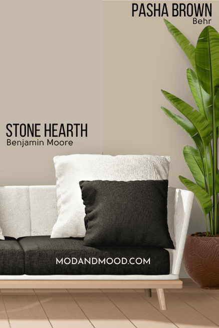
Pasha Brown is technically the exact same color as Stone Hearth, but it is more saturated (less gray).
Valspar (Lowe’s) Version of Stone Hearth
From Lowe’s, the best color match for Stone Hearth is the shade Counterpoint:
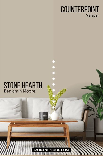
Counterpoint is a hair darker and a tiny bit more saturated than Stone Hearth.
Here is another look at each of these dupes before we move on:
Stone Hearth Compared to Other Neutral Paint Colors
You may be wondering how Stone Hearth stacks up against some other colors on your list! Here are a few comparisons between Stone Hearth and other popular neutrals. Click the plus to expand and see the colors side by side.
Sherwin Williams Accessible Beige is lighter than Stone Hearth, but otherwise it is almost the exact same color.
I will say that the undertone of Accessible Beige doesn’t vary quite as wildly as Stone Hearth does.
Sherwin Williams Balanced Beige is a little bit warmer, darker, and more saturated than Stone Hearth.
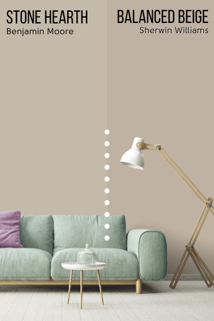
Each difference between these two is incremental, and the result is almost the same. I find that Balanced Beige runs almost the exact same range of undertones as Stone Hearth does.
At its warmest, Balanced Beige will be a bit warmer than Stone Hearth ever is.
Benjamin Moore Edgecomb Gray (also known as Baby Fawn) is lighter, and a bit cooler, than Stone Hearth.
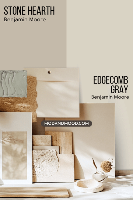
Both of these colors are greige, but Edgecomb Gray is definitely a light neutral, and Stone Hearth is in between light and mid-toned.
Despite being cooler than Stone Hearth on paper, Benjamin Moore Natural Cream does tend to look like a neutral cream color, and rarely gray or stone colored.
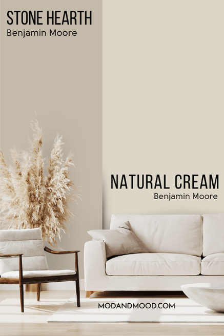
While it is technically too dark to be an off-white, Natural Cream does have a tendency to read that way because it is so neutral. Stone Hearth on the other hand, never looks like an off-white.
Benjamin Moore Pale Oak (aka Athena) is much lighter than Stone Hearth. It is right on the line of off-white and light neutral.
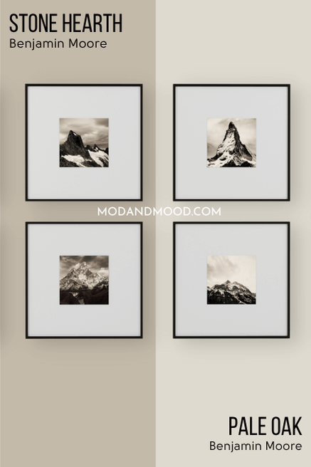
Both colors are greige with taupey undertones. Pale Oak doesn’t ever get quite as cool toned as Stone Hearth can.
Benjamin Moore Pashmina is a very similar color to Stone Hearth, but it is a little bit darker.
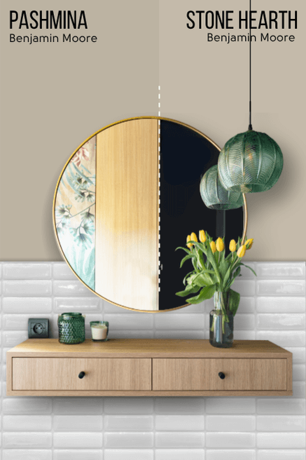
Besides the LRV difference, it is difficult to describe the difference between Pashmina and Stone Hearth, so I will show you! Pashmina can sometimes look like this:

This darker look, is a bit warmer than Stone Hearth would typically look at its darkest.
Benjamin Moore Revere Pewter is a little bit cooler, lighter, and more gray than Stone Hearth.
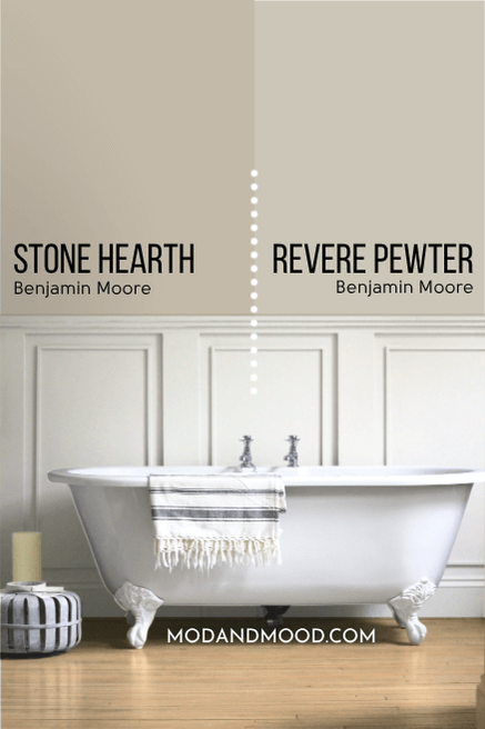
Revere Pewter can have a similar taupey mushroom color to Stone Hearth, but it can also have a slightly khaki look that Stone Hearth doesn’t have. When it does lean more taupe, Revere Pewter’s undertone isn’t quite as violet as Stone Hearth.
Benjamin Moore Stonington Gray is very silver in comparison to Stone Hearth. It is almost completely gray, and not technically greige at all (although it can look slightly greige on occasion).
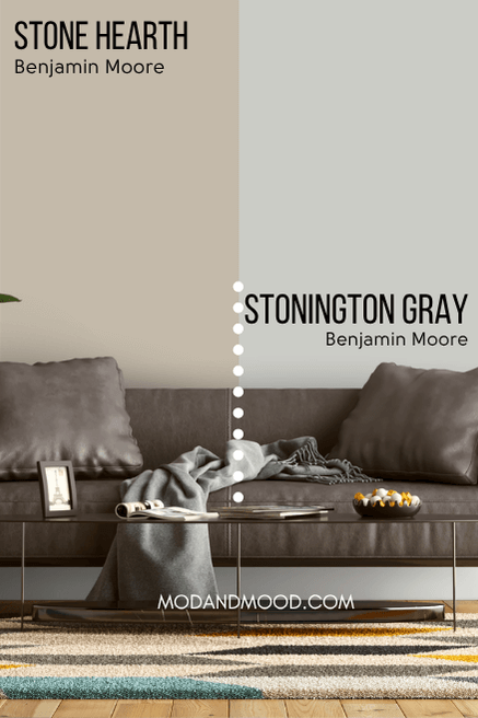
Stonington Gray most often has a slightly green undertone.
Thank you so much for reading until the end, that really helps my blog! I hope this helped you decide if Stone Hearth is the perfect smooth neutral for your next project!
Still on the look out? I’ve got more!: