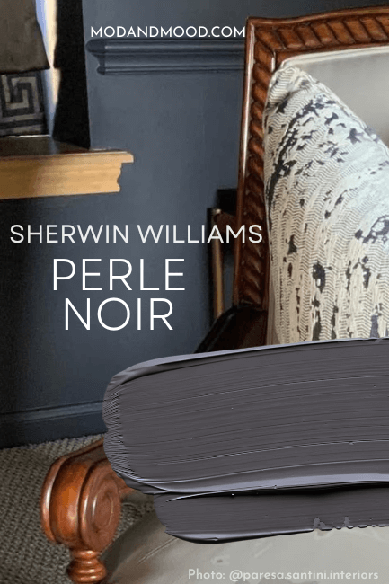
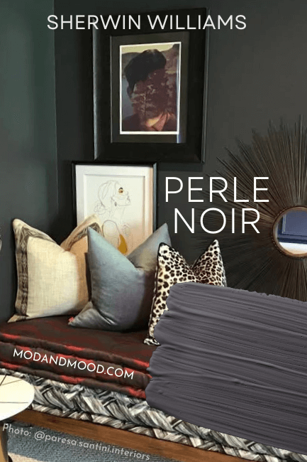
Purple is low on the list for most people looking for neutral paint colors, but what if it could be done super subtley? Sherwin Williams Perle Noir is a charcoal aubergine that doesn’t read girly or grandma.
Let’s take a look at coordinating colors for Perle Noir, see it in real homes, peruse trim suggestions, and get some alternatives!
What Color is Sherwin Williams Perle Noir (9154)
Perle Noir is a moody charcoal with just a hint of a purple undertone. This would be a great choice for a kitchen island or an accent wall.
While this color is dark, it never looks truly black, so you may find it to be a good substitute when a solid black would be too harsh.
What is the LRV and RBG of Sherwin Williams Perle Noir?
The LRV of Perle Noir is 8.
What does that mean?
The LRV (Light Reflectance Value) of a color indicates on a scale of 0 – 100 how much light a color reflects (or doesn’t reflect). True black has an LRV of 0 and pure white has an LRV of 100.
In the paint world, we are working in a range of about 3 – 93 because no paint color is purely black or completely white.
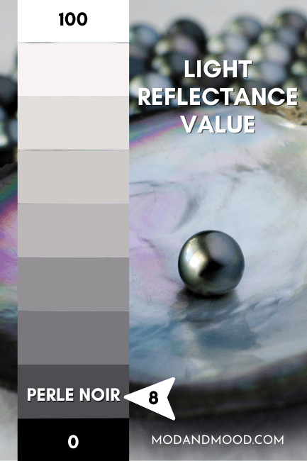
At 8, Perle Noir isn’t quite a black paint color. It’s more like a deep charcoal. It could read close to black in certain lights, but only because it is so gray.
If you want an actual black paint, this is not the one. Try Tricorn Black instead.
What Are the Undertones of Perle Noir?
Perle Noir is a deep charcoal with purple undertones. You wouldn’t even really say undertones, because this is actually classed as a purple paint color.

Despite technically being a smoky purple, I would call Perle Noir an inky charcoal. It can sometimes read like a navy blue, but typically it has a chalky plum undertone.
Is Perle Noir Warm or Cool?
This is a real tomato/tomatto, situation, because purple is where warm and cool tones meet on the color wheel (red and blue).
I would say that Perle Noir tends to read more to the cool side of purple, but you wouldn’t be wrong in thinking it reads warm, because it is purple and not a cool blue charcoal like most. That being said, it can look like a deep blue as well.
The Sherwin Williams Perle Noir Color Strip
Here is the whole color strip from Sherwin Williams that contains Perle Noir:

- Destiny (6274)
- Fashionable Gray (6275)
- Mystical Shade (6276)
- Moonlit Orchid (9153)
- Special Gray (6277)
- Cloak Gray (6278)
- Perle Noir (9154)
Sherwin Williams Perle Noir in a Color Palette
I would suggest using Perle Noir as a neutral, but staying away from colors that are either yellow or blue. Those will really emphasize the purple tones of Perle Noir.
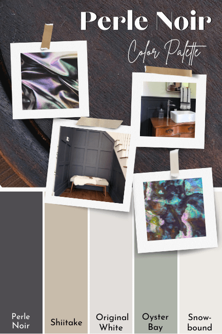
Coordinating Colors for Perle Noir
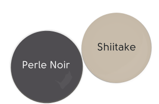
Perle Noir with Shiitake
The warmth in the beige of Sherwin Williams Shiitake will tone tone down the purple in Perle Noir just a touch, and leave it looking more like a neutral charcoal.
Original White and Perle Noir
Sherwin Williams Original White is almost like a much lighter version of Perle Noir, or a slightly lighter version of Destiny (the lightest color on the strip).
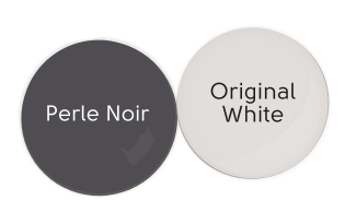
It has an LRV of 74, so it is an off-white paint color.
I actually snuck this one onto the LRV chart, and it doesn’t look out of place.

Perle Noir and Snowbound
Snowbound is a true white with a hint of warmth that does not lean at all yellow. I think it’s a great “safe” white choice with Perle Noir.

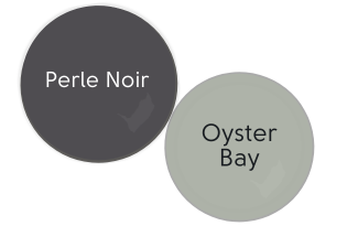
Complementary Color for Perle Noir
Green is directly across the color wheel from Perle Noir, and that is where we will find our complementary color. I chose the super grayed-out green of Sherwin Williams Oyster Bay.
What Trim Colors Go With Sherwin Williams Perle Noir?
Here are a few of Sherwin Williams most popular trim whites:

White Paint that Goes with Perle Noir
I would be cautious choosing an overly creamy white for trim with Perle Noir unless you are okay with emphasizing the purple tones. If you are, then a white like Greek Villa or Alabaster would look fit the bill.
My preference would be a more neutral white, like Snowbound, or something in between, like Pure White. These are soft but true whites.
To maximize how dark Perle Noir will look, go super bright with your trim color. Like Benjamin Moore’s Chantilly Lace, or High Reflective White.
Sherwin Williams Perle Noir for Your Home’s Interior
You are probably here to see this color in real life. So let’s get into it!
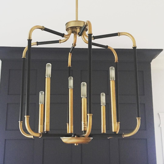
Sherwin Williams Perle Noir in the Living Room and Dining Room
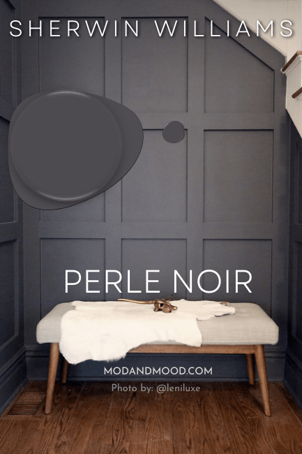
First let’s take a look at Perle Noir where its undertone is most obvious. Here is a feature wall by Katie (@leniluxe), where she used Perle Noir on board and batten:
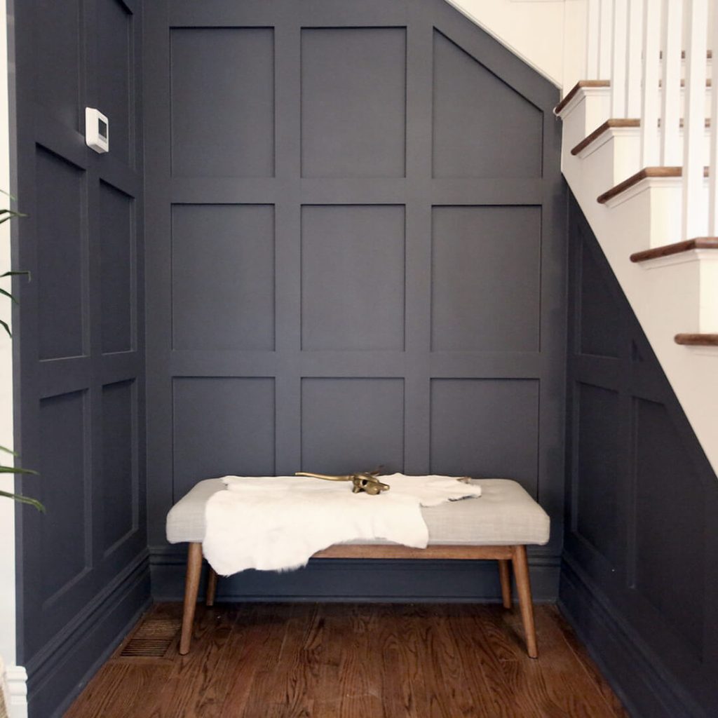
This is about as saturated as the color looks. I go back and forth on whether we would actually say this looks purple, or does it just look charcoal?
This next photo appears to be in a dining room, but we don’t have full context on it.
If you want my opinion: Anybody who hates purple might say they can spot it, but they wouldn’t still be reading, so….
Here is one more room, but this time we can see Perle Noir looking a lot more blue:
Here is another shot from the same space, but I where the color looks more green it is a light from outside.
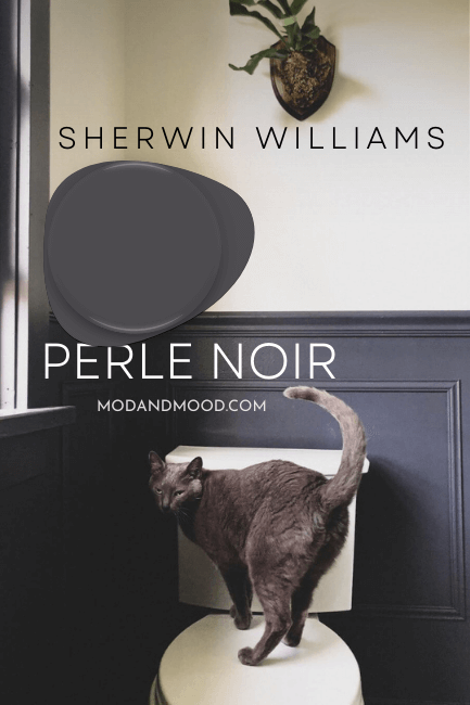
Sherwin Williams Perle Noir in the Bathroom
Here is the other space where I feel like Perle Noir looks the most “colorful” :
Alexandra (@acgrahamco) used Perle Noir on the wainscoting in this bathroom, with Sherwin Williams Shell White on the upper half of the walls.

In this room I find the white to look quite a lot like Sherwin Williams Greek Villa, so also check out that color if this is the creamy white you’ve been after!
Sherwin Williams Perle Noir in a Bedroom
Here is a bedroom by Prika Design (@prikadesign) where she painted both the 3D panel headboard and the ceiling in Perle Noir:
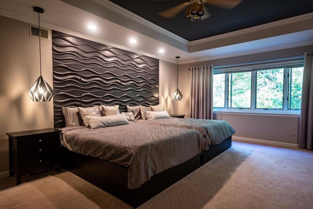
The walls are a light taupe-gray by Sherwin Williams, called Alpaca.
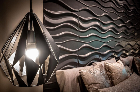
I love how graphic and cool this looks!
In this next bedroom, Perle Noir again looks about as dark and close to black as possible:

Magnolia Painting (@magnoliapaintingusa) used Extra White for the rest of the walls.
Sherwin Williams Perle Noir on Kitchen Cabinets
Perle Noir is not yet a super popular choice for cabinets, so I will have to show you something similar.
This kitchen is painted in Benjamin Moore Cheating Heart, which is just a bit more blue than Perle Noir:
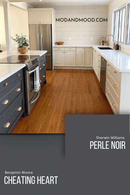
I think this is a pretty solid example of how Perle Noir will look on cabinets.
The Finishing Room (@thefinishingroommke) used Cyberspace in this next kitchen, and I chose a photo that I think looks quite a lot like Perle Noir:

I’ll show a side by side of the two colors in just a minute, but Cyberspace is more blue than Perle Noir. The upper cabinets in this remodel are Creamy.
Sherwin Williams Perle Noir on an Exterior
Perle Noir would be a beautiful dark gray for an exterior. In a world where charcoal exteriors are both safe and classy, Perle Noir adds a little twist.
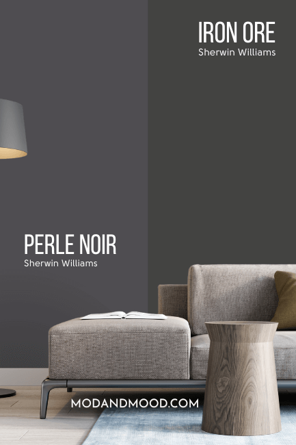
Here are a couple of exteriors in Sherwin Williams Iron Ore, where the color leans closer to Perle Noir. You will just have to use your imagination a little to picture them slightly more purple.
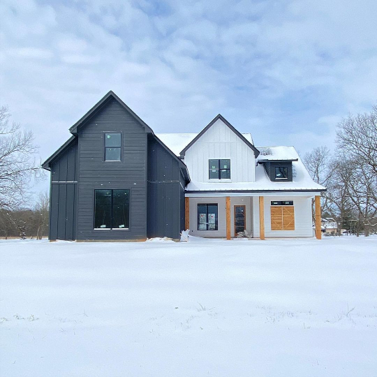
We will compare these two colors properly in just a minute, but you should know that Perle Noir is a little lighter than this.
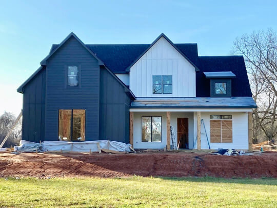
Here is one more exterior picture that looks very similar to how Perle Noir will look. (It’s Iron Ore again.)
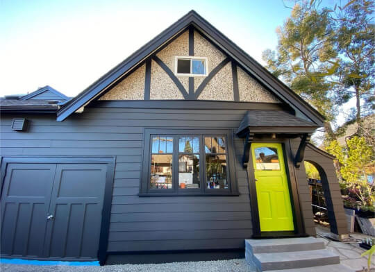
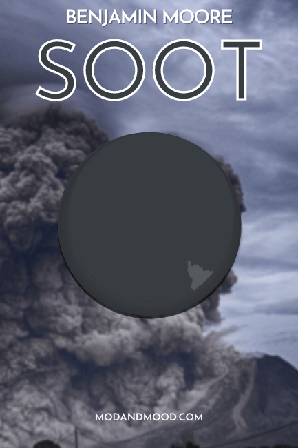
Finally we have an exterior in Benjamin Moore Soot, which I would not say normally looks super close to Perle Noir, but in this exterior picture it does:

Perle Noir Compared to Other Charcoal Paint Colors
Here is how Perle Noir stacks up against other deep gray paint colors you may be considering:
Sherwin Williams Perle Noir vs Peppercorn
Peppercorn is a slightly more popular charcoal choice than Perle Noir. It is technically a “perfect” gray, but in real life the color leans quite blue-gray, or even a little green sometimes.
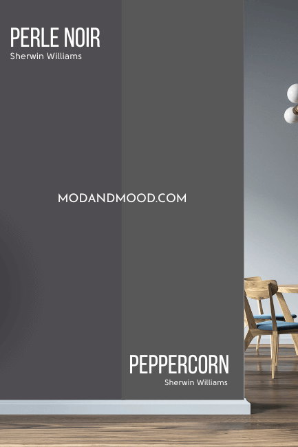
Here are both of these color strips so that you can see the subtle difference:
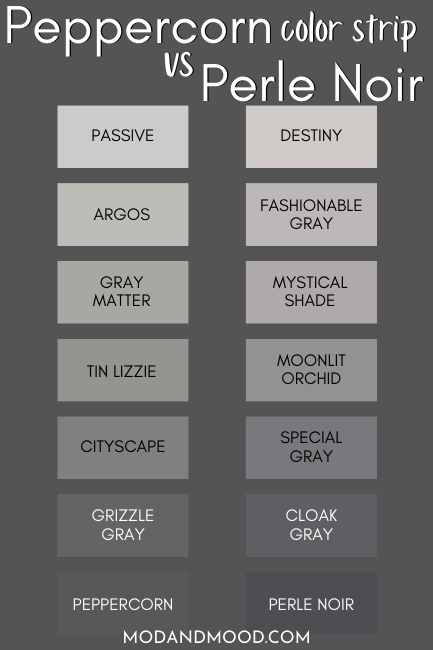
You can see here how the whole Perle Noir strip leans purple, where the colors in Peppercorn’s are more neutral to green.
The LRV of Peppercorn is 10, which is just light enough that it never reads black.
Sherwin Williams Perle Noir vs Iron Ore
Iron Ore is darker than Perle Noir, but still not a true black. I would say that Perle Noir always looks either neutral charcoal, or has a hint of purple, but Iron Ore is a chameleon that can look green, blue, or neutral – but never purple.
Sherwin Williams Perle Noir vs Cyberspace
Cyberspace is a very blue charcoal, as opposed to the purple charcoal of Perle Noir.
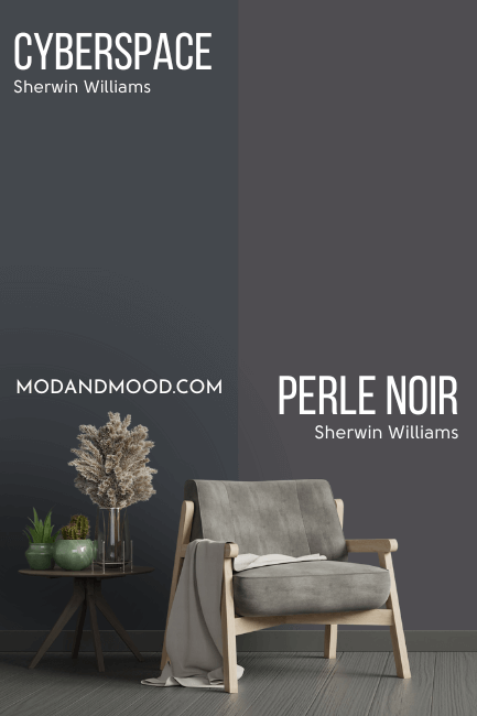
Cyberspace is also a little bit darker than Perle Noir, with an LRV of 6.
Sherwin Williams Perle Noir vs Behr Cracked Pepper
Cracked Pepper was named Behr’s Color of the Year in 2024, and at face value it is similar to Perle Noir, so I thought we should compare them!
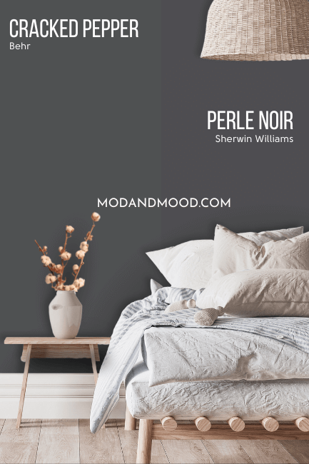
The LRV’s of Cracked Pepper and Perle Noir are the same, at 8. You can see that Cracked Pepper looks greenish compared to Perle Noir, and it does tend to have a greenish or blue undertone, rather than purple.
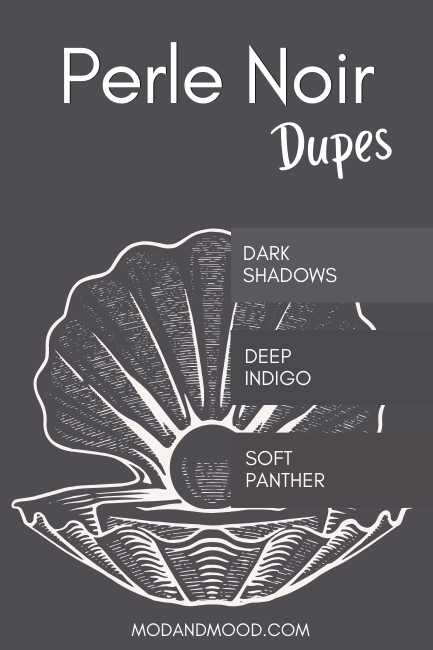
Dupes for Perle Noir from Other Brands
Here are the best color matches that I could find from the other big players in paint:
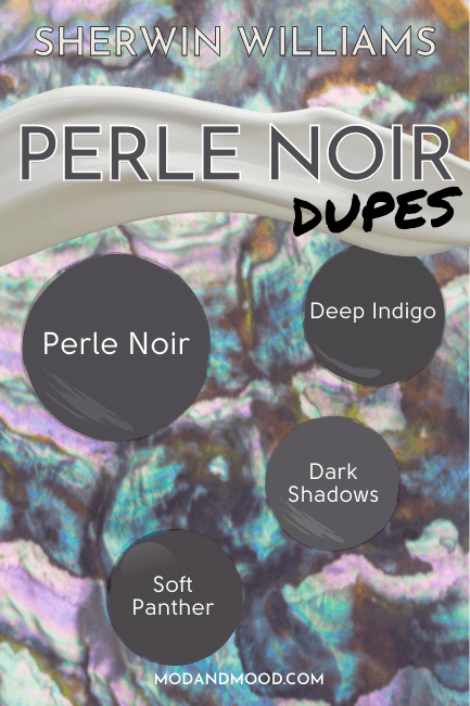
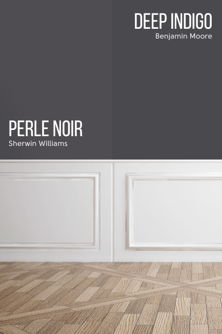
Benjamin Moore Perle Noir Equivalent
From Benjamin Moore, the closest match to Perle Noir is the shade Deep Indigo.
Benjamin Moore Deep Indigo (1442)
Deep Indigo leans more blue than Perle Noir, and a tiny bit darker.
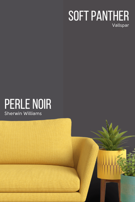
Valspar (Lowe’s) Equivalent to Perle Noir
From Lowe’s, the best color match for Pearl Noir is Valspar Soft Panther.
Valspar Soft Panther (8006-12F)
Soft Panther is a little bit darker than Perle Noir, and warmer (more red-leaning).
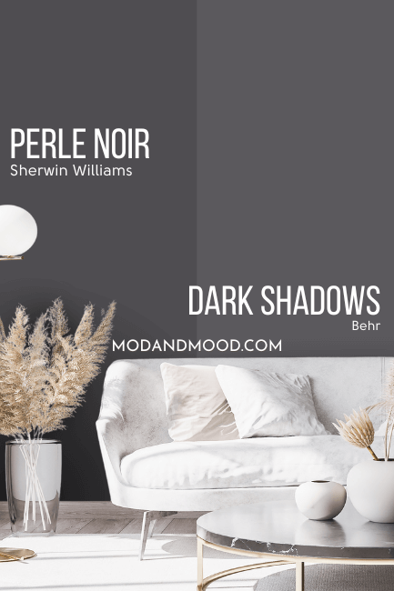
Perle Noir Behr Equivalent (Home Depot)
If you are heading to Home Depot, Behr’s shade Dark Shadows is the best color match that I could find for Perle Noir.
Behr Dark Shadows (MQ5-02)
Dark Shadows is lighter than Perle Noir, but a very good tone match. There is a shade darker (Extravagance) but for some reason it was much more purple.
Here another look at all of the dupes for Perle Noir together:
Perle Noir Pros & Cons
Thank you so much for reading to the end! That really helps my blog grow.
Final thoughts on Perle Noir: It’s quite an underrated charcoal that you could use safely, knowing that very few people will have the exact same color as you!
Use it thoughtfully with other grays or blues, because that can really emphasize the purple undertones.
Not the one? That’s okay! Here are more colors that you might like: