It’s not every day that I uncover a great paint mystery, but today is one of those days! Valspar recently named Warm Eucalyptus as their Color of the Year for 2026…but they also said you can get it at their “Independent Retailers” under the name Sage Slate.
Trouble is…they aren’t actually the same color! So today we will talk about it, and take a look at both.

What Colors are Sage Slate and Warm Eucalyptus, and How do we Know They Aren’t the Same?
Color of the year season is my superbowl! I try to keep track as the colors are announced by each brand.
I did a quick search to see if Valspar had named their color of the year, and they had! “Sage Slate” Google told me.

I tucked myself into bed delighted to talk about it, because I know this color, and it’s a great choice! (It’s one of my dupes for Sherwin Williams Retreat!)
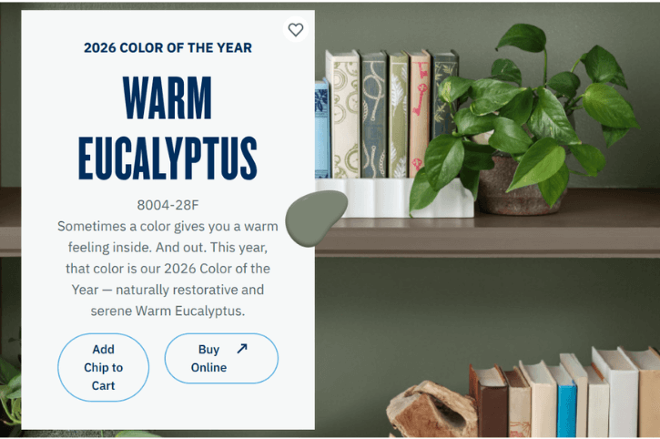
Imagine my surprise when I searched it up again the next day, and half of the results said “Warm Eucalyptus!” I went to Valspar’s own page, and there it was in black, white, and sage:
“…Our 2026 Color of the Year — naturally restorative and serene Warm Eucalyptus.” – Valspar.com
Whoa whoa whoa! Still a great color, but I didn’t think they were the same?
Just to make it absolutely crystal clear that I’m not crazy (at least in this arena), the official Valspar Instagram announcement was very straight forward. This was their caption:
“Our 2026 Color of the Year: One Color, 10 Ways 😉
🎨: Warm Eucalyptus (8004-28F) at @loweshomeimprovement // Sage Slate (V143-5) at independent retailers.”
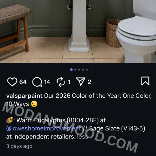
One Color. One.
Great! So they’re the same color! …Except that they aren’t.
Sage Slate is on the Valspar website as Lowe’s color 8004-32F and Independent Retailer color V143-5.

If you click into the link for the Independent color, it says that it’s the Color of the Year.

It does not say that on the Lowe’s version, but you can see that these are definitely one and the same color:

Okay, so maybe Warm Eucalyptus is just another name for it? Benjamin Moore does that all the time!
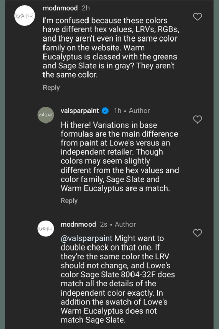
Nope. The color number for Warm Eucalyptus is 8004-28F, and the details are all different. It has a different RBG, LRV, hex value, AND it’s not even classed in the same color family!
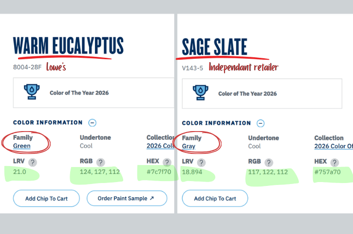
Here is how the colors compare:

Was I annoying about it? Yes. Yes, I was.
The explanation they gave me doesn’t really make sense – as I pointed out – because if they are the same color, the LRV should never be different. How can an identical color reflect more or less light?
To give them one very last benefit of the doubt, I did compare the swatches directly from the website rather than the hex codes. Same result:
(Just to be really clear, I don’t think their social media person was actually lying to me on purpose. I’m sure they get similar questions all the time, and this is just one of their canned responses.)
My working theory is that they goofed a little bit, and announced Warm Eucalyptus as the color of the year, not realizing that the Independent Retailers don’t have that color.
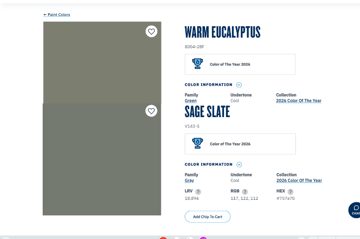
I was not able to find a perfect match for Warm Eucalyptus on the IR version of the website. Here are all of the greens in the same LRV range:
I am guessing that they picked close enough and hoped nobody noticed?
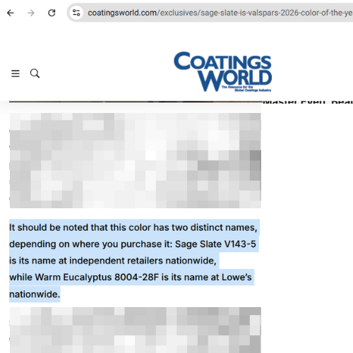
Apparently that may have worked, because I haven’t seen anyone else commenting that the colors are different. In fact in the article that does mention Sage Slate, they just took Valspar’s word for it that they are the same color but different names:
I’m curious if this all changes in short order, because they really aren’t the same color, but it can’t be that hard for them to add Warm Eucalyptus to their database…right?
Anyways, my research shall live on here as a time capsule to that weird day when there were two Valspar 2026 Colors of the Year and they tried to gaslight me. The point of all of this, is that apparently I have the time.
Moving on! Let’s look at each color really quickly.
What do Valspar Warm Eucalyptus and Sage Slate Look Like in Real Life?
Valspar colors are a little harder to find in the wild, but we can get a pretty good idea from using similar colors in other brands. (More similar than these two are. Har har!)
As I mentioned earlier, Sage Slate was one of my dupes for Sherwin Williams Retreat.
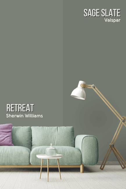
Retreat is just a little bit lighter and a hair cooler, but a great overall tone match.
Warm Eucalyptus on the other hand, happens to be an even better dupe for Sherwin Williams Dried Thyme:

If you have a really good screen, you can probably just make out the difference. Warm Eucalyptus is a teeny weeny babyyyy bit warmer than Dried Thyme.
Not to be petty, but this is Dried Thyme and Sage Slate compared to Warm Eucalyptus:
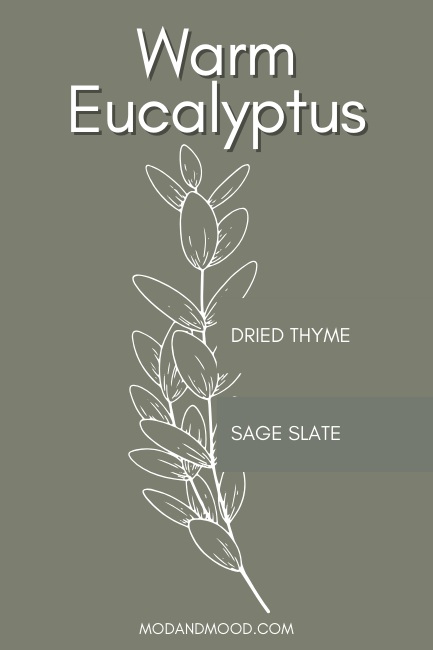
The difference seems more important when you can see how even colors in different brands are a better match.
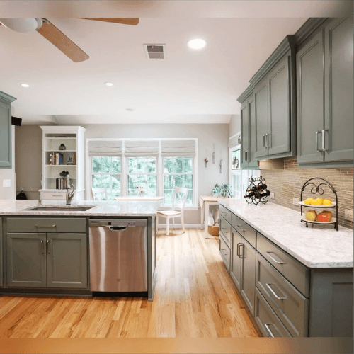
On to real life! Here is a kitchen in Sherwin Williams Retreat, to give you an idea of how Sage Slate would look on kitchen cabinets:

Here is Dried Thyme on kitchen cabinets, so you can see how Valspar Warm Eucalyptus will look:
Similar of course, but you can see that Sage Slate will look cooler and a touch more blue sage than Warm Eucalyptus.
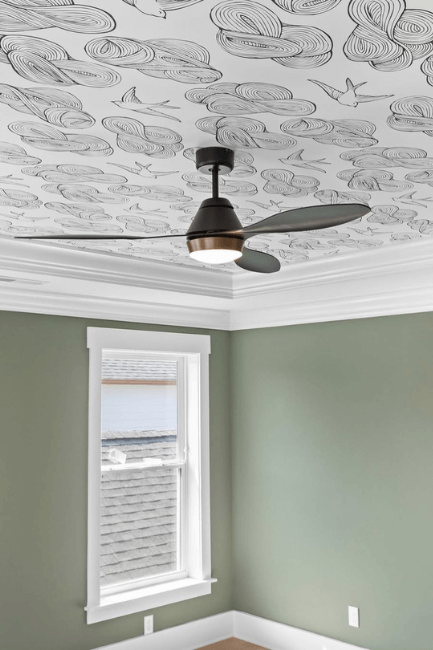
Here is a good idea of how Sage Slate should typically looks on walls:

This is Retreat again, and I would say you should imagine it a hair darker if it was truly Valspar Sage Slate, but actually I think it reads a touch darker than typical here.
Here is a look at how you can expect Warm Eucalyptus to look on your walls:
This is Dried Thyme again, but you should imagine it a little bit darker anyway, because I think it is reading lighter here.
I hope this was an interesting journey into the Valspar Color of the Year! I will probably make separate proper posts for each of these colors, because I went on for long enough with my documentary in the beginning! Stay tuned for updates, but we may only here crickets from them.
In the meantime: