Dorian Gray is a popular gray paint color by Sherwin Williams, but it doesn’t get as much love as the many lighter options. This versatile and shape-shifty gray, happens to look 50 shades of chic on cabinets!

Here we will take a look at Dorian Gray in a few different kitchens, where you can see allll of the undertones and decide if he is the one for you!
Before we hop right into it:
Is Gray a Good Color for Cabinets?
Neutral cabinets are always a good idea! Cool silvery grays have fallen out of favor somewhat in recent years, so I would stick with a gray that has some sort of undertone.
That could mean a gray with some warmth, or maybe a hint of color like blue or green. Dorian Gray is a good choice because it is a bit of a chameleon, and it has a lot of interest and depth.
The LRV of Dorian Gray is 39, so it is a mid-toned gray. In this LRV range the color can appear anywhere from light to medium dark, depending on the lighting.
Dorian Gray on Real Life Kitchen Cabinets
Dorian Gray does have a few different faces: Cool gray, greige, and taupe.
To illustrate each of these looks, we will see four different kitchens. I will try not to be confusing, but I will kind of bounce back and forth between them as we talk about the different undertones.
The kitchens are:
Amy & Ryan’s at the @rockcreekfarmhouse

A design project by Lyle and Megan – @creationsbymegans

Liz’s new build – @building_up_toelle

Ben and Elenie’s @anncreekcottage

Even just from the introduction you can see how much Dorian Gray varies!
Dorian Gray Where It Looks Like A True Gray
Despite the name, Dorian Gray is equally likely to look greige, taupe, or gray.
In this photo of Megan and Lyle’s project you can see that the color looks like a light gray on the peninsula, and a dark gray in the background:

In both cases the color looks like a true gray without any obvious undertones.
Let’s contrast that by looking back at the first photo I shared of this kitchen, where each area of cabinets looks a little bit different!:
The island looks like a mushroom color, the back wall cabinets look like a medium to dark gray with a slight green undertone, and the pantry cabinets look almost sage!
I don’t know that I’ve seen a color where light and dark vary quite as much as Dorian Gray. Here is a great example of that:

It’s almost unbelievable what a difference the lighting makes! Liz’s wall color is Sherwin Williams Snowbound.
Here is another ultra light look to Dorian Gray, where the undertone is quite cool and silvery:
I would say that the color isn’t likely to look quite this light. Dorian Gray is also the color on the trim, and you can see it’s depth a little better above and beside the patio door.
Here is one more look at the same kitchen that is again quite a true gray:

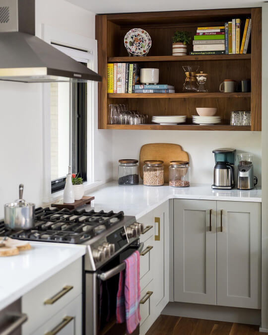
Dorian Gray Looking Greige on Cabinets
Let’s start this category with the lightest and most beige that Dorian Gray will ever look:

The hood vent and pantry cabinets look quite light and creamy, but all of the Dorian Gray looks pretty warm here.
Here is another angle with a similar look:

The white walls are Sherwin Williams Alabaster throughout the home.
There’s a very fine line between greige and khaki with Dorian Gray, and this shot is a good example of that:

The color definitely looks warmer here, but whether you see beige or a green undertone, is probably up to the beholder.
Here is another look that I wasn’t sure about categorizing. The hood vent looks quite beige, the window wall looks more silver, and the island has a whiff of green.
Here is another photo where I settled on “mushroom,” but you could also convince me that it’s silver:

If you like how the color looks here, you might prefer one of my favorite Mushroom Paint Colors for Kitchen Cabinets.
At the very least, Dorian Gray keeps things interesting!
Dorian Gray Looking Taupe or Green on Cabinets
We have already seen a few photos where Dorian Gray has a slight green undertone or a bit of a mushroom look, but here is an example of particularly strong taupe undertones:

The range hood in particular has the slightest taupey-violet undertone.
If you are partial to the color here, you might like the Best Trending Taupe Paint Colors.
Here is a particularly strong green look from Dorian Gray:

The color doesn’t look particularly warm here, but it definitely has a strong green undertone.
If you prefer this look, you might like one of the colors from my Sage Green Kitchen Cabinets post, or Benjamin Moore Fieldstone (which I will show you in just a minute).
What Color Hardware and Countertops Should You Use with Dorian Gray Cabinets?
The hardware colors that these kitchens showed off are: Black, brass, and gunmetal.


I think it’s a great idea to use a higher contrast hardware with Dorian Gray. A brushed metal or chrome would not pop enough against the medium gray.
What Color Countertops Are Best with Dorian Gray Cabinets?
In all of our example kitchens, the owners/designers opted for white stone countertops, and I think that is the best overall option.
Dorian Gray is a bit of a deeper color where cabinets are concerned (at least compared to white, off-white, or most neutral options) so light is a great choice.

I would definitely stay away from gray countertops because you don’t want to have clashing undertones. Black could be an option if you have a lot of natural light.
Butcher block countertops will work with Dorian Gray if you are okay with the color staying cool in comparison. The warmth in wood will make the color look more gray. An orange-hued wood may also increase the chance of a purple undertone.
Other Neutrals You Might Like for Cabinets (Dorian Gray Alternatives)
If Dorian isn’t quite the perfect shade of gray for you, here are some similar colors that I also like for cabinets:

When I picked these colors, I actually forgot that Repose Gray and Acier are on the same color strip as Dorian Gray. Whoops! Could have saved myself some pondering over alternatives I suppose.
However! You will see that they each achieve slightly different looks.
Sherwin Williams Repose Gray
Repose Gray might be my favorite gray for kitchen cabinets. It’s just light/dark enough and it has a creamy mushroom sort of undertone.

This color is not quite as chameleon-esque as Dorian Gray. It doesn’t ever look especially cool and it never has a green undertone.
Benjamin Moore Fieldstone
On the other side of the spectrum, Benjamin Moore Fieldstone is more likely to have a green undertone, and a very pretty green undertone it is!
Fieldstone is somewhere between a silvery gray and an outright sage. It’s kind of perfect if you are torn between the green kitchen cabinet trend and a traditional neutral.

Sherwin Williams Acier
Acier offers a third alternative look to Dorian Gray. This gray is slightly more likely to look violet undertoned, but like Dorian it can look greigey or even slightly green.

I would say that in general, Acier does read cooler than Dorian Gray.

Acier is a great choice if you like a taupe with a violet undertone.
Should You Choose Dorian Gray for Your Kitchen Cabinets?
Of course the choice is yours, but what do you think of Dorian Gray?
I think it’s a great choice for cabinets if you have a nice open space with good lighting. I do think that it tends to look a wee bit darker than my preference for an entire kitchen. If you don’t have great lighting, you might want to do Dorian Gray only on lower cabinets.
You should not choose Dorian Gray if you aren’t okay with a color that shifts a lot. If you are going to be annoyed that sometimes your cabinets look mushroom and sometimes they look green, you will not like Dorian Gray.
I would definitely go as neutral as possible with your tile and countertop choices, so that you don’t need to worry about clashing with any of Dorian Gray’s undertones.
Not the one? Here are some other colors that might be right up your street! :


