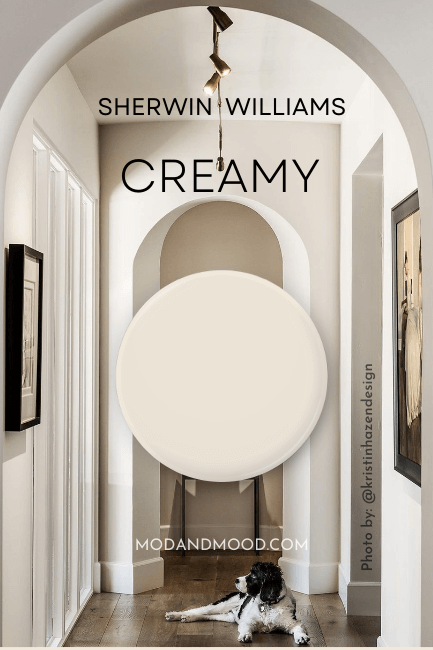
Sherwin Williams Creamy sounds perhaps too convenient, but it might just be the perfect creamy white for your next project!
Here we will talk about Creamy’s pesky undertones, get some coordinating color ideas, see it in real homes, and finally, go over some comparisons and dupes!
What Color is Sherwin Williams Creamy?
Sherwin Williams describes Creamy like this:
“This bright white has the softest of yellow undertones to create a subtle warmth in the room.” – sherwinwilliams.com
Let’s get one thing straight, Creamy is not a bright white. Not only does it have relatively strong undertones, it has an LRV of 81.

What’s an LRV you ask?
The LRV (Light Reflectance Value) of a color indicates on a scale of 0 – 100 how much light a color reflects (or doesn’t reflect). True black has an LRV of 0 and pure white has an LRV of 100.
In the paint world, we are working in a range of about 3 – 93 because no paint color is purely black or completely white.
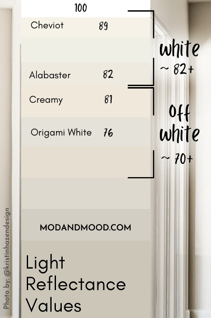
At 81, Creamy is only a true white depending on who you talk to, the weather, my mood, etc. My rule of thumb is typically that true white paint colors have an LRV of 82 or higher.
Personally, I would describe Creamy as an off-white. It can look fairly white, but you would never confuse it for a straight-outta-the-can white. It very obviously has pigment in it.
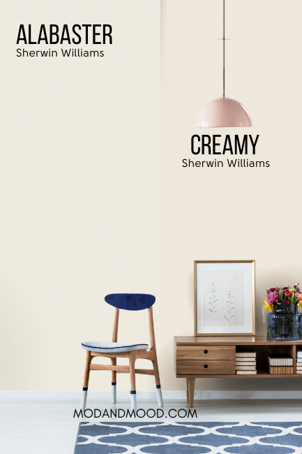
Sherwin Williams Alabaster is a soft white that does a better job of flipping between creamy white and true white.
What Are the Undertones of Sherwin Williams Creamy?
Creamy’s undertones range from yellow to beige, and sometimes a little peach (which is sort of in-between).
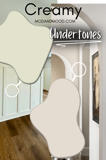
I put together this graphic to show the more extremes of each, but we will see more pictures when we get to real homes in just a minute!
Creamy in the Sherwin Williams Color Strip
The color strip that features Creamy isn’t exactly a traditional light to dark collection, but instead several creamy white to off-white options.
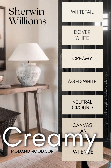
I have already covered Whitetail and Dover White.
Sherwin Williams Creamy in a Color Palette
Here are the coordinating colors that I recommend using with Creamy:
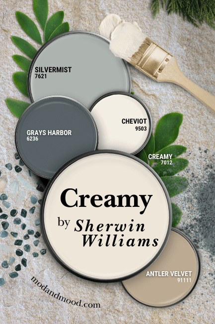
Coordinating White Paint Color for Creamy
Since Creamy is technically riiight on the edge of white and off-white, you can use Creamy as your white paint. If you want some contrast however, I recommend Sherwin Williams Cheviot.
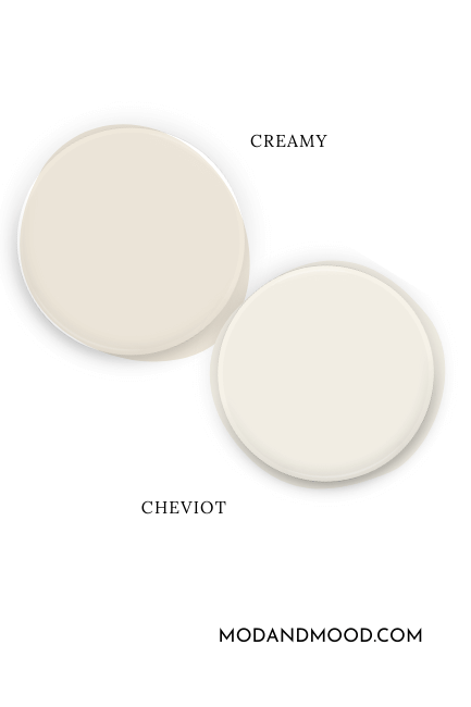
Cheviot has a very similar undertone to Creamy, but it is a nice light white. The problem with Creamy being almost white, is that you will have to go quite light in order to see that contrast. With an LRV of 89, Cheviot is up there!
Try Creamy with Sherwin Williams Grays Harbor
Grays Harbor is a beautiful murky gray blue that can have green undertones, or it can look like a true blue.
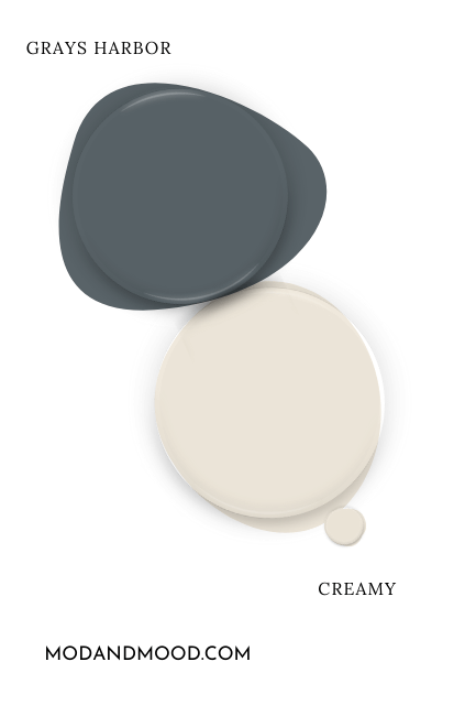
Blue is complementary to Creamy, but one that leans a little bit green like Grays Harbor is a good choice to stop Creamy from looking too buttery.
Neutral Paint Color to Use with Creamy
Because Creamy is so warm, you wouldn’t want to use a neutral that is too gray. Greiges are tempting, but the result would have Creamy looking very warm, and your neutral looking quite gray.
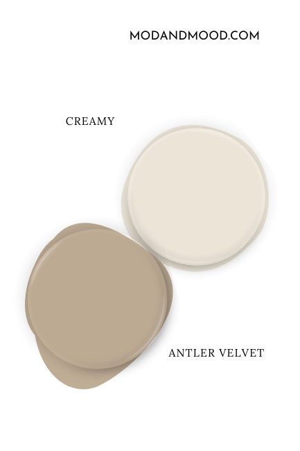
For this reason, I went with the true beige of Sherwin Williams Antler Velvet. On paper, it is a bit warmer than makes me comfy, but then again, so is Creamy. These two work very well together, and as a team they will actually help each other look a bit more neutral.
Pair Creamy with Sherwin Williams Silvermist
I decided to go a little cooler toned with the coordinating colors in this palette (besides the neutrals), because they are complementary to Creamy, but also I feel like it’s fairly easy to pair cream with other warm colors.
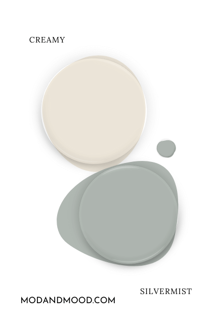
Choosing the right cool tones? That’s a little harder! Sherwin Williams Silvermist is the perfect cool toned gray blue-green that is colorful enough to bring some freshness into your space, but not too harsh against Creamy!
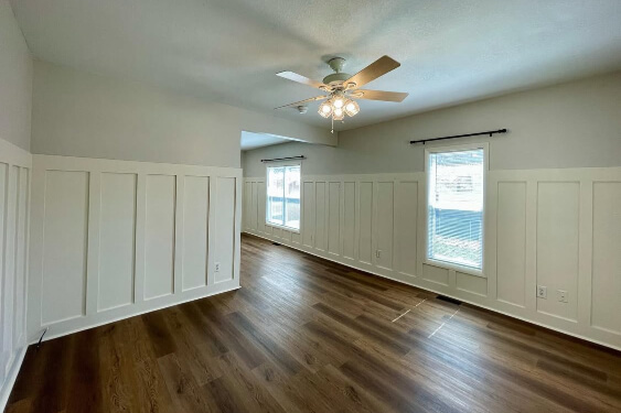
Take a Look at Creamy for Your Home’s Interior
Now let’s get into the fun stuff, and see Creamy in some real homes! First up is a home by Kristin (@kristinhazendesigns) that you may have noticed earlier:

This first photo is a beautiful example of the beige undertone of Creamy. The next one is in the same home, and while the undertone looks similar, it is a little more peach.
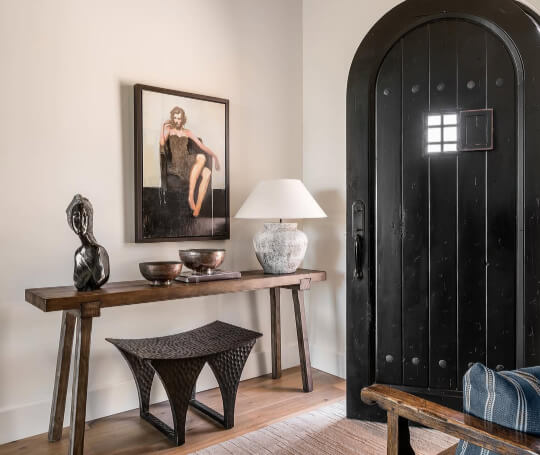
You can see more of Creamy in the album from this beautiful remodel on Kristin’s website.
Next we can see the warmer and more yellow undertone of Creamy in this flip house that Maranda (@marandapenner) was working on.
Now the color on the upper part of the wall is Sherwin Williams Egret White, which you can see is much cooler and more gray than Creamy, so we would expect this to bring out the warmest undertones.
This stronger yellow undertone isn’t as common as the rest, but I wouldn’t say it’s unusual or unexpected.
Creamy on Kitchen Cabinets
Back to another more beige undertone for Creamy, here we see it looking its most white:

The team at The Finishing Room (@thefinishingroommke) paired Creamy upper cabinets with Sherwin Williams Cyberspace on the lowers and island.
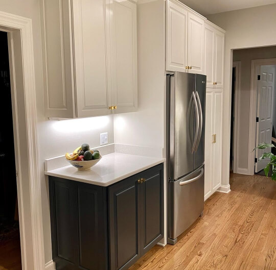
You can see that Creamy looks quite neutral in this kitchen, but not as crisp and bright as a true white would.


Finally for cabinets, we see Creamy on all of the perimeter cabinets in this kitchen that was also remodeled by The Finishing Room.

The island in this case is Sherwin Williams Iron Ore, but it actually looks a bit more like Peppercorn here.
Sherwin Williams Creamy on an Exterior
Like most colors, you should expect Creamy to read much lighter outside. It still doesn’t pop in the way that a true white would, but it can look quite white.
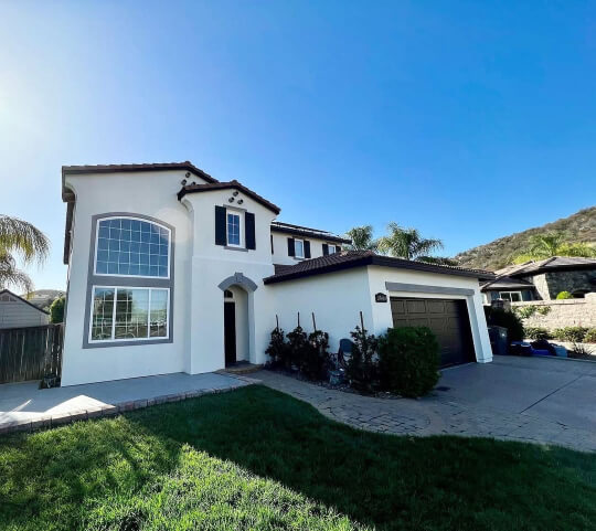
On this stucco number, Lorenzo and his team @lc.painting.llc used Creamy for the body of the home. Despite it looking quite brown in photos, the garage door and trim are actually Sherwin Williams Black Magic.
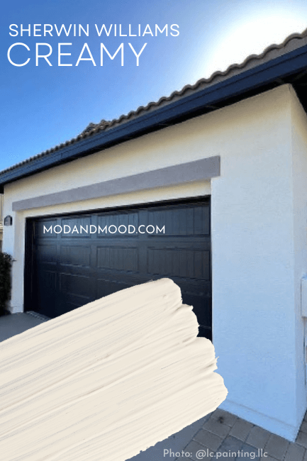
Personally, I still see the beige undertone here, but it is definitely subtle and very neutral looking. For some other great exterior options, you will love my post about Stunning White Paint Colors for Classic Brick Exteriors.
Sherwin Williams Creamy Compared to Other White and Off-White Paint Colors
I have no doubt that this off-white isn’t the only paint color you are considering, so here are some other fan favorites stacked up against Creamy! (Click to expand.)
Creamy and Sherwin Williams Dover White look incredibly similar on paper:
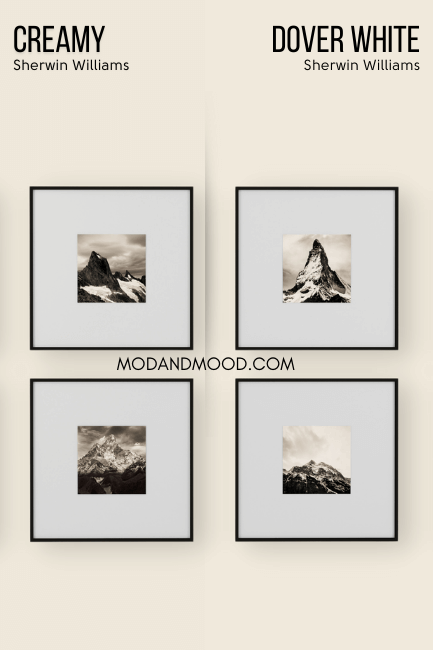
Dover White is a little lighter than Creamy, but the major difference between these two, is that Dover White isn’t very likely to look beige. They do have the same peach to yellow undertones, but Dover White is more overtly colorful than Creamy.
When we are talking about the beige undertones of Creamy, it can look quite similar to Sherwin Williams Greek Villa. However, Greek Villa is a true white and not an off-white.
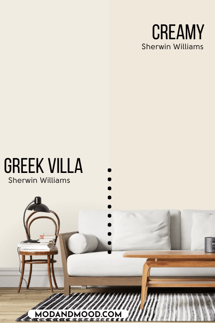
Although some people do report that they think Greek Villa looks yellow in their homes, I always see beige or maybe peach. On its own, Greek Villa can look like a totally true white with very limited undertones, but Creamy does not.
Shoji White is much more gray than Creamy, so although the underlying tone is similar, Shoji tends to stay much more neutral.
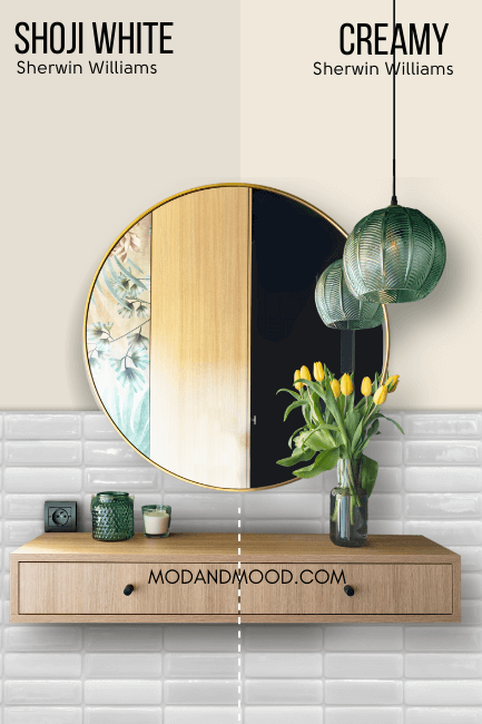
At their most beige, these two will look quite similar. Shoji White is also darker than Creamy, but because of that extra gray, it is actually easier to make Shoji read white.
Shoji White can lean peach, but not ever yellow.
Benjamin Moore Swiss Coffee is a true white, and not an off-white like Creamy. Therefore it is much more likely to look white.
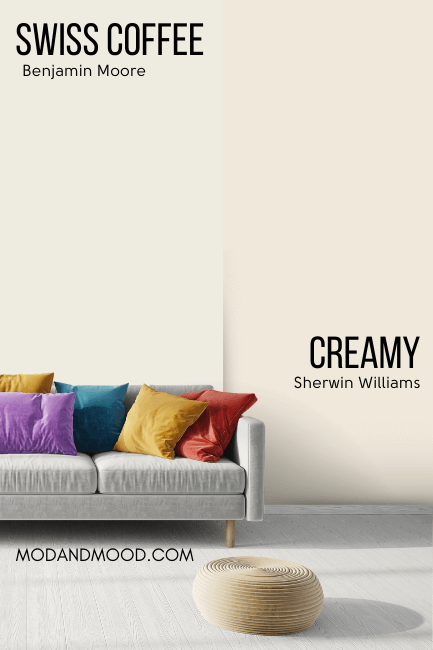
Swiss Coffee at its strongest, does look similar to Creamy because it has a creamy beige undertone. I do find that Swiss Coffee can also look a little yellow, or a little peach, but never as obviously as Creamy does.
Dupes for Sherwin Williams Creamy from Other Brands
Here are all of the best alternatives to Creamy from each of the major paint players:
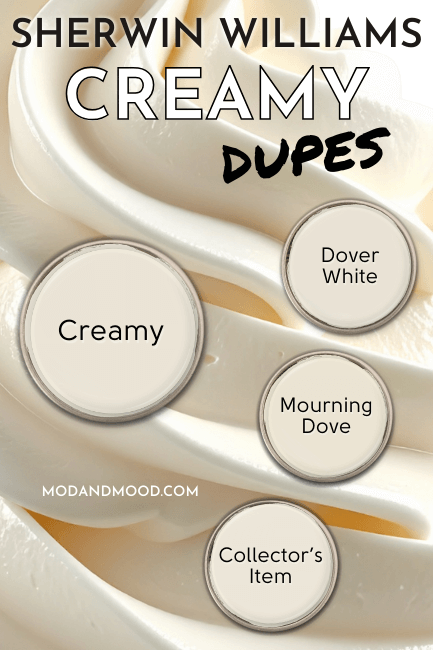
Creamy in Benjamin Moore
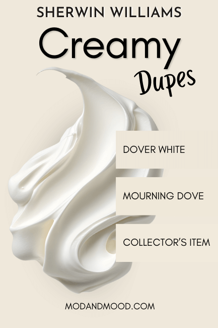
Benjamin Moore had a lot of pretty close alternatives to Creamy, but the best color match is their shade Collector’s Item:

Collector’s Item is just a little lighter and brighter than Creamy.
Creamy Equivalent in Valspar (Lowe’s)
Not to be confused with the Sherwin Williams version of Dover White, the Valspar version is my Lowe’s dupe for Creamy!
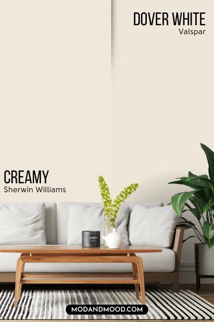
Valspar Dover White is just a whisper darker than Creamy.
Best Behr Color Match for Creamy (Home Depot)
The best dupe for Creamy at Home Depot, is Behr Mourning Dove.
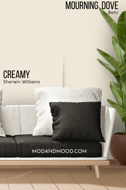
Mourning Dove is just a tiny bit more saturated than Creamy, but otherwise the color is the same.
Here is another look at each of the dupes!:
Thank you so much for reading until the end, that really helps my site! I hope this helped you decide if Creamy is the perfect creamy color for you!
Still not sure? Here are some other great options: