Boho is back baby! Will I be wearing a headband across my forehead again? Maybe not just yet, but if the situation calls for it…
Let’s take a look at an earthy neutral take on Boho, including specific paint colors that you can use to get the aesthetic.
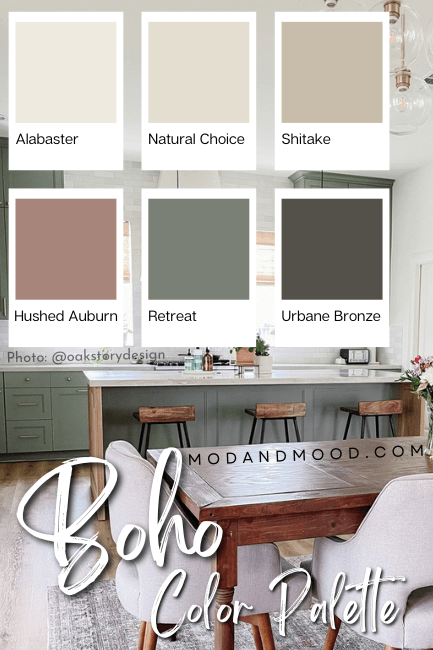
The Boho Interior Design Color Palette
When I was looking for a Boho inspired color palette, I didn’t find that the options were anything that I would consider to be the “Boho aesthetic.”
I was seeing rainbow-bright or pastel palettes that seem far from the easy-breezy Boho vibe that I picture. This is why I decided to put together my own!
Here are the Boho colors from this palette:
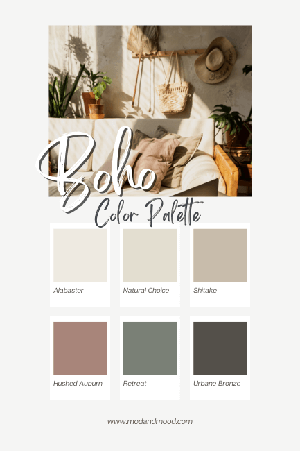
Sherwin Williams Alabaster
I’ll be honest, Alabaster isn’t my favorite white of all time, only because it is sooo popular. It is however the first white I think of when I think “Boho white,” so here we are!
Ashley (@ludic_living) used Alabaster flawlessly to bring the boho vibes to her retro home.

Alabaster is a creamy, still-white paint, with just enough gray to keep it from being yellow.
See more Alabaster here: Alabaster by Sherwin Williams a Classic White Review (and Dupes!)
Sherwin Williams Natural Choice
Natural Choice is an off-white paint color that reads “creamy natural.”
It’s giving Pampas. It’s giving hemp. It’s giving Boho!
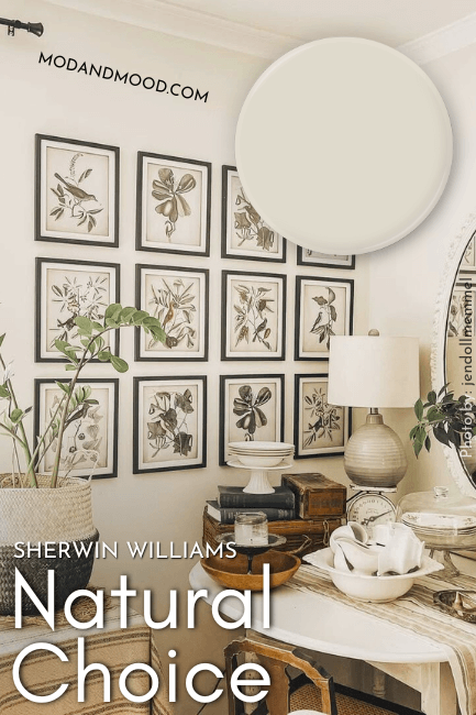
You might also like to know the difference between these two, and you can find out here: Sherwin Williams Natural Choice vs Alabaster (Which to Choose?)
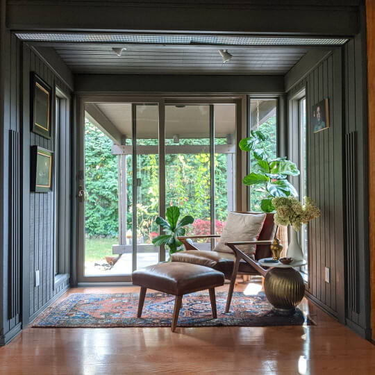
Sherwin Williams Shiitake
Shiitake isn’t an uber popular Sherwin Williams color, but it’s up there with the most versatile neutrals.

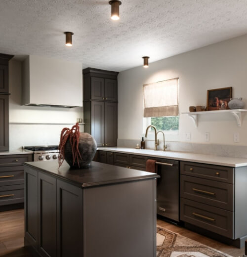
I personally love that Shiitake is natural and beige without being overly orange or yellow. It reads sandy-Boho baby! Here it is in combination with the earthy green of Sherwin Williams Cast Iron:

Sherwin Williams Hushed Auburn
I love a super warm color in any Boho color scheme. This can be any shade of terracotta, clay, or even berry. For this color palette I went with Sherwin Williams Hushed Auburn, which is the color on this nursery ceiling:
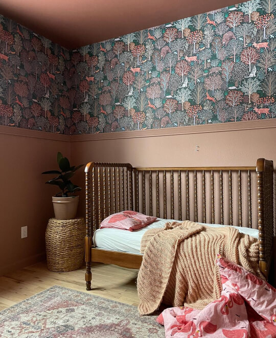
I kind of think of this as serving both color and earthy-neutral at the same time.
Sherwin Williams Retreat
I love all forms of sage and most greens when it comes to a Boho-inspired color palette for the same reason that I love clay. Greens give excellent pops of color while also being natural and neutral.

For this color palette I went with Sherwin Williams Retreat, which is one of my favorite versatile sages, but I’ll be honest and say that I love many green colors!

Retreat is like a perfect stereotypical sage color, and it’s probably the one I recommend the most. You should know that its undertones are on the cooler side, so you may want a different sage green if you are looking for something warm.
I’ll show you a few more favorite boho greens in just a minute.
Sherwin Williams Urbane Bronze
Urbane Bronze is a great dark brown with a whiff of charcoal. I like a deep earthy tone in a Boho color scheme to almost act like a black.
This would be great for trim, doors, or anything that you want to pop.

See more Urbane Bronze here: Urbane Bronze Review and Dupes (It Goes With Literally Everything!)
How to Put Together a Boho Color Scheme
The important part of any color scheme is that YOU like it. So that’s #1! My interpretation of “Boho” is light and airy, meets hippy. Basically, soft nature inspired colors.
To put together your own Boho color scheme, I recommend choosing a:
- White or Cream
- Neutral (Think straw or wood inspired)
- Darker earthy neutral (Like charcoal or deep brown)
- Green (Medium to dark green is best)
- Clay (Anything from terracotta to mauve)
Best Boho Inspired Paint Colors from Other Brands
Whether you can’t get to Sherwin Williams, you’re on a budget, or you just don’t like the colors, here are my fave alternatives from other brands.
(Plus a couple more from Sherwin Williams – because let’s face it, there are a LOT!)
Other Boho White Paints
Here are some other favorite whites that will look fabulous in your Boho-chic color scheme:
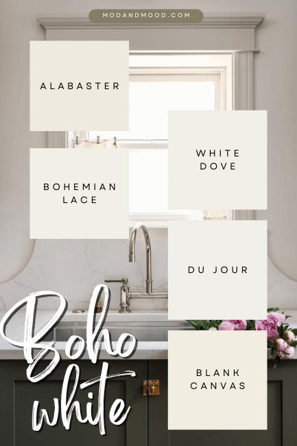
Benjamin Moore White Dove
White Dove is pretty similar to Alabaster, in that it is a still-white creamy color that has enough gray to stay neutral.
I would say that the undertone is a little more beige than Alabaster’s, but you can see a full comparison for yourself here: Alabaster vs White Dove (What’s the Right White?)
See more from White Dove in my post: White Dove by Benjamin Moore Complete Review (and Dupes!)
Valspar Du Jour
Du Jour is also a white that reads warm and soft, but still neutral.

Behr Blank Canvas
Blank Canvas was named the Behr Color of the Year for 2023. It is a creamy white that leans more gray-beige than yellow.

If you want to know more, check it out here: Behr 2023 Color of the Year Blank Canvas Review (Better Than Swiss Coffee?)
Honorable Mention: Sherwin Williams Bohemian Lace
I couldn’t resist including this lesser known white because it has Boho in the name!

This is one from the HGSW collection. It is a warm white that is honestly pretty similar to Alabaster, but a bit lighter.
Other Boho Creams and Off-Whites
If you aren’t going with a white-white, or you just want to use both white AND off-white or cream, here are some options!
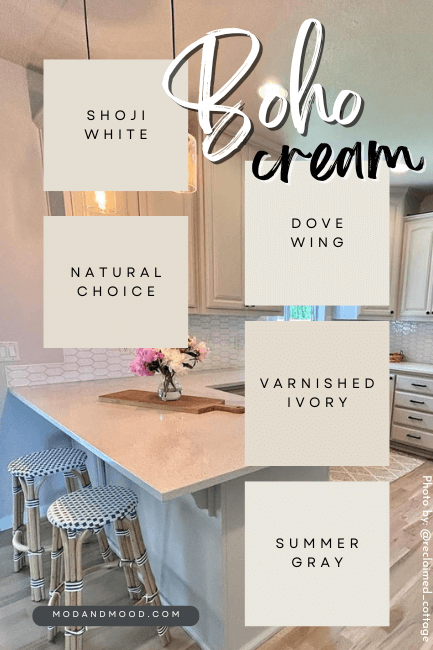
Benjamin Moore Dove Wing
Dove Wing is what you might call a “darker white.” It’s still super duper neutral but provides a bit more oomph and color than a true white.
See more here: Dove Wing by Benjamin Moore Review (See Real Homes and Dupes!)
Behr Varnished Ivory
Varnished Ivory is more of a traditional cream compared to these other off-whites. Think of it as being like the color of wheat.

Valspar Summer Gray
Summer Gray is cheating a little bit, because it is barely an off-white compared to these other ones.
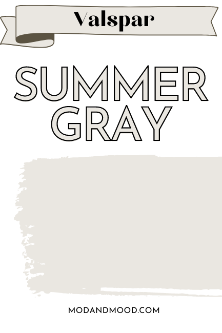
I wanted to include it because it’s a really popular Valspar neutral, and a nice greige off-white.
Honorable Mention: Sherwin Williams Shoji White
Shoji White gets an honorable mention, because it’s pretty darn similar to Natural Choice, but a favorite in its own right.

See more pictures in my post: Sherwin Williams Shoji White Review and Alternatives (It’s not greige!)
Other Boho Neutrals
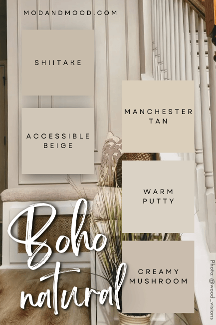
Benjamin Moore Manchester Tan
Manchester Tan is a slightly warmer neutral option if you are totally over grays and greige.

This one typically has a sunny sand undertone, and not straight up beige.
Read more on this color here: Benjamin Moore Manchester Tan (Review and Dupes of The Cheeriest Beige!)
Behr Creamy Mushroom
Creamy Mushroom is a taupey neutral that is the perfect option if you aren’t the biggest fan of beige. This one reads more mushroom, as the name suggests.
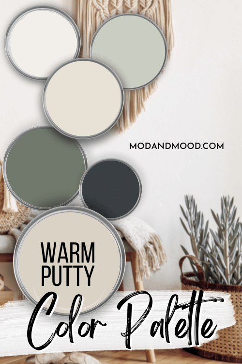
Valspar Warm Putty
Despite the name, Warm Putty is not all that warm and more akin to a greige. Still a great natural tone to pair with other Boho colors.
Sherwin Williams Accessible Beige
Accessible Beige gets an honorable mention because it’s one of Sherwin Williams most popular neutrals EVERRR. That comes with pros and cons:
Pro – It really is gorgeous and versatile.
Con – Everybody else thinks so too!

This color slides so perfectly into a Boho color scheme that I really couldn’t skip it!
See more from this color here: The Ultimate Sherwin Williams Accessible Beige Review (Plus Dupes!)
Other Boho Inspired Warm Colors

Benjamin Moore Barberry
Barberry is an earthy mauve color that is perfect if you don’t love orange or red-toned colors. It’s super pretty, and still a color that could be found in nature.
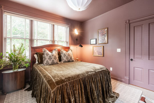
I love this one! Unfortunately, it’s a little too specific to suggest all the time, but for boho it works!
Behr Tandoori
I talked a little about both Tandoori and Valspar’s Copper Patina in my post The Best Terracotta Colors to Paint Your Walls. If you need a bold pop of color in your neutral Boho color scheme, terracotta is a great option. It’s bright but still classic in many ways.

I love Tandoori because it’s a really vibrant terracotta, but it certainly isn’t for the faint of heart.
Valspar Copper Patina
Copper Patina is a more flexible alternative to something like Tandoori, but bolder than the Sherwin Williams options.

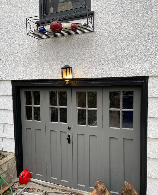
It’s a very “accurate” terracotta color and it looks great in any Boho chic space, particularly with a lot of plants. You can just peep it on the lower half of this boho nursery, and by the door:
Sherwin Williams Redend Point
Redend Point gets an honorable mention because it is a super versatile clay color AND a former Color of the Year.

I actually would have chosen it for the main list, but Hushed Auburn has a special place in my heart.
Find out more here: Redend Point: Sherwin Williams Rosy Tan (Review & Dupes!)
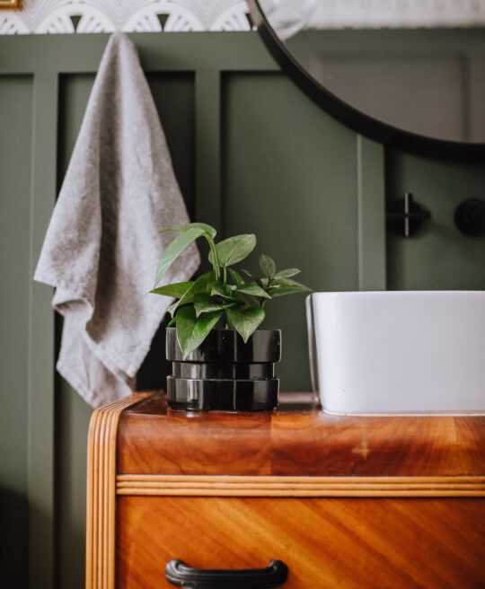
Other Boho Greens
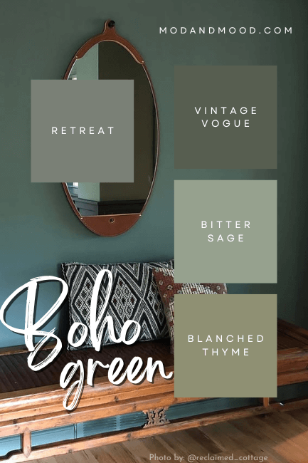
(The color on the wall in the graphic is close to Pewter Green or Succulent.)
Benjamin Moore Vintage Vogue
Vintage Vogue was actually my first choice for the main Boho green in my color palette, but at the last minute I decided to use all Sherwin Williams colors for the sake of simplicity.
Vintage Vogue goes with any and all neutral-Boho paint colors, and it provides a freshness and moodiness that your color scheme will LOVE.

The other wall color here is Sherwin Williams Worldly Gray. See lots more of this green here: Benjamin Moore Vintage Vogue Review (Plus Dupes!)
Behr Bitter Sage
Bitter Sage is a great sage option from Behr. It’s a great one for looking exactly how you would expect. This one is a little bit less “natural” looking, but a super pretty color that still coordinates well with other Boho colors.

(If anyone knows the credit for this photo please let me know. I found several sources on facebook but not the original.)
Valspar Blanched Thyme
Blanched Thyme is a bit of a brighter and warmer sage. It’s nice option if you are finding that your color scheme is too muted for your taste.

Here is a pretty close example, using Benjamin Moore Dry Sage:

If greens are totally not your thing, a blue-gray would also work well in a Boho color palette. Take a look at Sherwin Williams Cyberspace for one option.

Other Dark & Earthy Boho Colors
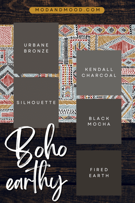
Benjamin Moore Silhouette
I had to add Silhouette to this post, because it was named Benjamin Moore’s color of the year for 2026, and it fits in perfectly!
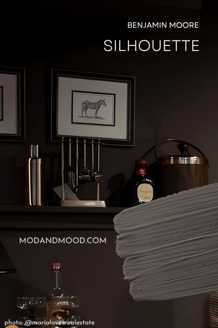
This deep brown still has a healthy dose of gray to keep it more neutral, but it has a beautiful undertone that ranges from saddle brown to berry.
You can also see this beautiful brown in my post about color drenching.
Benjamin Moore Kendall Charcoal
Kendall Charcoal is a super popular charcoal brown by Benjamin Moore. It’s a deep warm gray. This is a great option for an earthy, but not too “brown” shade.
Behr Black Mocha
Black Mocha is pretty similar to Urbane Bronze. It’s reminiscent of deep brown soil.
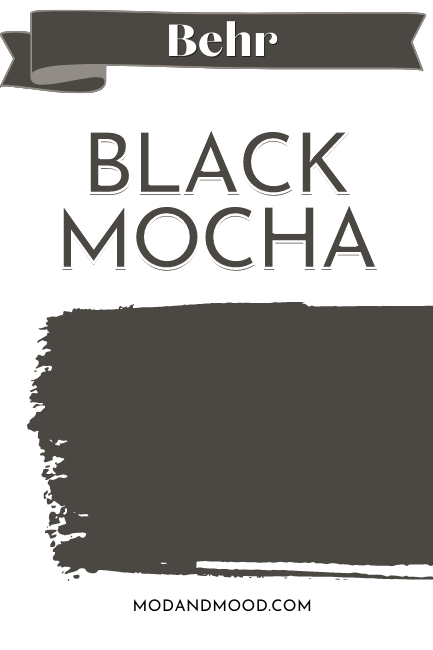
This one is super sophisticated!
Valspar Fired Earth
Fired Earth can be confused with being an actual black paint color, but in good light you can clearly see the brown. This is a good one if you were thinking about black but wanted something softer and a bit more Boho.

Completing Your Boho Color Scheme
Here are all of the colors that we talked about today:

Holy moly, I did not plan on having that many.
I love a good Boho color scheme and I hope you found some ideas here that are more in line with what you were picturing too!
Here are some more colors that you might like:


