I really thought that creamy whites could be on their way out, but it turns out that was just the beginning! Sure, Benjamin Moore and Sherwin Williams are well known, but Valspar has created the latest cult favorite: Cream in my Coffee.
And no, it’s not new, but it is definitely having a moment.

What Color is Valspar Cream in my Coffee (3003-10C)
Cream in my Coffee by Valspar is a creamy farmhouse white. It is a very popular “white” for this year, but it is definitely cream, and nowhere near a true white. On the color wheel, Cream in my Coffee is in the orange color family.
I have already written posts about Greek Villa, and White Flour if you like the look of them!
Valspar Cream in my Coffee Undertones
Cream in my Coffee has warm beige undertones, and does not often pull yellow, but it can.

Cream in my coffee is definitely a warm to neutral white, and not the least bit cool.
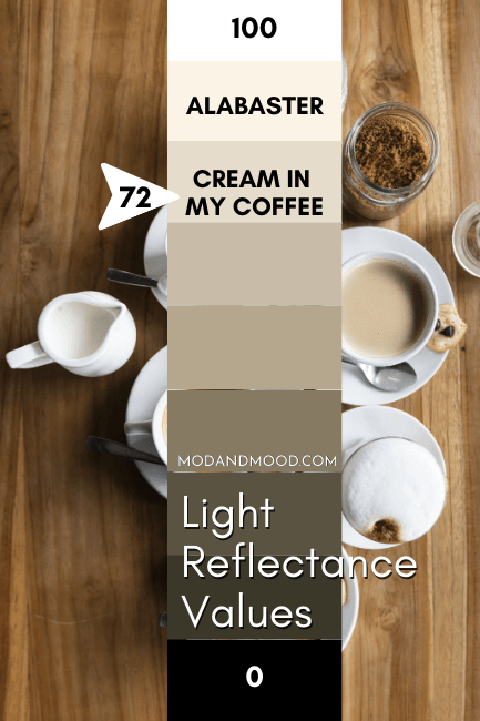
LRV of Cream in my Coffee
The LRV (Light Reflectance Value) of a color indicates on a scale of 0 – 100 how much light a color reflects (or doesn’t reflect). True black has an LRV of 0 and pure white has an LRV of 100.
In the paint world, we are working in a range of about 3 – 93 because no paint color is purely black or completely white.
White paint colors usually range from 82 and up.
Cream in my Coffee has a Light Reflective Value (LRV) of 72.3. So it reflects a good amount of light, but it’s definitely an off-white.
Valspar Cream in my Coffee Color Strip
Valspar places Cream in my Coffee as the lightest color on this color strip:
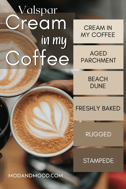
The other shades are:
- Aged Parchment
- Beach Dune
- Freshly Baked
- Rugged
- Stampede
Cream in My Coffee on Walls
I wasn’t able to find many pictures of Cream in my Coffee, so if you have any, feel free to DM me on Instagram! @modnmood
These next two pictures really show how Cream in my Coffee can look in different lighting.

In the first picture of the bedroom, Cream in my Coffee looks like a beige white.
In this second picture, looking around the window area in particular, Cream in my Coffee looks a lot more yellow.

Cream in my Coffee Living Room & Bath
In artificial light in this living room, Cream in my Coffee looks quite neutral:

Same here in the bathroom:
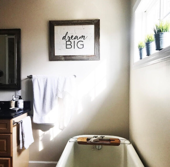
That’s why I would say that Cream in my Coffee usually looks beige, but if you really hate yellow, you should sample every corner of your room!
Cream in my Coffee Coordinating Color Palette
Here are a few colors that make the perfect “modern farmhouse” color palette with Cream in my Coffee.

Benjamin Moore Crystalline
Crystalline reads like a soft blue-green, but it’s actually a gray green and not blue at all. It’s a complicated subtle color that manages to be pale, but without looking baby pastel.

Crystalline has an antique feel that I love!
Benjamin Moore Simply White
I had to toss in a white that was closer to white, for those areas of your house that you want to keep as bright as possible.

Simply White is a warm white that is similar to Cream in my Coffee, but quite a bit lighter.
Benjamin Moore Gray Owl
Gray Owl by Benjamin Moore is a favorite neutral that is right up there with the famous Revere Pewter.

It’s a light gray with just a hint of a green undertone. This whiff of warmth works well with Cream in my Coffee and other cozy farmhouse colors.
Sherwin Williams Clean Slate
Clean Slate is a very pale gray with just a hint of blue. It has an antique feel to me, like Crystalline does, and it’s a welcome cooler neutral in a palette of warmth.


Sherwin Williams North Star
No farmhouse palette would be complete without a dusty blue of some kind! North Star is a Victorian-inspired pale blue that is super subtle.

Benjamin Moore Backwoods
Backwoods is one of my favorite colors right now!

Farmhouse palettes are usually dominated by blues, but I have seen so many beautiful green kitchens in this warm shade, and I really think it’s time for a change! Backwoods works really REALLY well with warm whites and beiges.
Benjamin Moore Blue Note
Blue Note is a dark navy that leans just a little gray. I don’t particularly love a true navy with creamy colors, and I think Blue Note strikes a good balance of blue, but not too blue.

Sherwin Williams Tricorn Black
I am loving the cream and black trend right now! Who doesn’t love a strong contrast? Tricorn Black is the blackest black that Sherwin Williams makes, and is a favorite for exterior trim and doors.

Cream in my Coffee vs Swiss Coffee
Because the names are similar, and because I already knew that Benjamin Moore Swiss Coffee was also a creamy white, I expected the two colors to be pretty similar. They are actually not at all!

Swiss Coffee is considerably lighter than Cream in my Coffee, and when it picks up a color it usually reads yellow. Cream in my Coffee tends to go beige, which I personally prefer.
Bear in mind that this might not be the Swiss Coffee that you’re thinking of, it’s just the most popular. There are actually several brands who carry Swiss Coffee Paint Colors.
Cream in my Coffee Dupes
No color profile would be complete without some dupes and doubles from other brands!
Let’s check out some alternatives to Cream in my Coffee from the other big names:

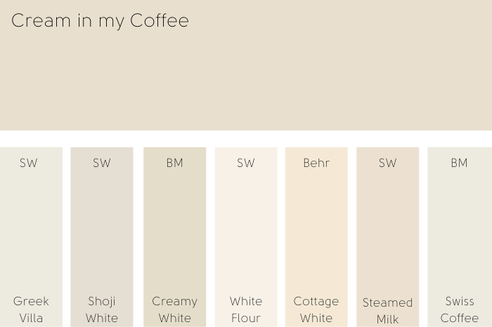
Cream in my Coffee Sherwin Williams Version
Sherwin Williams has a great range of creamy whites, and I found two that are really similar to Cream in my Coffee. Shoji White, and
Cream in my Coffee vs Sherwin Williams Shoji White (SW 7042)
Shoji White by Sherwin Williams is also a creamy white from the orange family.
Shoji White has an LRV of 74, so it will read a tiny bit lighter than Cream in my Coffee. It is also slightly more gray.

Side by side you can kind of see both of those differences, but all-in-all these colors are very similar! The big difference is in real life. I don’t think I have ever seen Shoji white look yellow, but once in a while Cream in my Coffee does.
Cream in my Coffee vs Sherwin Williams Steamed Milk SW 7554
Steamed Milk is another orange-white that reads like a very pale beige.
It has an LRV of 76, so it is lighter than both Cream in my Coffee and Shoji White. It is also more saturated than both, so it will look warmer, and more beige than gray.
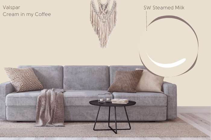
Again these colors are very similar, so it’s really up to your personal preference. I feel like Cream in my Coffee is perhaps a tiny bit more yellow than Steamed Milk, so if you are worried about your color choice looking pink in the slightest, then go with Valspar.
Cream in my Coffee Benjamin Moore Version
Now that we know Swiss Coffee is actually not the Benjamin Moore version of Cream in my Coffee, let’s look at a color that is: Creamy White.
Cream in my Coffee vs Benjamin Moore Creamy White
Full disclosure: I discovered Creamy White when I was looking for creamy whites by Benjamin Moore. A color of exactly that description? Yes please!
You already know what I’m going to say! Creamy White is an off-white from the orange family.
So how do these two compare?
Creamy White has an LRV of 72.3, which is exactly the same as Cream in my Coffee.
Now I think these two colors in real life are almost identical. You need to be careful with Creamy White if you are getting it color matched by a brand other than Benjamin Moore. The hex codes I could find online don’t seem quite right. I wish that Benjamin Moore gave them out!
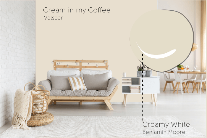
The hex code I first found was #E4DAC7 which looks like the right color, but that same site listed the LRV as 70, which of course is not right because Benjamin Moore themselves say 72.3.
The other hex code I could find is the one in the picture, which is #E4DDC9, that color has the same LRV but the tone is a little more yellow.
Basically, if you want an accurate version of Creamy White, go to Benjamin Moore.
Cream in my Coffee in Behr Paint
Last but not least, everybody loves a Home Depot option!
(Okay, except maybe me, not a big fan of Behr paint, but the colors are fine.)
Behr’s Cottage White is another pretty good dupe for Valspar’s Cream in my Coffee. It is another pale shade of “orange.”
Cream in my Coffee vs Behr Cottage White
I thought from looking at the two, that Cottage White was going to be more yellow than Cream in my Coffee, but it’s actually more red!
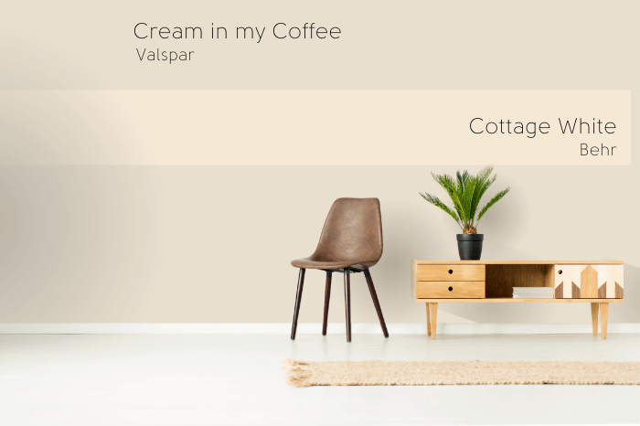
Cottage White is also lighter than I expected, and has the highest LRV of the bunch at 82.
Just based on that factor, Cottage White is more of a true white than the definite cream of Cream in my Coffee.
Side by side, Cream in my Coffee looks a bit more gray in comparison to cottage white, which is a more saturated color.


Cream in my Coffee Final Thoughts
I hope this helped you make a decision about Cream in my Coffee! If it’s not the one, you might like Sherwin Williams Oyster White.
Plus, I have a whole world of other whites to explore:


