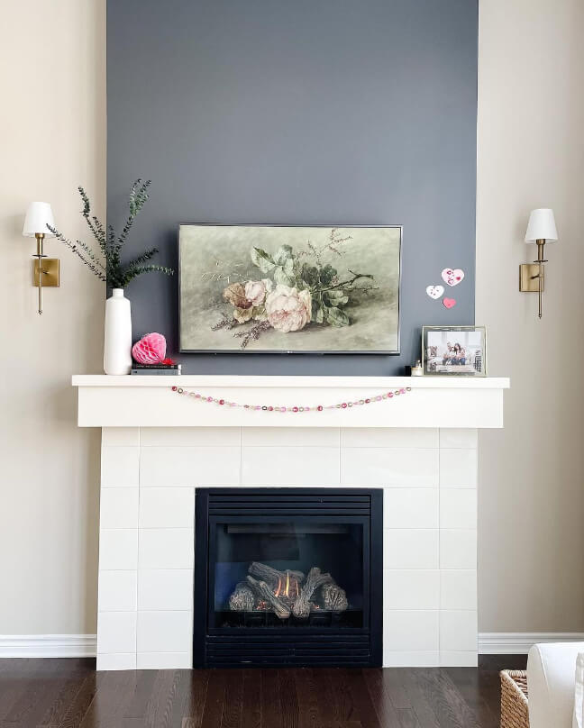
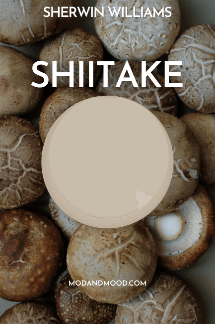
Sherwin Williams Softer Tan is a beige paint color with very warm undertones. This soft neutral could be the backbone of your color scheme, but it needs to be paired thoughtfully.
Here we will see lots of suggestions for colors that actually work with Softer Tan!

Really quickly before we dive in:
What Are the Undertones of Sherwin Williams Softer Tan?
Softer Tan has very warm peachy undertones. While it is classified as a neutral, the undertone can be a bit tricky to work with. Stay away from greiges or cool Grays with this one!

Sherwin Williams themselves say:
Undertones of wheat and a tinge of green lend a soft warm body to this neutral that makes it stand out. Encourage a sense of well-being in your space.
I don’t personally see the “tinge of green” at all. It isn’t a super popular color, so I’m not going to say it’s impossible, but I haven’t seen it.
At it’s coolest, Softer Tan looks almost like a greige with a slight peach undertone, and at it’s warmest it’s a very sunny beige.
Sherwin Williams Softer Tan in a Cool Toned Color Palette
Softer Tan is an interesting color because you can either go all-in with a very warm color palette, or complement it against cooler blue-leaning colors.
I decided to try a bit of both!
First is this cool-toned color palette:

Complementary Color for Softer Tan
The “official” complementary color for any given shade is whatever sits directly across the color wheel. For Softer Tan, this is a saturated dusty blue that leans purple.

Sherwin Williams Breathtaking is a close match. In this color palette I chose a few complementary cool colors that are more subtle:
Try Softer Tan with Charcoal Blue

Sherwin Williams Charcoal Blue is a dark gray-navy that works very well with the warm tones of Softer Tan. Navy or charcoal is a nice choice because it reads bold, but is actually pretty neutral.
Pair Peppercorn with Softer Tan
Peppercorn is one of Sherwin Williams most popular gray paint colors. Technically it is a “perfect” gray on paper, but in reality it often has a blue-ish undertone.

Because blue is complementary to Softer Tan, you should definitely expect Peppercorn to look a little bit blue if you use these two together.
Here is an example of Peppercorn with the slightly cooler color Accessible Beige:

Use Softer Tan with Sherwin Williams Misty
Misty is like a slightly toned down version of the complementary color for Softer Tan.

SW Misty is actually a dupe for Behr Light French Gray:

You can see how the natural tones in this decor work really well with this dusty blue. Softer Tan will do something similar.
You might also like the 2024 Color of the Year: Upward.
Coordinating White Paint Color for Softer Tan
When it comes to using a white paint color with softer tan, this is the one area where I would not go cool-toned.

Stick to warm whites like Sherwin Williams Alabaster or Dover White to make sure that the contrast with Softer Tan isn’t too harsh.
I also have plenty of warm white options on my White Paint Colors page.
Sherwin Williams Softer Tan in a Warm Toned Color Palette
Switching gears, here is my warm toned color palette for SW Softer Tan:

Neutral Paint Color to Use with Softer Tan
When using other neutrals like beige and brown with Softer Tan, make sure that they also have warmer undertones.
Sherwin Williams Antler Velvet is a nice coordinating neutral that has a similar undertone to Softer Tan:

For something darker, try Sherwin Williams Smokehouse for a saturated coffee brown:

You might also like Sherwin Williams Urbane Bronze – although it may be a touch too cool for Softer Tan.
Try Softer Tan with Sherwin Williams Moroccan Spice
For something warm, neutral, and unexpected, Moroccan Spice pairs beautifully with Softer Tan.

To be honest, there are probably a lot of terracotta colors that will work Softer Tan. Bear in mind that anything very orange will make Softer Tan look more gray.
You might also like Cavern Clay.
Sherwin Williams Recommends These Coordinating Colors
Sherwin Williams kept everything incredibly neutral with their coordinating color suggestions for Softer Tan:

Pair Softer Tan and Creamy
For a coordinating “white” Sherwin Williams recommends the off-white Creamy.

You might also like one of these other cream paint colors, or Valspar Cream in my Coffee.
Another off-white recommendation from Sherwin Williams is Moderate White:

You might also like the similar color Sherwin Williams Casa Blanca, although I can’t really see ever using Moderate White with Softer Tan in the first place. This combo isn’t my cup of tea. These colors are too similar for me, and the undertone is just a little off.
Softer Tan with Prairie Grass
The final color that Sherwin Williams recommends is Prairie Grass:

Prairie Grass is a beige with a slightly green undertone. Personally I would recommend a sage green like Benjamin Moore Vintage Vogue or the dark green of Sherwin Williams Ripe Olive with Softer Tan.
If you like the look of Prairie Grass, you might also like the warm and muted green of Sherwin Williams Svelte Sage or Benjamin Moore Dry Sage.
What is the Difference Between Softer Tan and Other Popular Tan and Beige Colors?
Here are a few other colors that you might be considering alongside Softer Tan:
Softer Tan vs Benjamin Moore Manchester Tan
Manchester Tan is pretty similar to Softer Tan, but it leans more yellow than Orange.

Curious about this sunny beige? Here are coordinating colors for Manchester Tan.
Softer Tan vs Accessible Beige
Accessible Beige is probably Sherwin Williams most popular beige color, but it is well earned! Unlike Softer Tan, this color coordinates well with almost anything:

Accessible Beige is more of a greige, where Softer Tan is a very warm beige with no real gray at all.
Softer Tan vs Kilim Beige
Kilim Beige is pretty similar to Softer Tan, it is just a little bit warmer and a little bit darker.

I hope this helps you choose coordinating colors to use in your Softer Tan color scheme, or helped you decide if it’s the right tan/beige for you.
Not sure? Here are some other colors you might like:


