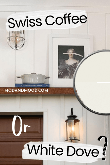
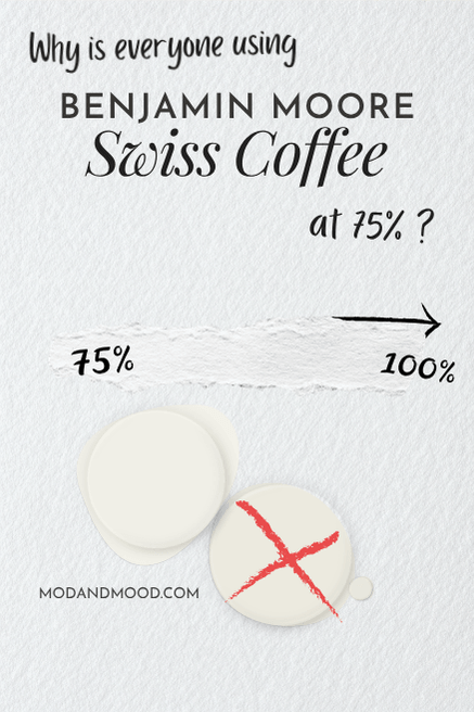
Benjamin Moore Swiss Coffee is the only color I know of where people use it mixed at a different strength MORE than they use it standard! Don’t get me wrong, this color is popular either way, but 75% strength in particular is the mix of choice.
Here we will see Benjamin Moore Swiss Coffee at 75% strength in real homes, and see if we can understand the hype. I will also tell you how to get the look at Sherwin Williams!
What Does Swiss Coffee at 75% Mean?
I just want to clarify that we are talking about Benjamin Moore Swiss Coffee mixed at 75% strength aka lightened by 25%. Sometimes people find that term confusing and they think lightened by 75%, but we are talking about Swiss Coffee, but just a hair…less of it.
In this post I will be talking about Benjamin Moore’s version of Swiss Coffee, which is not the same as the Behr version or the Valspar version. (There are actually a lot of paint colors with this name, and I have compared them all here.)
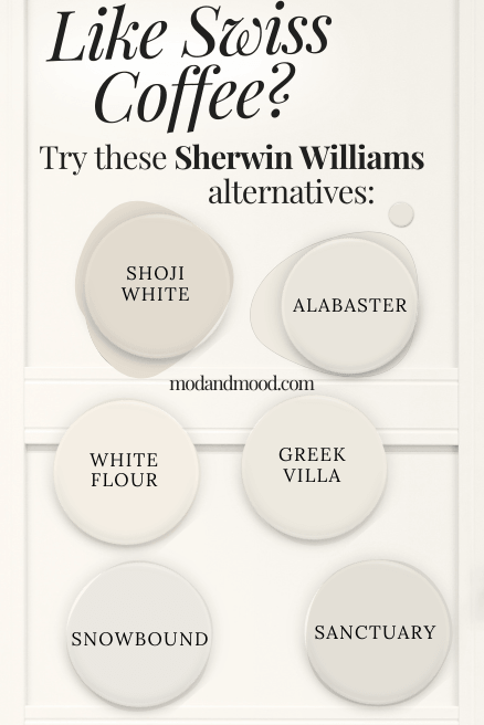
You also should not get Benjamin Moore Swiss Coffee mixed into Sherwin Williams paint at any strength. There are a lot of very sad homeowners who have learned that it just doesn’t look the same. I will show you a Sherwin Williams alternative at the end!
How Does Benjamin Moore Swiss Coffee Look at 75%
I wasn’t lying when I said that people use Swiss Coffee at 3/4 strength more than they use it at full strength! I have quite a few examples of 75% and only a few for 100%. Today, that is helpful!
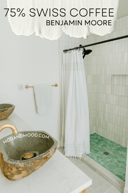
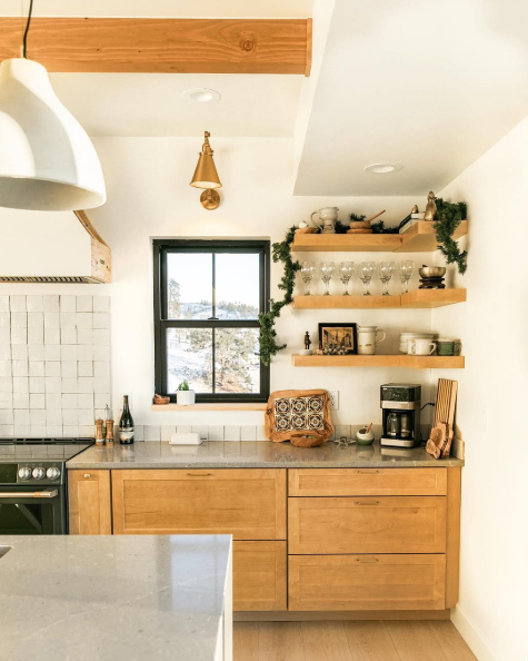
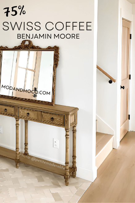
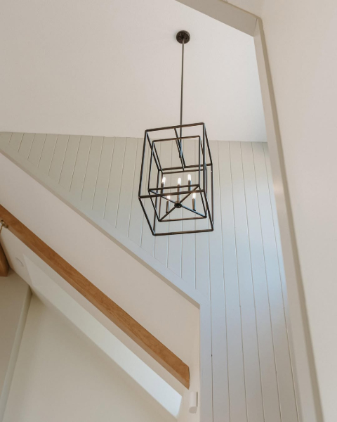
First up, Karisa of @petitemodernlife used Swiss Coffee at 75% for her whole home.
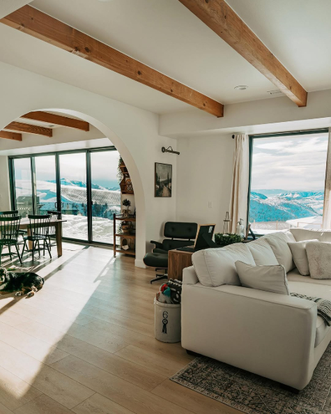
You can see that the color looks like a true white, but with just a little warmth. In the bathroom you can peep the undertone a little better against the gray-white shower tile:
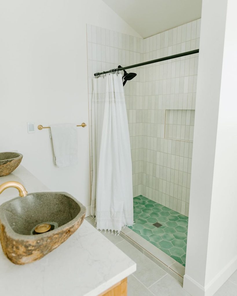
Swiss Coffee is a creamy white paint color, and in my opinion, it does have a yellow undertone. This doesn’t mean that it looks yellow necessarily, but you can see how it is more yellow than the tile.
Where other creamy paint colors have peach, pink, or even green undertones, Swiss Coffee’s does tend to be yellow. I hate even saying that, because a lot of people want to run away screaming from the mere mention of yellow, but most will be none the wiser when they see the color in real life.
You should know that Swiss Coffee is technically a true white color, so at 75% it is even more white. This is a great soft white, but I would not choose Swiss Coffee at 3/4 strength expecting it to look overtly creamy, and definitely not off-white.
Here it is looking white white:
…and here it is in warm sunny light:
Moving over to Laura’s home (@la_chaffin), we see something really helpful, which is Swiss Coffee walls at 75% and kitchen cabinets at full strenth!

The range hood is Sherwin Williams Iron Ore. We see more of the 75% Swiss Coffee and Iron Ore combo in the living room, where it looks more white:
Now let’s get the rest of my annoying hot takes on Swiss Coffee’s undertones out of the way!
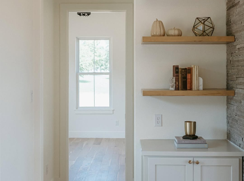
I do find that this color at any strength can sometimes look a bit green, gray, or a combo of both. We see that here in this dining room photo:

Now I am particularly sensitive to green. I feel like I can always see it if it’s there, but this isn’t exactly an uncommon look for Swiss Coffee either. Most white paint colors are susceptible to green shadows from outside, because they are just sooo reflective. So bear that in mind!
Let’s finish up with a beautiful classic 3/4 Swiss Coffee look!
This is the color that you should expect most of the time with this strength of Swiss Coffee.
It really is impossible to prevent all undertones. It is, what it is, with white paint colors. They are all going to change at least a little bit from room to room and in different lights and orientations. (At least they aren’t as bad as gray for that!)
Why Are Designers and Homeowners Choosing to Use Swiss Coffee at 75%?
So now to answer the question, why 75%? And why always with Swiss Coffee?
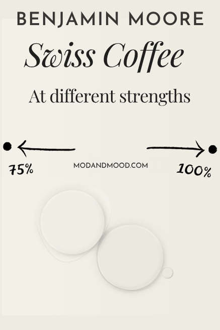
As to why 75%, we have to take a look at Swiss Coffee at full strength. Since it is essentially the very same color cranked up a touch, there will be a LOT of overlap (obviously).
Swiss Coffee at 100% can still look very white. It has an LRV of 82, so it is right on that line of white and off white paint colors.
The LRV (Light Reflectance Value) of a color indicates on a scale of 0 – 100 how much light a color reflects (or doesn’t reflect). True black has an LRV of 0 and pure white has an LRV of 100.
In the paint world, we are working in a range of about 3 – 93 because no paint color is purely black or completely white.
Based on the color codes, I guesstimate 75% Swiss Coffee to have an LRV of around 86.
Here it is looking pretty white, and basically the same as it does at 75% strength.
This is about as white as it gets for Swiss Coffee at full strength, but it is a little bit softer than the lightest and brightest look at 75%.
Here is a look at Swiss Coffee at full strength with a strong undertone:
This is a great example because it is still natural light and the rest of the colors look accurate. This is essentially the “why” for 75%. More white, and less risk of yellow.
This next picture is one of my favorites for Swiss Coffee’s undertone, because you can see very little of it at the bottom of the wall, and it gets stronger in different light and shadow.

The trim here is Benjamin Moore Simply White.
Now for the other “why.” Why is it always Swiss Coffee at 75% and not other whites?
For no reason whatsoever. I did some digging and the only reason people use Swiss Coffee at 75% is to tone it down a bit. By that logic, you could do the same for any color, but it does seem to always be Swiss Coffee.
I truly think that a few people did it and then it caught on. It doesn’t seem to be a “hack” that needs to be used on Swiss Coffee.
I don’t personally recommend tinting colors lighter in general. I would rather pick a color that I actually like than rely on the gamble of a different mix. With Swiss Coffee it is a pretty safe bet however, because we have a really good idea of how it looks!
So what happens when your painter or builder only uses Sherwin Williams? Definitely do not ask them to tint the paint at 50% Swiss Coffee! They have 101 variants of Swiss Coffee in their system, and I regularly see people complaining that it doesn’t look right.
Sherwin Williams doesn’t have as many light white options as Benjamin Moore does but Westhighland White is a good alternative to 75% Swiss Coffee.
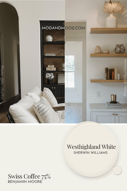
The LRV of these colors are pretty much identical, but the undertone is a sliiightly different. I do find that they look pretty similar in real life. Here is Westhighland White with Accessible Beige trim and paneling.
Had you told me that this was Swiss Coffee at 75%, I would have believed you!
That’s all for this one! Thank you so much for reading until the end, that really helps my blog!
Not ready to commit? Let me help you delay!