
Sherwin Williams has named Celery as their “Color of the Year” for 2027! This announcement comes third after Valspar Cottage Door, and Behr Grounded.
This light green is a more “specific” choice than they typically go for, but is it any better than last year’s pick Universal Khaki? (Spoiler alert: I wasn’t a fan.)
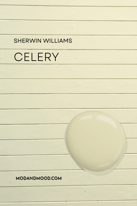
Here we will talk about what Celery actually looks like, see it in a color palette, and get you some dupes from other brands!
What Color is Sherwin Williams Celery?
Celery is pretty much what it sounds like. It is a light celery green color. I would describe it as a very light apple green, or like a subdued acid green.
Here is an example using Magnolia Summer Hay, but I have adjusted the color to look like Celery:

Celery is pretty on trend since it is a warmer green color, but I do think this falls sort of in the pastel category, which is just a bit more challenging to work with.
Celery is NOT a sage green. People loooove to be using AI to render color inspiration, but it is very inaccurate when it comes to the nuance of specific colors. I have already seen people sharing “Celery” where it is very much not Celery.
Can’t blame anyone for trying, because very few people have used real-deal Celery in their homes. However, I was able to find this post:
As well as this somewhat filtered example from quite a long time ago:
Light Reflectance Value (LRV) of Celery
The LRV of Celery is 71.
What does this mean?
The LRV (Light Reflectance Value) of a color indicates on a scale of 0 – 100 how much light a color reflects (or doesn’t reflect). True black has an LRV of 0 and pure white has an LRV of 100.
In the paint world, we are working in a range of about 3 – 93 because no paint color is purely black or completely white.
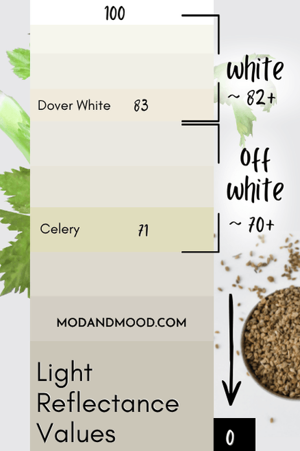
At 71, Celery is technically light enough to be an off-white. It is pretty pigmented though, so it isn’t ever going to look white. It is definitely a pastel green though.
What Are the Undertones of Sherwin Williams Celery?
Celery has pretty strong yellow undertones. So much so, that this color is pretty close to an equal mix of green and yellow. It is sort of like a butter-meets-wasabi situation.
At its warmest, you should expect Celery to look almost completely yellow. At its coolest, Celery can look almost minty. (It’s still just a little too yellow.)
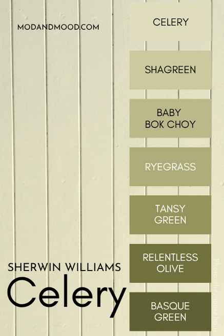
Celery in the Sherwin Williams Color Strip
Here is the whole collection from Sherwin Williams where we find Celery:
Sherwin Williams Celery in a Color Palette
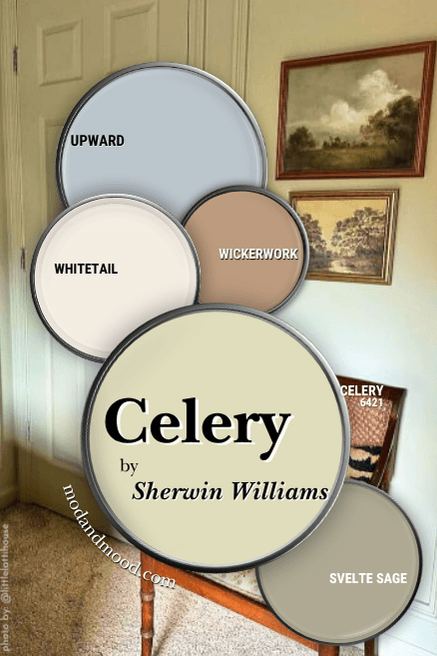
I have two color palettes for Celery: Mine and the official Sherwin Williams version.
Initially I was going to leave it at whatever colors the pros recommended…but I just didn’t like it, so maybe let’s head there first!
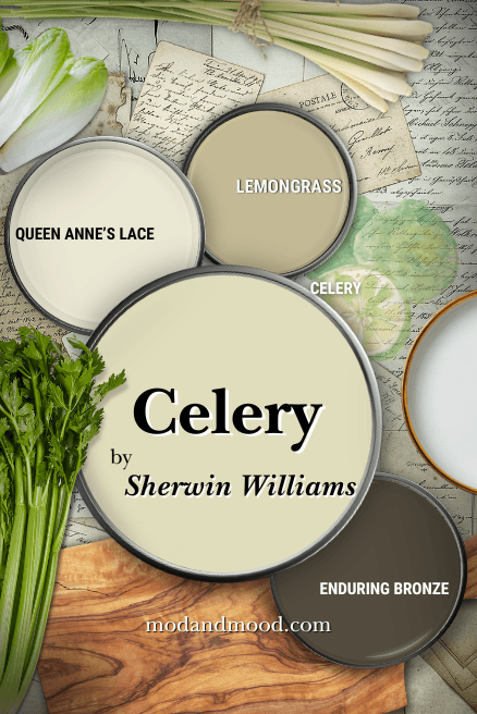
I said I didn’t like it, but I still tried to make it look good!
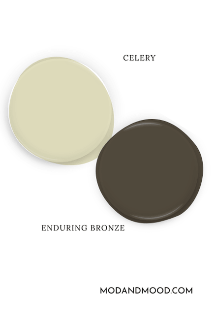
Pair Celery with Enduring Bronze
This combo I like, and I think it works well. Sherwin Williams Enduring Bronze (not to be confused with the more famous Urbane Bronze) is a moody brown with an earthy green undertone.
Use Celery with Similar Lighter and Darker Shades
At least that’s what Sherwin Williams recommends you do! Both the “white” that they have in their color palette, and the coordinating green are pretty similar to Celery.
Sherwin Williams Queen Anne’s Lace is light enough that it is technically right on the line of white and off-white, but it is just too pigmented to ever look white. This color is more cream-forward, but it can have a slight green undertone.
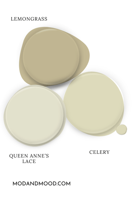
Sherwin Williams Lemongrass is similar to a darker version of Celery, but it is much more muted. I don’t really have a problem with this pairing, so much as I don’t love the color.
I did something similar with my coordinating color palette for Celery, but I picked a shade I like better. Let’s check it out, shall we?
Try Celery with Sherwin Williams Svelte Sage
Celery makes Svelte Sage look almost gray in comparison, but it’s really not.
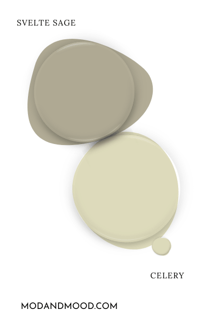
This calm sage color is also a very warm green. Personally, I like it as a more palatable darker “version” of Celery.

Coordinating White Paint Color for Celery
This is one scenario in which a yellow-based white fits the bill! I opted for the creamy but versatile shade Sherwin Williams Whitetail.
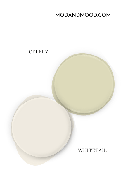
Whitetail is still a true white paint color, so it works for trim, doors, and all the rest, but it does have a warm beige to yellow-leaning undertone.
Complementary Paint Color to Use with Celery
The “official” complementary color for Celery (the shade directly across the color wheel), is a light periwinkle blue.
The exact complementary shade would be quite purple, so I went with a former color of the year Sherwin Williams Upward, because it’s a more versatile alternative.
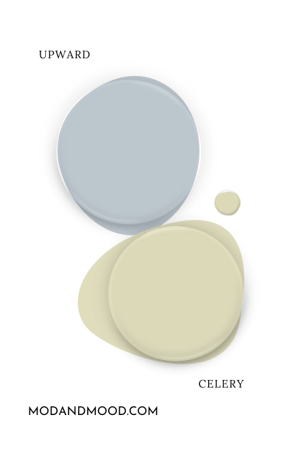
Upward can have a peri-leaning undertone, but it is more predictably a gray blue or french blue color.
Neutral Paint Color to Use With Celery
For a neutral that goes with Celery, I decided to play around with color theory a little bit.
Red is across from green on the color wheel, so while periwinkle is complementary to a yellowy-green shade like Celery, a clay color will actually emphasize the green.
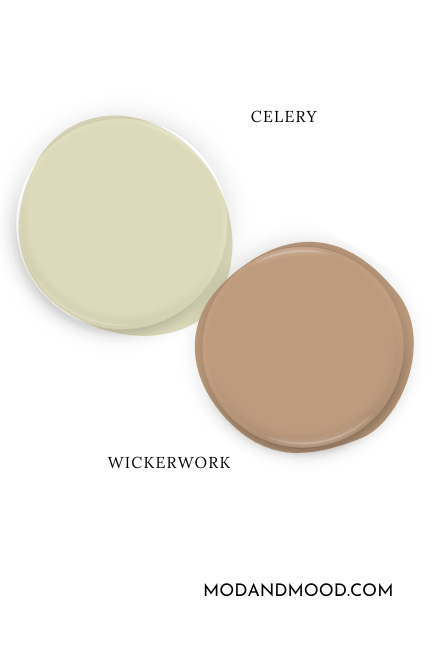
If it was my home, emphasizing the green is probably the direction that I would go with Celery, so I chose the clay-beige of Sherwin Williams Wickerwork, but any red or pink-leaning beige would also do.
Sherwin Williams Celery vs Honeydew
Sherwin Williams Honeydew is a slightly more popular color that is pretty similar to Celery. Here is how these two compare:
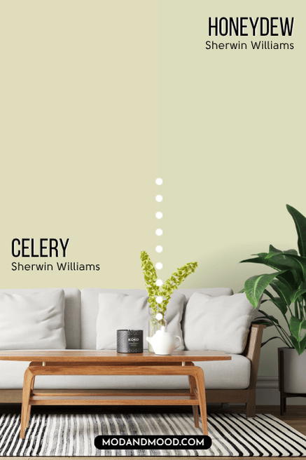
Honeydew and Celery have the same LRV of 71, but Honeydew is more green than Celery. (Opposite of the real life fruits and veggies, in my humble opinion!)
Dupes for Sherwin Williams Celery from Other Brands
Here are a couple of options to get the same look as Celery in other brands!
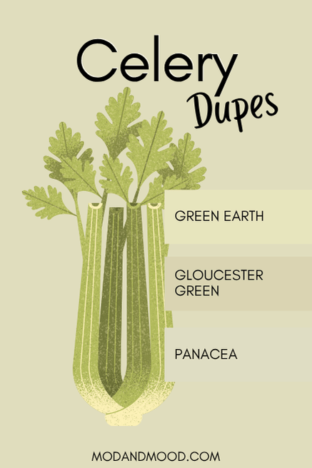
Celery Equivalent in Valspar (Lowe’s)
Valspar has the best dupe for Celery with their color Panacea.

Panacea is a teeny tiny bit more gray than Celery, which just makes it a hair more subdued. Not really a bad thing in my book, but it’s not enough to change the spirit of the color, or to get us out of “pastel.”
Benjamin Moore Version
Benjamin Moore has quite a few colors that are close to Celery, but none as close as I would like. I settled on two alternatives to Celery that are good in different ways.
Green Earth
Benjamin Moore Green Earth is like a cleaner, brighter, version of Celery. These two are more similar in real life than they look on paper:
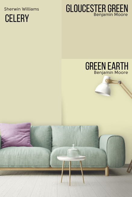
Gloucester Green
If closer to acid green was never your goal, you may like Benjamin Moore Gloucester Green more than Green Earth or Celery. Gloucester Green is a slightly darker and slightly more muted version of Celery. It is more like a green wheat color.
Celery in Behr
Unfortunately, the Behr website wasn’t working at the time that I was writing this post. They recently overhauled it so it is more difficult to see every color, and today the categories were totally down. Whomp whomp.
When I update this post I will try to find a Behr dupe.
What Do You Think of Celery?
I purposely reserved commentary on Celery until the end so that you can form your own opinion. Me personally? It’s not a color that I can see myself using. In my opinion, it is just a little too light and a little too pastel.
I have dipped my toe into shades that are similar to Celery in the past, and I find any color that is in this murky light to off-white category is hard to keep away from “baby room.” Is it better than last year’s color? I’m going to say marginally! I can see a few use cases where this color makes sense, and I do love how Megan has used it.
Colors that have a similar vibe that I like better are: Svelte Sage, October Mist, and Clary Sage. All of those tend to be on the warmer side of sage, and I find that a little more versatile.


