Soft and mysterious colors are very “in” for this year, and Sherwin Williams Ethereal Mood is a color that you can’t judge by the cover. (Or swatch!) This neutral greige presents lighter than you may expect, and has a surprising undertone!

Here we will go over all things Ethereal Mood, and put this color to work in a color palette!
What Are the Undertones of Sherwin Williams Ethereal Mood? (SW 7639)
I would describe Ethereal Mood as kind of a dark wheat color. It is very beige-forward, but there is an earthy green undertone in there. Do NOT let the swatch fool you, because this one is a trickster.
Sherwin Williams describes Ethereal Mood like this:
“The cool green undertone in this delicate gray adds an airy, nature-infused vibe to any space. Consider this versatile yet soothing neutral in a bedroom.” – sherwinwilliams.com
This is interesting to me, because if you are going to call this color only “gray” and not “greige,” then surely the undertone must be a warm green and not cool.
A true gray with a cool green undertone would be more along the lines of a true sage, and Ethereal Mood is definitely approaching brown.

Anyway…
You should know that because it is so neutral, I feel like Ethereal Mood often reads much lighter than you would expect for an LRV of 38.
The LRV (Light Reflectance Value) of a color indicates on a scale of 0 – 100 how much light a color reflects (or doesn’t reflect). True black has an LRV of 0 and pure white has an LRV of 100.
In the paint world, we are working in a range of about 3 – 93 because no paint color is purely black or completely white.

At 38, Ethereal Mood is in the middle of mid-toned colors, but it can read similar to paint colors with LRVs way up in the 50 – 60 range.
If you were to use this color alongside crisp whites you will find that it appears true to its LRV and more green. Used with other neutrals, darker colors, or alongside off-whites, it can read like a lighter beige.
You do have to be a little careful when looking for inspiration about Ethereal Mood, because sometimes people tag this color when they actually used Ethereal White (SW 6182), which is an off-white.

That would make things extra confusing, because Ethereal Mood can look lighter than you might expect, but not typically off-white.
All this to say, Ethereal Mood can range in appearance from a mid-toned mix of mushroom and green, to a light beige. I do not find that this color ever looks truly gray, or cool.
Sometimes Sherwin Williams releases a one-off color and then shoe horns it into a color strip that kinda sorta makes sense. Ethereal Mood is one of those colors:

They have cobbled together a color strip of somewhat related tones, but I certainly would not rely on this for darker and lighter versions of this color.
If you like colors like these, you might find some new options in my post: Fabulous Sage Green Trim Colors to Uplevel Your Aesthetic (See Real Homes!)
Sherwin Williams Ethereal Mood in a Color Palette
For this color palette I was visualizing an aristocratic hunting lodge. Somewhere that very little hunting goes on, but it is cozy and woodsy, in a upper crust sort of way.
Specific? Yes. I’m not really sure why, but the vision was clear:

Let’s get into the colors!
Coordinating White Paint Color for Ethereal Mood
When you are using Ethereal Mood, I absolutely think there needs to be a strong bit of white present, and the white should have at least some color in it.
I really like the green undertone in Ethereal Mood, so I recommend leaning into that by using white paint colors with undertones that complement and emphasize green.

For a true white, I recommend Sherwin Williams White Flour (SW 7102). This underrated white has a brightness to its creaminess, in a tone that works well with Ethereal Mood.
For a darker option, try the creamy off-white of Sherwin Williams Shoji White (SW 7042).

This beigey off-white is creamy but still very neutral. I would probably use this white if you want to keep Ethereal Mood looking lighter.
When used as your only white, Shoji White actually does look surprisingly white, which will trick your eye into seeing other colors as lighter.
Try Ethereal Mood with Sherwin Williams Cityscape (SW 7067)
I really wanted a subtle, murky blue to pair with Ethereal Mood. This is a real challenge because any coordinating blue that leans even a little green is likely to make Ethereal Mood look beige in comparison.
Unfortunately, a true powdery blue also isn’t the right vibe in my opinion, because we don’t want to overpower the subtle color in Ethereal Mood.
I finally settled on getting color theory to do the work, and went with Cityscape, which is quite gray at face value:

In real life, Cityscape can look quite blue, and it should definitely lean that way against the much warmer Ethereal Mood. Both of the white colors in this palette will also emphasize the blue undertone in this color.
Neutral Paint Color to Use with Ethereal Mood
The idea of using a dark brown-gray neutral with Ethereal Mood is an easy decision. A warm sagey-beige with a deep chocolate greige is just *chef’s kiss.* The only question is, which one?
I eventually settled on Sherwin Williams Black Fox (SW 7020), but I won’t lie to you, it was rock, paper, scissors, between that color and Urbane Bronze (SW 7048). They are very similar colors, and equally good choices.

I also paused for a long time on Sherwin Williams Stony Creek (SW 9610), which is another deep bronzey color you may like. For a slightly lighter option, you could try Sherwin Williams Settlement (SW 9594).

Sherwin Williams Recommends These Coordinating Colors
Here are the colors that the experts over at Sherwin Williams suggest you use with Ethereal Mood:

I won’t talk about Shoji White because we were on the same page with that one, and I already went over it!
Pair Ethereal Mood and Sherwin Williams Aged White (SW 9180)
Aged White is the same recommendation I made earlier, but in a different font!

Aged White is definitely more of an antique white and more overtly creamy than the other two that I recommended, but the same sentiment is there! It should emphasize the green undertone of Ethereal Mood.
Use Ethereal Mood with Acacia Haze (SW 9132)…Maybe
I don’t hate the idea of using Acacia Haze with Ethereal Mood, but it is not going to show off the color to its fullest potential.
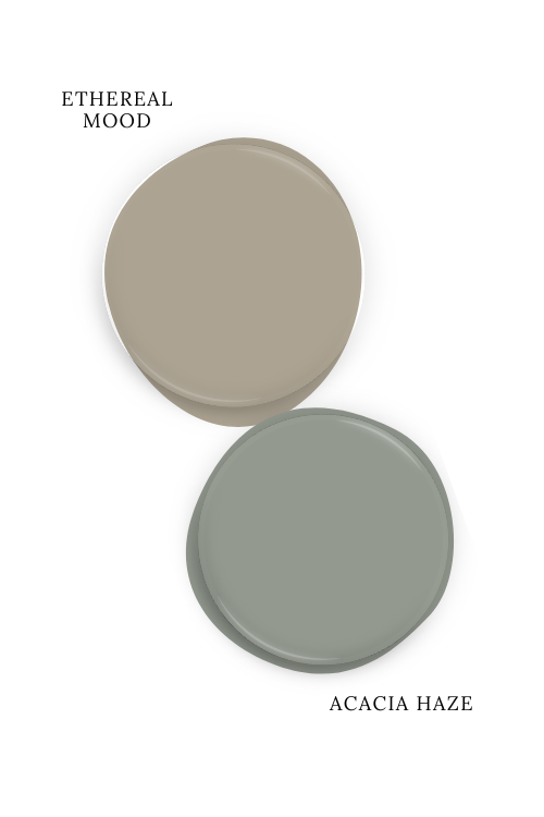
Because Acacia Haze is quite obviously sagey, it will have Ethereal Mood looking very beige, which isn’t bad, but it doesn’t do much for it either. That’s more like picking a beige to go with Acacia Haze, and less like picking a color to go with Ethereal Mood…if that makes sense?
That being said, Acacia Haze is one of my favorite sage greens, and in the tippity top for versatility.
Here’s another look at each of these coordinating colors:

What is the Difference Between Ethereal Mood and Benjamin Moore Revere Pewter?
Ethereal Mood and Benjamin Moore favorite Revere Pewter are much more similar in mind than on paper:

Revere Pewter is much lighter and more gray than Ethereal Mood. While Revere Pewter can have a slightly green undertone, more often it looks purely greige. I certainly would not pick Revere Pewter for a green undertone, it’s more like something to be okay with.
What is the Difference Between Ethereal Mood and Accessible Beige?
The major difference between Ethereal Mood and Sherwin Williams Accessible Beige, is that Ethereal Mood has a slightly green undertone, and Accessible Beige doesn’t have a green undertone whatsoever.

Accessible Beige would look pink before it would ever look green…and it doesn’t look pink.
Thank you so much for being here and reading until the end, that really helps my blog! Before you totally settle on Ethereal Mood, there are a lot of similar colors that spring to mind, and I think you may want to take a look at them too:


