Skip to content

5 Dupes for Farrow and Ball Setting Plaster from Other Brands (Sherwin Williams and More!)

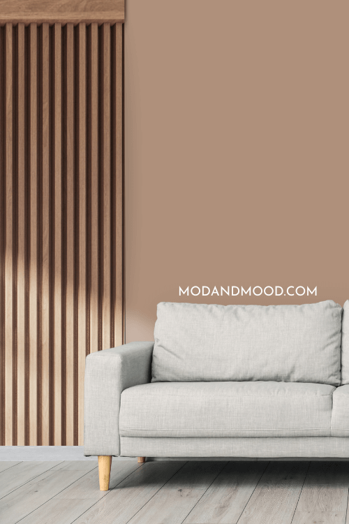
    Setting Plaster is an unexpected neutral hit from Farrow & Ball. It is an earthy pink-beige that strikes a nice balance between “posh Victorian” and “nature-inspired.”

    Dupes for Farrow & Ball Setting Plaster arranged as paint dot swatches around a larger paint dot of Setting Plaster over a background of a gondola in a canal in venice with setting plaster colored buildings rising up on either side.

    Not everybody has access to Farrow & Ball colors, so here we will look at some beautiful dupes from other brands that you can get your hot little hands on!

    What Color is Farrow and Ball Setting Plaster?

    Setting plaster is like a slightly more saturated version of a typical “nude” color. It is a beige color with stronger pink and peach undertones.

    Farrow & Ball Setting Plaster on vertical shiplap paneling behind a beige headboard in a bedroom with white linens on the bed.

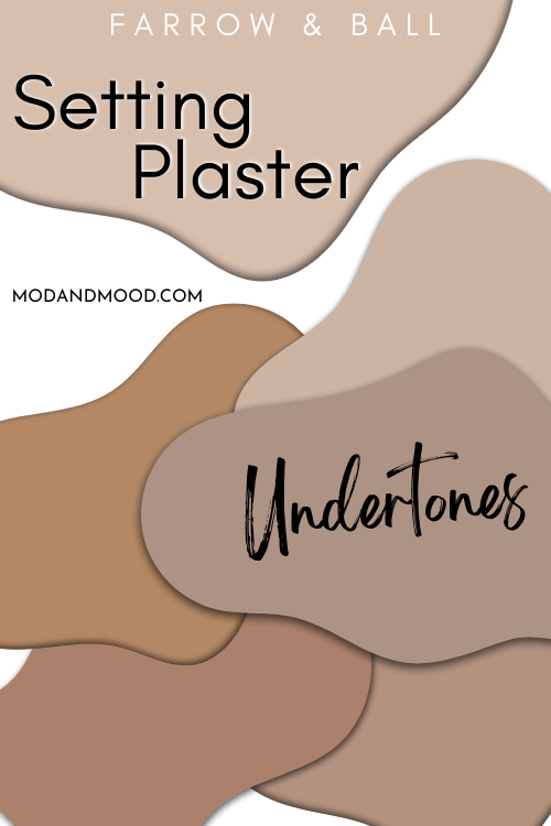
    I would say that Setting Plaster stays fairly consistent in it’s look. It can range in appearance from almost terracotta to a chalky pink color.

    Here is a look at either extreme, the darkest and warmest that this color ever looks and the lightest and coolest.

    Setting plaster looking chalky pink on one half of a wall and terracotta on the other half behind a gray sofa and parquet floors.

    Here is a look at all of the different undertones that this color can have:

    Swatches of all the different Farrow & Ball Setting Plaster undertones.

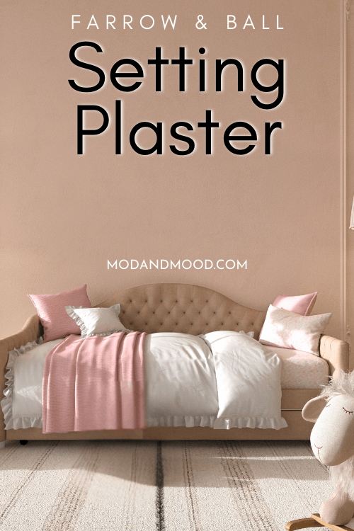
    All that being said, here is a very typical look for Setting Plaster:

    Farrow & Ball Treron Setting Plaster on the wall behind a beige daybed.

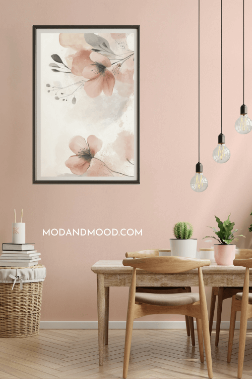
    The color doesn’t deviate a whole lot from this, except what you would expect from lighting. Here is a typical lighter look:

    Farrow & Ball Setting Plaster on a dining room wall where it looks quite light. There is a wooden table and chairs, edison bulbs hanging from the ceiling, and a large watercolor flower print on the wall.

    …And this is what you can expect in lower light:

    Farrow & Ball Setting Plaster on a living room wall behind a light grey sofa with wooden accent wall on one side.

    The LRV of Setting Plaster is approximately 56.

    The LRV (Light Reflectance Value) of a color indicates on a scale of 0 – 100 how much light a color reflects (or doesn’t reflect). True black has an LRV of 0 and pure white has an LRV of 100.

    In the paint world, we are working in a range of about 3 – 93 because no paint color is purely black or completely white.

    Farrow & Ball Setting Plaster marked at 56 on an LRV chart from 100 (true white) to 0 (true black) over a background of a similar color on shutters.

    At 56, Setting Plaster is right in the same LRV range as most whole-home neutral paint colors. Anything with an LRV between approximately 48 and 65 is what you will see on the walls in most homes.

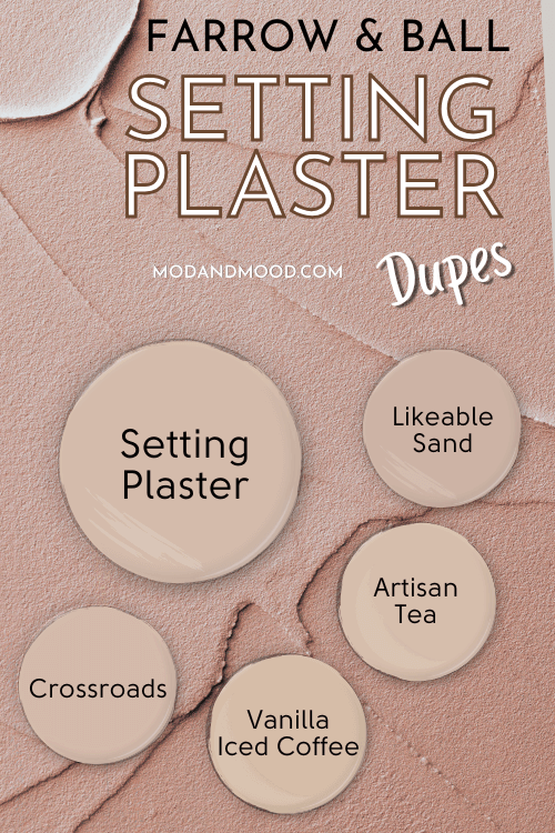
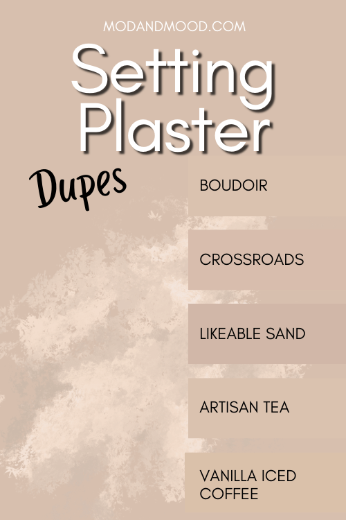
    Now on to the dupes!

    Dupes for Farrow & Ball Setting Plaster arranged as paint dot swatches around a larger paint dot of Setting Plaster over a background of similar colored wet plaster.

    Get the Setting Plaster Look From Benjamin Moore

    There were two possible color matches from Benjamin Moore for Setting Plaster, the colors Crossroads and Boudoir.

    Farrow & Ball Setting Plaster on half of a wall and Benjamin Moore dupes Crossroads and Boudoir swatched on the other half behind a navy blue sofa and a couple of plants.

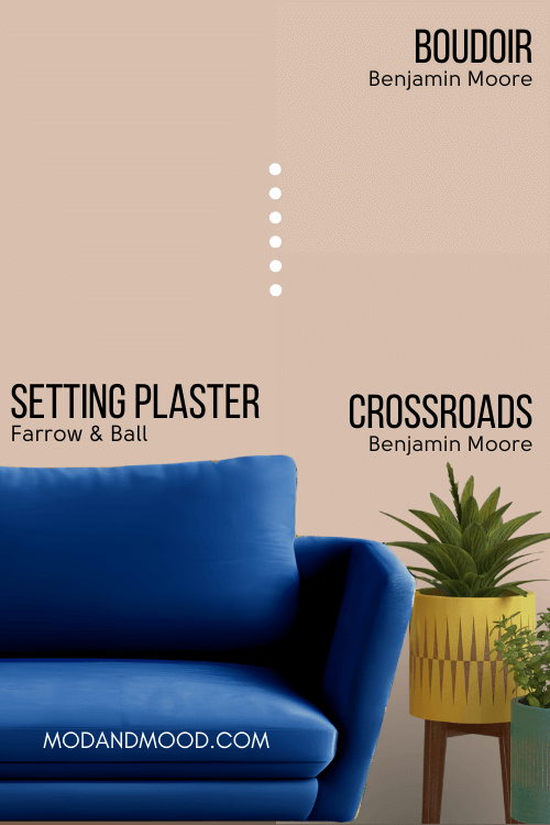
    I liked the color Crossroads a little bit better, but if you would like less pink, you may prefer Boudoir.

    Benjamin Moore Dupe for Setting Plaster: Crossroads

    Crossroads is just a hint more pink than Setting Plaster, and a tiny bit less gray.

    Benjamin Moore Dupes for Setting Plaster: Crossroads and Boudoir, each marked on a hex code color chart alongside Setting Plaster.

    The LRV of Crossroads is the same as Setting Plaster.

    Bonus Benjamin Moore Dupe Boudoir

    Boudoir is also very similar to Setting Plaster, but it leans a little more orange/yellow. It is also a hair lighter.

    You can see from the chart that both colors are very close to Setting Plaster, so we are splitting hairs. Either would be a great dupe!

    Sherwin Williams Version of Setting Plaster

    The best color match for Setting Plaster from Sherwin Williams is the color Likeable Sand:

    Farrow & Ball Setting Plaster on half of a wall and Sherwin Williams dupe Likeable Sand on the other half above taupe colored wainscoting in a bathroom with a white clawfoot tub.

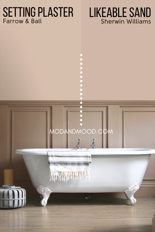
    Likeable Sand is a little bit darker, pinker, and less gray than Setting Plaster.

    This color is actually two shades lighter on the same color strip as former color of the year Redend Point.

    Sherwin Williams Redend Point Color Strip from Malted Milk to Vintage Leather, with Likeable Sand, Interface Tan, Moroccan Spice, and Tanbark in Between. Background of a colorful desert scene at sunset.

    Dupe for Setting Plaster at Home Depot (Behr)

    The closest dupe from Behr for Setting Plaster is the color Artisan Tea.

    Farrow & Ball Setting Plaster on half of a wall and Behr dupe Artisan Tea on the other half behind a white wood-framed sofa.

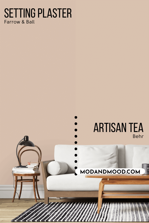
    Artisan Tea is a little bit lighter, a touch more saturated (less gray), and a little more orange/yellow than Setting Plaster.

    Best Valspar Version of Setting Plaster (Lowe’s)

    Over at Lowe’s, the best color match for Setting Plaster is Valspar Vanilla Iced Coffee.

    Farrow & Ball Setting Plaster on half of a wall behind a navy velvet sofa, and Valspar version Vanilla Iced Coffee on the other half.

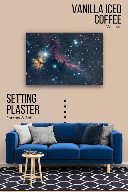
    Vanilla Iced Coffee is a little bit more saturated than Setting Plaster, and its undertone leans slightly more towards terracotta.

    Here is another look at each of these dupes:

    Dupes for Farrow & Ball Setting Plaster from other brands. Five swatches of similar colors line the right side of the graphic. Colors are Boudoir, Crossroads, Likeable Sand, Artisan Tea, and Vanilla Iced Coffee over a background of Setting Plaster with a plaster texture sponged in between the color and the swatches for contrast.
    Dupes for Farrow & Ball Setting Plaster arranged as paint dot swatches around a larger paint dot of Setting Plaster over a background of similar colored stucco.

    Thank you so much for reading until the end! That really helps my blog!

    Not set on Setting Plaster? Here are some other paint color ideas that you will love!

    Graphic reads "Best Terracotta Paint Colors" with 9 terracotta paint swatches. From top left to bottom right: Smoky salmon, persimmon, copper patina, wild flower, cavern clay, baked terracotta, baked clay, tandoori, warm brownie
    All of the taupe paint colors from the article arranged over a background of a bedroom with a feature wall in Mesa Taupe.
    The 7 mushroom paint colors from the article swatched over a photo of cabinets in SW Shiitake and Cast Iron,