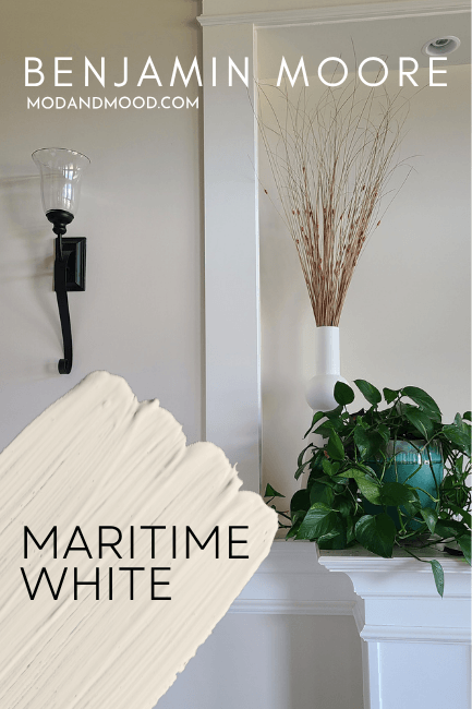
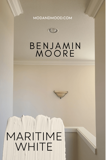
Benjamin Moore Maritime White is a color that truly surprised me. This creamy off-white has a very peach forward undertone that sounds (and looks!) a little scary, but the result is a soothing, luxurious linen tone.
Don’t take my word for it! Here you will learn all about Maritime White’s undertones, see it in real homes, get coordinating color ideas, compare it to popular alternatives, and get dupes from other brands!
What Color is Benjamin Moore Maritime White?
Maritime White is a creamy off-white paint color with a strong beige to peach undertone. It can look like a neutral sandy color when north-facing, but it most often looks warm.
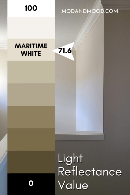
Maritime White LRV
The LRV of Maritime White is 71.6.
What’s an LRV anyway?
The LRV (Light Reflectance Value) of a color indicates on a scale of 0 – 100 how much light a color reflects (or doesn’t reflect). True black has an LRV of 0 and pure white has an LRV of 100.
In the paint world, we are working in a range of about 3 – 93 because no paint color is purely black or completely white.
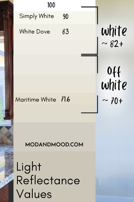
At 71.6, Maritime White is at the darker end of off-white.
What Are the Undertones of Benjamin Moore Maritime White?
Unlike many off-white paint colors, Maritime White is very consistently off-white. Some off-white colors can look white when they are the only white in your space, but the undertone of Maritime White is just too strong for that.
Let’s take a look at Maritime White’s range of undertones!

Very neutral white colors tend to be more chameleon-like than colors such as Maritime White, that have stronger undertones. This color tends to be fairly consistent in its appearance. It looks like a creamy off-white with a beige to peach undertone 90% of the time.
If it ever looks more gray, it is only in small places with cool northern light. Never the whole wall!
Maritime White can look slightly yellow on occasion, but this is typically in warm sunlight.
Maritime White in the Benjamin Moore Color Strip
Benjamin Moore does have a light to dark color strip for Maritime White, but quite frankly, it loses the plot about halfway through:
I get it, we’re staying true to the trajectory of the color…(maybe?), but those last shades are getting a little hideous. I did my best to come up with something a little more palatable.
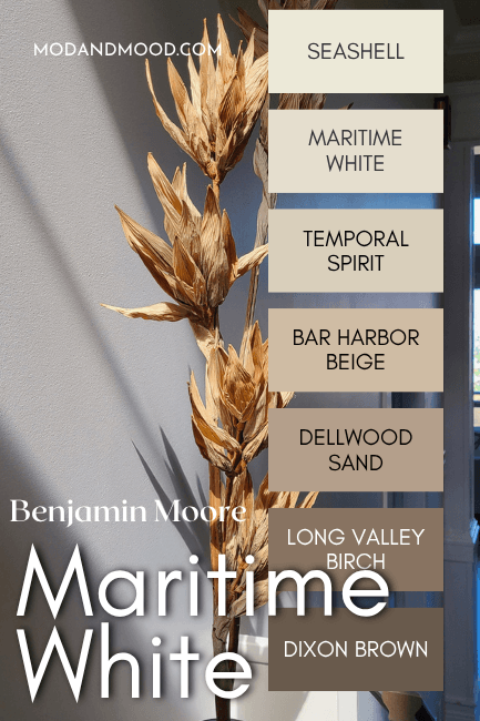
The other colors that I recommend as roughly lighter and darker versions of Maritime White are:
- Seashell
- Temporal Spirit
- Bar Harbor Beige
- Dellwood Sand
- Long Valley Birch
- Dixon Brown
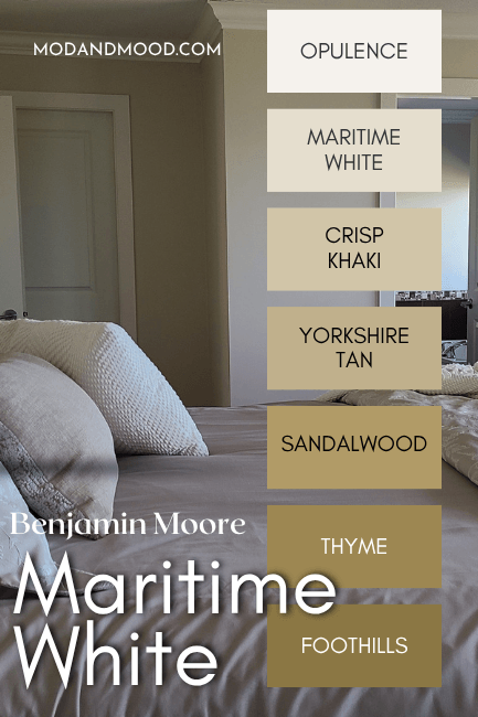
Benjamin Moore Maritime White in a Color Palette
Here are the colors that I recommend using with Maritime White:
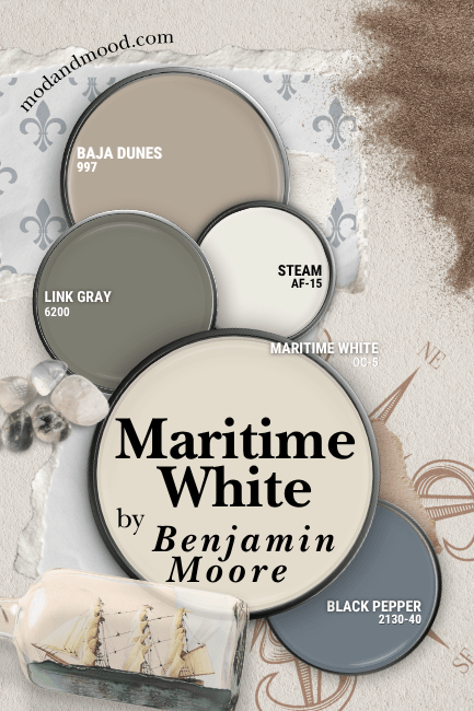
Coordinating White Paint Color for Maritime White
If you want Maritime White to look its lightest, brightest, and closest to white, you should use it as your only white paint color. It is much easier to see the undertone of an off-white when there is a true white for reference.
If you do want a true white for contrast on your trim, doors, cabinets etc., I recommend Benjamin Moore Steam.
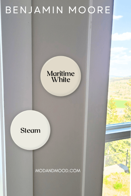
Steam is a creamy white, but a true white. It has a bit of gray in it, so it tends to look like a fairly neutral cream. It offers some contrast against Maritime White, but nothing too harsh.
Try Maritime White with Sherwin Williams Link Gray
For this combination I was inspired by a real-life scenario:
The wall color here is Dove Wing, but in this photo it is uncharacteristically warm and looks more like Maritime White.
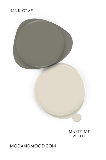
On paper, Link Gray looks quite gray, but it actually has a strong green undertone, and the underlying peach in Maritime White should emphasize this.
Link Gray is from the same Sherwin Williams color strip as Thunderous and Cast Iron. If you want to stick with Benjamin Moore, Desert Twilight and Antique Pewter are very similar to Link Gray.
Neutral Paint Color to Use with Maritime White
For a neutral pairing with Maritime White, most warm beiges will work, as long as they lean more peach/pink rather than yellow. I am not the biggest fan of peachy beiges, so for this color palette I went with Benjamin Moore Baja Dunes.
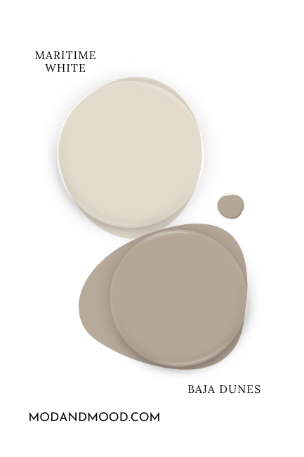
Baja Dunes leans a little bit taupe, but it still has an undertone that works with Maritime White.
Complementary Color for Maritime White
Technically the complementary color for Maritime White is an equally light and saturated blue. I decided to go with a sophisticated and toned down version with Benjamin Moore Black Pepper.
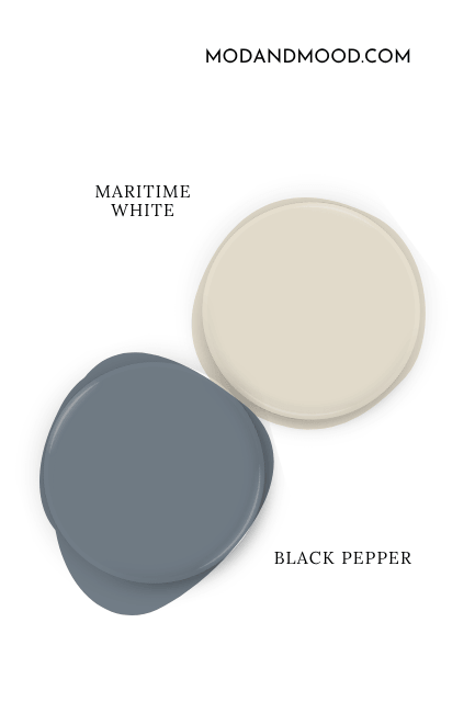
If you like this pairing, you might also want to consider Sherwin Williams Cyberspace.
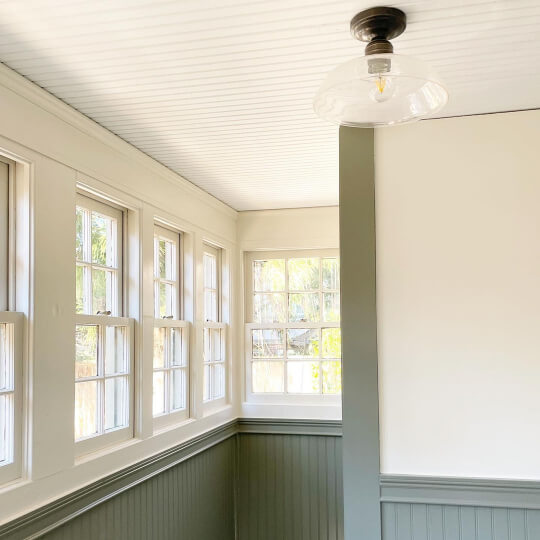
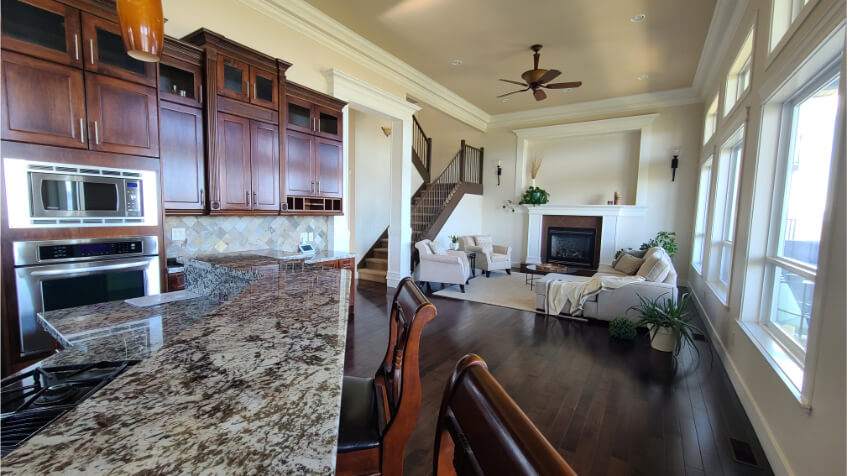
Benjamin Moore Maritime White for Your Home’s Interior
I recently completed a very large project using Maritime White! My client wanted to repaint their whole house from a darker brown color to something light and fresh.
They were prepping the house for sale, so we needed to keep the investment manageable, and work with the existing finishes, which was a palette of mostly browns.
- Tile, countertops, floors, and cabinets in the whole home ranged from rust to espresso
- First floor ceilings were a peachy beige color that was either Sundew or Sea Urchin
- Trim was Benjamin Moore Steam
In the end, Maritime White was the only lighter neutral that worked with all of the existing finishes that we didn’t want to touch. The goal was to split the difference between the ceilings and the trim, and this color did a beautiful job of that!
We originally agreed that we would paint the ceilings if we had to, but we ended up loving it.
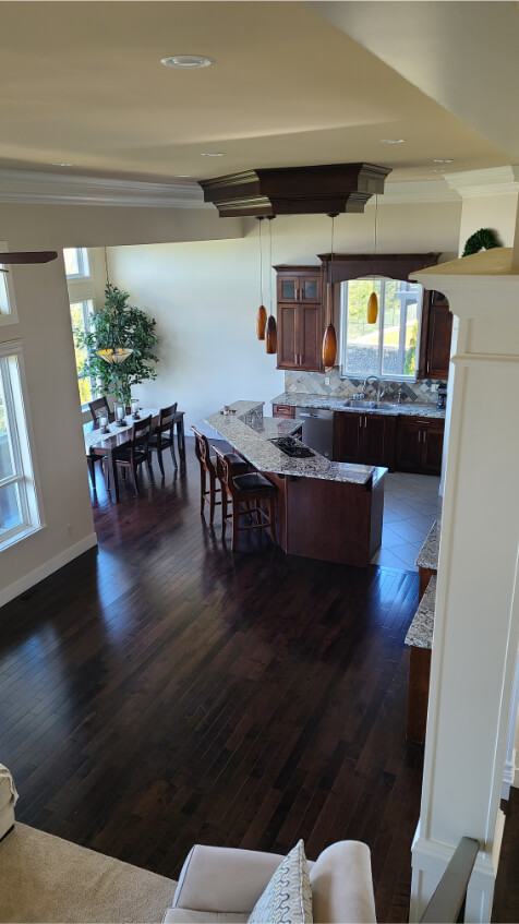
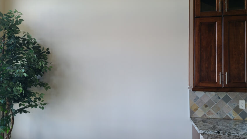
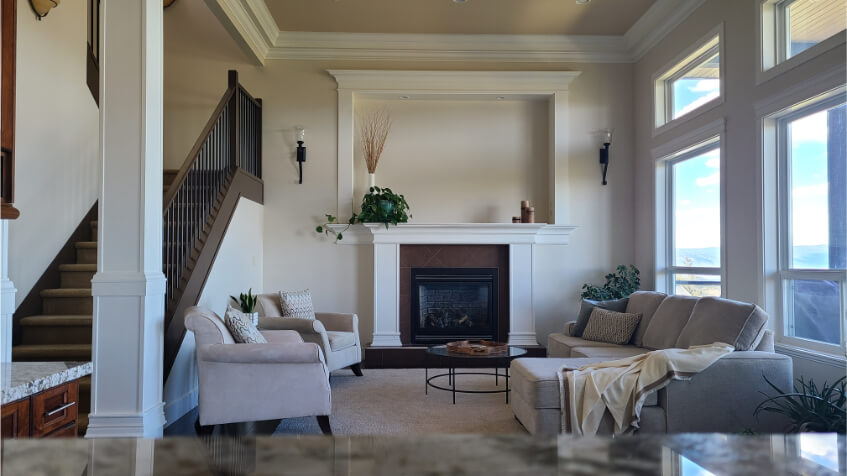
Maritime White most often looks like this:
…and this:
Somewhere between an off-white and a linen-y beige
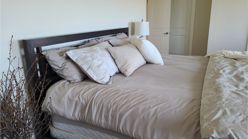
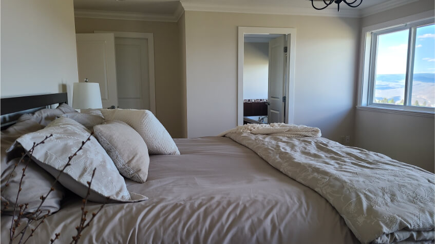
It can sometimes look a touch more yellow, as I mentioned earlier, particularly in late sun:
But again, most of the time it looks like a creamy off white with a peachy beige undertone:
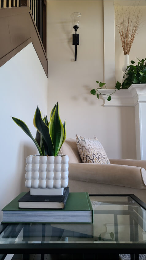
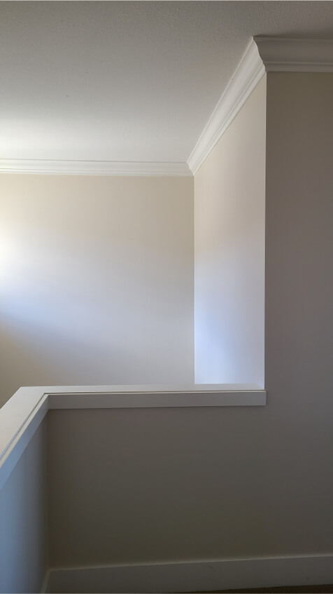
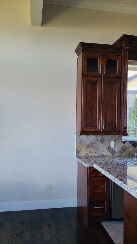
This room is north-facing, so this is as cool as it gets. You can see the color looks more crisp on the left side of the photo, but it only ever looks like this in cool direct light.
Maritime White on an Exterior
Here is a great example of what to expect from Maritime White on an exterior:
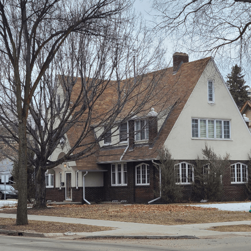
The color will normally look a little lighter than this, because the weather was quite overcast.
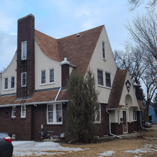
Typically colors look lighter outside, and you should expect Maritime White to look fairly white.
Benjamin Moore Maritime White Compared to Other White and Off White Paint Colors
Here is a quick and dirty comparison between Maritime White and a few other colors that are usually in the same conversation:
Benjamin Moore Maritime White vs Ballet White
As you can see here, the only obvious difference between Maritime White and Benjamin Moore Ballet White (aka Muskoka Trail) is that Ballet White is a hair lighter, with an LRV of 72.
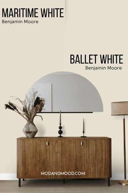
Upon closer inspection, Ballet White is both a tiny bit cooler and a little more gray than Maritime White. It looks just a little less peach on the wall.
Benjamin Moore Maritime White vs Swiss Coffee
Benjamin Moore Swiss Coffee and Maritime White are not all that similar, except for that they are both creamy white paint colors. Swiss Coffee is often referred to as an “off-white” but it is actually right on the line of true white and off-white, with an LRV of 82.
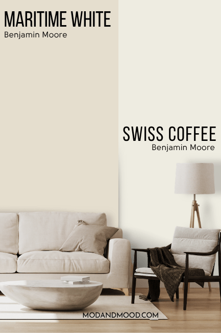
Swiss Coffee can look like a true white on occasion, but Maritime White does not. Swiss Coffee also has a slightly cooler and more yellow undertone than Maritime White.
Another difference is that many people use Swiss Coffee at 75%.
Benjamin Moore Maritime White vs Muslin
Just to be clear, this is the Benjamin Moore version of Muslin and not the Sherwin Williams color.
Benjamin Moore Muslin is darker than Maritime White, with an LRV of 66.54.
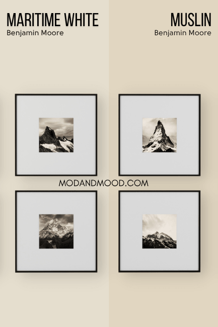
Muslin is like a more saturated version of Maritime White. The color family is exactly the same, but Muslin is stronger.
Dupes for Benjamin Moore Maritime White from Other Brands
Not going with Benjamin Moore? Here are some great options to get the look at other stores!
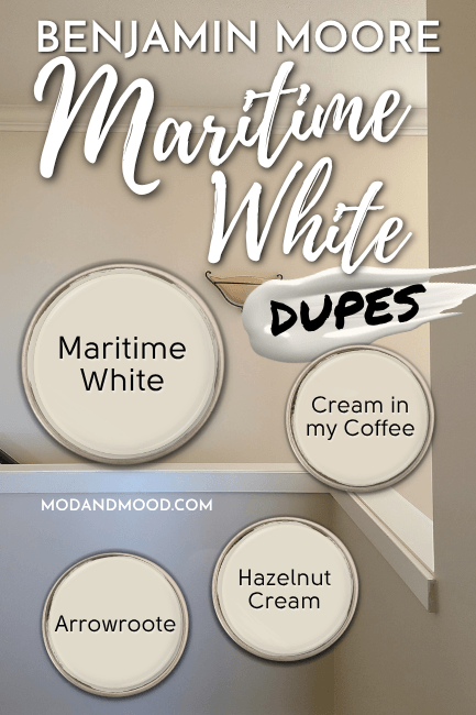
Maritime White in Sherwin Williams
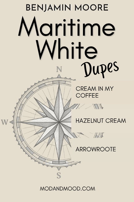
Sherwin Williams has a great dupe for Maritime White with their shade Arrowroote.
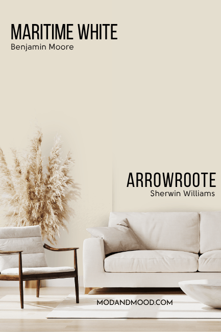
Arrowroote is just a hair more gray than Maritime White. Honestly, the difference is pretty imperceptible.
Maritime White Equivalent in Valspar (Lowe’s)
Over at Lowe’s, the best version of Maritime White is the shade Cream in my Coffee.
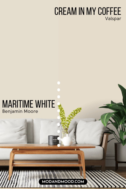
Creamy in my Coffee is a little bit more peach than Maritime White. The color family is a little warmer and it is sliightly more saturated.
Best Behr Color Match for Maritime White (Home Depot)
At Home Depot, the best dupe for Maritime White is the color Hazelnut Cream.
This is actually the best dupe overall. These two are twins!
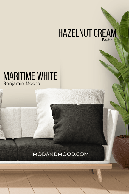
There is no “on paper” difference between Maritime White and Hazelnut Cream, so any difference will just be down to the actual paint you choose.
Here is one more look at each of these dupes:
Thank you so much for reading until the end, that really helps my blog! I hope this helped you decide if Maritime White is the dreamy creamy color you’ve been looking for.
Still not sure? No sweat! I’ve got a lot more where this came from: