Looking for a darker, warmer, neutral paint color? Browns are about to have a serious come back over the next few years, but these aren’t your Mama’s brown paint colors!

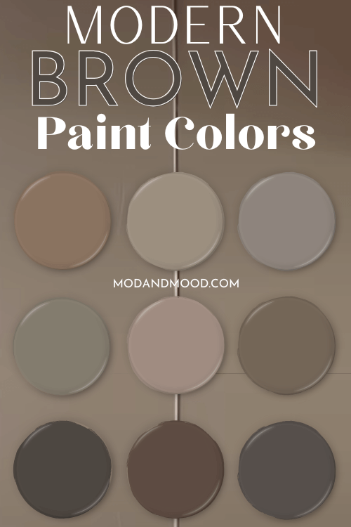
Today’s designers and home decor enthusiasts are selecting moody browns with complicated and interesting undertones. Today we will take a look at 9 very luxurious brown paint colors that are both sophisticated and still very neutral.
What Brown Undertones are More Modern?
Brown can still go dated in a hurry! There’s no doubt about that. So what makes a brown modern?
Of course, trends will come and go, but today’s stylish brown paint colors lean heavily onto green, gray, or taupey purple undertones.
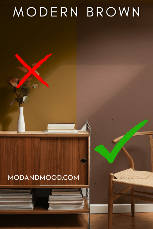
If you want to stay modern, stay away from overly warm browns with mustard or orange undertones. Home decor fashions may be leaning into warmer colors and away from gray, but they are transitioning at a very relaxed pace.
Most trend-setting brown paint colors still have cooler undertones.
Being the fallible person that I am, I realize that a lot of these colors are just dipping a toe into brown, but these are colors that I personally like and would use.
Let’s get into the colors, shall we?

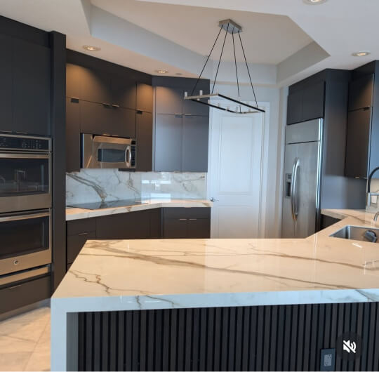
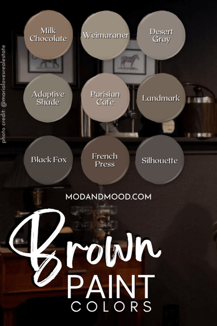
Valspar Milk Chocolate
I would describe Valspar Milk Chocolate as a mid-toned teddy bear brown.
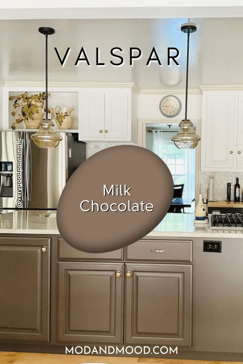
This color ranges in appearance from very slightly greige to a more caramely brown, but it always maintains a pretty standard look.

In this two-toned kitchen by the team at Very Good Painting, the owners chose this pleasant brown for the island and lower cabinets. Upper cabinets are Sherwin Williams Alabaster and the off-white trim is Sherwin Williams Wool Skein.

The LRV of Milk Chocolate is 19.3, so despite being one of the lightest colors on this list, it is definitely on the darker end of mid-toned. (Which in my opinion, is what takes a color out of beige and into brown.)
What’s an LRV?
The LRV (Light Reflectance Value) of a color indicates on a scale of 0 – 100 how much light a color reflects (or doesn’t reflect). True black has an LRV of 0 and pure white has an LRV of 100.
In the paint world, we are working in a range of about 3 – 93 because no paint color is purely black or completely white.

In my opinion, truly dark paint colors have LRVs of around 10 or less.
Benjamin Moore Weimaraner
Weimaraner is a mid-toned brown paint color that ranges in appearance from pewter, to a dark sand color.
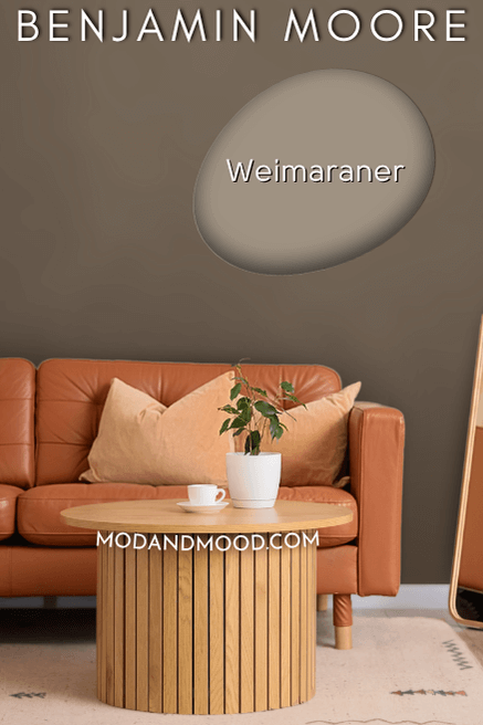
The LRV of Weimaraner is 31, so it is right in the middle of mid-toned. Thanks to Comfort Painting, we get a great idea of all the different undertones that Weimaraner can have.
Here is Weimaraner where it looks more beige:
Here is the color where it looks more greige:
I would say that Weimaraner can have a slightly “earthy” undertone, but it stops short of anything that I would consider green.
Here is a look at that earthy undertone, but please note from the ceiling that the light is very warm in this photo:
In general, I would say that Weimaraner is a super neutral, sandy dark beige or lighter brown.
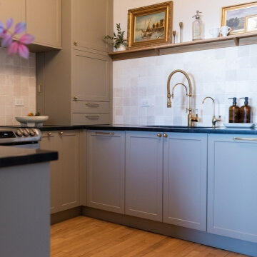
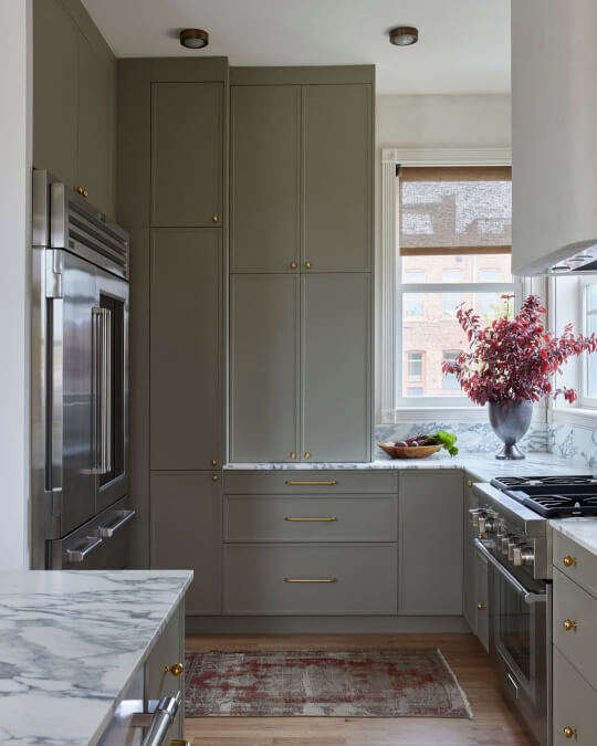
Semihandmade Desert Grey
You may be wondering: What paint brand is this?
Semihandmade is a cabinet company that specializes in flat packed kitchens and door fronts for IKEA cabinets. However, they have truly charmed and bewildered me with their Desert Grey color.
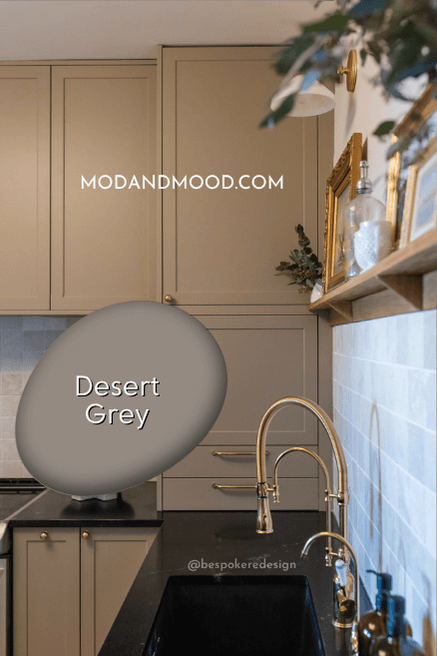
I was seeing it all over the custom kitchens by the team at Bespoke Redesign, so I thought it was worth duping! First, let’s see the real thing:
What I LOVE about this color, is that it is a true chameleon. Even in the same photo it can look like two totally different colors:
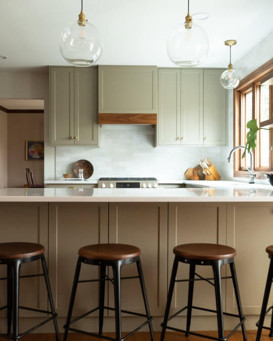
It’s almost unbelievable that the brown cabinets and green cabinets are actually the same color!
It should be noted that Desert Gray clearly doesn’t always look brown, so if you are sold on chocolate, this isn’t the color for you.
Here is the color where it actually looks very green and not brown at all:
Now how are we going to bring this color into your home? Well, you can either purchase the real deal cabinets or fronts from semihandmade, or use one of these great alternatives:
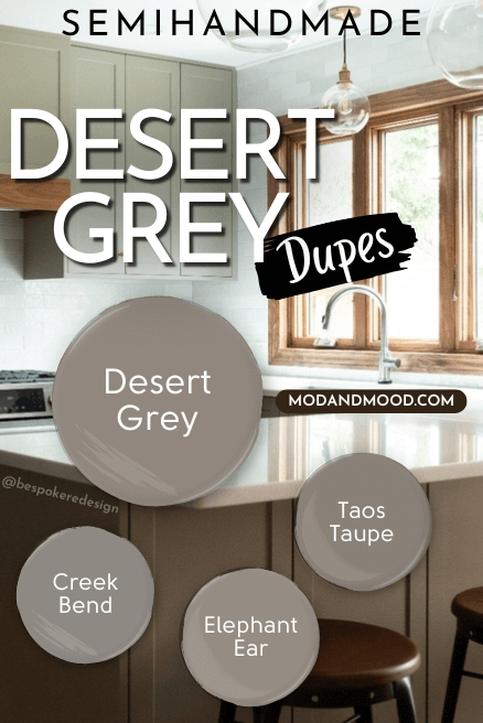
I selected each of these colors for not only being close in swatch to Desert Gray, but more importantly, in spirit. These colors all shapeshift and run the same range of undertones as Desert Gray.
Benjamin Moore Taos Taupe, Behr Creek Bend, or Sherwin Williams Elephant Ear are all great alternatives for this semihandmade color. They all range in appearance from a medium beigey brown to almost sage green. The LRVs for these three dupes range from 23 to 28.
Sherwin Williams Adaptive Shade
Adaptive Shade is a medium brown that most often has a green undertone. It can range in appearance from quite brown to gray olive.
Here is an example of it looking very brown:
In this room it is heavily influenced by the dark brown of Urbane Bronze on the ceiling and the warm lighting. I really love the color here, but I wouldn’t recommend Adaptive Shade if you want all brown all the time.
In reality Adaptive Shade can look quite green. Here is a more typical look for this color:
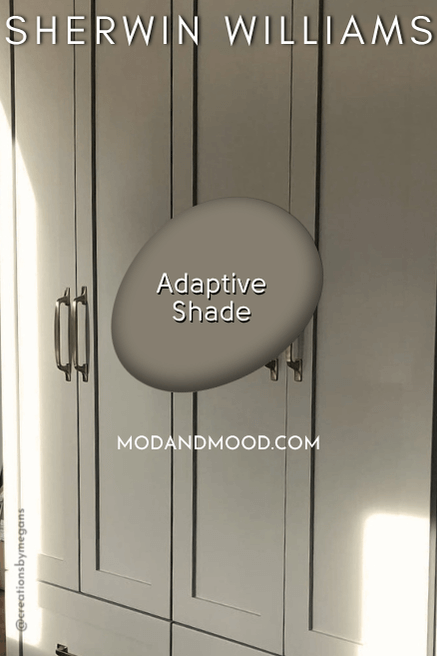
It’s sort of a not-gray, not-brown, not-green. I happen to like a murky and mysterious color! I almost shouldn’t have included Adaptive Shade because it’s not a true brown, but when I spotted how brown and how gorgeous Jenny was able to make it look, I had to include.
The LRV of Adaptive Shade is 21.
Behr Parisian Cafe
Based on the name, it’s fitting that Behr Parisian Cafe is a delightful mocha color.
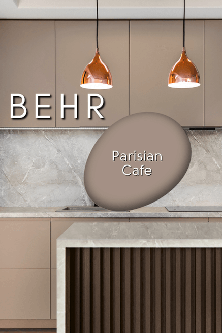
Parisian Cafe is a medium brown, with an LRV of 29. You should know that this shade has a taupey undertone, so it can look almost like a mauvey brown:
This is a version of neutral that I really like, but if you hate purple, you probably won’t like Parisian Cafe.
Sherwin Williams Landmark
Landmark is similar to Adaptive Shade, but it looks brown more often. This color is somewhere close to chocolate, but with a slightly cooler undertone.
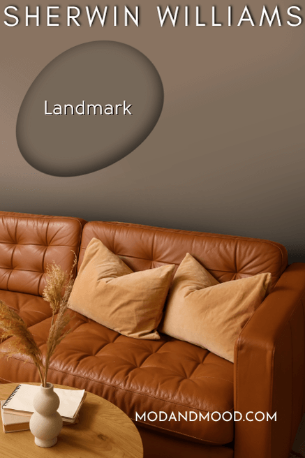
While Landmark does have a green undertone, it most often looks like this:
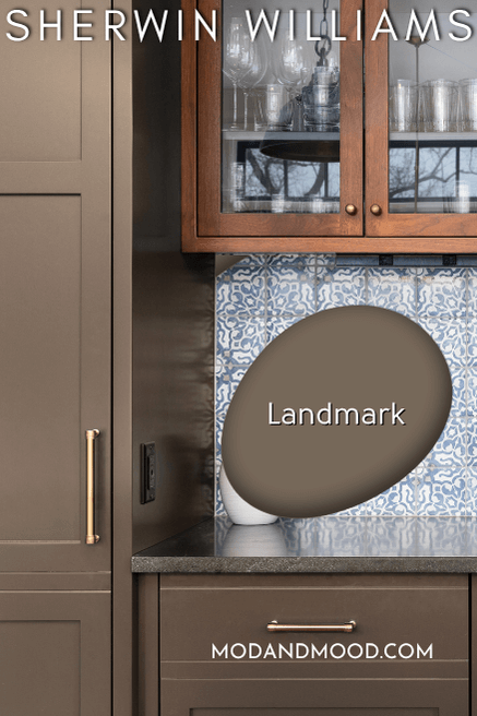
When Landmark looks cooler, it typically looks a bit more gray:
The LRV of Landmark is 15. This is a great darker brown option that still has a very neutral undertone, and it’s not so dark that it ever looks black.
Sherwin Williams Black Fox
It was a toss up whether to include Black Fox or Urbane Bronze on this list! I had to pick just one because the colors are very similar.
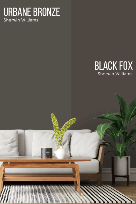
Ultimately I went with Black Fox because it is more brown than Urbane Bronze, and that’s the point of this post!
Like Urbane Bronze, Black Fox can still look quite gray. It ranges in appearance from black with a hint of warmth, to a warmer charcoal. Here it is looking very gray:
I didn’t have as many pictures of Black Fox as I thought, so here is a very similar color by Benjamin Moore called Night Horizon, where it looks pretty typical for Black Fox:
I would only choose Black Fox if you are okay with a deep brown that can also look black or charcoal. The LRV of Black Fox is 7.
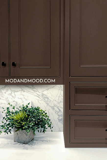
Benjamin Moore French Press
As the name implies, Benjamin Moore French Press is a true espresso brown.

This deep brown does have a warm undertone, and while it is neutral, it isn’t gray at all. I would say that French Press ranges in appearance from a very dark camel color to chocolate brown.
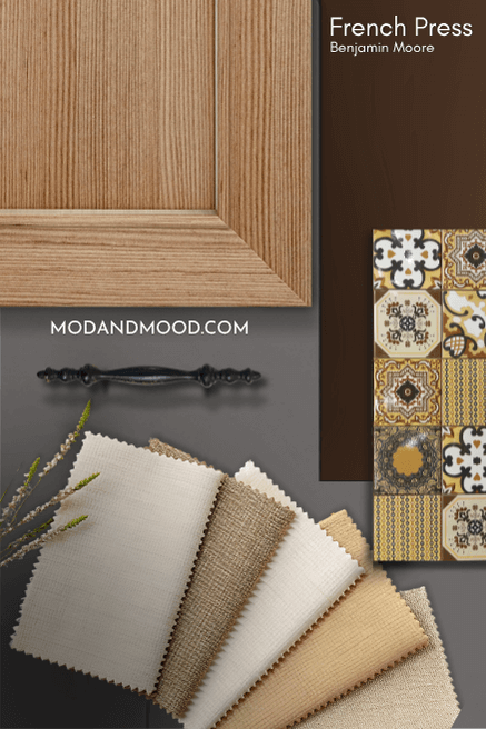
The LRV of French Press is 9.89, so it is dark, but not dark enough to look black.
Benjamin Moore Silhouette
Saving the best for last, Benjamin Moore Silhouette may be my very favorite color on this list.
*A happy little update! Only two days after publishing, Silhouette was named the Benjamin Moore color of the year for 2026!*

Silhouette is a very dark chocolate brown that can still have a little bit of a gray cast. Maria used Silhouette in flat, which I think helps to keep it looking richer and more brown.
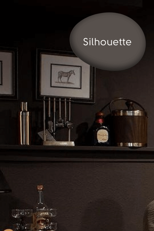
Silhouette has an LRV of 10, but I do think it typically reads darker, and it can even look black in lower lighting. This is mostly due to that extra bit of gray in it.
Thank you so much for reading until the end, that really helps my blog! I hope this gave you some great ideas for luxurious warm browns that will take your next project to the next level.
While you’re here…check these out too!


