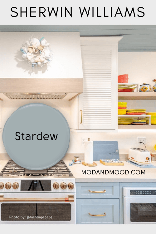
Sherwin Williams Stardew is a soft gray blue that looks pastel adjacent, but is muted enough to not read “babyish.”
Here we will take a look at some coordinating color options in a couple of different palettes, including Sherwin Williams’ own recommendations. I’ll also show you a couple of real-life examples of Stardew.
What Are the Undertones of Sherwin Williams Stardew?
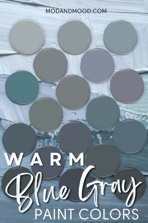
Stardew’s undertones range from quite gray to true blue, but they can also lean ever-so-slightly turquoise.
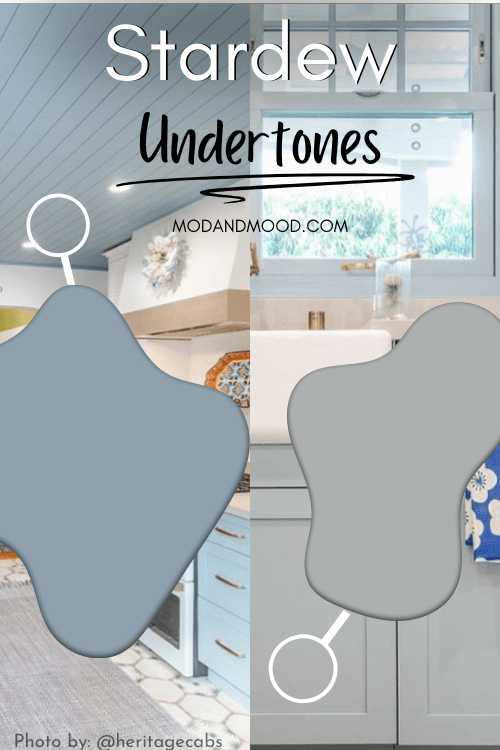
While I would not say that Stardew ever looks like a turquoise, the blue leans a little more green that purple, and that’s the best way that I can think to describe it.
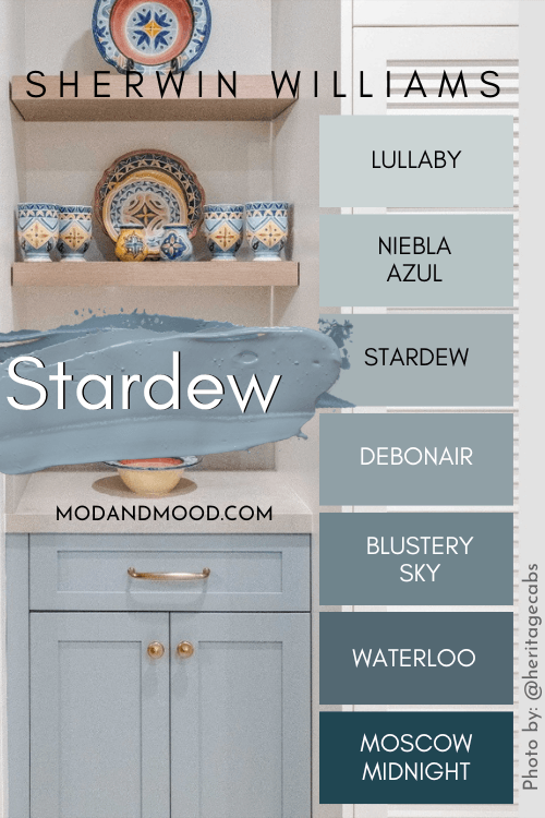
Stardew in the Sherwin Williams Color Strip
Here are all the colors from this Sherwin Williams collection, including other big favorites Debonair and Niebla Azul:
The LRV of Stardew is 43.
The LRV (Light Reflectance Value) of a color indicates on a scale of 0 – 100 how much light a color reflects (or doesn’t reflect). True black has an LRV of 0 and pure white has an LRV of 100.
In the paint world, we are working in a range of about 3 – 93 because no paint color is purely black or completely white.
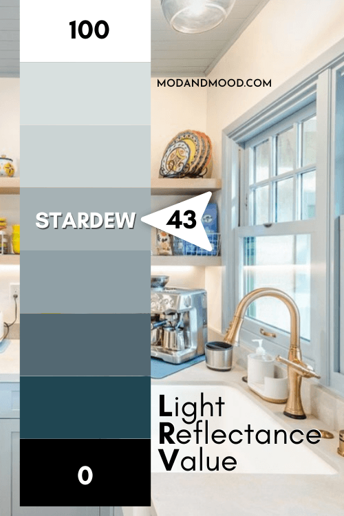
At 43, Stardew is perfectly mid-toned, but I will say that I think it reads a bit lighter a lot of the time. I was expecting the LRV to be around 55.
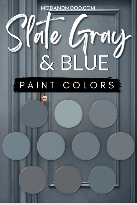
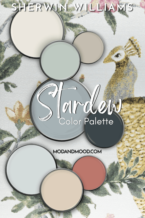
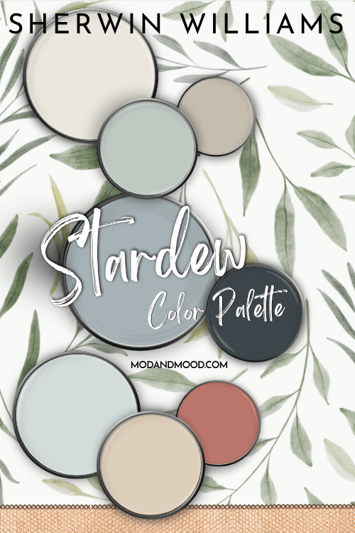
Sherwin Williams Stardew in a Color Palette
Here are the coordinating colors that I like with Stardew:
Coordinating White Paint Color for Stardew
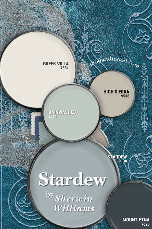
My pick for a white paint color to pair with Stardew is Sherwin Williams Greek Villa.
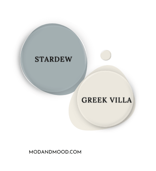
Greek Villa is a warm white that can either look truly creamy or truly white. The beige undertone of Greek Villa is complementary to Stardew. This also means that Stardew will emphasize the creaminess in Greek Villa, so you should not pick this one if you want a true white.
(For that, you might prefer Sherwin Williams Extra White or Benjamin Moore Chantilly Lace.)
Try Stardew with Sherwin Williams Rainwashed
I really like the idea of using Stardew with an equally subdued green, so I went with Rainwashed.
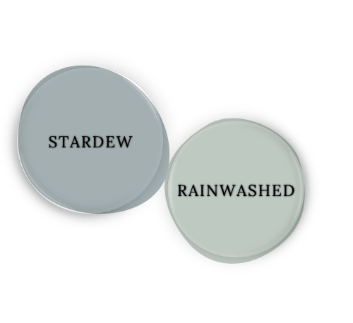
Rainwashed has a lot of gray in it, just like Stardew. When put together, the gray in each cancels out somewhat, so you will get a subtle contrast of blue and green. Rainwashed is lighter than Stardew, to make sure the contrast doesn’t get lost!
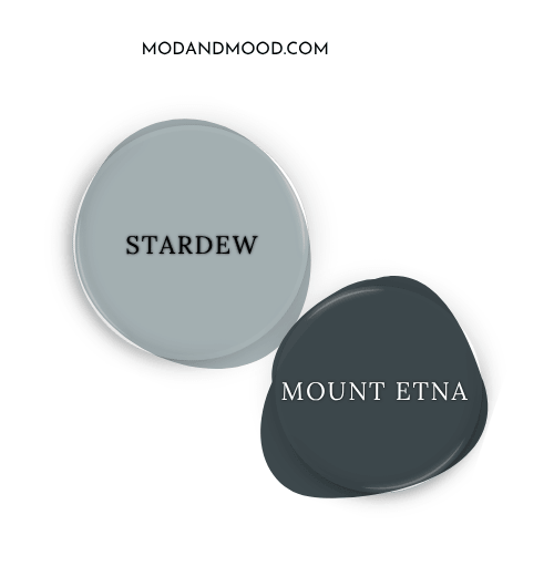
Pair Stardew and Sherwin Williams Mount Etna
Mount Etna is a dark gray blue-green. I find the undertones mimic Stardew, so these two pair beautifully!
Neutral Paint Color to Use with Stardew
Beige is complementary to blue, and blue and gray love each other, so you could really use any neutral with Stardew.
I decided to go with a neutral that could use a little help from Stardew! Sherwin Williams High Sierra is a mid-toned greige, but it is one of those tricky ones that can have a strange blue undertone. Pairing High Sierra with an actual blue like Stardew helps it stay warm and greige.
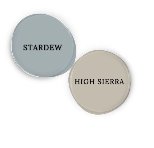
Using this same logic, Stardew would also be a good helper for Sherwin Williams Repose Gray.
Sherwin Williams Recommends These Coordinating Colors
Enough about me and my opinions, what do the experts at Sherwin Williams recommend? (Or what I sometimes suspect is a computer…)
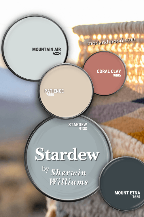
(I left Mount Etna by accident, but it looks nice, so I’ll allow it.)
Pair Stardew and Sherwin Williams Patience
Patience is absolutely complementary to Stardew! That bold peachy undertone is a perfect pick from across the color wheel:
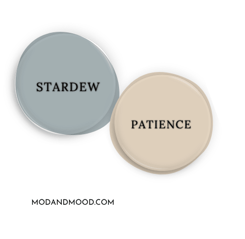
Unfortunately for Patience, it just isn’t my cup of tea. If you like it, you might prefer Sherwin Williams Casa Blanca.
Use Stardew with Sherwin Williams Mountain Air
Mountain Air is a blue off-white that Sherwin Williams describes as a “bright, green-blue pastel.”
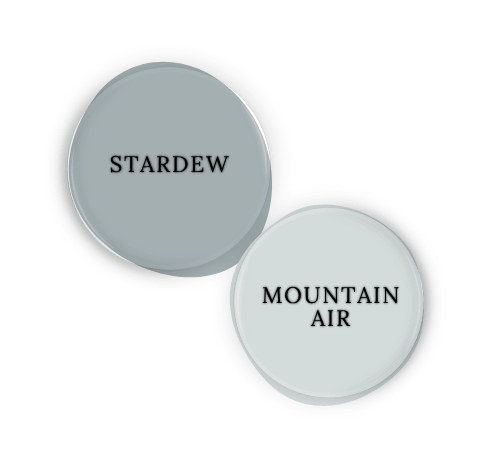
The undertones of Mountain Air totally make sense with Stardew. I wouldn’t personally use this as a white, but they didn’t recommend another one.
Try Stardew and Sherwin Williams Coral Clay
Coral Clay and Stardew are also complementary, but Coral Clay is much bolder!
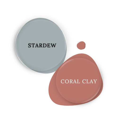
This combination is playful but also pretty versatile! You could pop some sage green in with this combo and have it looking pretty sophisticated.
Sherwin Williams Stardew Inside and Outside Real Homes
A powdery gray-blue is an interesting, but also pretty safe, choice for kitchen cabinets. Whether the goal is French country or cottage core, Stardew is a good pick that doesn’t read “babyish.”
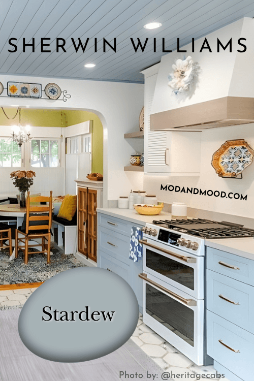
The white in this kitchen is Benjamin Moore Cloud White.
Just to be fair, here is a kitchen with Stardew on lower cabinets where it does look a fair bit darker:
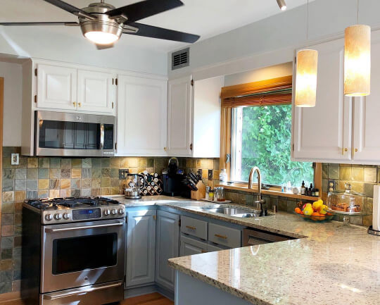
The upper cabinets here are Sherwin Williams Snowbound.
Moving on to an exterior, here is a good example of how Stardew looks outside.
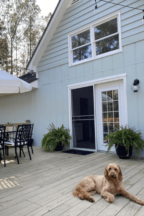
The color here is actually Sherwin Williams Rainwashed but it looks uncharacteristically blue here where it is normally more green.
Lighting will always be a factor of course, and you should expect any color (except some whites!) to look lighter outside.
In the case of Stardew you may find that the color looks surprisingly bright blue or very gray, depending on whether the sky is clear or overcast.
What is the Difference Between Stardew, Debonair, and Niebla Azul?
As you may remember, Stardew is on the same color strip as both Debonair and Niebla Azul.
Debonair is one shade darker than Stardew, and it does look very much like a darker version of the same color:

Niebla Azul is one shade lighter than Stardew. It ranges in appearance from almost the exact same as Stardew, to a lighter and slightly more turquoise version.
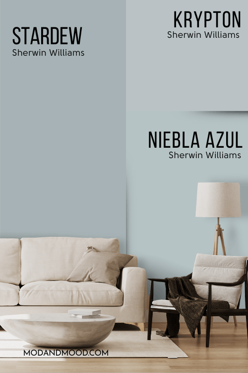
Sherwin Williams Stardew vs Krypton
Krypton is another very famous gray blue from Sherwin Williams. The major difference is that it is lighter than Stardew. It has an LRV of 52, which is a full shade lighter.
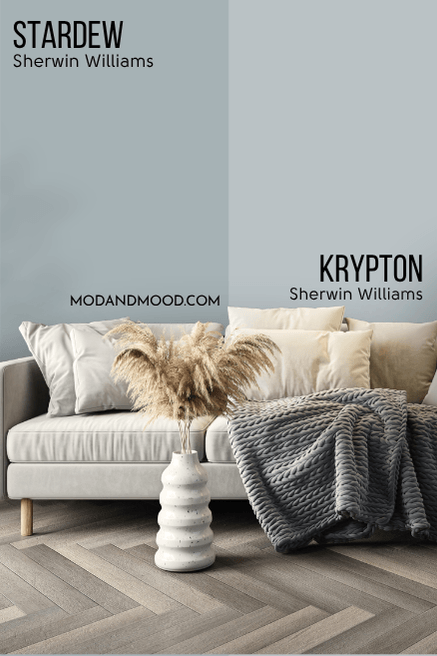
In terms of color, Stardew and Krypton are quite similar, but Krypton is a bit cooler toned than Stardew. (Less likely to lean turquoise.)
Here is another look at all of the coordinating colors:
Thanks so much for reading until the end! That really helps my blog.
Not ready to go? Here are some other posts that you might like: