Benjamin Moore Deep Royal is a gorgeous navy blue reminiscent of dark skies or deep oceans. It’s totally classic and super underrated. It has all the usability of Hale Navy, while being a little less mainstream.

What Color is Benjamin Moore Deep Royal (2061-10)
Benjamin Moore Deep Royal is an ultra-saturated navy blue color. The LRV is low enough that it could appear close to black, but that extra saturation usually keeps it looking a little brighter.

Why did I think this should be the former Color of the Year? Well, to be honest, I thought it would be.
Allow me to take you on a journey…
I went full-on “woo woo” reading the stars, and constantly refreshing the Benjamin Moore website, in the days and months leading up to their announcement.
I was seeing signs. I was gathering clues. I was very wrong.
It all started with this teaser:

That little rectangle of navy blue was surely a clue. Surely.
In fact, it only appeared when your browser window was a certain size.
A clue. It must be. For smart people, such as I.
This other collage on Benjamin Moore’s Color of the Year collection page confirmed my hunch:

I scrolled through every single Benjamin Moore color that it could be, and settled on Deep Royal as the perfect match.
The rest of the Deep Royal color strip even looks similar to that ombre swatch beside the dress.
Turns out Benjamin Moore isn’t Taylor Swift and they actually didn’t have any easter eggs. We can only assume that the tricky little rectangle was the work of a budget web developer, and it was a whole afternoon wasted for yours truly.
Whomp Whomp. Moving on…
What is the LRV of Benjamin Moore Deep Royal?
What is an LRV anyway?
The LRV (Light Reflectance Value) of a color indicates on a scale of 0 – 100 how much light a color reflects (or doesn’t reflect). True black has an LRV of 0 and pure white has an LRV of 100.
In the paint world, we are working in a range of about 3 – 93 because no paint color is purely black or completely white.

The LRV of Deep Royal is 3.41, so it is down with the deepest darkest paint colors. There is just so much color in it that it doesn’t ever look black (at least in my opinion).
What Are the Undertones of Deep Royal?
Deep Royal is a deep true blue, but on a blue scale from green to purple, it is more likely to lean green than purple. Think “deep sea” and not indigo.

Is Deep Royal Warm or Cool?
Deep Royal, like all blues, is a cool paint color.
Cool colors are best for creating calming spaces, like bedrooms or spa baths.
The Deep Royal Color Strip
The Deep Royal color strip is full of blues on the bolder side. These ultra saturated blues are not especially my thing, but if you looove blues, you might see a few shades that you like.
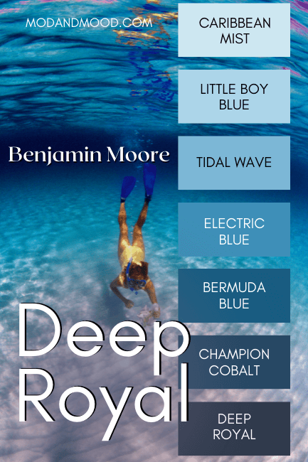
I actually think Deep Royal stands out as the tamest tone in this strip. So much so that it almost doesn’t belong!
Lighter Version of Deep Royal
On the same color strip, the shade lighter than Deep Royal is Champion Cobalt. I don’t find that it really achieves the same look because Champion Cobalt is just so bright, and a lot more teal.
You might like Sherwin Williams Indigo Batik.

Benjamin Moore Deep Royal in a Color Palette
I kept things classic for this royal navy blue color palette, and used a variety of other goes-with-anything Benjamin Moore shades.

Coordinating Colors for Deep Royal
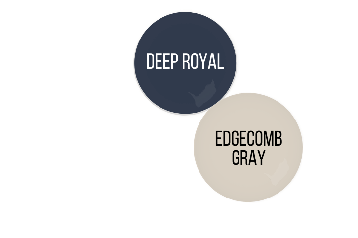
Edgecomb Gray with Deep Royal
This palette needed a soft and sandy neutral to complement the deep blue of Deep Royal. I went with Edgecomb Gray (also known as Benjamin Moore Baby Fawn).
Deep Royal with Carolina Gull
Carolina Gull might be my very favorite green by Benjamin Moore. It’s a sagey color that literally goes with ANYTHING.
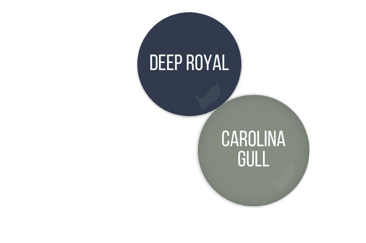
Give it a try if you want to use sage with the rich navy of Deep Royal. (Which is always a great combination by the way!)
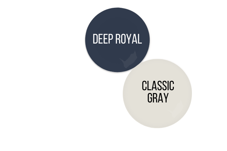
Classic Gray and Deep Royal
Classic Gray is actually a fairly creamy off-white, and not all that gray. It’s a perfect white/neutral compromise if you can’t decide on a whole home wall color to complement pops of Deep Royal.
Complementary Color for Deep Royal
The “official” complementary color for Deep Royal (the color directly across the color wheel) is a dark chocolate browny-gray.
To be honest, an exact match isn’t the nicest color, so I went with something “inspired by.”

Deep Royal and Kendall Charcoal
Kendall Charcoal is a warm charcoal, so it’s a nice dark gray with a hint of brown. It’s great with Deep Royal as a gray option that won’t make your color scheme too stark.
Sherwin Williams Urbane Bronze would be another great complementary option.
What Trim Colors Go With Benjamin Moore Deep Royal?
Navy blue paint colors typically work well with all wood tones. They were a staple in many classic Victorian color schemes, and Deep Royal is a pretty classic navy.
White Paint that Goes with Deep Royal

Your white trim choices for Deep Royal will depend on the aesthetic that you’re going for:
Crisp Nautical?
Try the clean white of Chantilly Lace.
Soft and Classic?
Take a look at White Dove, or Sherwin Williams Alabaster.
For something in between, try Sherwin Williams Pure White.
Benjamin Moore Deep Royal for a Home Interior
The good news about Deep Royal, is that it is an underused navy blue paint color. There are big time favorites from each brand, and Deep Royal seems to not enter the conversation.
All the better for us, because it really is a great blue!
Unfortunately, that also means I don’t have as many great example photos as I would like, but I did my best and created a few too.
Deep Royal on Kitchen Cabinets
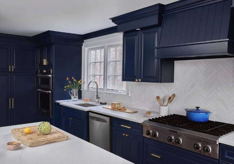
First lets take a look at Deep Royal in this beautiful kitchen by Colleen Siddig Design (@colleensiddigdesign):

I was surprised to learn that the white paint color is Benjamin Moore Chantilly Lace. It does not normally look as cool as this!
Here’s the before photo to really help you appreciate the “after” :

This kitchen went total opposite from warm earthy tones to crisp cool ones.
The original kitchen wasn’t even all that dated, just really dingey!
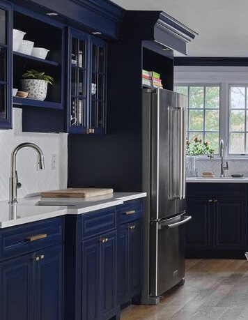
I love that Colleen decided to take the Deep Royal all the way up to the crown molding. It really makes a statement.
The island is also Deep Royal:

This kitchen has lots of natural light, so it can handle dark cabinets like these. If your kitchen is not as blessed, you might want to consider doing a two toned look with Deep Royal for lower cabinets only.
Deep Royal in a Bedroom
This next before and after is by the team at MGS Painting (@mgspainting) :
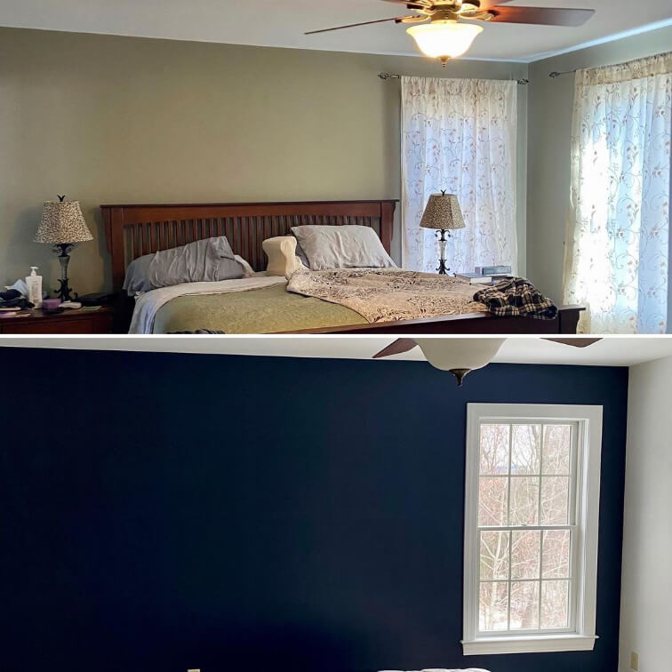
I thought it was pretty funny that the bedroom MGS Painting made over, was practically the same “before” color as the cabinets that Colleen worked her magic on!
Deep Royal is quite dark for a bedroom, so you can see in the corner that it was chosen as an accent wall for this space, and not the whole room.
A Living Room in Benjamin Moore Deep Royal
Thanks to MGS Painting, we have a nice blank background to see what Deep Royal would look like in your living room:

You can see that this color is a really nice neutral color that really allows your furniture to pop.
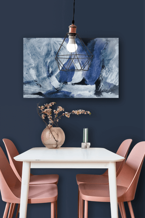
Deep Royal for Your Dining Room Walls
A Deep Royal dining room is always a good idea, because it looks so good with wood furniture, and a dedicated dining room can handle a deep moody shade:
If you do want more examples of how Deep Royal could look in different rooms and lighting, check out my post about Sherwin Williams Naval. The color may not be exactly the same, but it’s a great source for inspiration.
Benjamin Moore’s Deep Royal on an Exterior
I was able to find Deep Royal on one exterior, but I have to say it looks more muted than I would have expected, but also more so than I think is typical:
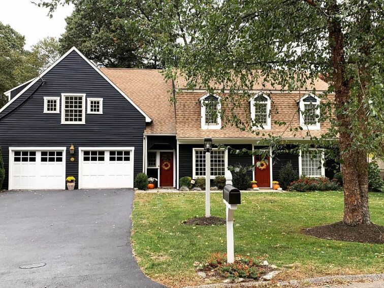
You can see that this picture of Justine’s home (@justinejellybean77) was taken on an overcast day, so on your exterior I would expect it to look more blue. Here it looks a bit closer to Benjamin Moore Soot.
Of course it’s always a good idea to test your colors, because you just never know! Even your particular trees, grass, and neighbors can effect how your color looks.
I think Deep Royal should definitely make your short list for exterior navies! It’s not a shade of navy we see all the time, but it’s still totally classic. You might also like one of These Luxurious Blue and Navy Exterior Paint Colors.
Deep Royal Compared to Other Navy Blue Paint Colors
So, how does Deep Royal stack up against the most popular navy blues by Benjamin Moore?
Benjamin Moore Deep Royal vs Hale Navy (HC-154)
You can see that Hale Navy (no doubt Benjamin Moore’s most popular navy) is a more muted and slightly lighter navy compared to Deep Royal.

Hale Navy is another great option, and it is well known to go with absolutely everything!
Check out this post for more: Hale, Yes! It’s Hale Navy! (Benjamin Moore’s Go-with-everything Paint Color)
Benjamin Moore Deep Royal vs Old Navy (2063-10)
Wow, okay! These two are pretty similar:

If you are reading on desktop it will be harder to see the difference, so if you are really interested, try switching to your phone which shows color in better detail.
These two are pretty similar in terms of how saturated and dark they are. Old Navy is slightly darker with an LRV of 3.11 vs Deep Royal’s 3.41.
The difference that you will notice in your home, is that Deep Royal is more to the teal side of navy, and Old Navy leans more towards purple. (Though neither color actually reads teal or purple, that’s just the only way to describe it.)
Ironically you would expect a color named Deep “Royal” to be more of a bright royally blue, but of the two I find Old Navy to be more royal.
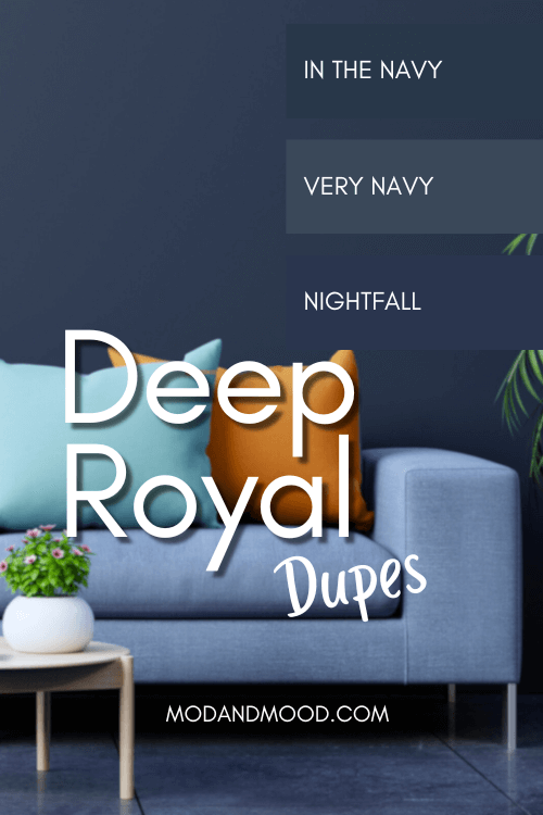
Deep Royal Dupes
Let’s take a look at some deep fakes for Deep Royal!
(I’m sorry, I had to.)
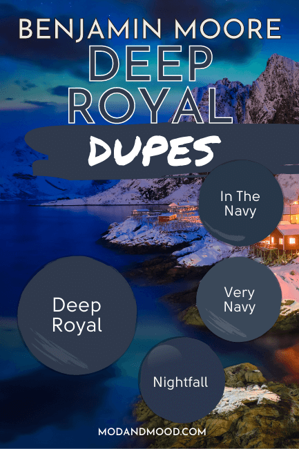
I’ll just start by saying that the navy blue paint market is not nearly as saturated as the white, gray, or beige market.
These dupes are not the exact matches that I have become used to finding! You may find them “good enough” or you may want to skip down to Benjamin Moore and get the real thing.
Sherwin Williams Deep Royal Equivalent
Sherwin Williams has the best overall winner for a Deep Royal copycat with their shade “In the Navy.”
Sherwin Williams In the Navy (SW 9178)

In the Navy is a little bit more saturated than Deep Royal, and leans a tiny bit more green.
Valspar (Lowe’s) Equivalent to Deep Royal
The next best equivalent for Deep Royal, is Valspar’s shade “Nightfall.”
Valspar Nightfall (8003-46G)
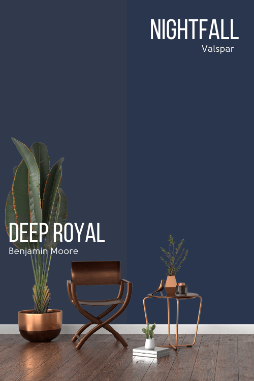
You can see that Nightfall is a bolder and less muted navy blue than Deep Royal. It is also a little bit darker.
Deep Royal Behr Equivalent (Home Depot)
Behr had the poorest navy blue selection to choose from, but in my opinion that’s because they have the poorest selection of truly dark paint colors in the first place.
Their closest shade is Very Navy.
Behr Very Navy (M500-7)

You can see that Very Navy is lighter than Deep Royal, but it does well in terms of the tone. It is just a bit less saturated than you might like, considering that Deep Royal already doesn’t read really “bright.”
We are talking dark paint vs dark paint here though, so you may find that Very Navy is dark enough for you.
Here is another look at each of these dupes:
Deep Royal Pros & Cons
We’ve reached the end of our deep dive on Deep Royal. What do we think?
Let’s take a quick look at the pros and cons!
Pros
- A safe deep navy with no real clashing concerns
- Makes a bold and dramatic statement
- Looks great on cabinets, feature walls, and exteriors
Cons
- Perhaps a little too safe?
- VERY dark. It can even look black
Thanks so much for being here to the end! Not sold on Deep Royal? Check out these other colors:


