Benjamin Moore Blue Note might just be the navy that ticks the most boxes! This smoky charcoal navy has a luxurious teal undertone that makes any project look expensive!
Here we will see this beautiful color in real homes, talk undertones, get coordinating color palette ideas, and of course, see some dupes and comparisons.
What Color is Benjamin Moore Blue Note?
Blue Note is a beautiful navy blue with lots of depth. It varies quite a lot in appearance. It can look:
- Almost black
- Deep sea navy
- True navy
- Charcoal blue
We will see all the different faces of Blue Note when we get to real homes!
What Are the Undertones of Benjamin Moore Blue Note?
Benjamin Moore describes Blue Note as having “dark gray undertones” but I disagree a little. The gray in Blue Note is what makes it such an interesting shifting color, but I wouldn’t say that it comes across as “undertones.”
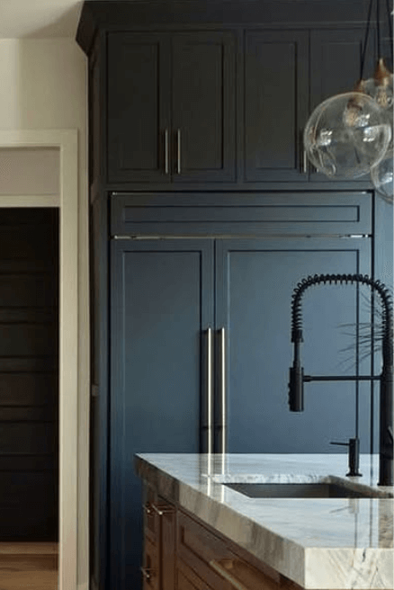
In some situations, the gray in Blue Note does come across as an almost “chalkiness” on top of a richer color. This isn’t the best example, but you can see it a tiny bit in this beautiful kitchen by the team at ML Designs (@mldesignskc):
In my opinion, the primary undertones of Blue Note are teal. This is what I see most often that makes me recognize the color instantly (or at least has me guessing between a couple!).
Blue Note can also look like a simple true navy, but that look is much less distinct, and I would argue that it can be achieved more consistently by a number of other navy colors.
Basically, that’s not the look that makes Blue Note special (in my opinion).

At its darkest and most gray, Blue Note can look almost black.

More real life examples in just a minute!
Blue Note in the Benjamin Moore Color Strip
Blue Note is on the same Benjamin Moore Color Strip as Soot, which happens to be one of my favorite go-with-everything dark colors.
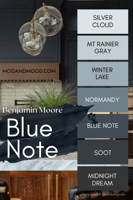
The other shades on this color strip are:
- Silver Cloud (2129-70)
- Mt Rainier Gray (2129-60)
- Winter Lake (2129-50)
- Normandy (2129-40)
- Soot (2129-20)
- Midnight Dream (2129-10)
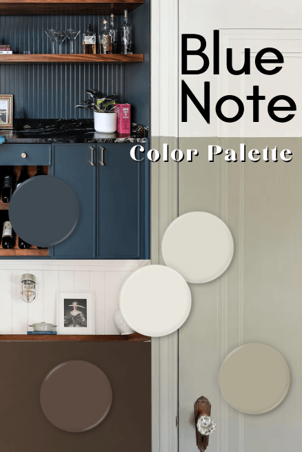
Benjamin Moore Blue Note in a Color Palette
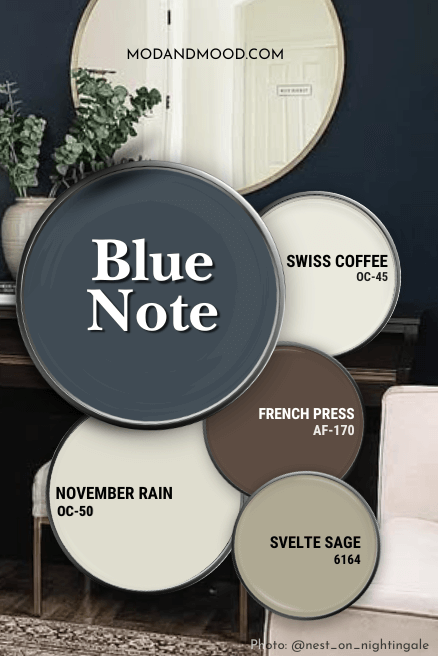
For this color palette I went very “of the moment.” All of these coordinating colors are very stylish currently, which should get you some miles out of them before they are tired.
Coordinating White Paint Color for Blue Note
I’m of two minds when using white with blue paint colors. Creamy white and blue are complementary to each other, but sometimes blue can really make your cream look yellow.
Considering the teal undertone of Blue Note, I think a warm white is the way to go! In this case it’s okay for the undertone of your white to be a little stronger, because any kind of beige (or even yellow) will look really nice with Blue Note.
I went with Benjamin Moore Swiss Coffee for (I think?) the first time ever!
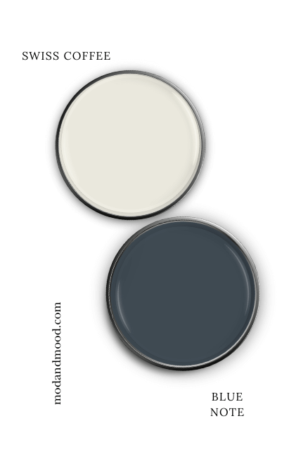
This is surprising only because Swiss Coffee is an uber popular white. It might even be the most popular white that Benjamin Moore carries. (If you weren’t aware, there are actually several “Swiss Coffee” paint colors, and you can see them all here: Swiss Coffee Paint Colors Compared – Are They All the Same?)
Swiss Coffee is a warm white with a fairly neutral undertone, but it can sometimes read a tiny bit yellow. If you really hate yellow, you might prefer Benjamin Moore White Dove, which has a more beige/peach undertone.
Neutral Paint Color to Use with Blue Note
I’ll be honest, most (all?) of these coordinating colors are pretty neutral, but in the traditional sense I went with Benjamin Moore November Rain.
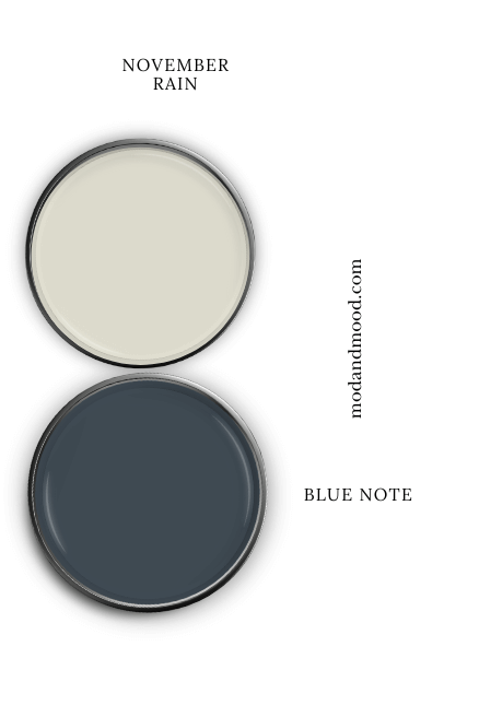
November Rain is technically an off-white, because it has an LRV right on the line of off-white and light neutral. This is one of the coordinating colors that Benjamin Moore suggests for Blue Note, and I didn’t see any good reason to argue!
November Rain ranges in appearance from a darker cream to a light greige. You should expect it to stay warm against the much cooler tones of Blue Note.
Try Blue Note with Sherwin Williams Svelte Sage
So I actually went back and forth on whether to choose Sherwin Williams Svelte Sage or Benjamin Moore Dry Sage for this color palette. I ended up going with Svelte Sage because it was my first thought.

I had forgotten that Dry Sage is on the same color strip as November Rain, so actually it would have made more sense:
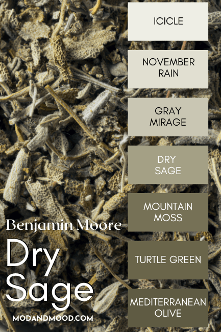
Svelt Sage is a bit lighter and more subtle than Dry Sage, but either of these sage greens would work well with Blue Note!

I like that these muted sage colors are quite warm as far as greens go, so they contrast about as much as a green can with Blue Note, while still remaining soft with the other coordinating colors.
Pair Blue Note with a Deep Brown
For this color palette I went with the chocolate brown of Benjamin Moore French Press with Blue Note:
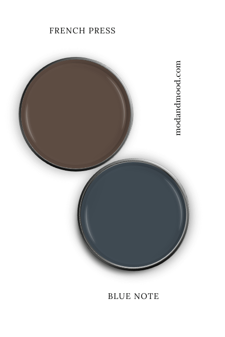
I wanted quite a warm brown to use with Blue Note because I think the contrast is really nice and the combo is very complementary.
That being said, I did go through quite a few brown options (some of which are in my Modern Brown Paint Colors post), and Urbane Bronze and Silhouette are equally good choices – if a little more gray.
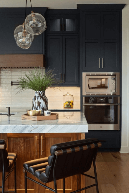
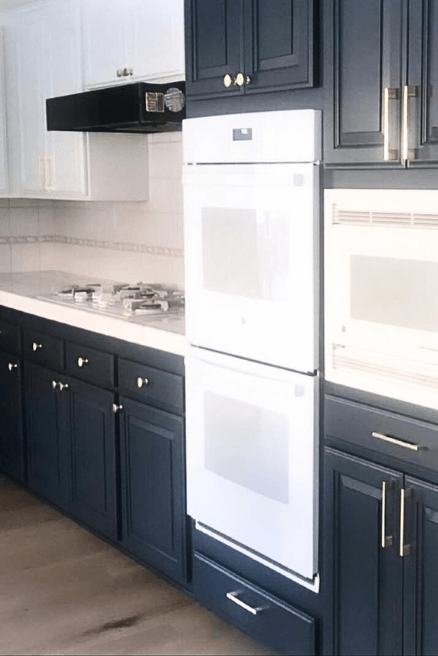
Benjamin Moore Blue Note on Kitchen Cabinets
Kitchen Cabinets are hands down the most popular place to use Blue Note! So that’s where a lot of our examples are coming from today.
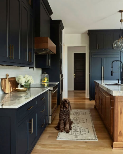
First up we have that kitchen we looked at earlier, from ML Designs:
The teal undertone here looks gorgeous, and I would say it is the most common look for Blue Note – particularly how the color looks on the left side of the kitchen.
Here is another angle of the kitchen where the color looks much more subdued:
In the next kitchen by Bethany (@reclaimed_cottage), we see Blue Note looking slightly more true navy:
Both of the kitchens that I have for examples, don’t show the gray side of Blue Note as strongly as it can look.
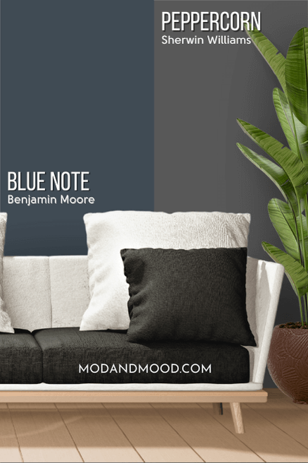
Here is an example of how Blue Note can sometimes look when that gray overpowers the color a little bit:

This photo is actually Sherwin Williams Peppercorn, but this is an identical look to how Blue Note appears when the teal is not on display and the color is very gray.
Peppercorn is technically completely gray, but it has a very shifty undertone:
Here is one more look at Blue Note looking quite “chalky” :
This time the color looks more boldly blue and not so much navy charcoal, but both are accurate.
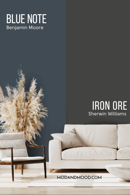
In contrast, here is how Blue Note can look at its most saturated and most teal:

This incredible color drench situation by Karla (@northernbirdinteriors) is actually Sherwin Williams Mount Etna, which is similar to Blue Note, but a bit more green:

Despite the color difference there is definitely some overlap in appearance.
Finally, I’m not actually sure what color these cabinets really are, but they look like Blue Note:

To be totally accurate, try imagining this just a little darker and a hint less colorful. (Although this is how Blue Note can look.)
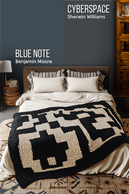
Using Blue Note on Your Walls
When it comes to walls we need to use our imaginations just a teeny tiny bit, because I am going to use my dupes for Blue Note for these examples.
We will compare Sherwin Williams Sea Serpent to Blue Note in just a minute, but what you need to know, is that this is pretty much exactly how Blue Note will look on the walls:

The creative minds behind @1907homerenovation used Sea Serpent in both the study/library of their antique home, and the living room:

It’s here in the living room that we get a great picture of how Blue Note looks when it almost looks black:

In this next project by @wood_visions, we get a good idea of Blue Note’s very lightest look:

This is Sea Serpent again, but very accurate to how Blue Note looks at its lightest and most true blue.
Here is one final example indoors, this time in a bathroom:

Blue Note for Your Home’s Exterior
Now let’s take a look at how Blue Note looks in the great outdoors!
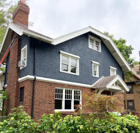
First we have some real deal Blue Note, but you can see that it looks very gray, and the undertone is almost to the purple side of blue:
This particular look is a little more accurate to Sherwin Williams Iron Ore:

…which isn’t all that similar to Blue Note:
So while your exterior could turn out like that first photo, I think we can find something a little more accurate. (Although Iron Ore does have surprising blue undertones most of the time.)
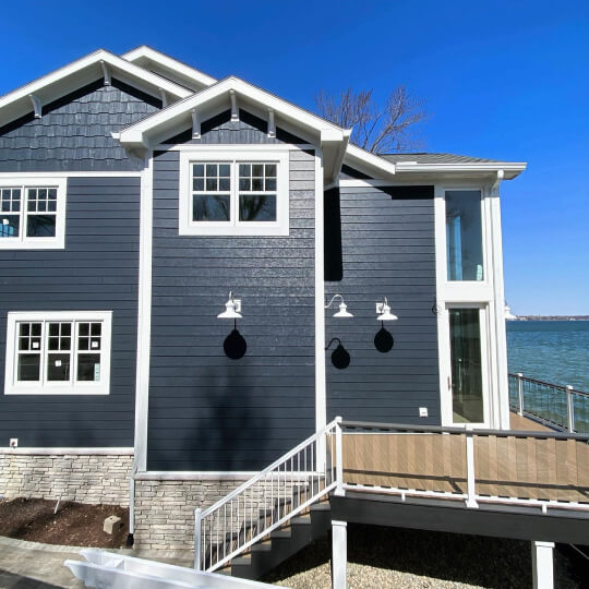
To give you an idea of Blue Note where it looks more blue on an exterior, we will use Sherwin Williams Cyberspace:
On paper, Cyberspace is a bit more gray than Blue Note and it leans more to the purple side of blue:
However this exterior is pretty accurate to Blue Note:

…but you could imagine it a tiny bit more teal.
For another good example, let’s use one shade darker: Soot.
Picture this a bit lighter to get a good idea of how Blue Note will look. Here is one more picture where this exterior looks incredibly teal:

You can keep that look in mind, but maybe with a pinch of salt, because it is unusually bright looking on the porch.
Dupes for Blue Note from Other Brands
We’ve already talked about this a little bit, but here are all of the best dupes for Benjamin Moore Blue Note from other brands:
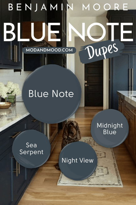
Blue Note in Sherwin Williams
The best color match for Blue Note from Sherwin Williams is Sea Serpent.
You have already seen quite a bit from this color in real homes, but what is the difference?
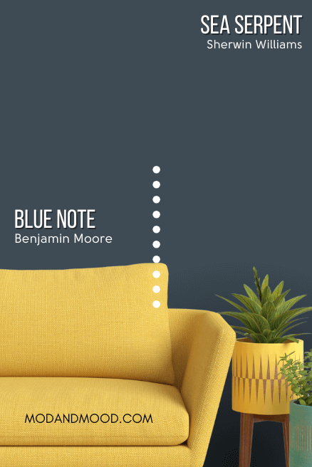
While the difference on paper and in real life is largely imperceptible, Sea Serpent is a tiny bit more green than Blue Note and a little more saturated.
I definitely think that these two give the same thing in real life, and this is a near perfect dupe for Blue Note.
The Best Behr Color Match for Blue Note (Home Depot Dupe)
From Behr, the very best alternative for Blue Note is Midnight Blue:

Midnight Blue is actually quite a popular Behr color all on its own. I would have liked to get a little bit closer to Blue Note, but this is the best overall tone match, and it’s not far off:

This dupe is a slightly lighter version of Blue Note. Behr unfortunately doesn’t have a shade darker, but you might also like:
Behr Starless Night
Starless Night is closer to the LRV of Blue Note, but it is a little bit more saturated and less teal. Think more “true navy” :
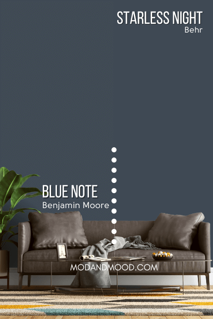
That being said, Starless Night is still pretty close in feel to Blue Note. Here it is on the lighter side:

Here it is looking darker in the same room:

Not a bad alternative, if not a dupe.
Blue Note Valspar Equivalent (Lowe’s)
Over at Lowe’s, the best equivalent for Blue Note is their shade Night View:
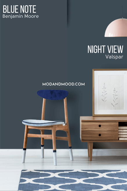
Night View is almost identical to both Blue Note and Sea Serpent. On paper it is closer to Sea Serpent, but I’m not sure you could tell any of these three apart. Like Sea Serpent, Night View is a little bit more saturated and a tiny bit more green leaning than Blue Note.
Benjamin Moore Blue Note vs Gentleman’s Gray
Gentleman’s Gray is more overtly teal than Blue Note. With Blue Note, I would say that teal is an undertone, but Gentleman’s Gray is classified as a teal color.

Both colors can look quite teal or quite navy. In real life, it is more difficult to tell these two apart, particularly because both are a little difficult to pin down.
In general, I would say that Gentleman’s Gray is a bit more bold and “colorful” than Blue Note. Blue Note has a smoky look a bit more often than Gentleman’s Gray does. There is however, a LOT of overlap here.
Benjamin Moore Blue Note vs Hale Navy
Speaking of overlap, let’s take a look at Hale Navy compared to Blue Note:
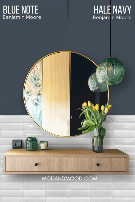
These two look a bit more alike on paper than in real life. While both of these colors have a fair bit of gray in them, Hale Navy is a true navy and doesn’t look teal. It can have an undertone on the greener side of blue, but it stops just short of teal:

In turn, Hale Navy can have a more purple undertone than Blue Note gets to:

I find that Hale Navy looks more consistently true blue, where Blue Note more often leans teal. (Again there is a lot of overlap here.)

Benjamin Moore Blue Note vs Newburyport Blue
Newburyport Blue is a much bolder and more saturated blue than Blue Note:

While both of these colors can have a teal undertone, Newburyport Blue more often looks like a blueberry color. When it does look teal, it is much brighter than Blue Note.
While Newburyport Blue can look a little smoky, I would not say that it ever looks charcoal or black.
You can see a bit more from Newburyport Blue in my post: Benjamin Moore Newburyport Blue vs Hale Navy
Thank you so much for reading until the end! That really helps my blog. Haven’t found what you’re looking for? Oh baby, I’ve got more! :