Perhaps in response to “Millennial Gray,” Maximalism has seen a sudden surge in popularity recently! Homes are being filled with lots of fun colors and an eclectic mix of whatever decor sparks joy.
Let’s take a look at some fun and versatile color palettes that are on theme for happy, quirky: Maximalism!
Rainbow Pastel Maximalism
Much of the fun of maximalism comes from using a LOT of color. Here are some rainbow pastels that all work well together, but can also be mixed and matched.
If you are into this style, you are going to want to follow Rosie over @the_flat_that_rosie_built. She has been doing the most since before it was cool!
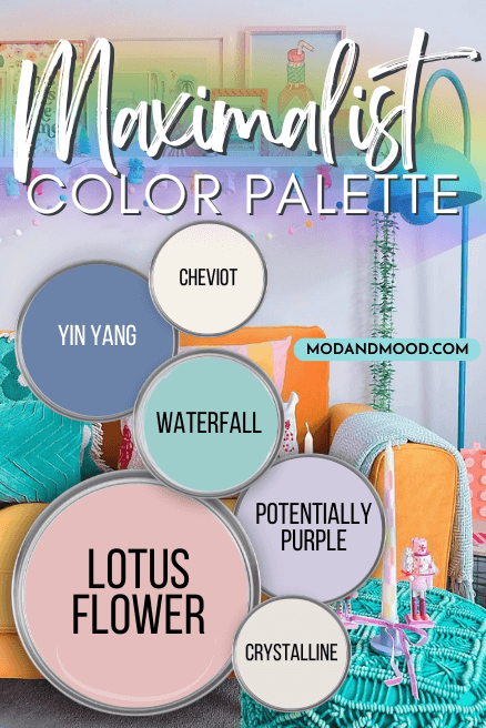
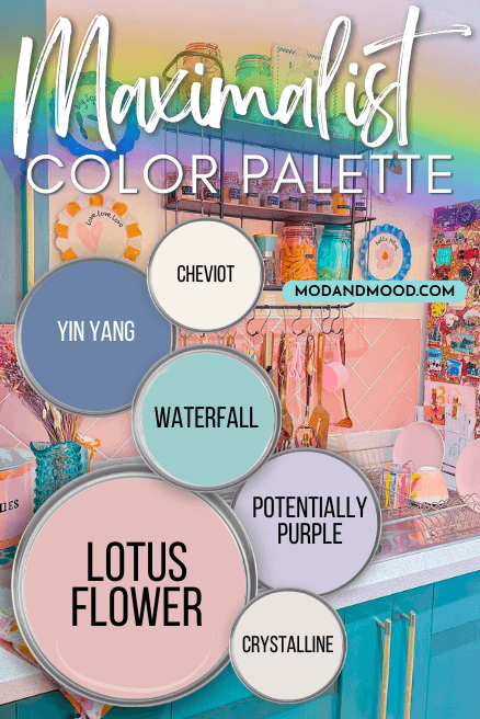
Sherwin Williams Lotus Flower
Lotus Flower is a near perfect pink. It’s not too bright or babyish, but it is a true pink.

You will see this color a few times in this post, because it works well in a lot of different color schemes!
Sherwin Williams Potentially Purple
Potentially Purple is a pretty lilac color that is nice and light, but saturated enough to read purple.

This shade leans more blue than berry, which I think is perfect in a pastel purple. This is a unicorn-rainbow-glitter purple, if ever I saw one!
Sherwin Williams Cheviot
Cheviot is a bright white with a yellow to peach undertone. It works well as a white in maximalist color schemes because it has a bit more color than most bright whites.

Sherwin Williams Crystalline
Not to be confused with the Benjamin Moore shade Crystalline (which is a light green), the Sherwin Williams version is a muted off white with a warm undertone that verges on pink.
Benjamin Moore Yin Yang
Yin Yang is a mid-toned blue that leans just a little bit periwinkle.

It is actually one shade lighter than Benjamin Moore’s “Color of the Year” from 2024 – Blue Nova.
While it is technically a little dark to be a pastel, Yin Yang pairs very well with pastels, and it is a nice saturated blue.
Benjamin Moore Waterfall

Waterfall is a beautiful aqua color that could also be classed as a Robin’s Egg Blue.
This gorgeous blue green is a bright and happy choice that pairs well with pastels, but also with most shades of orange.
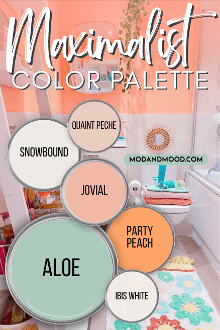
Maximilism with Melon & Mint
After a peruse through Pinterest, I noticed that a lot of maximalist color schemes could be categorized as “Melon & Mint.” These palettes pair shades of pink and orange with greens and aqua:
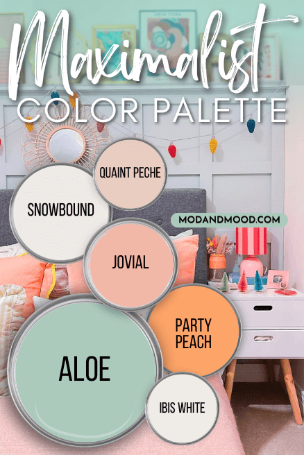
Here are some colors that I recommend to get the look:
Sherwin Williams Quaint Peche
Quaint Peche is actually quite a subdued peach option, but with a really beautiful peachy pink undertone.

This is a perfect all-over shade for your walls if you want your decor to do most of the talking.
This color has a little bit of calming gray, so it’s nice and creamy rather than punchy. (If that makes sense.)
Sherwin Williams Jovial
Jovial is a happy salmon color that works well with almost all other shades of orange, pink, green, aqua, and charcoal.

For how specific it looks, the possibilities are surprisingly endless!
Jovial could pretty easily be swapped out with Lotus Flower if you wanted to go more pink with your color scheme than peach/orange.
Benjamin Moore Party Peach
For a truer orange that is a little less versatile than Jovial, you might like Benjamin Moore’s Party Peach:

This shade does still lean a little bit pink, so it coordinates well with other shades like melon and true pinks.
Sherwin Williams Aloe
Aloe is a beautiful and bright blue-green. This color works really well with everything from pastels and neutrals, to blues and subdued gray greens.

Sherwin Williams Ibis White
For white options in the melon and mint color scheme, I recommend these white paint colors because they both can have the slightest pink undertone:

Ibis White has the stonger undertone of these two, but it still reads mostly creamy white. However, the undertone does favor shades of pink.
Sherwin Williams Snowbound
Make no mistake, Snowbound is much more “soft white” than it is pink. Often the undertone is incredibly subtle.

Both of these are technically true whites, so you can use them in any color scheme!
I like this color scheme a lot, because it’s easy to swap out just one shade and get something totally different (that still works!).
Here is an example where we switch out the mint of Aloe for a deeper aqua color:
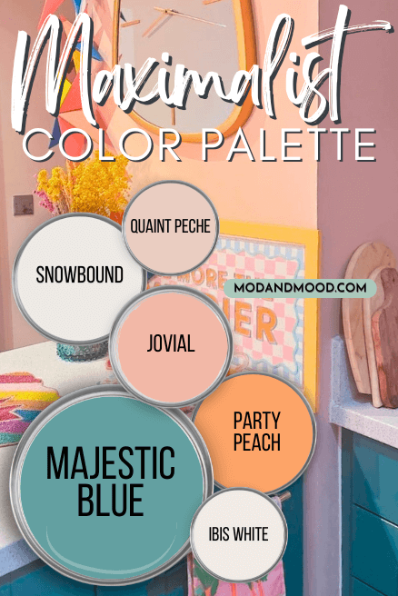
I am loving how all of the pinks and peach work with a slightly more teal color!
Benjamin Moore Majestic Blue

Majestic Blue is a saturated blue green that is teal adjacent, if not an actual teal. This mid-toned color is pretty bright, so if it’s a bit too much you might be:
The Muted Maximalist
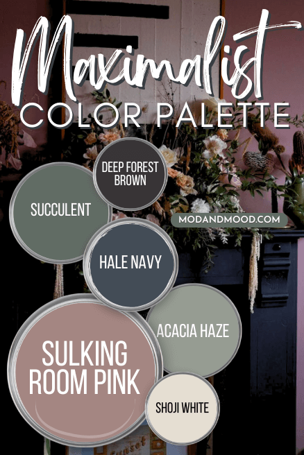
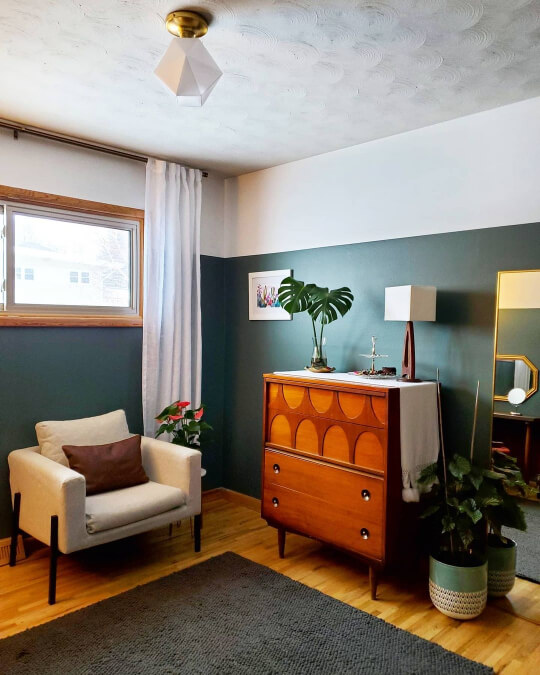
You can still spark joy and fill your home with things you love without choosing super bright paint colors. This color palette is for the maximalist who favors timeless colors! A great example of this style, is @thejordansathome!
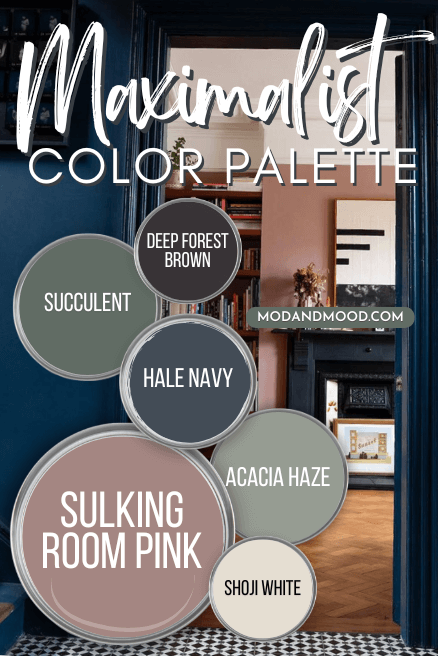
Farrow & Ball Sulking Room Pink

If you want to dabble in pink but love a neutral, Farrow & Ball’s Sulking Room Pink is the perfect way to dip a toe in.

This traditional-feeling Victorian pink is actually pretty classic. You might also like Benjamin Moore Barberry.
Benjamin Moore Hale Navy

Benjamin Moore Hale Navy is a go-with-anything deep blue with a heavy dose of gray. This color may be classic and neutral, but it still makes a bold statement because it has so much depth.
Sherwin Williams Deep Forest Brown

Sherwin Williams Deep Forest Brown is an almost black brown that also has lots of neutralizing gray. I like the idea of this color for maximalist color schemes because you can use it like black, but with a twist.
You might also like Sherwin Williams Greenblack for the same effect, but with a green undertone. For something like Deep Forest Brown but a little lighter, try Urbane Bronze or Benjamin Moore Silhouette.
Sherwin Williams Succulent
Succulent is one of those colors that seems like it has too much personality to play well with a lot of other colors, but it does!
You could use Succulent in any maximalist color scheme that requires a green, and it will probably work!
Sherwin Williams Acacia Haze
Acacia Haze is a sage green color that is also really neutral. I like this one because it is perfectly mid-toned and reads very nature inspired.

This one is perfect for maximalist meets boho!
Sherwin Williams Shoji White
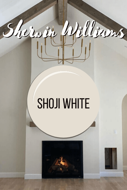
Shoji White is a favorite creamy off white from Sherwin Williams. This color can either read like a light neutral or a white, depending on how you use it! You can really slot this color into any of these color schemes when you don’t want a crisp white or a true beige.
Just like with the melon & mint color palette, we can swap out just one shade to get a different look:
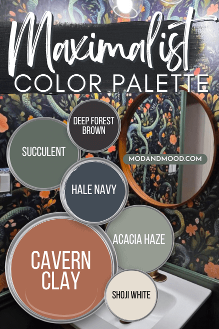
Here Cavern Clay takes the color story from Victorian to Mid-Century Modern. Although in this serpentine bathroom at Sara’s place (@thesaradupee), we get something else entirely!
Sherwin Williams Cavern Clay
Cavern Clay is one of my favorite terracotta paint colors because it also works well with a huge variety of shade. (Sensing a theme?) This one comes across as almost equal parts orange and red, but just muted enough.

Rose & Sage Maximalist Theme (Vivid Botanicals)
Finally for a garden party inspired color palette, we have this rose and sage ensemble:
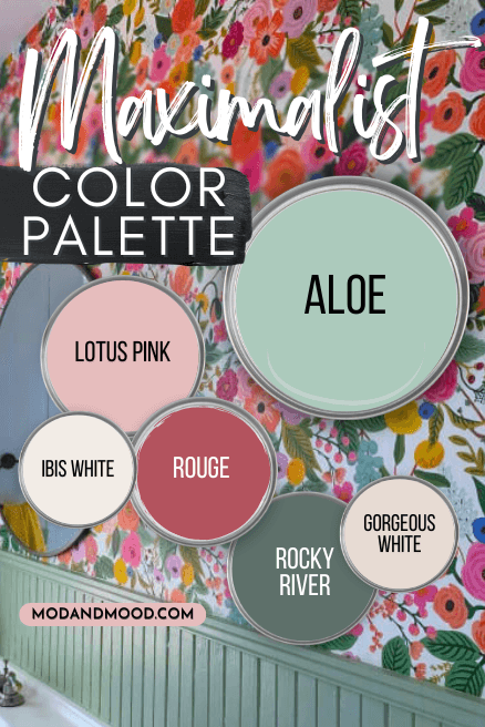
You will recognize Ibis White, Lotus Pink, and Aloe from the other palettes we just looked at.
Sherwin Williams Rocky River
Rocky River is one of my favorite teal paint colors for kitchen cabinets. This green-forward shade toes the line of sage and teal.

There are a lot of teal and magenta color schemes that I also really liked, and this color can do both!
Benjamin Moore Rouge
Rouge is a sophisticated take on Barbie pink.

This dark rosy pink can work anywhere that a dusty pink or true magenta isn’t quite doing it. It is like a hot pink dialled back a bit.
Sherwin Williams Gorgeous White
Gorgeous White is an off white with a fairly strong pink undertone.

Use it like a white, neutral, or pink!
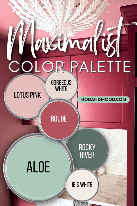
Over at Nicole’s @basicbluehouse, her burgundy/magenta laundry room is a little pocket of color within a larger, very incredible color story. Definitely check out her home for more inspiration!
That’s all I have for you today, I hope these color palettes are a jumping off point for you to assemble your own maximalist color scheme. I tried to bring together a great mix of shades that do it all, and some that are just plain fun!
Still procrastinating on that project? Allow me to enable! Here are some more ideas you will love: