Sable by Sherwin Williams is a trending deep brown paint color with warm, luxurious, chocolate tones. Dark brown is a top choice for color drenching, and Sable is a great way to create a deep and moody space with all the comfort of a warm color.
Here we will talk about Sable’s undertones, get coordinating color palette ideas, see the color in real homes, and dupe the look in other brands!
What Color is Sherwin Williams Sable? (Let’s Talk Undertones!)
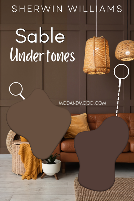
Sherwin Williams Sable (sometimes called “Sable Brown”) is a dark chocolate brown paint color with undertones ranging from golden to berry.
At its lightest and most golden, Sable looks almost like a dark copper color. At its darkest and most chocolatey, it looks like an espresso color with perhaps a whiff of violet.
The LRV of Sherwin Williams Sable is 8.
The LRV (Light Reflectance Value) of a color indicates on a scale of 0 – 100 how much light a color reflects (or doesn’t reflect). True black has an LRV of 0 and pure white has an LRV of 100.
In the paint world, we are working in a range of about 3 – 93 because no paint color is purely black or completely white.
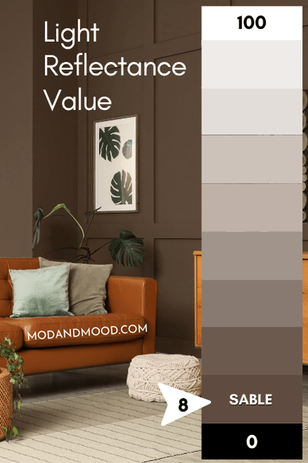
I usually say that truly dark paint colors tend to have LRVs of 10 or less. At 8, Sable is a dark paint color and not a darker mid-tone. It isn’t quite dark enough or muted enough to ever look black (in my opinion).
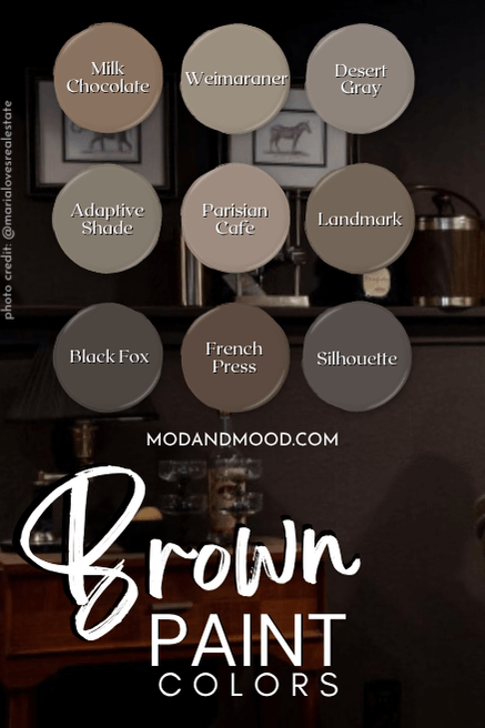
Sable in the Sherwin Williams Color Strip
Here is the whole collection from Sherwin Williams featuring Sable:
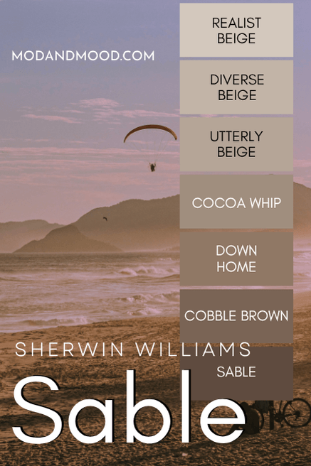
The other colors from light to dark are:
- Realist Beige
- Diverse Beige
- Utterly Beige
- Cocoa Whip
- Down Home
- Cobble Brown
Surprisingly, the only color that I have really touched on before is Cocoa Whip, which I used in my color palette for both Whitetail and Steamed Milk.
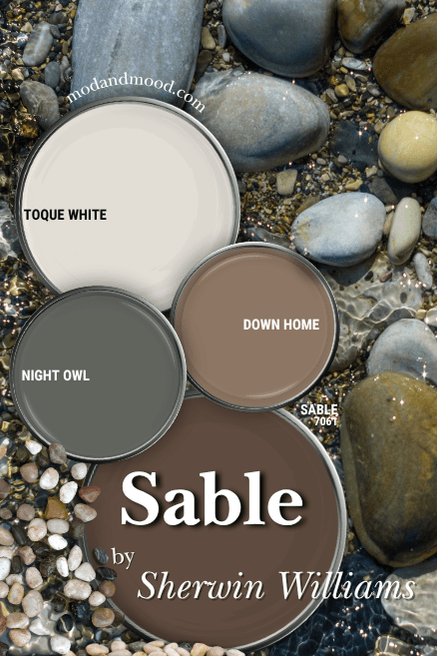
Sherwin Williams Sable in a Color Palette
Here are the coordinating colors that I recommend for Sherwin Williams Sable:
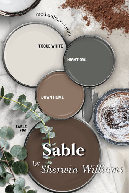
Coordinating White Paint Color for Sable
Right now low or no-contrast color schemes are trending, so I went with an off white for this color palette instead of a true white.
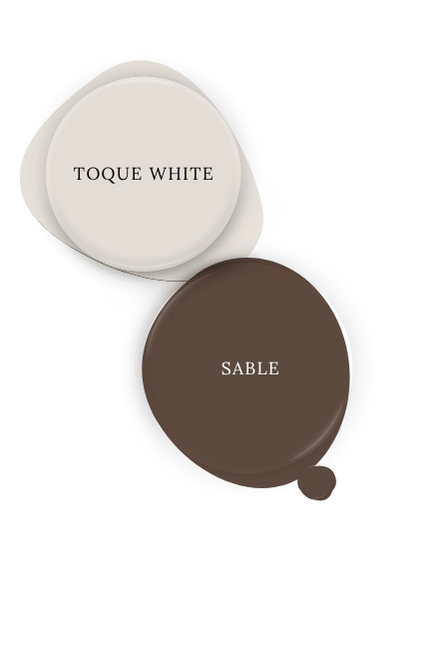
Sherwin Williams Toque White has similar undertones to Sable, so it makes for a harmonious combo! This creamy off white is almost like a darker version of Snowbound.
Try Sable with Sherwin Williams Night Owl
Technically the complementary color for Sable would be a navy blue, but I wasn’t feeling like that looked very fresh. Instead I went with a deep charcoal green with Sherwin Williams Night Owl.
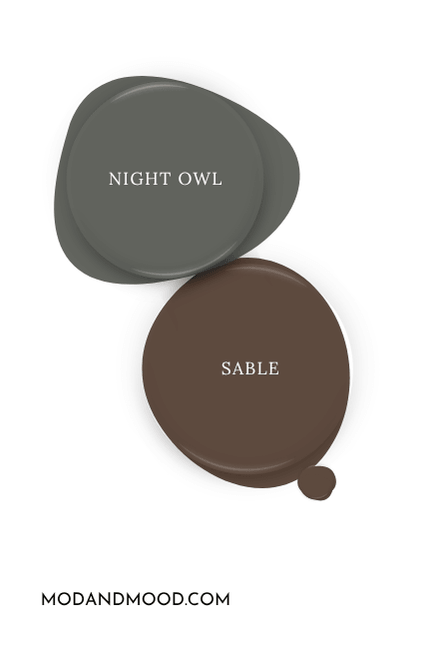
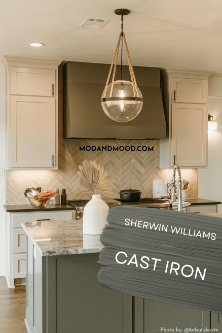
For a slightly warmer version of this color, you might like Sherwin Williams Cast Iron, which was alllmost my pick for this palette.
Neutral Paint Color to Use with Sable
For a coordinating lighter neutral to pair with Sable, you could really pick any of the beige colors from the same color strip. I was going to go lighter, but I ended up liking the tone-on-tone look of Down Home.
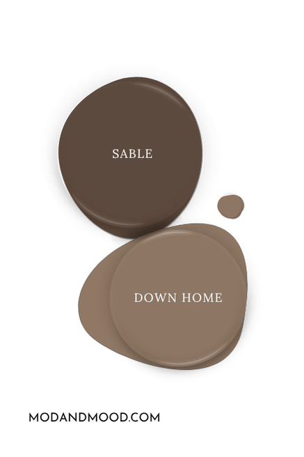
This is a great option for a color drench when you don’t quite want to go all in on the dark side!
Sherwin Williams Sable for Your Home’s Interior
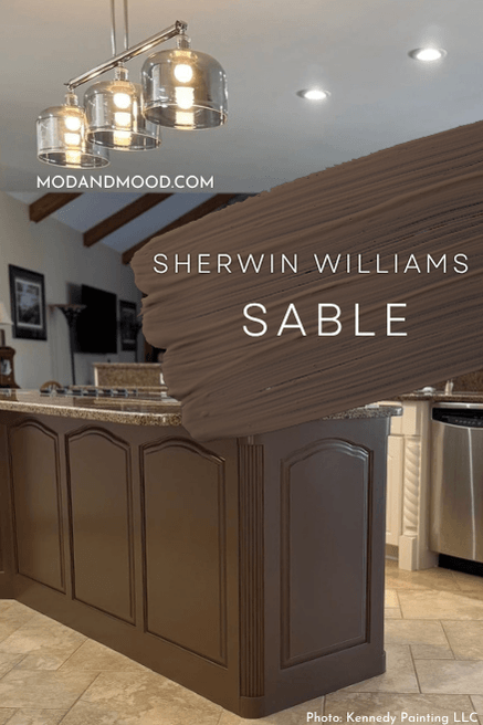
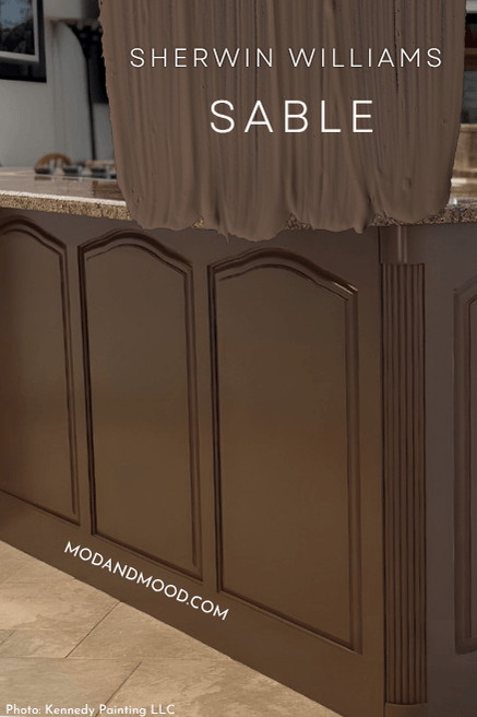
Luckily for us, I was able to find one single solitary kitchen where Sable was used on the island cabinets!
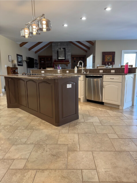
The team at Kennedy Painting LLC used Sable for the island and Sherwin Williams Greek Villa for the perimeter cabinets.
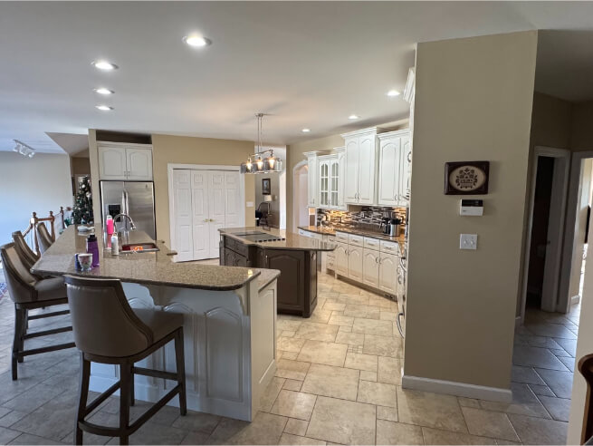
The island is a really good example of a typical look for sable:
I was also able to find this post, with a few good examples of Sable on walls:
Sable on an Exterior
I actually don’t see people choosing brown for their whole exterior much these days, but I do have one example using the slightly darker color Turkish Coffee:
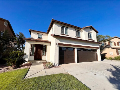
The color here looks very much like Sable does inside, but you should expect it to look a little lighter than this outside. The stucco here is Sherwin Williams Creamy.
A much more popular color for exteriors is Sherwin Williams Urbane Bronze, which we will take a look at compared to Sable right now!
Sherwin Williams Sable Compared to Other Brown Paint Colors
Really quickly before we get into the dupes, here is how Sable compares to other brown paint colors.
Sherwin Williams Sable vs Urbane Bronze
While Urbane Bronze and Sable are both brown paint colors, Urbane Bronze is around a 50/50 mix of charcoal and brown, where Sable is a true brown paint color.
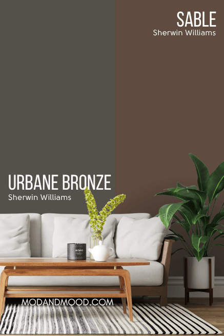
There is some overlap where Urbane Bronze looks its absolute most brown, but it’s never the true chocolate of Sable. (Check out Dragon’s Breath for a Benjamin Moore version of Urbane Bronze.)
Sherwin Williams Sable vs Turkish Coffee
Sherwin Williams Turkish Coffee is almost like a darker version of Sable:
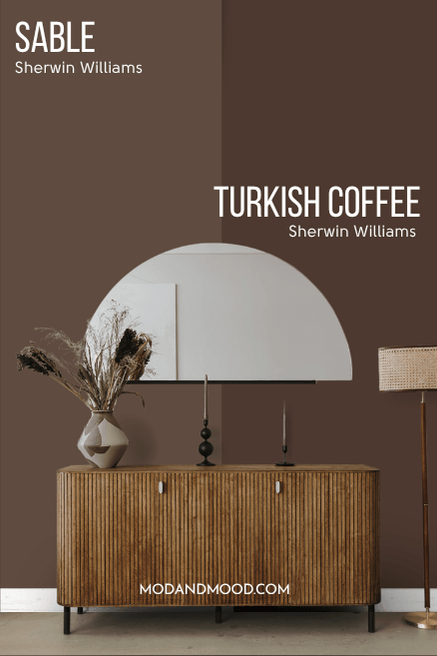
Technically Turkish Coffee is a little deeper into the red-brown color family, so you may find it slightly more likely to have the berry brown undertone. In general these two would be hard to tell apart from one home to another, because LRV is the major difference.
Sherwin Williams Sable vs Benjamin Moore Silhouette
I wanted to compare Sable with Benjamin Moore Silhouette, because that deep brown was named the 2026 color of the year!
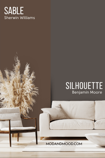
Despite looking quite different on paper, these colors have pretty similar undertones, it is just that Sable is like a very intense and saturated version of Silhouette.
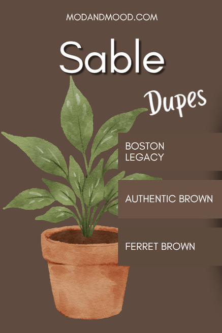
Dupes for Sherwin Williams Sable from Other Brands
Can’t get yourself to a Sherwin Williams store? Here are some other colors that will get you the same vibe as Sable!
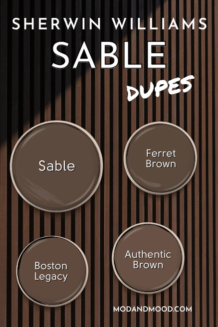
Benjamin Moore Version of Sable
From Benjamin Moore, the very best color match to Sable is the color Ferret Brown. (Makes sense, because apparently a sable is a type of weasel.)
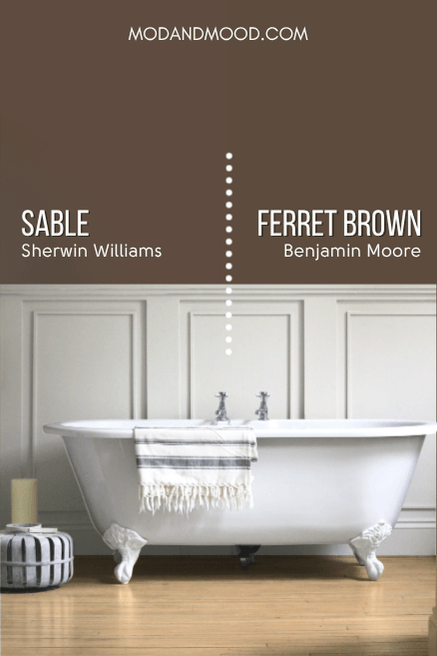
Ferret Brown is just ever so slightly cooler than Sable (more yellow rather than red on the orange-brown scale), but I’m not convinced you could tell these two apart!
Sable Equivalent in Valspar (Lowe’s)
Over at Lowe’s, the best dupe for Sable is the Valspar shade Boston Legacy.
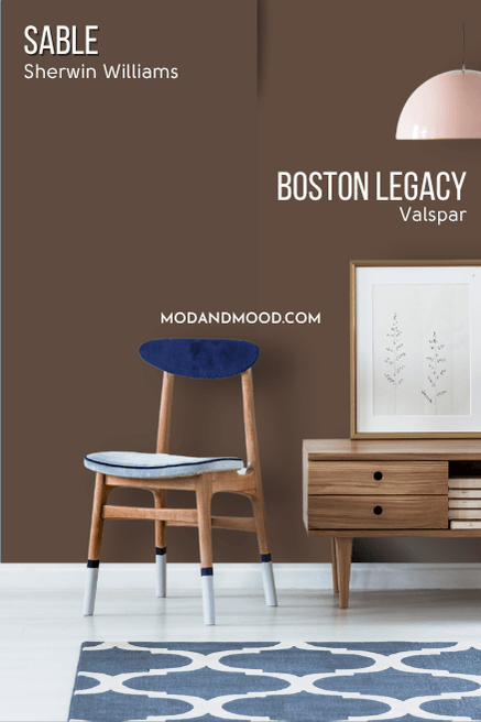
Boston Legacy goes the other direction from the Benjamin Moore dupe, and it is slightly more red leaning. Having seen this color in real life, I don’t think you could tell from one home to another which color is which!
Best Behr Color Match for Sable (Home Depot)
Finally we have the Home Depot dupe for Sable, with the color Behr Authentic Brown.
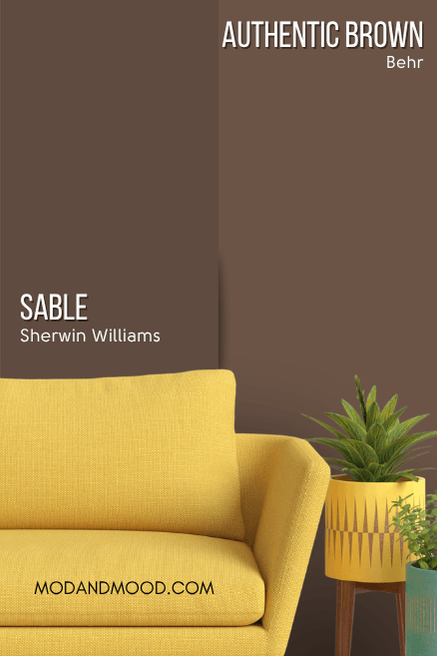
Authentic Brown is lighter than Sable, as you can see, but it is still a nice dark color, with an LRV of 10. The other major difference is that the Behr color is more saturated (less gray) than Sable.
Here’s another look at each of these dupes:
Thank you so much for reading until the end! That really helps my blog. I hope this helped you decide if this is the right color for you.
Still not sure? Not a problem! I’ve got plenty more where this came from: