Whether you’re a purist who loves wood trim, or you just can’t be bothered with the massive undertaking of painting it all, here are some gorgeous wall colors that go with wood trim!

Choosing a Wall Color with Your Goal in Mind
Before we begin, here is a little bit of color science! Blue is across the color wheel from orange:

This means that if your wood has warm orange tones that you dislike, you do not want to complement them. Aka you do not want to use the color across the wheel.
If you have red-toned wood, green will emphasize the color, etc.
That doesn’t mean you can’t successfully use blue or green with wood, it’s just something to be aware of. You will find that the complementary color for your wood makes it pop more.
You might even find that you don’t actually hate the wood, you just hate how it clashes with the current color scheme.
If you do want to neutralize the wood somewhat, try a warmer color, or one that isn’t directly complementary.
Colors to Avoid with Wood Trim
This section is just my opinion, as most decor advice is. So take the parts that make sense to you, and feel free to ignore the rest.
Taupe
I love taupe. Certified lover girl of taupe over here! Unfortunately, most shades do not work with wood trim.

This is because taupe also has a warm undertone, but often in a different way than wood does. I find that the conflicting warm tones tend to clash. I’m sure there are very specific taupes that work, but it’s a tricky business, and one that I would avoid.
Brown
As you know, wood is brown. (Thank you captain obvious.) As such, it is very difficult to try and match the perfect brown wall color with wood trim. Most of the time the result can get close, but still be just a little off.
Most Beiges
The same goes for beige as with brown. It’s sort of similar to wood, but not quite right. I also find that most beige colors end up looking quite dated with wood trim because this was a popular combination in the early 2000’s. The exception here is if a beige is light enough. Off-whites with beige undertones can definitely work with wood.

Some Grays
Sorry to be so unspecific, but gray is complicated with wood trim. If you want to play it safe, skip it altogether!
If you really want to go gray, I recommend choosing a gray paint color with a strong green or blue undertone, and skipping on any that have warm or purple undertones.
These are the obvious colors to avoid, so let’s carry on to see some that work!
My Favorite Paint Colors for Wood Trim

Here are all of the colors that stick out in my mind for coordinating in really beautiful ways with wood trim:
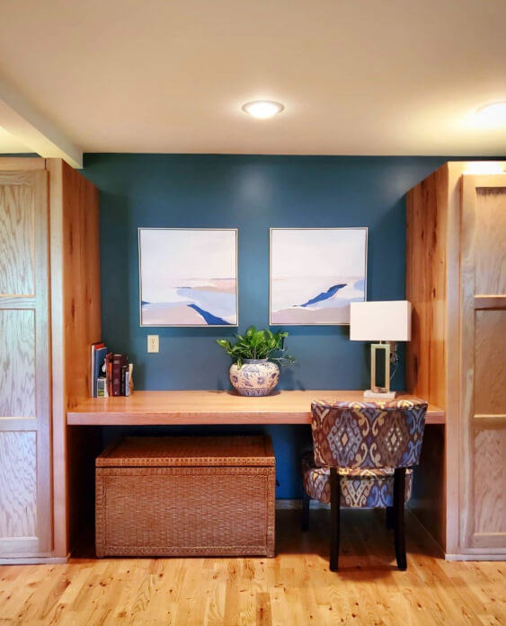
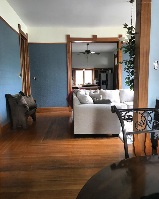
Benjamin Moore Hale Navy
I know I cautioned that blue will emphasize the warm tones in your wood, but what if that changes your whole opinion on it?
Hale Navy and wood trim is the classic Victorian combo. It oozes understated elegance. Sarah used a lot of really gorgeous paint colors in @1895stepler_house, which is full of wood trim, so definitely check out her Instagram for more.

Hale Navy can change colors throughout the day and in different lights. It ranges in appearance from quite a gray blue to a rich navy.

It’s not really a surprise that Hale Navy goes with wood trim, because it is often regarded as one of those paint colors that truly goes with anything!
Where possible, add in elements of creamy white, and you have a winning color scheme!

Sherwin Williams Ethereal White
White is a classic option for any and all tones of wood trim, but Sherwin Williams Ethereal White is an unexpected take on soft white that hits all the right notes!

In this first photo you can see that it looks lovely and neutral with this very warm wood.
Ethereal White is actually a creamy off-white with the slightest green undertone. It’s so sooo difficult to have a warm white with a green undertone, so this color is truly something special!
Ethereal White works just as good with dark wood as it does with warm wood tones. If you like this color, you might also like Behr Irish Mist, which is pretty similar.
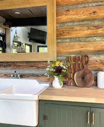
Sherwin Williams Foggy Day
Foggy Day is a rich blue with a subtle anchoring of gray that is very complementary to warm wood trim.
This shape shifter can range in appearance from almost navy, to a medium dusty blue, or even to a murky gray blue-green.

Foggy Day manages to be quite moody and mysterious, without needing to be super dark.

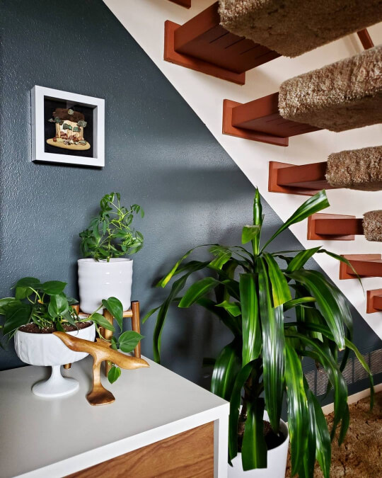
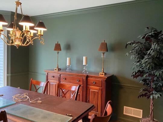
Sherwin Williams Rock Bottom
Rock Bottom is quickly becoming one of my favorite colors of all time! If you’re stuck in a design dilemma, I honestly think Rock Bottom has a good chance of being the answer!

This murky green-toned gray has chameleon-like tendencies, so it’s hard to classify, but it definitely does work with wood!
Here you can see it with a beautiful honey oak ceiling:

The warm wood does highlight the cooler undertones in Rock Bottom, but I would give this color a pass if you hate olive, because that can be one of it’s undertones.
Personally I love Rock Bottom because it’s such an interesting and unique color, without being ultra “specific.”
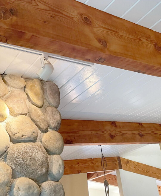
Benjamin Moore Soot
Soot is a deep charcoal from Benjamin Moore with cool blue undertones. This is another color that goes with anything, so of course it goes with wood trim!

Finally we have an example with a more neutral walnut-toned wood!

Soot promises to bring cohesion to your space. This color is a great option if you want something predictable! Despite being fairly gray, I don’t find that Soot has the same chameleon-like tendencies that many complicated gray paints do.

Soot can occasionally look close to black, because it is a very dark color.
Benjamin Moore Simply White
I believe Simply White to be the brightest creamy white on the market, and a creamy white might just be the safest bet for any shade of wood trim!

This shade will keep your color scheme light and bright without over-emphasizing the warmth in your trim, because it is warm itself!
In that first photo we see it with very neutral wood, but here it is with something warmer:
You can see that the wood does still look warm – definitely – but it doesn’t look overly orange, like it might with some other colors.
This next photo isn’t exactly wood trim, but I wanted to show Simply White with another tone of wood:

This white works great with all three of these wood colors, and it will look great with yours too!
Sherwin Williams Rosemary
For something a little less “expected,” you might try reaching for SW Rosemary.
Not exactly trim, but here is Rosemary absolutely slaying with a few different wood colors:

This warmer shade of sage green is a real showstopper with all wood tones, but especially honey oak!
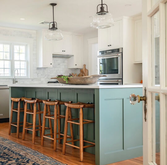
Here is Rosemary again with a more red-toned wood:
I think what makes Rosemary a foolproof choice with wood, is that it looks really great with orangey tones in general. I also love it with brick!

Another reason to like Rosemary, is that everybody else will like it too! It’s one of those colors that I always see people asking for the name of on Instagram and Facebook. It’s not overused by any means, just super appealing.
Sherwin Williams Pure White
I had to toss in a totally classic and neutral white on this list, just to cover all the bases! SW Pure White is just that: A very neutral classic white with just a hint of warmth.

I was surprised to find that I didn’t have much by way of photos of Pure White with actual wood trim, so I will do my best to show it with different wood tones in other ways!
First we saw something light and natural. Here it is with a very warm-toned wood:

…and here it is with something in between. A sort of neutral mid-toned…walnut? (I’m so sorry, I don’t know my grains that well!)

Here is Pure White with wood that leans somewhere between neutral and cherry, with an espresso colored wood on the floors:

Finally, here is Pure White against honey oak floors:
Here the color looks a bit warmer than normal, but that is due to the artificial light more than the floors.
You can see that no matter the color of wood, Pure White works! That is sort of the nature of Pure White though. Much like Chantilly Lace, it’s a very straightforward white with little to no undertone.
Benjamin Moore Vintage Vogue
Finally let’s wrap things up with another beautiful green! Vintage Vogue is a luscious sage green with a little more warmth than others.
This color works super well with the warmest tones of wood, and it’s one of my favorites with honey oak in particular.
This green most often looks somewhere between sage, forest, and olive, but it always looks good!

Here is another look at all of my favorite paint colors to pair with wood trim:

I hope this helped you decide on a color scheme that is going to help you embrace the features that your home (most likely) already has!
Not quite right? Here are some other colors that I also like with wood trim: