A while back I had a list of foolproof colors that go with everything, but that got me thinking, ARE there colors that everyone loves? I decided to scroll through my mental archive to pick out a few Sherwin Williams colors that are true crowdpleasers!
These are the very few paint colors that I haven’t heard a single bad word about.
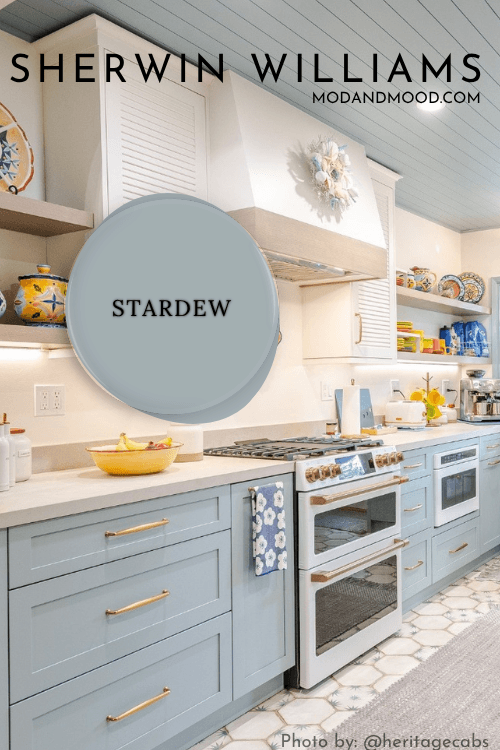
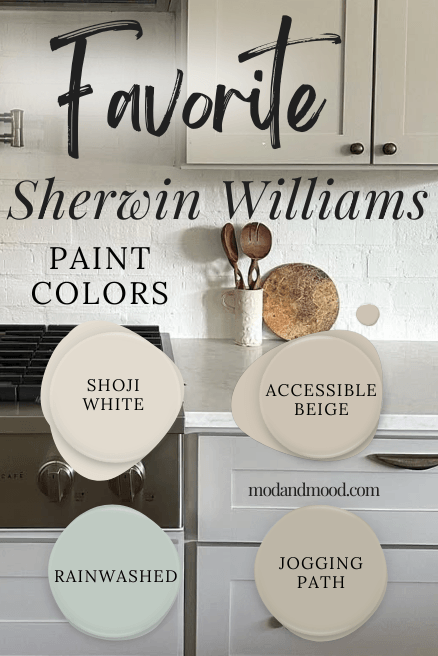
1. Sherwin Williams Rainwashed
Rainwashed is a gorgeous misty gray green with aquatic blue undertones. It can range in appearance from a muted hybrid of mint and sage, to almost totally blue.
However it ends up looking, it always looks soothing and sophisticated.
This color is perfect for walls, cabinets, or exteriors, and again haven’t heard anyone say a bad word about it!
(And that’s saying something, because I also talk paint on Facebook now.)
Rainwashed is from the same color strip as other favorites: Window Pane, Halcyon Green, and Jasper.
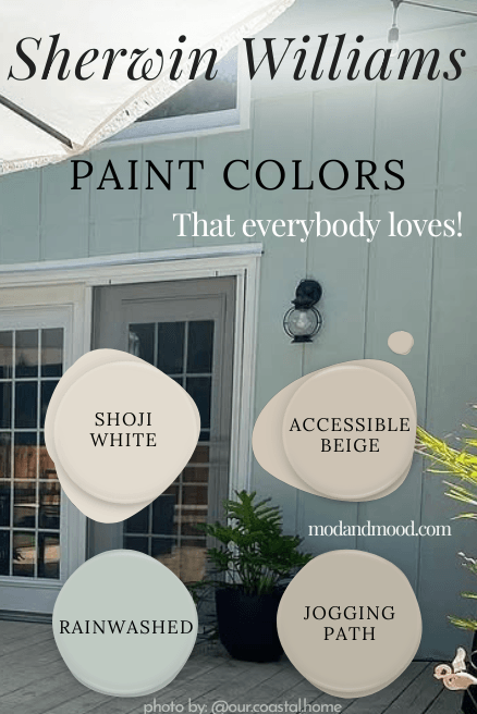
2. Sherwin Williams Shoji White
It’s actually crazy how divisive the world of white paint is! One woman’s “too yellow” is another woman’s “hospital hallway,” so what’s a girl to do?
Go with Shoji White!

Shoji White is actually an off-white, but it is currently a top choice for a whole-home paint color. This creamy color has a beige undertone, and pretty much EVERYBODY loves it.
Shoji White is a color that I recommend very often for a soft white that doesn’t look yellow or gray. (To see what undertones it does have, I have some examples in this post.)
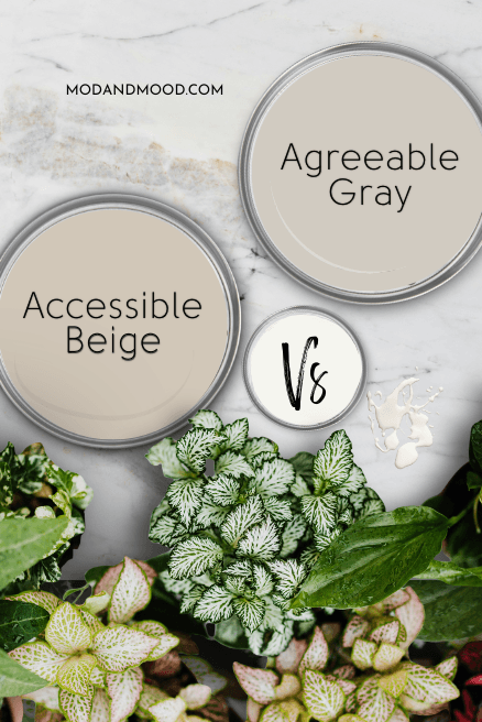
3. Sherwin Williams Accessible Beige
Accessible Beige is an everybody-loves-it color…with one caveat: Some people hate all beige paint colors.
However if that’s the case, you just won’t be using Accessible Beige. For everybody who does use Accessible Beige, they are super happy!
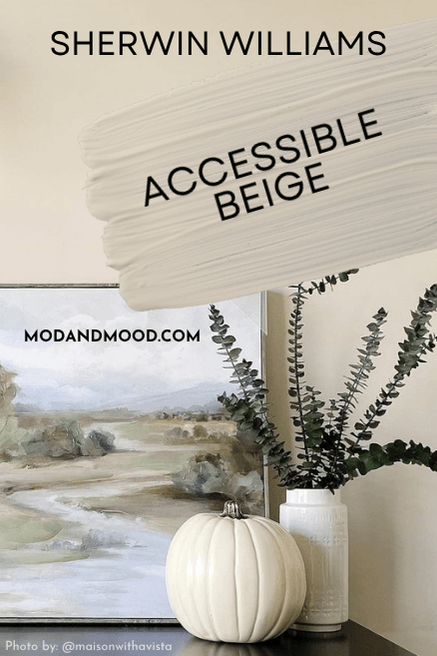
Accessible Beige is a go-with-everything neutral that has enough gray to stop it from ever looking orange or unpleasantly warm. This whole home color is still on the lighter end of neutral, and it is a top choice for cabinets!

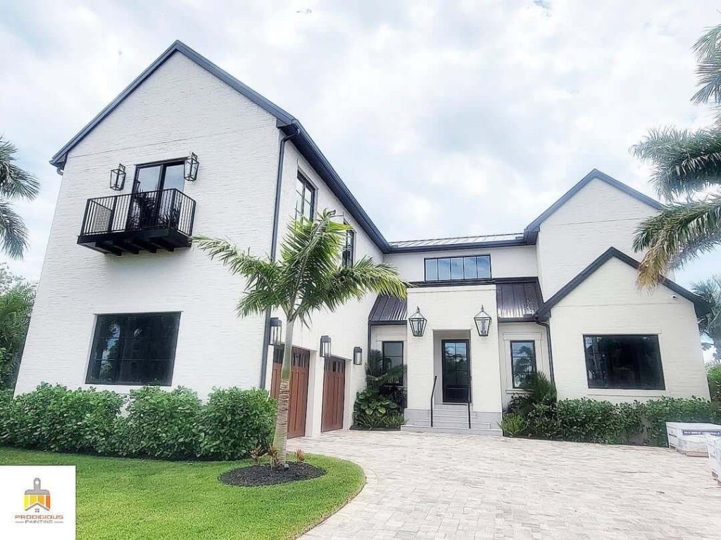
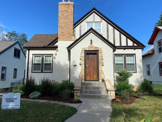
Accessible Beige is not my favorite neutral for exteriors, but it does look great on stucco and masonry!
4. Sherwin Williams Jogging Path
Jogging Path is a newer favorite, and a bit of a surprising favorite too! With neutral paint colors trending decidedly warm, Jogging Path is un-decidedly warm.
It is a greige, so of course there is warmth there, but it can also look like a stone color, and very often it has a slightly green undertone.

For a neutral color with a less-neutral undertone, Jogging Path has rave reviews! Everybody who uses it loves it. It’s a great option that always looks nice, but doesn’t feel as “done.”
That’s it! Short and sweet! I do have plans to add to this post, so I will keep you updated as I collect more color options that everybody loves, but unsurprisingly, these are not so common!
I should give an honorary shoutout to Alabaster, as most people do love it, but most people isn’t everybody.
Here are some other colors that a lot of people love: