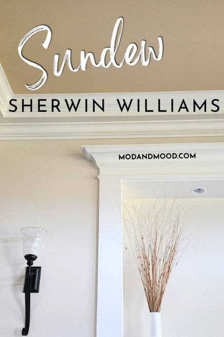
Sherwin Williams Sundew is a warm and toasty light beige paint color. Here we will talk about Sundew’s undertones, see it in a coordinating color palette, and go over the coordinating colors that Sherwin Williams recommends!
What Are the Undertones of Sherwin Williams Sundew?
The good thing about a more saturated color like Sundew, is that it tends to be more predictable than neutrals that have a lot of gray in them.
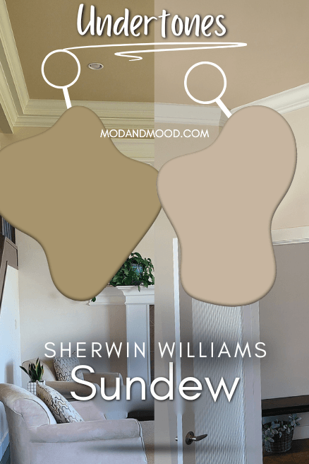
Sundew ranges in appearance from a light tan that looks fairly brown, to a peachy beige with a whiff of pink.
The LRV of Sundew is 63, so it is on the lighter end of mid-toned.
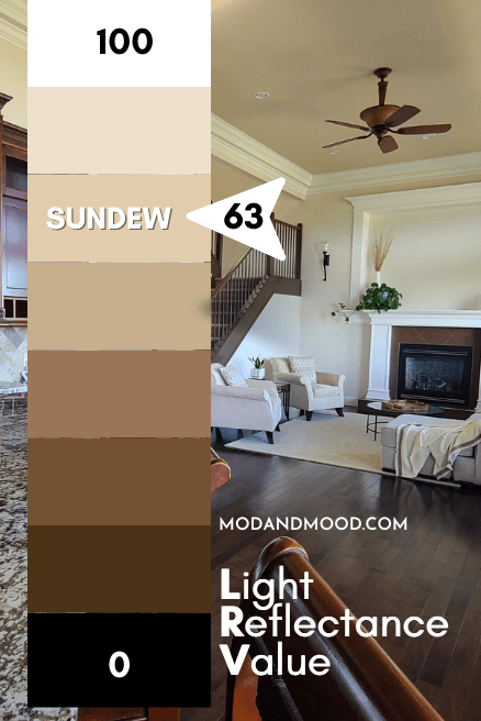
The LRV (Light Reflectance Value) of a color indicates on a scale of 0 – 100 how much light a color reflects (or doesn’t reflect). True black has an LRV of 0 and pure white has an LRV of 100.
In the paint world, we are working in a range of about 3 – 93 because no paint color is purely black or completely white.
Sundew in the Sherwin Williams Color Strip
Sherwin Williams does place Sundew in a color strip that is kinda-sorta a light to dark collection, but the shades are all pretty similar.
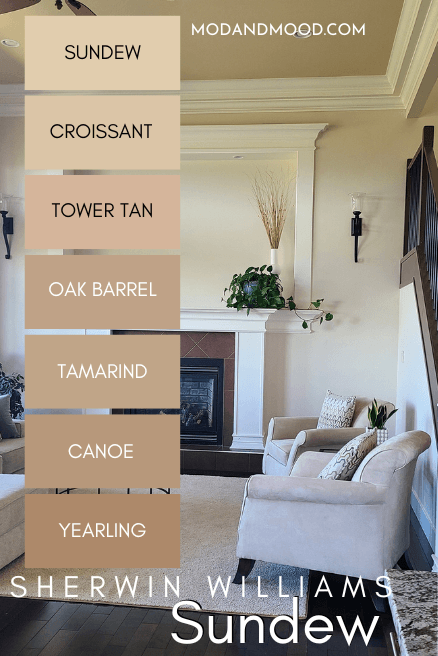
The other colors in this collection are:
- Croissant
- Tower Tan
- Oak Barrel
- Tamarind
- Canoe
- Yearling
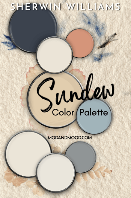
Sherwin Williams Sundew in a Color Palette
I’ll be honest, very warm neutrals like Sundew are just a little more difficult to pair with other colors, but here is the palette that I came up with:
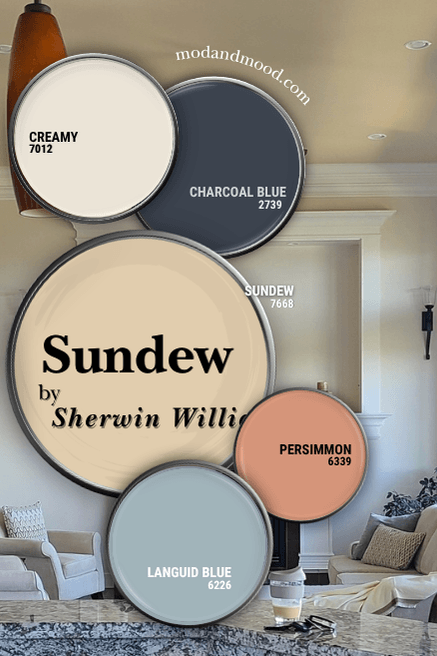
Coordinating White Paint Color for Sundew
When it comes to a coordinating white paint color, Sundew is best paired with other overtly warm colors. For my palette I chose Sherwin Williams Creamy.
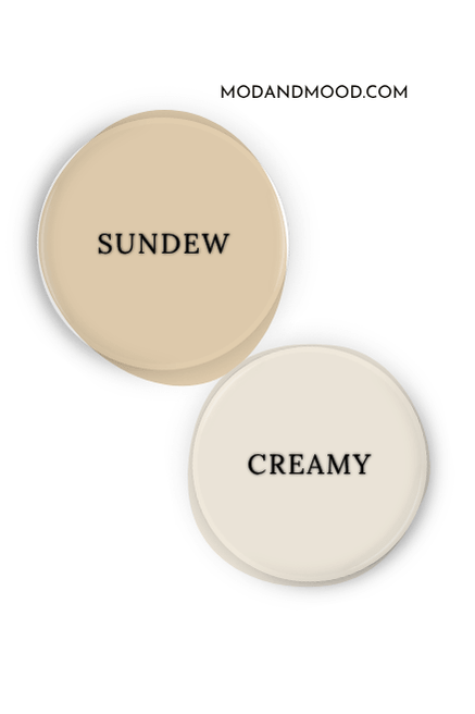
Creamy is technically on the line of white and off-white paint colors, but because it is so creamy, it tends to look more off white. In small doses, such as a trim color with Sundew, it will look fairly white, as long as there are no other white paint colors around.
A close second choice for me would be Sherwin Williams Greek Villa, which is a little bit lighter.
Complementary Paint Color to Use with Sundew
The opposite shade across the color wheel is where we find complementary colors. For Sundew this is a popping blue.
I went with something just a hair more subdued for the sake of versatility, with the shade Sherwin Williams Languid Blue.
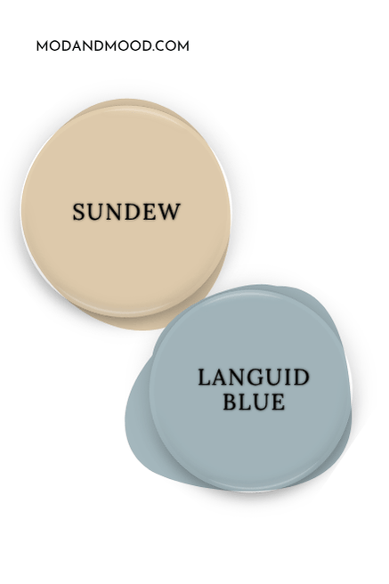
Languid Blue is on the same color strip as Sherwin Williams Whirlpool.
You could go a bit less literal with a complementary color and go with a darker blue like Sherwin Williams Charcoal Blue.
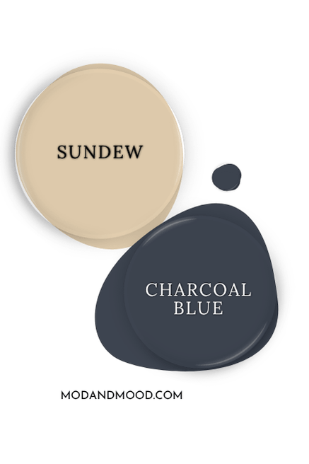
Charcoal Blue is very similar to Benjamin Moore Hale Navy.
Try Sundew with Sherwin Williams Persimmon
I was wracking my little brain to come up with another color that would go with the specific tone of Sundew AND blue, and I decided to lean into the sunset theme with a pretty coral.
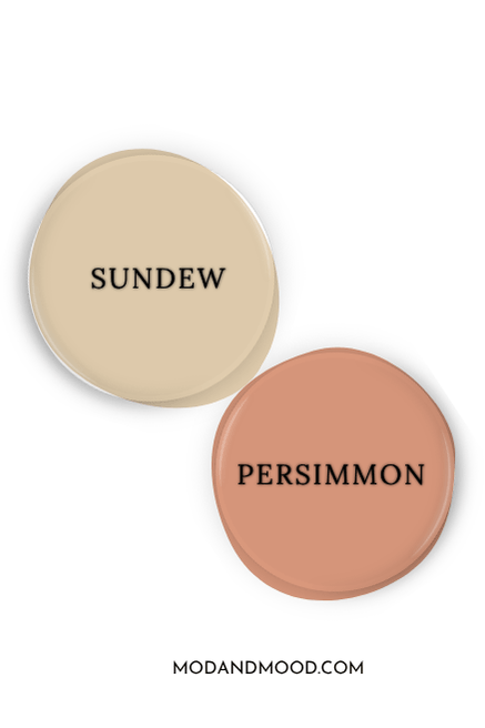
Sherwin Williams Persimmon is one of their more popular terracotta colors, and it works well with Sundew and Languid Blue.
Because Persimmon is so orange/coral, you should expect that Sundew will look more tan in comparison and less peach or pink.
Sherwin Williams Recommends These Coordinating Colors for Sundew
Now let’s take a look at the coordinating colors for Sundew that the experts at Sherwin Williams suggest!

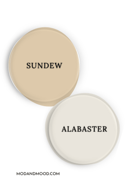
Pair Sundew and Sherwin Williams Alabaster or Dover White
Sherwin Williams went pretty similar with their recommendations for a coordinating white paint color. Both Dover White and Alabaster are certified creamy!
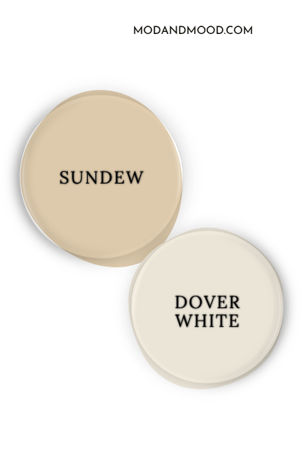
I actually prefer Dover White with Sundew because I think the stronger undertone works better. Alabaster also works, but you can see that Sundew makes it look a little more gray:
Use Sundew with African Gray (If You’re Crazy…)
Listen…I don’t know what to say about this pairing:
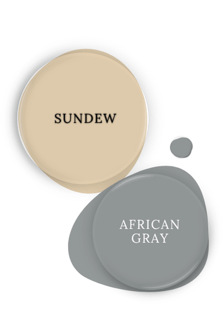
I tried to sell it in the palette by picking a background that works, but I don’t get it and don’t respect it. I am GUESSING(?) that the blue undertones in African Gray are meant to be complementary to Sundew.
I just choose to believe this was a computer generated pick, because I would never put a warm beige with a cool-toned gray like this.
Here is another look at all of the coordinating colors:
What is the Difference Between Sundew and Muslin or Kilim Beige?
Sherwin Williams Muslin is sometimes compared to Sundew, but it is much lighter, and technically an off-white. It is also quite a bit more gray.
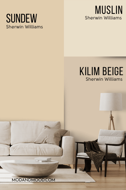
Sherwin Williams Kilim Beige honestly looks very similar to Sundew in real life. Both of these colors run the same general range of undertones. Kilim Beige is more gray, so it looks like a sand color maybe a hair more often than Sundew does.
Sundew in Benjamin Moore
If you are looking to use Sundew in Benjamin Moore, their popular color Sea Urchin is very similar.
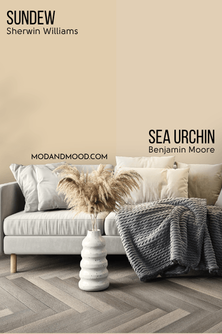
Sea Urchin is just a hair lighter and less saturated. Sundew is like a sliiightly turned up version of Sea Urchin.
Thank you so much for reading until the end, that really helps my blog! Still undecided? I’ve got a lot more!: