Valspar Sparkling Sage is a light gray green paint color that can shift from warm to cool and back again. It is neutral enough to use throughout your whole home, but what colors should you use with it?

Today we will look at coordinating colors in a color palette for Sparkling Sage, and also see what pairings Valspar recommends!
Really quickly, let’s talk undertones.
What Are the Undertones of Valspar Sparkling Sage?
Sparkling Sage is a bit of a chameleon, it can have either a cool minty undertone or a warm grassy undertone.

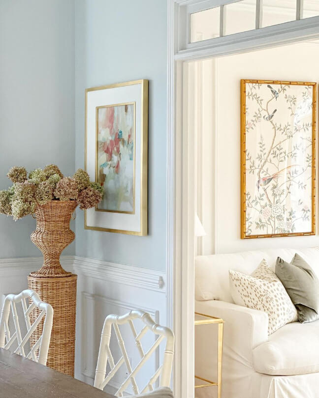
Here are a couple of good examples using the dupe Sherwin Williams Sea Salt:

This first photo is quite cool, and the next one is a little warmer.

Sparkling Sage will most often look like a cool gray-green, but in lower artificial light it is more likely to lean warm.
Valspar Sparkling Sage in a Color Palette
Here is a coordinating color palette that I put together for Sparkling Sage:

Coordinating White Paint Color for Sparkling Sage
For a beautiful Valspar white, try the shade Du Jour with Sparkling Sage. This white is bright but still soft.

Here it is with Behr Light French Gray, just to give you an idea. (Du Jour is the color in the adjacent room).
Try Sparkling Sage with Valspar Chimney Smoke
Chimney Smoke is a deep charcoal with a cool blue undertone that works beautifully with Sparkling Sage:

This color is actually a dupe for the popular color Sherwin Williams Cyberspace.
Sage and charcoal or navy has always been a great combo! Here is an example using the darker sage of Benjamin Moore Carolina Gull, but with a trim similar to Cyberspace:
That’s the closest thing I could find, but you can see how these tones work well together.
Neutral Paint Color to Use with Sparkling Sage
For a whole-home color scheme, consider using a light greige like Behr Toasty Gray with Sparkling Sage:

If you want to stick with Valspar, try the slightly warmer color Warm Putty:

If you like the look of this color, Warm Putty is actually a dupe for Sherwin Williams Taupe of the Morning.

Using this example of Sea Salt, you can see how the color works beautifully with the natural straw of the baskets.
Use Sparkling Sage with Sherwin Williams Porpoise
Staying neutral, but moving a little darker we have the shade Porpoise.

Porpoise is like a rich chocolate brown but with a little less warmth. This is a really nice alternative to using a cool charcoal or black with Sparkling Sage. You will get lots of contrast without any harshness.
Porpoise is one of my favorite Dark and Moody Exterior Colors From Sherwin Williams. For something very similar from Valspar, try Catch of the Day.

Valspar Recommends These Coordinating Colors
Now for the colors that Valspar suggests for coordinating with Sparkling Sage!

Try Sparkling Sage with Oatbran
Valspar Oatbran is pretty similar to the neutral colors that I picked. It is a medium to light beige with just a little bit of neutralizing gray:

Sparkling Sage is the perfect natural green color to pair with a nature-inspired neutral like Oatbran.
Oatbran is a very close match to cult favorite Sherwin Williams Accessible Beige.
Pair Sparkling Sage and Valspar Swiss Coffee
Swiss Coffee is a true white with a slightly warm undertone. It coordinates very well with any color, including Sparkling Sage!


Check out this color and all the other versions in my post: Swiss Coffee Paint Colors Reviewed (Are They All the Same?)
Use Sparkling Sage with Peacock House
Pairing Sparkling Sage with a much darker shade from a similar color family is a great idea! Valspar recommends the saturated emerald teal of Peacock House.

For a similar look, try Sherwin Williams Blue Peacock, Cascades, or Benjamin Moore Black Forest Green.
Here is a look at all of the coordinating colors that we’ve covered:

What is the Difference Between Sparkling Sage and Sherwin Williams Sea Salt?
Sea Salt is a little bit cooler and lighter than Sparkling Sage, but the difference isn’t huge:

I think it would be fair to peruse all the photos that I have in my full review of Sea Salt, with an idea that Sparkling Sage will look very similar, but a bit warmer.
Thank you so much for reading! If Sparkling Sage is not quite right for you, check out these other posts: