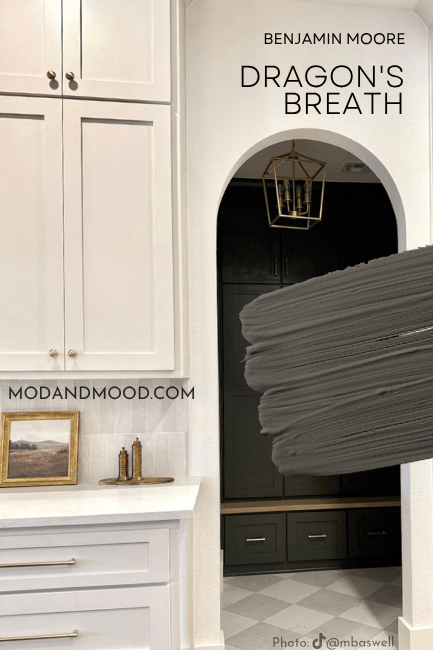
Benjamin Moore Dragon’s Breath is an alluring mix of charcoal and brown that is not only super on trend, but also very sophisticated.
Here we will talk about Dragon’s Breath and its shifting undertones, see the color in real homes, and get some coordinating color ideas.
We are also going to explore whether or not this is really the Benjamin Moore version of the uber popular: Urbane Bronze.
What Color is Benjamin Moore Dragon’s Breath?
For once we can go with the Benjamin Moore description! They say that Dragon’s Breath is:
“A deep, dark gray-brown that breathes drama into any space.” – benjaminmoore.com
That is pretty much the size of it! Dragon’s Breath is a beautiful warm charcoal with interesting chameleon-esque undertones.
What Are the Undertones of Benjamin Moore Dragon’s Breath?
Dragon’s Breath has shifting undertones that are most often green to bronze. You could say that it’s a charcoal paint color with “earthy” undertones and that would catch most of them.
On occasion, Dragon’s Breath can also look like a true stereotypical charcoal color, with cool blue-ish undertones. This is more likely to happen with higher sheens, where the extra glare tricks your eyes a bit.
Dragon’s Breath Light Reflectance Value
The LRV of Dragon’s Breath is 9.18.
What does that mean?
The LRV (Light Reflectance Value) of a color indicates on a scale of 0 – 100 how much light a color reflects (or doesn’t reflect). True black has an LRV of 0 and pure white has an LRV of 100.
In the paint world, we are working in a range of about 3 – 93 because no paint color is purely black or completely white.
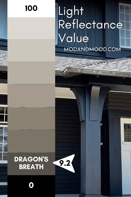
I was surprised at the LRV of Dragon’s Breath if I’m honest, because it often reads close to black. At 9.18 it is a truly dark paint color, but not quite in the LRV range of most black or even off-black paint colors.
For example Sherwin Williams Iron Ore is often considered to be an “off-black” and it has an LRV of 6, which is more in line of what I expected from Dragon’s Breath.
The number doesn’t really matter, but you should know that this color behaves a little bit darker than its LRV suggests.
Dragon’s Breath in the Benjamin Moore Color Strip
Here are all of the colors from the color strip where we find Dragon’s Breath:
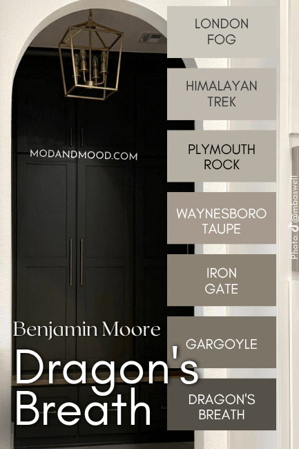
- London Fog
- Himalayan Trek
- Plymouth Rock
- Waynesboro Taupe
- Iron Gate
- Gargoyle
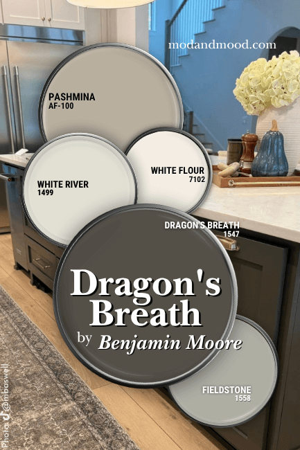
Benjamin Moore Dragon’s Breath in a Color Palette
Here are the colors that I would use with Dragon’s Breath:
Coordinating White Paint Color for Dragon’s Breath
Personally, I really like the greenish undertone of Dragon’s Breath, and for that reason I would use a shade that is complementary to that particular tone. (It helps to pick it up.)
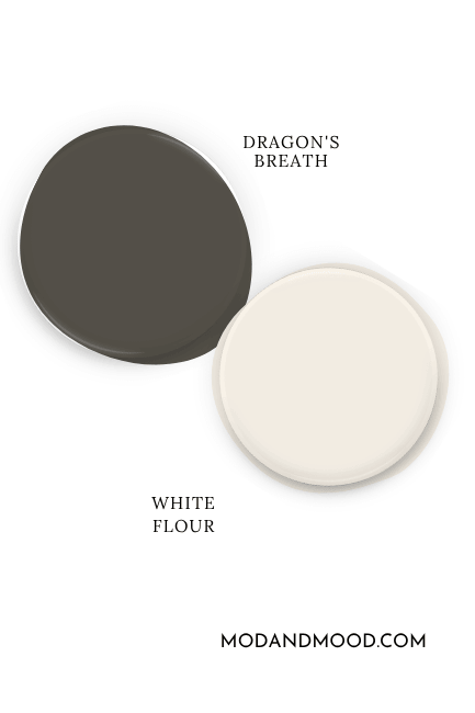
I chose Sherwin Williams White Flour for this color palette because it is a true white that is actually very bright, but it has a nice warm undertone that complements green.
If you want to stick to Benjamin Moore colors, try their version: Pink Damask.
It’s quite chic right now to lower the contrast between your colors and use NO true white at all, so I also including an off-white option in Benjamin Moore White River.
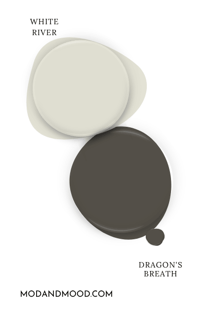
Now White River achieves a different goal than White Flour (or at least it will most of the time). This off-white is a soft gray green color that is a dupe for Sherwin Williams Ethereal White, which I loooove!
Since White River is gray and green like Dragon’s Breath, some of that should cancel out, and both colors *should* look warmer.
Try Dragon’s Breath with Benjamin Moore Fieldstone
Fieldstone is a super fun color, because it looks almost totally gray on paper, but in real life it has a strong sage undertone.
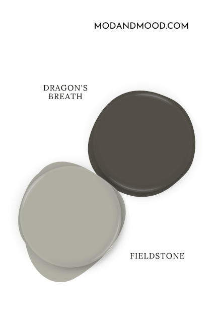
While Fieldstone and Dragon’s Breath share a lot of qualities, Fieldstone is much cooler, which will keep Dragon’s Breath leaning more brown.
Neutral Paint Color to Use with Dragon’s Breath
You could easily select any lighter color from the Dragon’s Breath color strip to use as your neutral coordinating color, so that is always an option! I decided to go much warmer with Benjamin Moore Pashmina.
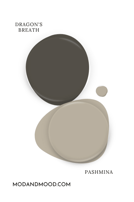
You should know that using a taupe paint color like Pashmina is much more likely to emphasize the green undertone in Dragon’s Breath.
If you would rather help Dragon’s Breath to look warmer and more brown, try using it with a blue color (complementary), a silvery gray, or a cooler toned greige.
Benjamin Moore Dragon’s Breath for Your Home’s Interior
Normally I just stick to a single color palette, but as we jump over to real homes, I wanted to share Morgan’s (@mbaswell) whole home color palette that she used with Dragon’s Breath!
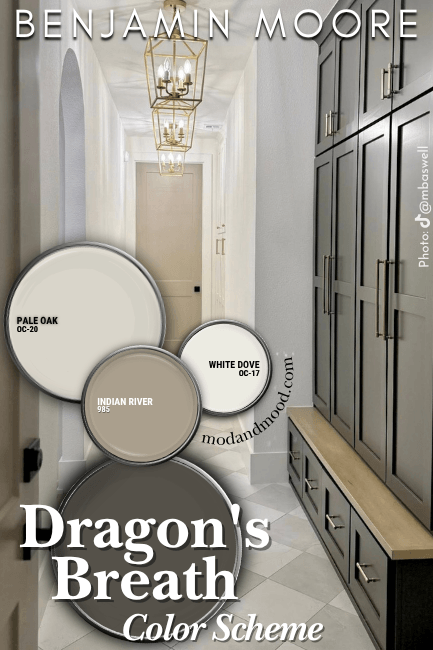
Dragon’s Breath is seen here on the storage cabinets in her hallway. The wall color throughout her home is Benjamin Moore White Dove, and the doors are Benjamin Moore Indian River (aka Ranchwood, which had I known beforehand I would have preferred to use. It’s a bit more…modern in name).
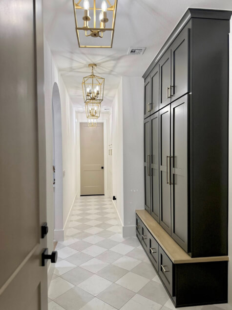
I’m actually quite bummed that I didn’t start this post earlier, because I just wrote one about beige interior doors, and the ones at Morgan’s place are gorgeous.
Morgan used Dragon’s Breath in a few places around her home! Here it is on her island:
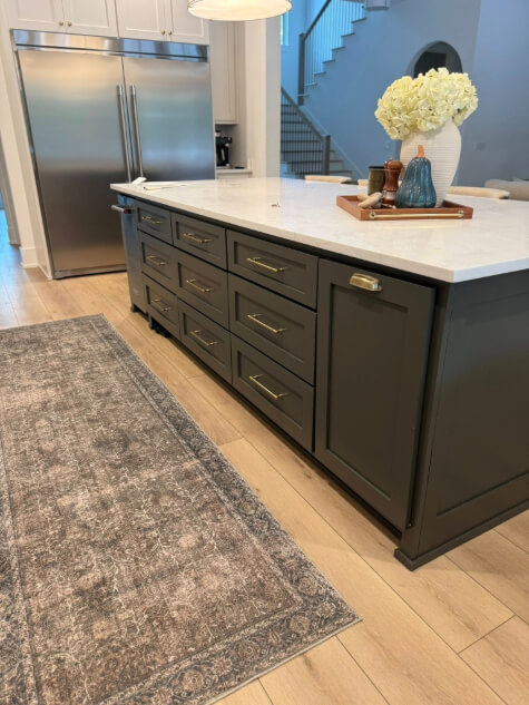
If you like how the color looks here, you would also really like Sherwin Williams Rock Bottom!
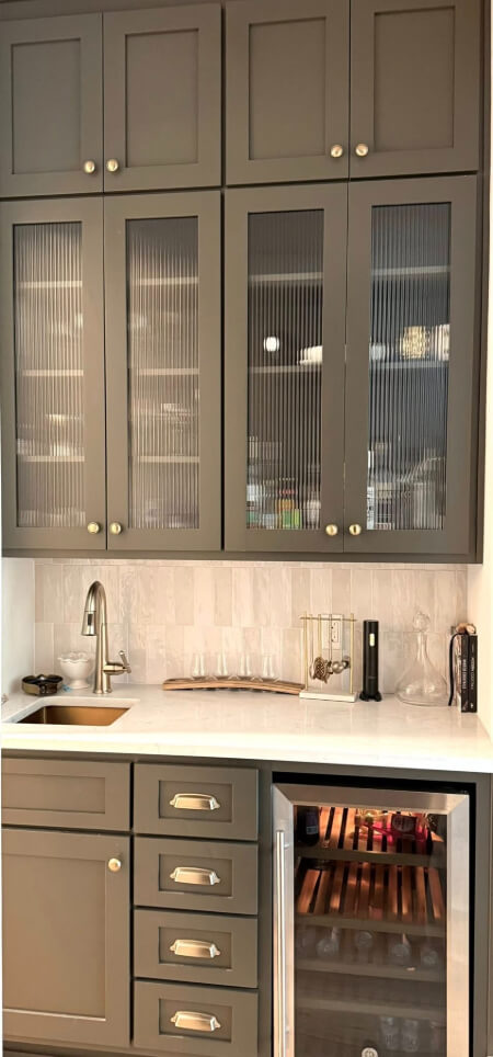
That’s not all for cabinets! Here is more Dragon’s Breath in the wet bar:
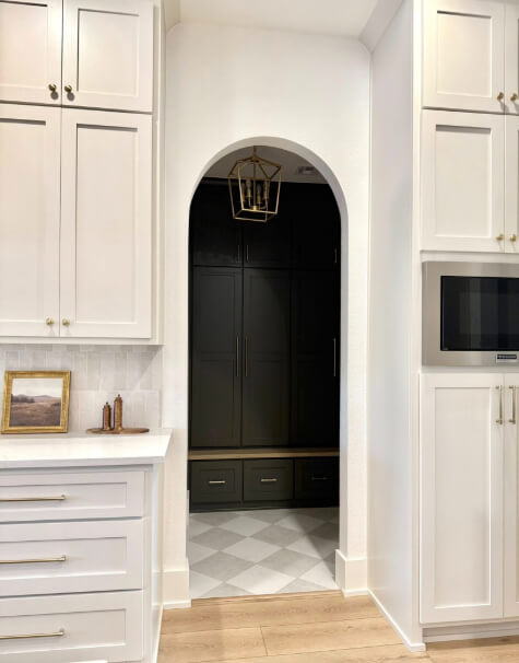
The Pale Oak in the color palette comes in on the rest of the kitchen cabinets:
I wasn’t able to find pictures of Dragon’s Breath on walls, but I wanted to give a couple of close examples. Here is the shade lighter, Gargoyle, where it looks quite dark with a slight wash of dark gray over it:
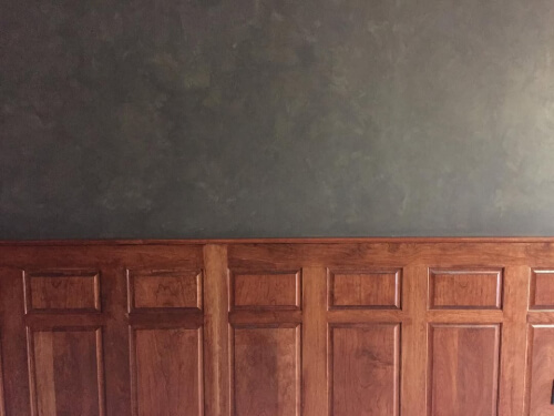
I like this photo because it is like all the tones of Dragon’s Breath in one!
Here is Urbane Bronze which (spoiler alert!) is nearly identical to Dragon’s Breath:
I will compare these two properly right after we see an exterior!
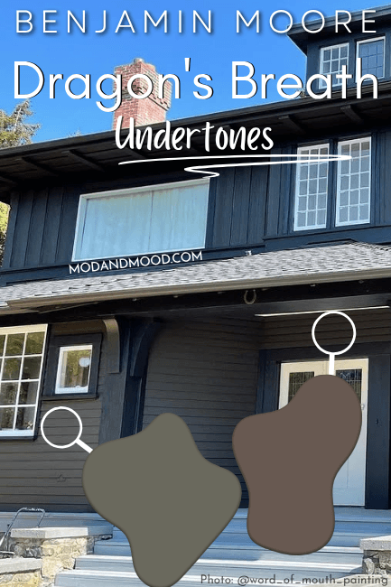
Dragon’s Breath on an Exterior
The team at @word_of_mouth_painting took on a pretty big project with this Dragon’s Breath exterior!
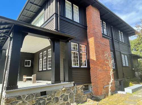
The white is Benjamin Moore Chantilly Lace and the trim is black. I like how you can really get a good idea of the different faces of Dragon’s Breath, all on a single house!
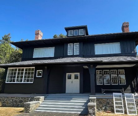
In some pictures the siding looks nearly black, and in others it looks green, charcoal, and brown!
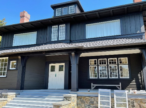
(Sorry all the lines look horrific once the photo was re-sized…not sure what happened there.)
Benjamin Moore Dragon’s Breath Compared to Other Dark Brown and Charcoal Paint Colors
Now let’s get to the good stuff, and see how the underrated Dragon’s Breath, compares to some colors that are very much rated.
Dragon’s Breath vs Urbane Bronze
Urbane Bronze is very much the Sherwin Williams equivalent to Dragon’s Breath, and vice versa.
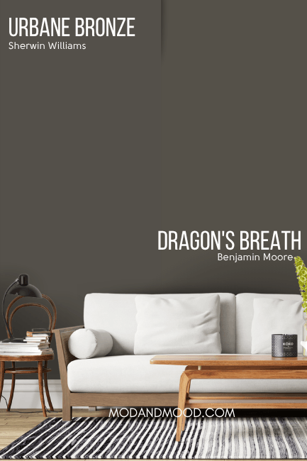
So what is the difference?
Dragon’s Breath is a little bit less gray (more saturated) than Urbane Bronze, but since it is also a little cooler in color, some of that levels out.
These two colors have all of the same possible undertones. Both can look greenish, brown, charcoal, or all three. If I had to point out any difference, I do think that Urbane Bronze leans gray a little more often than Dragon’s Breath.

I also think that Dragon’s Breath looks green perhaps a bit more often than Urbane Bronze does.
In my opinion the differences between these colors are pretty negligible, and it’s hard to even say what they are for sure, because there are just sooo many more examples of Urbane Bronze than Dragon’s Breath.
Benjamin Moore Dragon’s Breath vs Sherwin Williams Iron Ore
By simply looking at Dragon’s Breath and Iron Ore on paper, you may be wondering why we are even talking about this. Iron Ore is a true charcoal that most often has a cool smoky blue cast, and Dragon’s Breath is a mix of brown and charcoal.
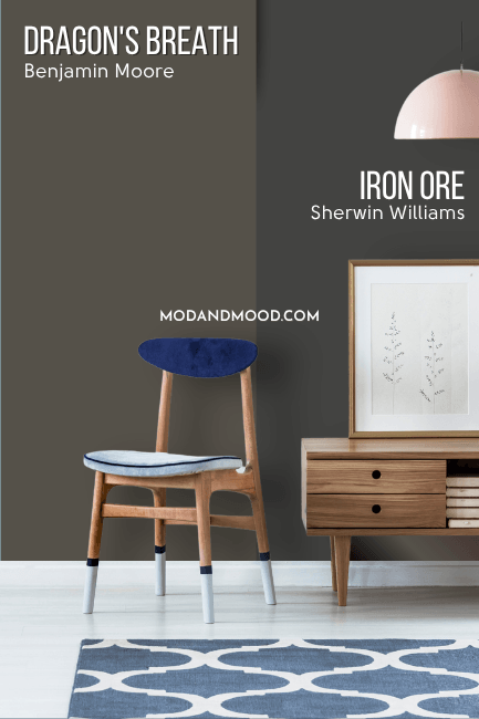
In real life scenarios, Iron Ore is just fooling around. There is actually quite a lot of overlap between these two colors, because Iron Ore can also look slightly green or brown, depending on the situation.
I do have a post about Urbane Bronze vs Iron Ore, so that will really help show the similarities if that is of interest.
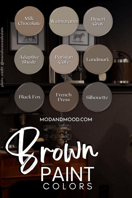
Dragon’s Breath vs Benjamin Moore Silhouette
Silhouette was named the 2026 “Color of the Year” by Benjamin Moore and it is quite similar to Dragon’s Breath, so we need to have a closer look!
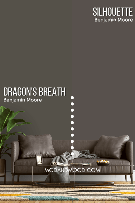
The major difference between these two is simply in undertone. Silhouette can look quite like Dragon’s Breath when it looks more earthy, but it stops short of actually looking green.
Silhouette has a much warmer undertone that leans toward chocolate or even berry. It doesn’t ever look super cool or blueish.
That’s the end of this one! Thank you so much for making it this far, that really helps my blog! Want more? I’ve got it!