What is decor for, if not to have a little fun with it? Here are some whimsical and dreamy color palettes to bring a little fantasy into your home. These are perfect color schemes for everything from a cozy cottage to your little one’s nursery.

Side note: If you aren’t feeling a soft and neutral whimsical color scheme, the last palette is a bit funner and more saturated.
Whimsical Fairy Forest Color Palette

Benjamin Moore Simply White
Simply White is the perfect white for a whimsical color palette because it is a bright white with a fairly strong creamy undertone.
Here it is on upper kitchen cabinets:
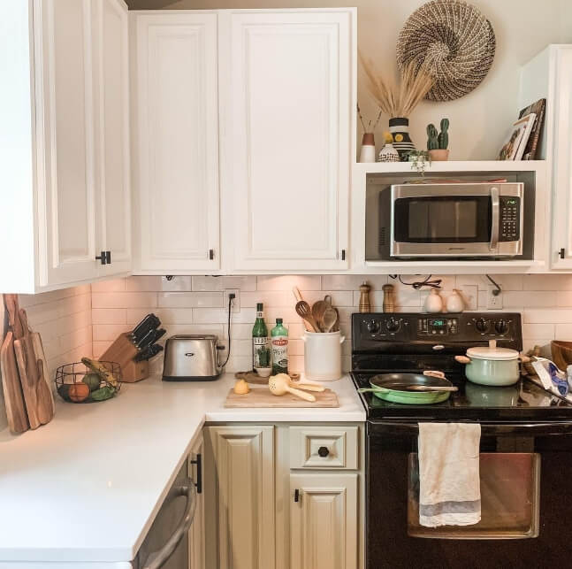
The lower cabinets are Sherwin Williams Svelte Sage, which now that I’m thinking about it, should really be on this list of whimsical colors.
Let’s call it an honorable mention:

Anyways, Simply White is a great springing off point for almost any color scheme, but the bright warmth makes it perfect for a bit of weightless whimsy.
Benjamin Moore Dove Wing
Dove Wing is a very light neutral that provides a great canvas for your whimsical color scheme.

I like this color because it feels very calming without the heaviness of a true beige.
Sherwin Willams Shiitake
Shiitake is a smooth and grounding color that is the perfect mushroom shade for any whimsical or woodland color palette:

I will note that Shiitake can shapeshift from quite a warm beige to a cooler taupe color, as seen here (on the island):

Get yourself a color that can do both! Shiitake is also on my list of favorite mushroom colors for kitchen cabinets.
Valspar Champagne Glee
Pink isn’t for everyone, but Valspar’s Champagne Glee could probably convert a few people!

This soft champagne color has a muted neutral quality that is oh so chic! This is perfect for slipping some pink into your whimsical decor, because I just feel that’s on theme.
If this is too pink, you might like Sherwin Williams Taupe of the Morning. It can have a slightly pink undertone, but it isn’t actually pink.

Benjamin Moore Peale Green
Peale Green is a fairly saturated green color that manages to stay pretty neutral. It’s an attention grabber, but easy to work with in terms of coordinating colors.

I like Peale Green a lot because it feels very “specific” but it appeals to a lot of people and works in many decor themes.
Sherwn Williams Porpoise
Porpoise is a medium to dark greige color that can have either a warm undertone, or a hint of green.
Something about this color is just so sophisticated! :

Porpoise is also on my list of Dark and Moody Exterior Colors From Sherwin Williams. I like Porpoise for grounding a whimsical color scheme while keeping things on the lighter side. Try using this color in place of black!
Here’s another look at this color palette:

It’s quite easy to adapt this general color scheme for other whimsical vibes as well:
Warm Whimsical Color Scheme

You might have noticed that we only swapped out two colors to get this look! Cascades is the new green, and Hushed Auburn became the darkest neutral.
Sherwin Williams Cascades
Cascades is a very dark teal paint color that works well with all blush and neutral paint colors:

This shade also pairs well with other jewel tones, or even navy. See more Cascades in my post of Tantalizing Teal Paint Colors for Kitchen Cabinets.
Sherwin Williams Hushed Auburn
Hushed Auburn makes my little heart sing! This neutral autumn color is seriously moody without relying on darkness to do so.

You can use this in place of any gray, beige, or dark neutral…if you dare! The subtle pinkness of it makes it perfect for any whimsical or woodsy color scheme.

Just a couple more swaps and we have our…
Woodland Whimsy Color Palette

The additions here are Benjamin Moore Pashmina, and Sherwin Williams Evergreen Fog.
Benjamin Moore Pashmina
Pashmina is a beautiful taupey paint color that looks approximately one million times better in real life than it does on the swatch!

This color is actually pretty similar to Sherwin Williams Shiitake, so you could use whichever one you like better!
Important to note: Use Pashmina with cool colors to emphasize it’s warm undertones, and use it with warm neutrals to get an almost green undertone!
Sherwin Williams Evergreen Fog
Evergreen Fog is former “Color of the Year” from Sherwin Williams, but it only continues to gain popularity every year!

In this kitchen it looks a lot lighter than it normally would, but I wanted to show it with that whimsical wallpaper!

Finally let’s switch gears and take a look at something that is a more maximalist version of whimsy:
Bold Whimsy Color Palette

Whimsical doesn’t have to be all airy-fairy! Perhaps it’s just fun.
Cascades and Simply White we already saw, but here are the rest of these colors:
Sherwin Williams Aloe
Despite the name sounding true green, Aloe is a pretty bright and happy blue-green.

This color is equal parts minty and magical! This is best used with other bright and saturated colors. Without them it can go beach or baby in a hurry, rather than whimsical!
Sherwin Williams Cavern Clay
There are plenty of terracotta colors that I like, but Cavern Clay is exceptionally versatile.
This color is equal parts earthy and bold. It’s perfect for achieving a whimsical boho vibe.
Sherwin Williams Rocky River
Rocky River is much more teal than you might think from the swatch:

This versatile blue green works well with reds, oranges, and neutrals, but use it thoughtfully with other greens and blues.
Rocky River is on the same color strip as Window Pane, Rainwashed, Jasper and several other Sherwin Williams favorites:

Sherwin Williams Ethereal White
Ethereal White is my go-to off white recommendation for anyone who wants a color that isn’t cool or overly creamy.

This color feels whimsical by it’s very nature. It’s giving fairytale!

Thank you so much for reading to the end! That really helps my site. 🙂 Here are some other posts that you might like: