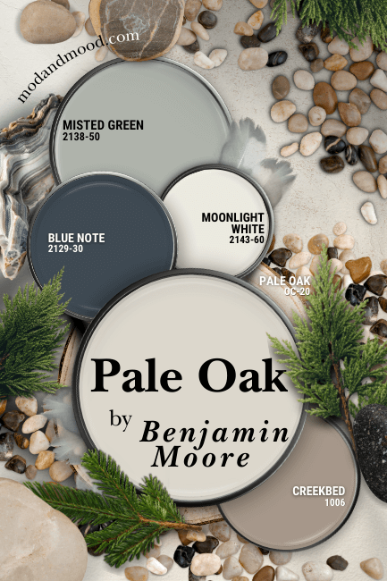
Benjamin Moore Pale Oak is a color that has truly stood the test of time. You could have used this greige shade in the throws of “millennial gray,” and you can still use it in the warmer palettes of today!
Here we will take a look at Pale Oak in real life, talk about undertones, go over some coordinating color ideas, compare it to other light neutrals, and of course – see some dupes!
This post has been written and illustrated entirely without the use of AI.
What Color is Benjamin Moore Pale Oak?
Pale Oak is a very light greige paint color. It ranges in appearance from creamy off-white to light mushroom, with a stop off at silver in between.
(You should know that Pale Oak is the same color as Benjamin Moore Athena 858.)
The LRV of Pale Oak is 68.64
What’s an LRV?
The LRV (Light Reflectance Value) of a color indicates on a scale of 0 – 100 how much light a color reflects (or doesn’t reflect). True black has an LRV of 0 and pure white has an LRV of 100.
In the paint world, we are working in a range of about 3 – 93 because no paint color is purely black or completely white.
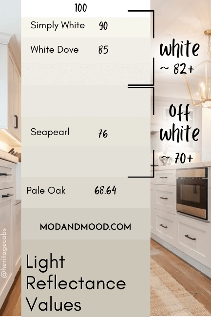
At 68.64, Pale Oak is technically just outside of off-white and into light neutral territory. Generally, off-white paint colors have LRVs in the 70 – 80 range.
That being said, it is close enough, especially because it is so neutral. You may find that it looks off-white in rooms that have a lot of bright natural light, and in spaces where there is little true white for context (or there are a lot of darker colors).
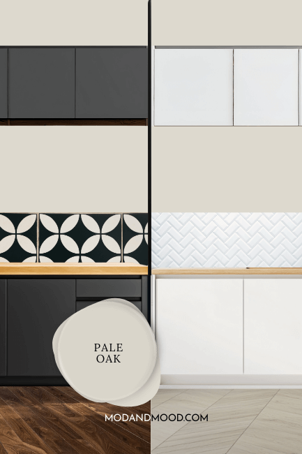
I tried to illustrate this here. The background is all one piece, but with the different materials over top – and the dark line – Pale Oak looks quite different on each half.
I have personally used Benjamin Moore Shoreline in my previous home, which has an LRV of 68.82, and I can tell you that sometimes you could only see it was a color by looking at the ceiling or trim.
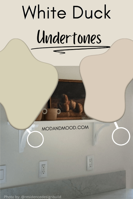
What Are the Undertones of Benjamin Moore Pale Oak?
For the most part, Pale Oak looks how you would expect from the swatch. It is a very even tempered neutral that reads equal parts gray and beige.
I’m going to point out its different undertones, but they are pretty subtle, so you may or may not see (or agree with) what I am talking about.
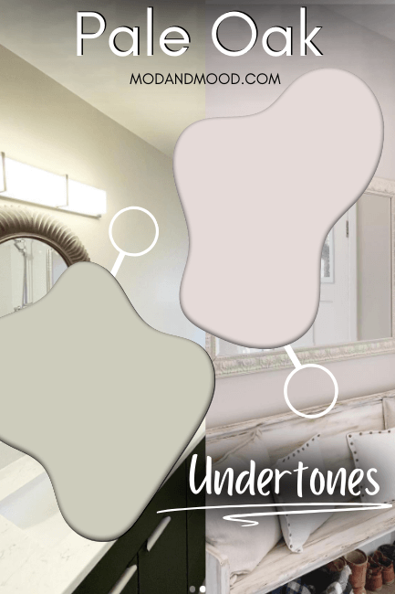
The most common undertones for Pale Oak that people notice are pink and purple, followed by green.
In this first picture we get a combination of both pink and purple:
There is definitely a brightening filter on this photo, so the color looks a little cooler than in real life, but you can still get the idea.
This next picture is a pretty typical look for Pale Oak, but in my opinion it still has a purpley pink undertone:
I don’t personally have a problem with a taupey undertone like this. I normally prefer it to a sunnier yellow beige.
Green is less typical for Pale Oak, but it does happen. We can see it a little bit above the vanity lighting in this bathroom:
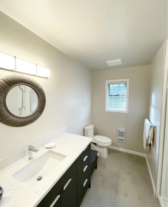
This is more likely to be an issue in rooms with big windows, because Pale Oak is very reflective and you may find it picks up a green cast from trees and grass outside.
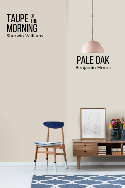
If you really don’t like a green undertone, and the windows are a concern, you might prefer Sherwin Williams Taupe of the Morning. It is a little bit darker, and has a stronger undertone which will cancel the green.
The difference here is fairly obvious, but from one room to another, these colors look very similar.
Pale Oak in the Benjamin Moore Color Strip
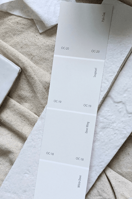
Benjamin Moore places Pale Oak into the same white and off-white color strip as Seapearl, Dove Wing, and White Dove:
Benjamin Moore has also slotted Pale Oak into a light to dark color strip of shades that aren’t actually sequential, but it works well:
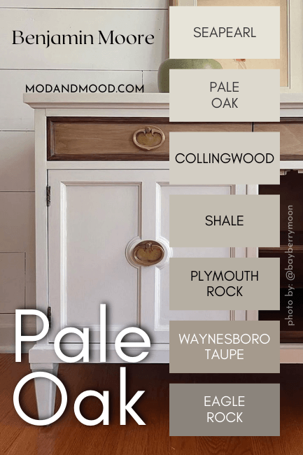
The other shades in this color strip are:
- Seapearl (OC-19)
- Pale Oak aka Athena (OC-20 or 858)
- Collingwood (859)
- Shale (861)
- Plymouth Rock (1543)
- Waynesboro Taupe (1544)
- Eagle Rock (1469)
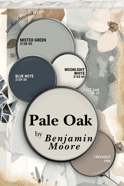
Pale Oak in a Color Palette
Make no mistake, Pale Oak can be paired with just about anything! I decided to go with a mix of warmer and cool tones for this color palette:
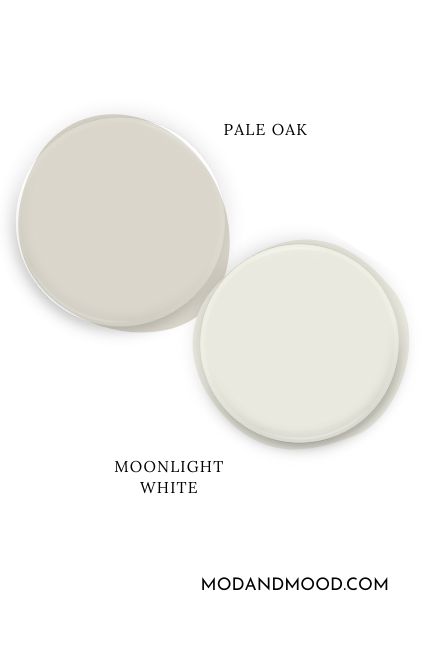
Coordinating White Paint Color for Pale Oak
I decided to pair Pale Oak with a mid-toned white paint color that has an undertone somewhere in between Pale Oak’s, and a traditional cream.
Benjamin Moore Moonlight White ended up being the winner:
Try Pale Oak with Benjamin Moore Blue Note
Blue Note is a luxurious blue-green navy with loads of depth.
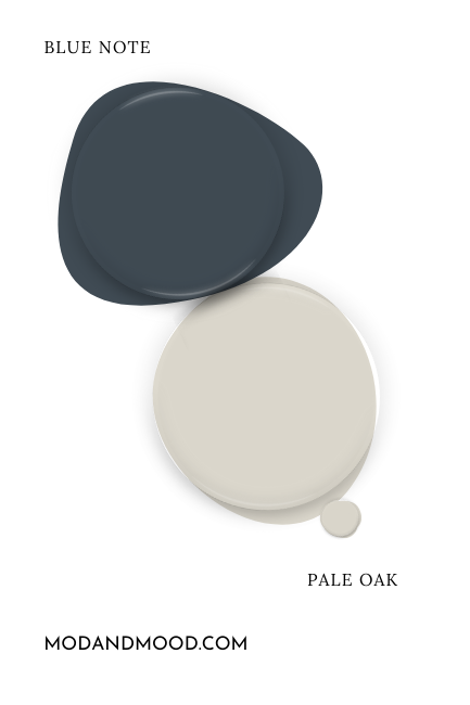
This color makes a statement, and since Pale Oak isn’t getting cast in that role, these two work well together! Blue is also a complementary color for Pale Oak.
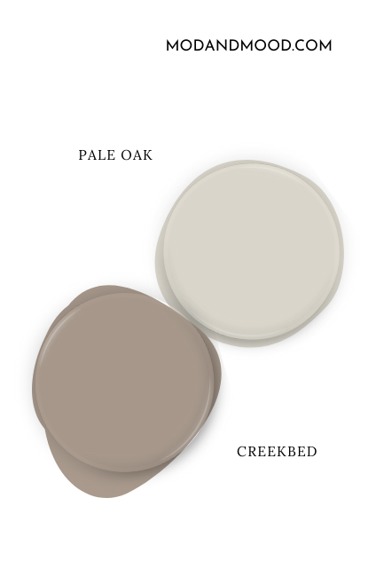
Neutral Paint Color to Use with Pale Oak
Benjamin Moore Creekbed is a saturated taupey brown that is almost like a more intense version of Pale Oak.
If you like this color, you are sure to like some of my favorite brown paint colors.
Pair Pale Oak and Misted Green
Benjamin Moore Misted Green is a sparkling sage that contrasts nicely against Pale Oak, while maintaining lots of light.
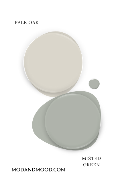
I like Misted Green because it is pretty light as far as sage goes, but manages not to look minty.
Benjamin Moore Pale Oak for Your Home’s Interior
Now time to see Pale Oak in real life! Let’s start with the kitchen:
Pale Oak on Kitchen Cabinets
We saw a sneak peek of this kitchen by @Heritagecabs earlier when we talking about undertones, but here is the rest of it:
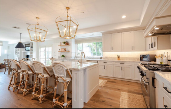
You can see that the cabinets do look almost off white. You can catch the depth a little better where the cabinets meet the ceiling.
This is a great color for cabinets if you are torn between white and something like beige or mushroom. It’s dark enough to look interesting, but still pretty classic.
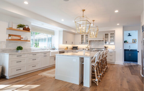
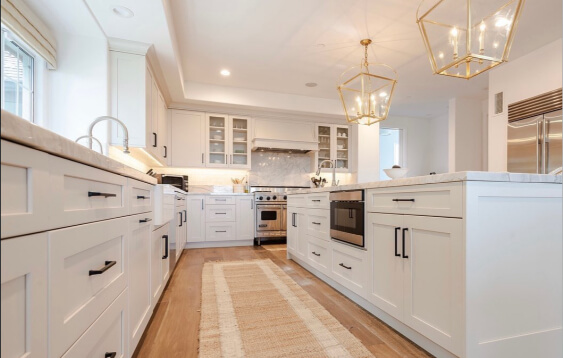
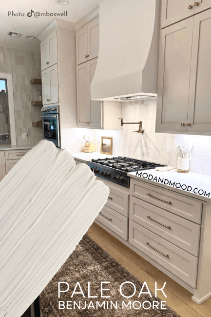
Friend of the blog Morgan (@mbaswell) used Pale Oak for the kitchen cabinets in her new build.
This kitchen is goals! So is her whole home for that matter. The white wall color is Benjamin Moore White Dove.
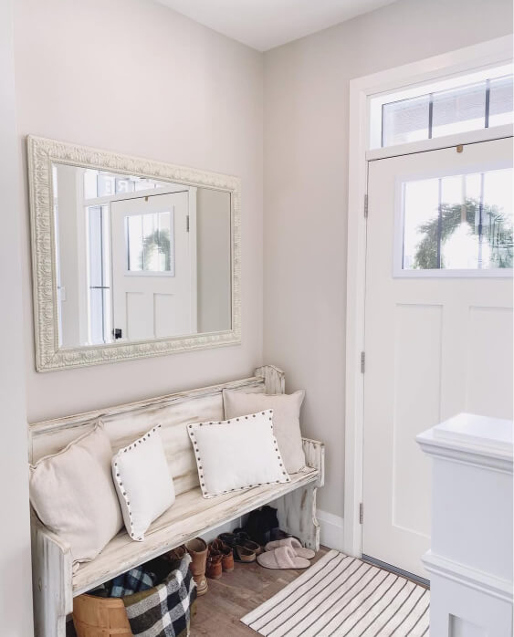
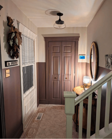
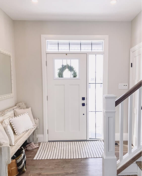
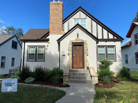
Pale Oak in an Entrance Hall
The most interesting use of Pale Oak that I found, was in this entrance hall at Denise’s (@denisegodbout) home:
She paired Pale Oak with Benjamin Moore Cinnamon Slate, which is a former color of the year. I’m actually so glad that I found her, because I have been pretty ho-hum on Cinnamon Slate, but here it looks amazing!
Denise also used Pale Oak in other areas of her home. Here it is with a door in Amherst Gray:
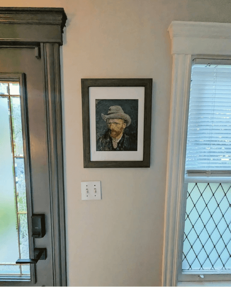
The color looks pretty typical here!
Pale Oak in the Bedroom
The team at ThriveAll Projects (@thriveallprojects) used Pale Oak on the walls in this bedroom, with a feature wall in Benjamin Moore Marblehead Gold.
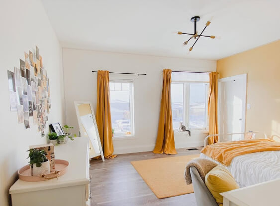
In that first photo you can see that the walls almost look like a creamy white color, but when we get closer you can see the contrast:
The trim and ceiling color here are not a bright white, so it is a little hard to tell still.
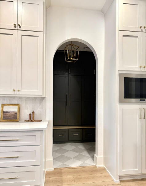
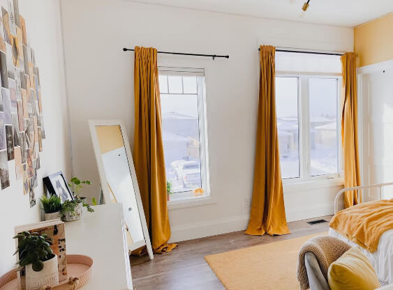
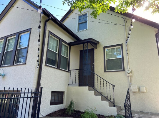
The team at ThriveAll is the same one that brought us the entryway we saw earlier when discussing undertones. Here is one more shot of that:
Here Pale Oak looks its coolest and most gray on the right side of the photo, and more typical on the left side.
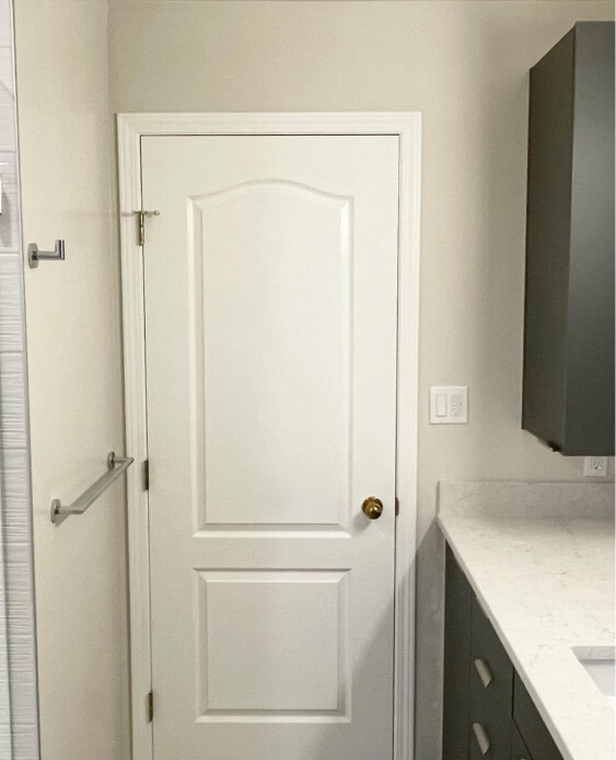
Pale Oak in the Bathroom
Finally we will take a look at Pale Oak in a bathroom:
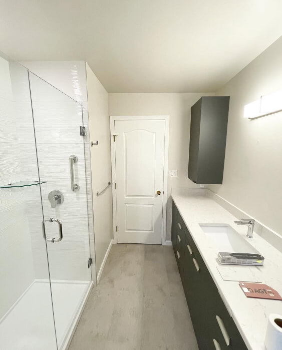
Again, we saw this project by @word_of_mouth_painting when we were talking undertones, but in the rest of the photos I would say that the color looks pretty typical.
Should You Use Pale Oak for Your Exterior?
While you could use Pale Oak for your exterior, you should know what to expect…and what you should expect, is for your house to look white.
Every color looks lighter outside, so there is a huge range of white, off white, and light neutral paint colors that all look pretty white on exteriors. For example, here is the difference between Pale Oak and Sherwin Williams Accesible Beige:
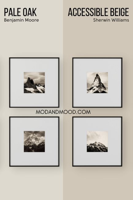
…And even Accessible Beige can look off-white outside:
Although lighting definitely plays a big part! Here it does look beige:
You can expect Pale Oak to consistently look much lighter than this. I would only choose Pale Oak if you are seeking a creamy, off-white look, with a neutral undertone.
For a closer example, Sherwin Williams Shoji White is a pretty popular exterior choice. It is little lighter and cleaner than Pale Oak:
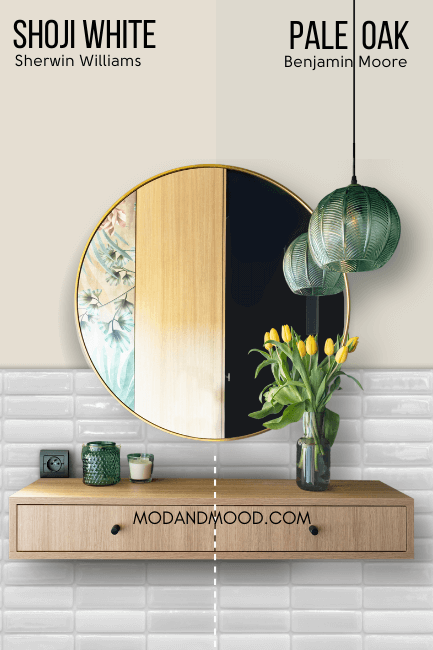
Here is how Shoji White looks on an exterior:
This is its creamiest and darkest look due to the overcast day. You should expect Pale Oak to actually look a little more white, because it is more gray and neutral than Shoji, despite being a touch darker. The undertone of Pale Oak won’t be quite as obvious.
Although it isn’t outside, here is an example of Pale Oak at its lightest, and how you can expect it to look on an exterior:
(If you weren’t sure, it is the color on the dresser, and not the wall.)
Pale Oak Compared to Other Light Neutral Paint Colors
It’s no surprise that Pale Oak is often compared to other popular neutrals. Take a look at how this shade stacks up against other favorites.
Besides being darker, Sherwin Williams Agreeable Gray is more similar to Pale Oak than I expected:
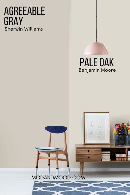
The undertone of Agreeable Gray is a little bit deeper into taupe/mushroom than Pale Oak’s is. Because it is darker, Agreeable Gray doesn’t ever look white or off-white, where Pale Oak can.
Benjamin Moore Balboa Mist is very similar to Pale Oak:
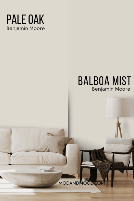
Balboa Mist is a hair darker than Pale Oak, with an LRV of 65.53. It is also a little bit more gray, and not as beige.
Despite the name, Classic Gray typically looks more like a creamy white than a gray.
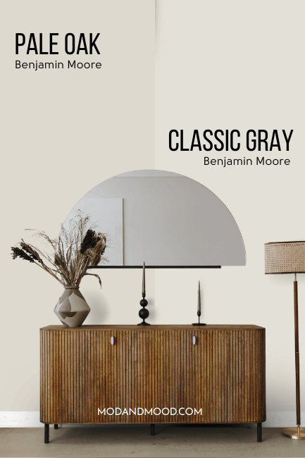
Pale Oak is very close to a darker version of Classic Gray, although on paper, Classic Gray is just a sliver more gray.
Benjamin Moore Collingwood is darker than Pale Oak. It also has a stronger purple undertone, and it is more gray and less beige.
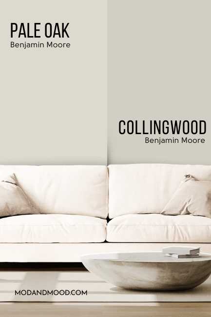
Despite the differences, Collingwood would still be classified as a greige.
Revere Pewter is probably Benjamin Moore’s most popular greige. The most obvious difference between Pale Oak and Revere Pewter, is that Revere Pewter is darker:
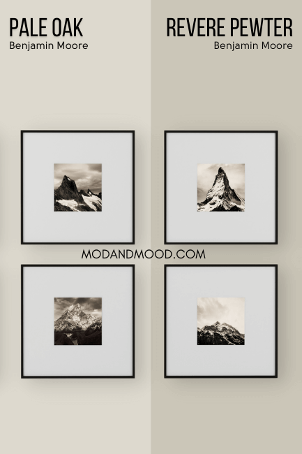
Revere Pewter tends to be a little bit more of a chameleon than Pale Oak. It is more likely to have a green undertone, or even a slightly buttery one, but it can also look purpley.
I would not say that Revere Pewter ever looks pink.
Dupes for Pale Oak from Other Brands
Let’s take a look at all of the best alternatives for Pale Oak from other brands:
Just so you know, I manually sift through hundreds of colors to choose the very best color matches. I’m not relying on any online tools to tell me, and that’s how you know these are true dupes!
Sherwin Williams Version of Pale Oak
Sherwin Williams actually has several great alternatives to Pale Oak, so it was hard to figure out which one is truly the best match:
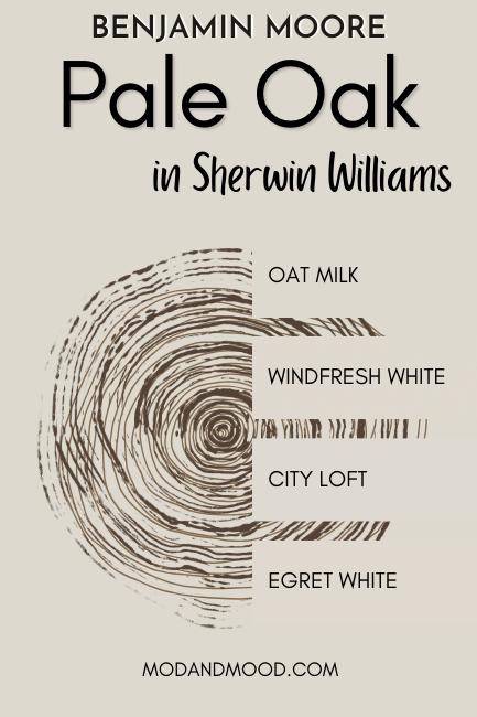
The top 4 color matches are:
- Oat Milk
- Windfresh White
- City Loft
- Egret White
Despite there being a couple of imperceptible options, Sherwin Williams City Loft is the best overall color match for Pale Oak:
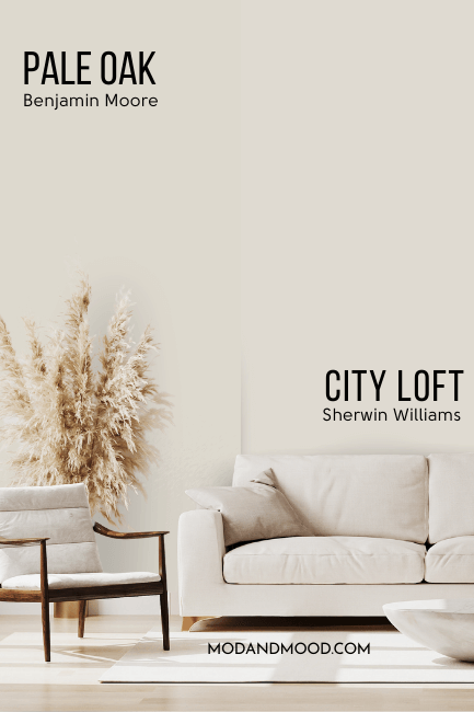
Now City Loft is just a whisper lighter than Pale Oak, but it was the closest in tone from all of the options. Technically City Loft is from a slightly warmer color family, but it is also a hair more gray, so it cancels out.
Any of those options would be great substitutes, and if I hadn’t done a deep dive, I probably would have gone with Oat Milk.
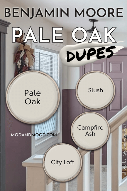
Valspar Equivalent for Pale Oak (Lowe’s)
The best dupe for Pale Oak over at Lowe’s, is Valspar Slush.
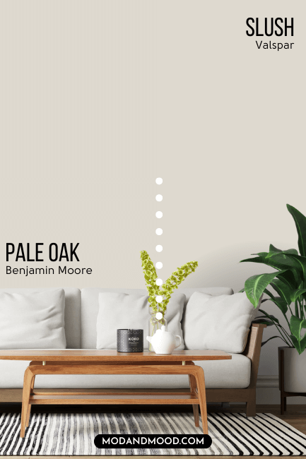
Just like City Loft, Slush is technically a little bit warmer than Pale Oak, but since it is also more gray, it cancels out.
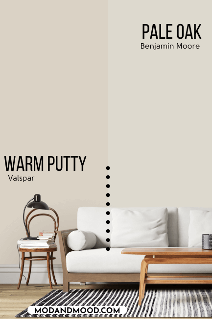
You might also like Warm Putty if you are looking for a popular Valspar greige:
Behr Color Match for Pale Oak (Home Depot)
From Home Depot, the equivalent shade to Pale Oak is Behr Campfire Ash.
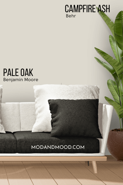
Campfire Ash actually claims to be the exact same color as Pale Oak on paper. They have the same hex code and RGB value. (There might still be ever so slight variations due to the manufacturer’s different paint.)
Another very solid alternative to Pale Oak is the shade Behr Silver Drop, which I have covered before.
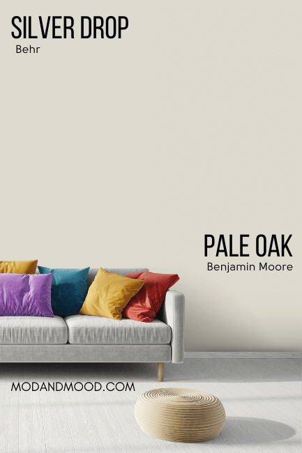
It’s almost impossible to see the difference here, but Silver Drop does tend to look a touch cooler, and it has a silver or green undertone more often than purple/pink.
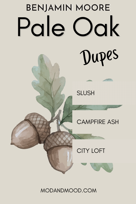
Here’s a recap of all the best dupes:
Thank you so much for reading until the end! That really helps my blog.
Not sold on Pale Oak? Check out these other awesome colors: