Rules and etiquette are always changing (like “no white after labor day”), and home decor is no different! There may have been hard and fast rules for accent walls before, but today things are a little more flexible.
Let’s look at a few tips, (not rules!) to help you choose the perfect wall to accentuate in your home, during these more casual times.
Basics on Choosing an Accent Wall to Feature
Before we hop into different rooms specifically, here are the easiest choices for an accent wall in any room (in no particular order):
#1 – The Most Interesting Wall
If you’re lucky enough to have an interesting architectural element in your space, this is a natural choice for an accent color.
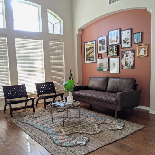
The designer here went with Sherwin Williams Cavern Clay to highlight the interesting recessed area in this wall. The main room color was already on the walls when the clients purchased the home, but it is very similar to Benjamin Moore Classic Gray.
#2 – The Smallest Wall
This is probably my favorite place for an accent wall. If you can’t decide, choose the smallest wall!

Not only does this feel like less of a commitment, and make repainting down the road super easy, sometime less is more with accent walls! A color pops the most when it is in contrast to its surroundings.
I like to use this same concept when contemplating wallpaper. When you don’t know what to do with a plain odd wall, that’s a great place to experiment with a bold print.
#3 – The Wall Opposite of the Main Entry Point
This is the classic advice for choosing an accent wall. Theoretically this is the first place that your guests will look when they enter a room.
Let’s move onto some room specific advice!
How to Choose the Accent Wall in Your Living Room
#1 – The Wall Across from the Main Entrance into the Living Room
As I mentioned, the traditional placement for a living room accent wall, is whichever wall is opposite of the main entry point.
The idea is to paint the wall that your eye immediately goes to, and make that the feature.
Here we see that concept at work, with the bold teal of Sherwin Williams Cascades.
#2 – Where You Want the Eye to Go
An argument could be made that the wall you immediately look at, is likely whichever wall you paint as the feature wall (provided it’s visible from the doorway).
If “opposite of the doorway” doesn’t suit you, or it’s not an interesting wall, choose the living room wall that you would prefer the attention go to.

This wall is painted in Sherwin Williams Rock Bottom.
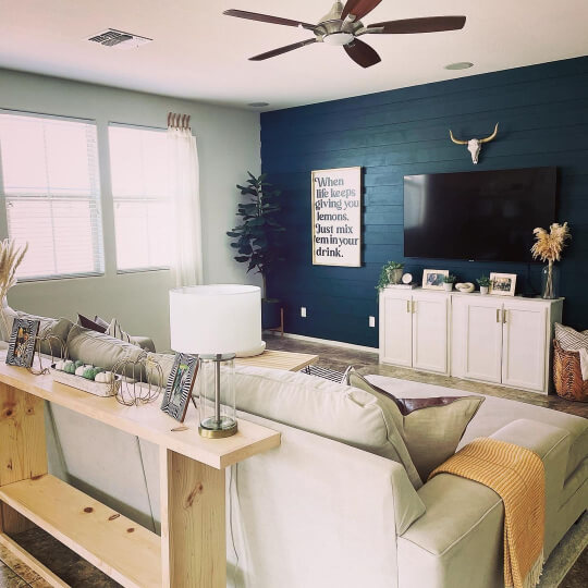
#3 – The Wall Opposite of the Best Light Source
Often the entry point to a room and the largest windows are not on the same wall. If you really want to emphasize the color you’ve chosen, make the wall across from the best light source your accent instead.
Here we see a beautiful feature wall, but the dark color of Sherwin Williams Rock Garden is harder to appreciate with the light source in the middle of it:
Going opposite of the light source will also add a little extra oomph to anything you choose to display on your accent wall.
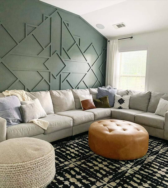
#4 – The Fireplace Wall (or the Most Interesting Wall)

This accent wall is Sherwin Williams Blue Peacock.
If you have a fireplace in your living room, this is a natural wall to accentuate! One popular idea is to paint the fireplace all the way to the ceiling:
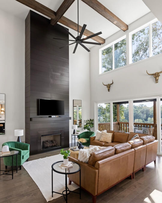
This fireplace is painted in Sherwin Williams Urbane Bronze.
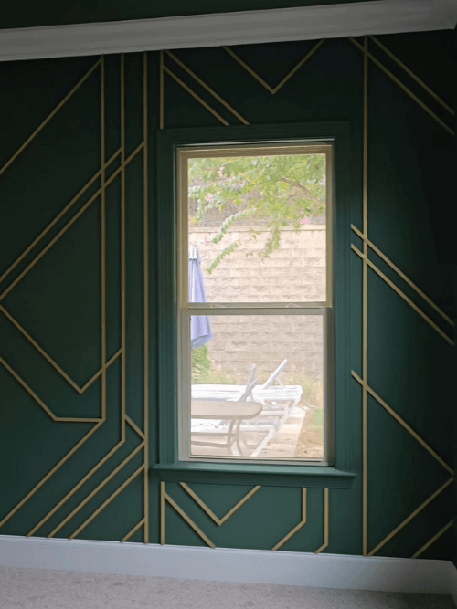
If you don’t have a fireplace, but some other interesting architectural detail, make this your feature wall. This could be a vaulted wall in your entryway, a bay window, or a wall with built in nooks for display.
#5 – The Entrance Wall
One wall that doesn’t get a lot of accent love, is the wall that you enter your living room from. (Often via the front door.)
This one is in the color Sherwin Williams Cyberspace.
Many times this is the wall most likely to be seen from your furniture. Choosing this as your feature wall gives an element of surprise to your guests, and the front door is a natural focal point from inside your space.
Which Wall Should be the Accent Wall in Your Dining Room?
#1 – The Longest Wall
In the living room, the largest wall is often not the one that wins the feature wall, but the opposite is true in the dining room.
Choose the wall that sits length-wise behind your dining table to really show off the furniture. This is especially great if you like to put a lot of seasonal decor on your dining table.
This is in the color Sherwin Williams Iron Ore.
#2 – The Most Interesting Wall
This is a theme in this post, but if you have an interesting feature in a room: Feature it!
This could be a half wall, some interesting windows, or really any unusual shape.
How to Pick the Accent Wall in Your Bedroom
Choosing the accent wall in your bedroom gets a little more straightforward than in other areas of your home.
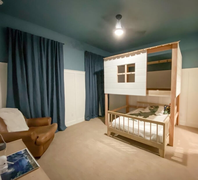
#1 – The Wall with the Bed
Whichever wall the head of your bead rests against, is the most popular choice for the accent wall in the bedroom.

This bedroom feature wall is also in Sherwin Williams Iron Ore.
Think of it as an oversized headboard!
Typically bedrooms are laid out so that the bed (and the bed wall) are the first place that your eye goes to, so this is another natural reason to choose it.
Other Options for Bedroom Accent Wall Placement
If the idea of a headboard wall just isn’t doing it for you, you can choose to highlight another area in your room instead.
You already know what I’m going to say: If you have a reading corner, any kind of media nook, or an interesting window area, these are great choices for an accent wall.

If the color is just for you (it is the bedroom after all), you could also paint the wall opposite of the bed, so that you will see it the most.
Color drenching a walk-in closet is another fun and low-commitment idea.
Consider an Accent Ceiling
Colorful ceilings are very much in style right now, and if you have the guts, make that your accent “wall.”

Black seems to be the most popular, but a dark variation, a bright color, or even a textured wallpaper would be super bold.
This bedroom ceiling is in Sherwin Williams Whirlpool:
I actually have a whole post where you can see black ceiling inspiration:

Should Accent Walls be Lighter or Darker?
Traditionally, accent walls are darker than the surrounding walls. However, this assumes that you have a light enough – or neutral enough – paint color to begin with.
Light Accent Walls
If you already have darker walls (or just want to) there’s nothing saying that your accent wall could not be lighter. A white or creamy accent wall would look amazing with a dark green or navy.
This white wall is Benjamin Moore Chantilly Lace.
You could also do a lighter variation of your wall color as an accent. Just make sure it’s a minimum two shades lighter. 3+ would be better, but one is not enough.
Same Color Accent Walls
Speaking of accent walls not needing to be darker, you can create an accent wall with texture, instead of using a different color.
Board and batten, shiplap, textured paintable wallpaper, and geometric designs in wood, are all ways that you can create an accent wall and not need to use a darker (or different) color from your other walls.

Can You Have Two Accent Walls?
While you can have two walls painted in a different color from the rest of your room, I would still choose one to accentuate. For example: Paint both walls in the feature color, but add shelving or a gallery wall to just one in order to draw your eye to it.
But absolutely, you can use your accent color on more than one wall if you want to. It just doesn’t make both walls, accent walls.
Favorite Accent Wall Colors to Use
Here are a few of the most popular colors for accent walls:

Sherwin Williams Tricorn Black
Black is a dramatic choice for a feature wall, and it is still going strong! Tricorn Black by Sherwin Williams is one of the inkiest blacks that you can get:
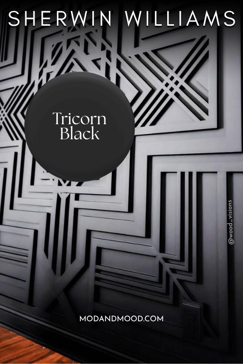
For a slightly trendier version, you might like a deep brown such as Benjamin Moore Silhouette. Black is classic, but warmer dark tones are having a moment!
Love the idea of black? I also have a post: Are You Brave Enough for a Black Accent Wall in Your Living Room? (19 Successful Looks!)

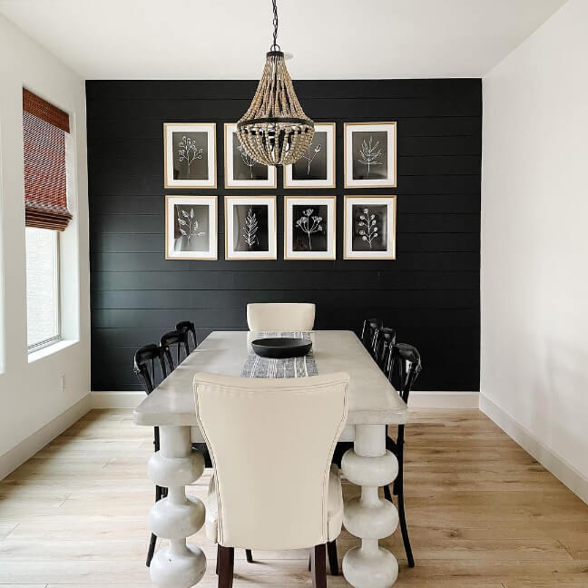
Sherwin Williams Iron Ore
Iron Ore is black adjacent. It’s a deep charcoal paint color that can look almost black, but it has a cool shifting undertone.
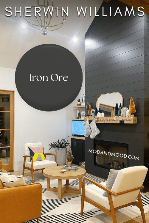
In my opinion, Iron Ore will literally never go out of style. It can look black, charcoal, smoky gray-blue, or even slightly green.
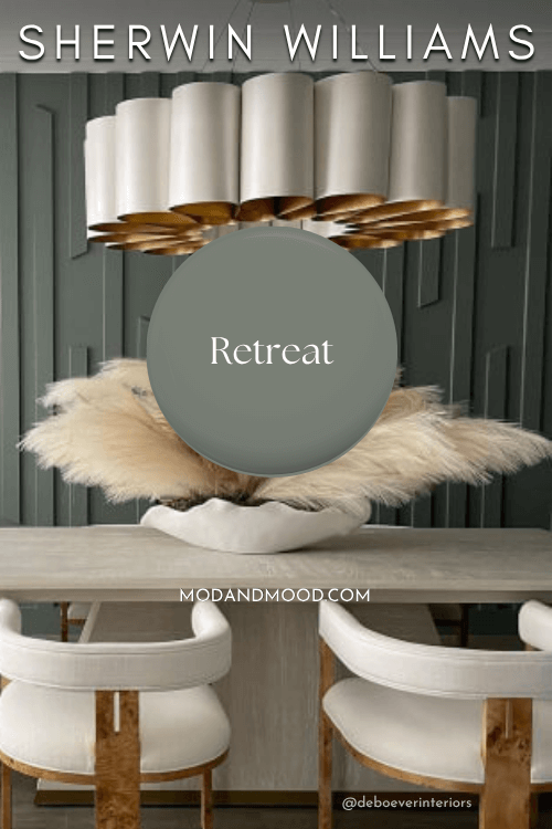
Sherwin Williams Retreat
Retreat is a beautiful true sage green with cooler undertones. I always recommend this color as my favorite foolproof sage. I truly think it goes with everything, and it always looks nice.
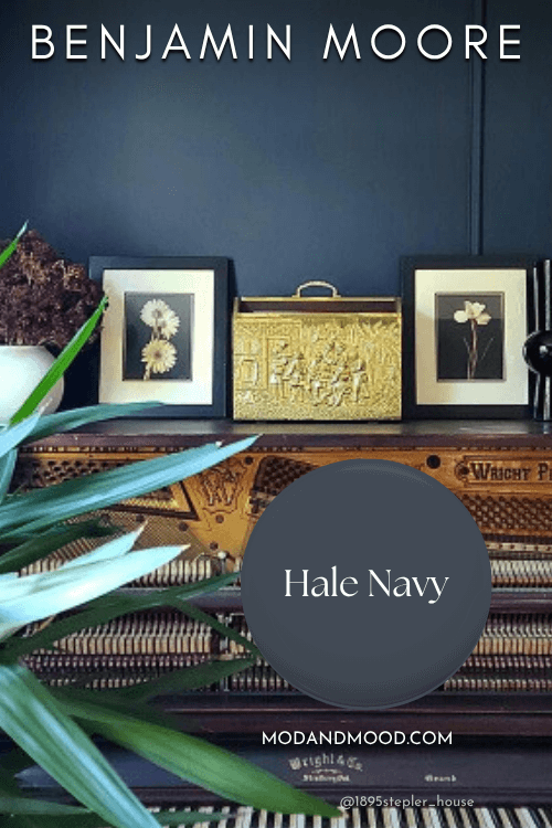
Benjamin Moore Hale Navy
If Retreat is a foolproof sage green, Hale Navy is a foolproof navy. I find blue a little more difficult to coordinate with other colors, but Hale Navy is like a great pair of jeans: It goes with everything!
There is no reason these are mostly Sherwin Williams colors, I just get the most requests for these. You can get amazing accent colors from Behr and Benjamin Moore as well.
Final Thoughts on Choosing Your Accent Wall
I hope that this helped you choose the perfect placement for your accent wall! I know there were a lot of options, but the most important thing is that you are happy with the look.
There are plenty of people who break the rules and choose whatever wall they please.
Before you go, you might like these posts:


