Benjamin Moore Pashmina is one of those rare colors that floats in and out of favor without ever truly going out of style. As trends continue to move warmer, taupe is poised for a comeback, but Pashmina never left!

Here we will talk about the undertones of this long-time favorite, see coordinating colors, look at some real homes, and ponder some dupes and similar shades!
What Color is Pashmina? (Let’s Talk Undertones!)
Pashmina is a delightful mid-toned taupe color that most often looks like a darker mushroom. You could also describe this as a greige, because it does look like equal parts gray and beige.
Like any color with a lot of gray in it, the undertone of Pashmina does shift a lot.

Pashmina can look almost all beige, but it doesn’t ever look completely gray.
The undertone of Pashmina swings through that mysterious taupe range from slightly violet…

to slightly green.
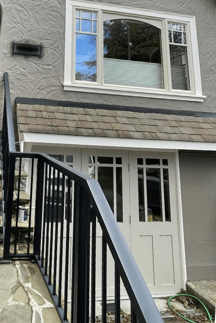
(Pashmina is the color on the doors.)
Again it most often looks like a slightly warmer version of greige, with a hint of violet.
The Pashmina Color Strip from Benjamin Moore
Pashmina is a fairly popular neutral paint color, but none of the other colors from this collection get very much attention:
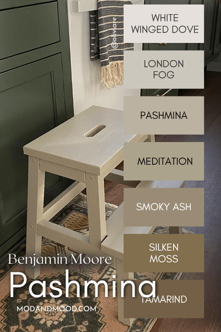
- White Winged Dove (1457)
- London Fog (1541)
- Pashmina (AF-100)
- Meditation (AF-395)
- Smoky Ash (986)
- Silken Moss (237)
- Tamarind (AF-120)
White Winged Dove is the next most popular shade from this color strip. Personally, I find that the darkest colors on this strip get a bit too green and muddy in comparison to Pashmina.
The LRV of Pashmina is 44.2. That makes it perfectly mid-toned!
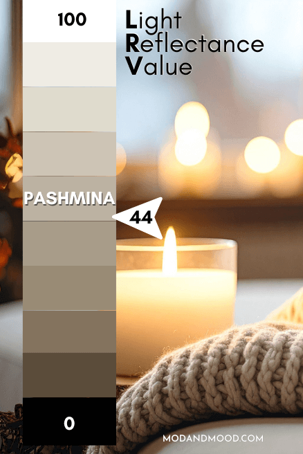
Most whole home paint colors have LRVs in the 50 – 65 range, so at 44, Pashmina is a little darker than a “light neutral,” but certainly not dark.
Benjamin Moore Pashmina in a Color Palette
Here is a coordinating color palette that I like for Pashmina:
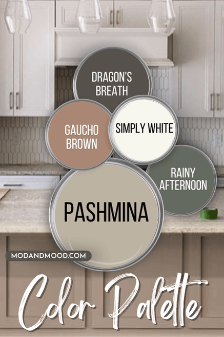
I tried to go for a range of neutrals and “real colors.”
Coordinating White Paint Color to Use with Pashmina
For a high contrast white that still has a nice warm undertone, I recomend using Pashmina with Simply White.
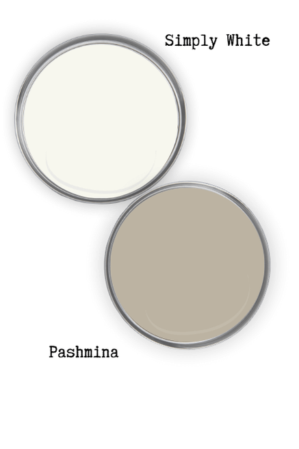
Simply White is a nice bright, true white, but it is also very obvious about its creaminess.
If you plan to use Pashmina on your walls and Simply White on ceilings, trim, etc., Pashmina will look a little darker than it would if you used a more muted white.
For less contrast and a lighter look to Pashmina, try an off white like Sherwin Williams Shoji White, or something in between, like Benjamin Moore White Dove.
Neutral Paint Color to go with Pashmina
Pashmina is already a neutral, but for a neutral accent color, try Benjamin Moore Dragon’s Breath:
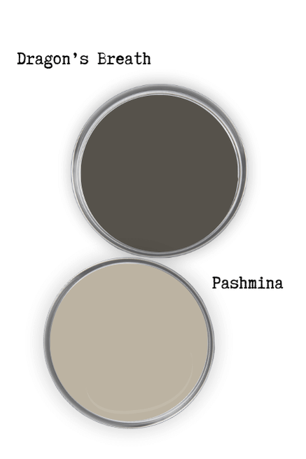
Dragon’s Breath is my Benjamin Moore dupe for the uber popular Sherwin Williams Urbane Bronze (a former color of the year!). If you like a deep brown, you will also like Benjamin Moore Silhouette, which just so happens to be the color of the year for 2026.
Pair Pashmina with Benjamin Moore Gaucho Brown
Ironically, Pashmina is much more brown than the terracotta of Benjamin Moore Gaucho Brown!
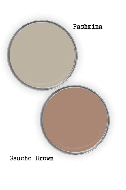
Gaucho Brown is a gorgeous mid-toned clay color that complements Pashmina beautifully. Both these colors are giving “sandy desert.” If you like this coordinating color, you will probably also like Sherwin Williams Redend Point.
You should know that next to a warmer toned color like Gaucho Brown, Pashmina is a little more likely to show that green undertone we discussed earlier.
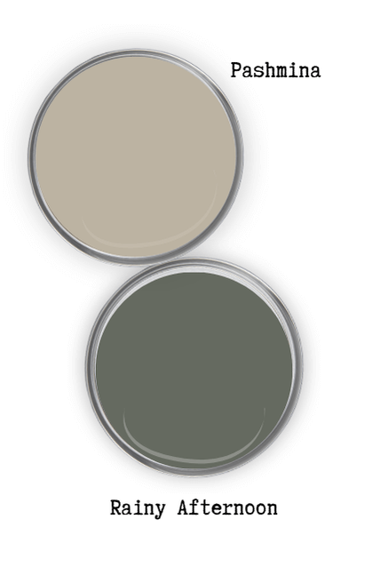
Try Pashmina with Benjamin Moore Rainy Afternoon
Benjamin Moore Rainy Afternoon is a deep gray green with shifting cool undertones. This is a trendy pair, and one that will make Pashmina look its warmest and most beige.
Pashmina on Cabinets
Moving on to Pashmina at work in real homes, let’s start off strong with some cabinets!
In the Bathroom
This bathroom actually inspired the thought behind pairing Pashmina and Rainy Afternoon:

The color on the wall here is Sherwin Williams Evergreen Fog. I love how it looks with the darker mushroom tone of Pashmina here. This is my personal favorite look from Pashmina.

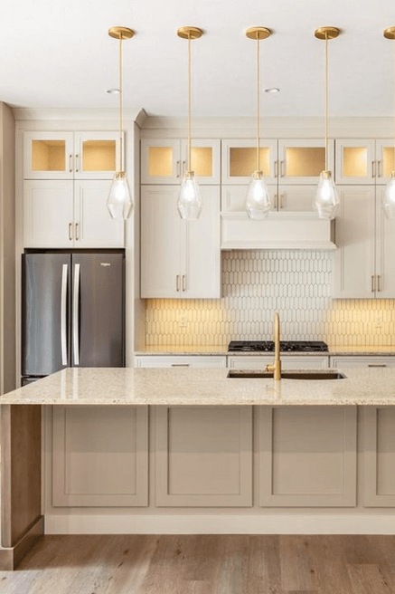
In the Kitchen
Here is Pashmina on kitchen cabinets that have had a makeover by the team at @lasservices:
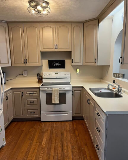
The lighting on the upper cabinets is quite warm, so bear that in mind. The lower cabinets are a little more accurate in terms of tone. (Not sure why all those drawers look crooked here, but I promise it’s a real photo!)
Now we have a couple of examples using the similar color: Sherwin Williams Shiitake:
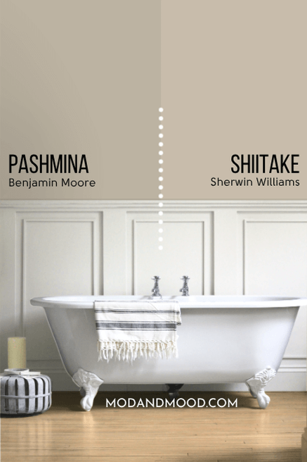
Shiitake is just a little bit lighter and less gray than Pashmina. I color adjusted the island on this next kitchen to reflect those differences, and look like Pashmina:
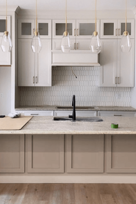
Here is the same kitchen in much warmer light, where I also color adjusted the island to look like Pashmina:
The upper cabinets are similar to Sherwin Williams Aesthetic White.
Finally for one more example, I am going to use Sherwin Williams Jogging Path:
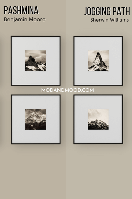
Jogging Path is a little lighter and cooler than Pashmina on paper, but you can see that it’s pretty close. I’ll ask you to use your imagination for this next kitchen:

If these cabinets were real deal Pashmina, they would be a little darker and a hair warmer…maybe. Honestly, I think this is pretty accurate to the cooler look that Pashmina can have.
Benjamin Moore Pashmina on an Exterior
For our exterior examples we will have to get close enough, once again. Here is an exterior by Heiler Painting in Jogging Path:
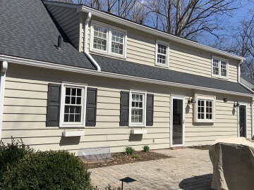
I found the color looks a bit more yellow here than either Jogging Path or Pashmina should…or so I thought, until I found this picture of Pashmina on a stool:

And let’s be real, that’s pretty similar! Here is one more from this exterior:

This look is very similar to the Pashmina doors we saw earlier:
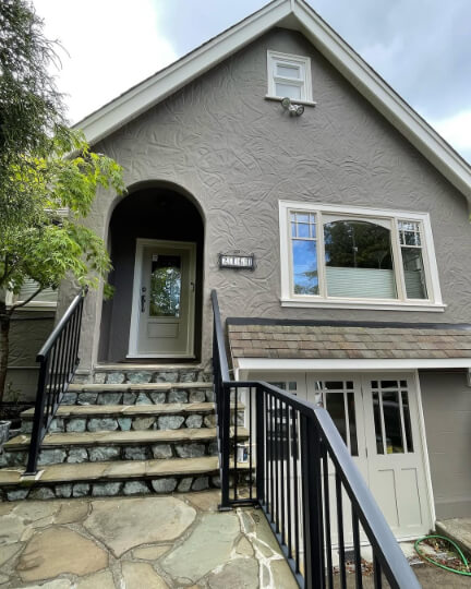
The stucco is painted in Benjamin Moore Iron Gate.
Pashmina for the Front Door
Here is another look at Pashmina on the front door of this home:
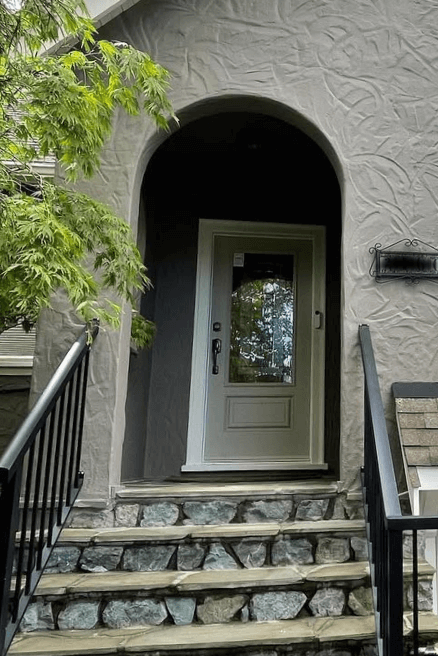
Again this is the coolest and most green undertoned that Pashmina ever looks.
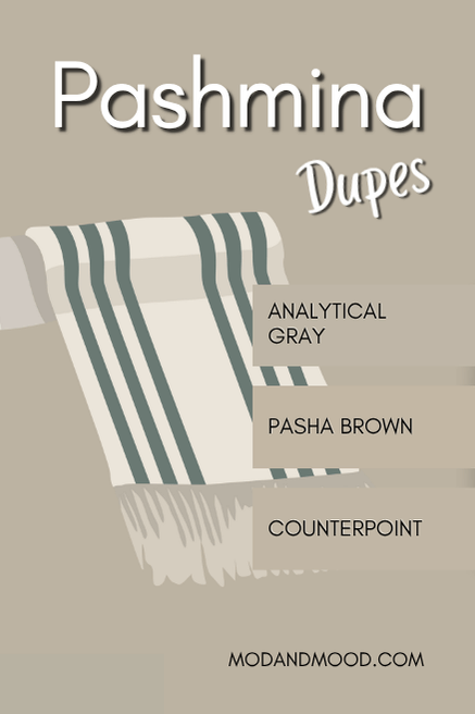
Dupes for Benjamin Moore Pashmina from Other Brands
Can’t make it to the Benjamin Moore store? Here are the best alternatives to get the same look from the other big brands!
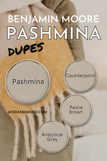
Sherwin Williams Version of Pashmina
From Sherwin Williams, the best color match for Pashmina is their shade Analytical Gray:
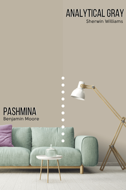
Analytical Gray is just a tiny bit lighter than Pashmina. Otherwise these colors are virtually identical.
This is where we have to pause for a brief awkward moment… Both the Behr and Valspar dupes, were also the closest matches that I could find for Benjamin Moore Stone Hearth. Can’t really do anything about that, because the colors are very similar.
Behr (Home Depot) Equivalent for Pashmina
Over at Home Depot, the best color match for Pashmina is Behr Pasha Brown.
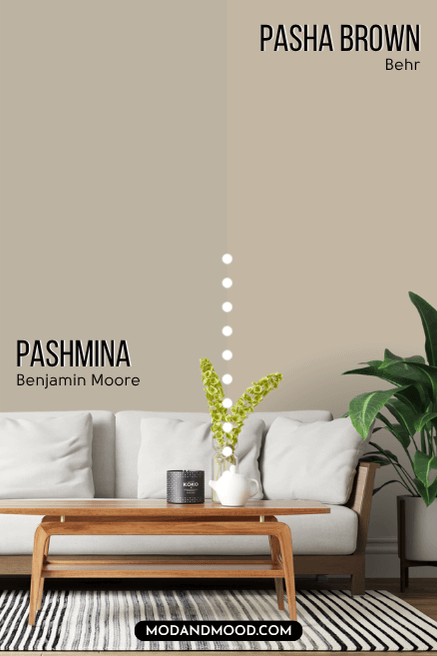
Pasha Brown is a little lighter and brighter than Pashmina. You can see that it looks less gray in comparison. Its undertone is also a little closer to a sunny true beige, and a bit less violet.
I would have liked to get a bit closer to a true color match, but a lot of the neutral Behr colors were significantly lighter or darker than Pashmina.
Pashmina at Lowe’s (Valspar)
The closest Valspar color to Pashmina, is the shade Counterpoint:
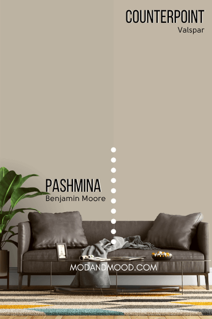
Like the Behr version, Counterpoint is lighter and brighter than Pashmina, but a little bit less so than Pasha Brown. The undertone of Counterpoint leans a little warmer and more violet than Pashmina.
Here is one more look at each of these dupes compared to Pashmina:
Speaking of comparisons…
How Does Benjamin Moore Pashmina Compare to Similar Neutral Paint Colors?
Honestly, there are just way too many colors in the same category as Pashmina, so here are the top 5 colors that are most often compared to it.
Accessible Beige is one of Sherwin Williams most popular paint colors! Both Pashmina and Accessible Beige are neutral colors with taupey mushroom undertones.
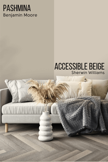
Accessible Beige is a lighter neutral color whereas Pashmina is mid-toned. In general, Pashmina almost looks like a richer, deeper, version of Accessible Beige. However Accessible Beige does not have the slightly green-leaning undertone that Pashmina can have on occasion.
Edgecomb Gray and Pashmina are both greige Benjamin Moore colors. Edgecomb Gray is much lighter than Pashmina, and a hair cooler.
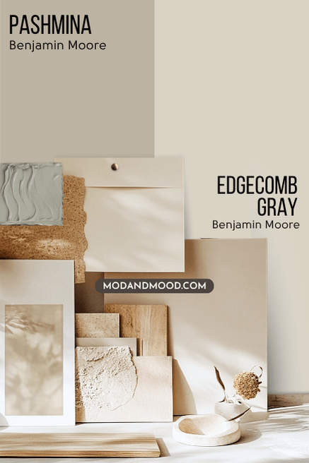
The general color of these two is about the same, but Edgecomb Gray just has a lot less of it.
Revere Pewter is known as the OG Benjamin Moore greige, so how does it compare to Pashmina?
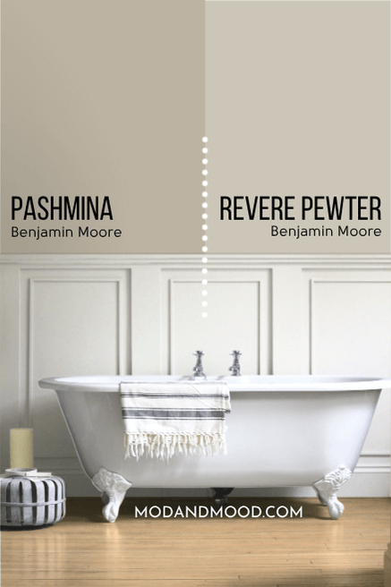
I would say that Revere Pewter toes the line between light and mid-toned paint colors, where Pashmina is a fair bit darker, and definitely mid-toned. Revere Pewter is also a little bit cooler and more gray than Pashmina.
In general, the undertones of these colors are similar. They can both flux from taupe with a bit of violet, to something almost green. Revere Pewter does so with more subtlety.
Stone Hearth and Pashmina are very similar taupe paint colors by Benjamin Moore:
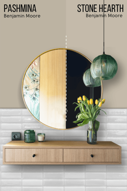
These two are so similar that some of the dupes I ended up with were the same! Stone Hearth is a little lighter than Pashmina. The rest of the difference is hard to describe, but it’s like Pashmina is a bit more concentrated than Stone Hearth.
At it’s darkest and warmest, Pashmina is a tiny bit richer and warmer than Stone Hearth is. To get a full picture of Stone Hearth, I have a post for that!: See the Many Faces of Benjamin Moore Stone Hearth in These Classy Homes (Plus Dupes!)
Despite how it looks on paper, Thunder and Pashmina are technically almost the same “color,” but Thunder is a lot less saturated (more gray):
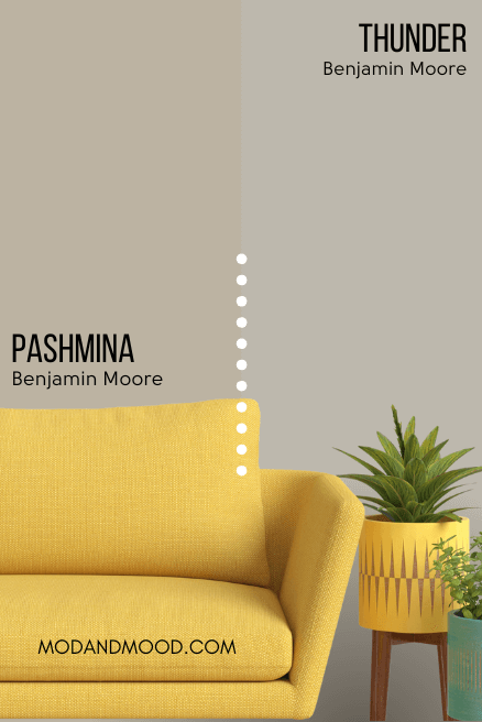
Thunder tends to look more silvery gray than beige, but it can still have a slightly violet or green undertone like Pashmina does.
That’s all I have for Benjamin Moore Pashmina! I hope this helped you decide if it’s the one for you.
Thanks so much for reading until the end! That really helps my blog. Before you go, here are some other colors that you might want to add to your short list!


