Comfort Gray is a nice compromise between a neutral gray wall color and a light sagey blue-green. Here we will look at Comfort Gray in real homes, see coordinating colors, and look at a couple of alternatives.

What Color is Sherwin Williams Comfort Gray (6205)
Comfort Gray is a light gray color that can range in appearance from plain gray, to pale blue-gray, or light seafoam.
Despite the varying undertones, Comfort Gray can typically be used like a neutral as it works well with most other colors. It’s a nice alternative to a plain jane gray or beige.
LRV of Sherwin Williams Comfort Gray
The LRV of Comfort Gray is 54.
What does that even mean?
The LRV (Light Reflectance Value) of a color indicates on a scale of 0 – 100 how much light a color reflects (or doesn’t reflect). True black has an LRV of 0 and pure white has an LRV of 100.
In the paint world, we are working in a range of about 3 – 93 because no paint color is purely black or completely white.

At 54, Comfort Gray is in that perfect LRV range from approximately 45 to 60 where we find most whole-home colors.
This means that Comfort Gray would make a great backdrop on any wall in your home.
What Are the Undertones of Comfort Gray
Comfort Gray is equally likely to have blue or green undertones. It very often has a mix of both.
I would describe Comfort Gray as a kind of “aquatic gray.” It looks like a very muted aqua or seafoam most of the time.
Here is a very typical look for this color:

Comfort Gray can occasionally look like a true gray with very little undertone, but this is unpredictable.
Here is a look at Comfort Gray where it appears more gray:

Here is a more blue look to this color:

Finally, here is how Comfort Gray looks at its brightest and most colorful:

The Comfort Gray Color Strip from Sherwin Williams
Out of all of the colors on the same color strip, Comfort Gray is the only one that ever looks blue. If you want to avoid a blue undertone, you might want to consider a shade lighter or darker.

The other colors on this same color strip are:
- Spare White (6203)
- Sea Salt (6204)
- Oyster Bay (6206)
- Acacia Haze (9132)
- Retreat (6207)
- Pewter Green (6208)
- Ripe Olive (6209)
Lighter Version of Comfort Gray
One shade lighter than Comfort Gray on the same color strip, is the color Sea Salt.
Sea Salt is a very popular paint color, so you may have seen it around!

Comfort Gray vs Sea Salt
While it is the shade lighter, Sea Salt can occasionally have a warm green-beige undertone, where Comfort Gray does not. It often does have the same gray green look with a cool blue undertone, but Sea Salt never looks just blue-gray. It always has some green in its undertone.
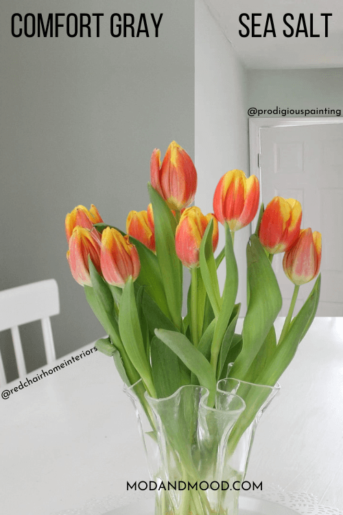
I also would not say that Sea Salt ever looks completely gray, but on occasion, Comfort Gray can.
Darker Version of Comfort Gray
One shade darker than Comfort Gray on the same color strip, is the color Oyster Bay.
Again Oyster Bay does have a similar undertone to Comfort Gray, but there is always some green in it:

Comfort Gray vs Oyster Bay
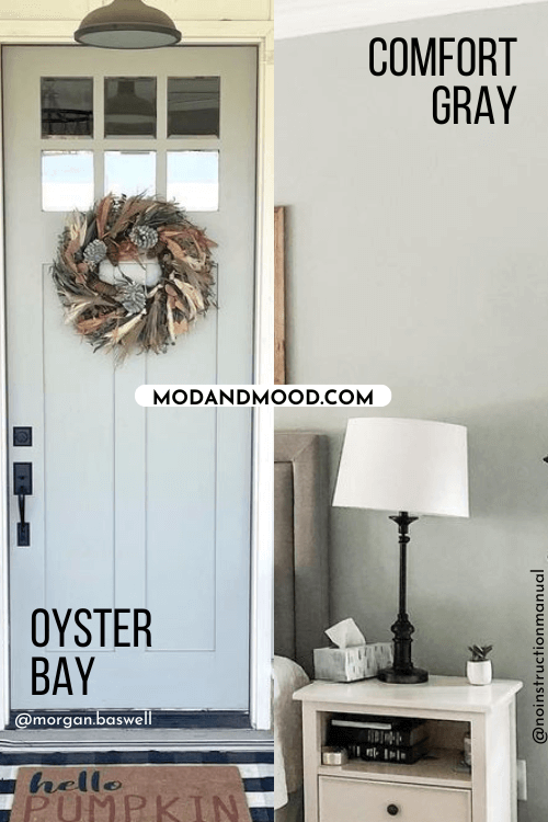
I would say that Oyster Bay generally looks a little more “colorful” than Comfort Gray does.
Is Comfort Gray Warm or Cool?
Comfort Gray is a cool paint color. The other colors on the same strip can sometimes have a warmer green undertone, but I don’t find that Comfort Gray ever does.
Despite the fact that it is cool, you can usually use this color as a neutral. I would not pair it with other light grays.
Sherwin Williams Comfort Gray in a Color Palette
Let’s take a look at some coordinating color ideas for Comfort Gray. These are just suggestions, because this color is very versatile!

Coordinating Colors to Use with Comfort Gray
Neutral Paint Color to Use with Comfort Gray
Warm neutrals can be paired with Comfort Gray, but I recommend going either darker or lighter to avoid any clashing.

Elephant Ear is a taupey mid-tone that can lean either mushroom or slightly green its undertone. When paired with Comfort Gray you should expect it to read more mushroom.
White Paint Colors to Use with Comfort Gray
You might like pairing Comfort Gray with the off-white from the same color strip (Spare White), but I decided to go just a smidge warmer and use Sherwin Williams Ethereal White.

Ethereal White is a neutral creamy off-white with the slightest green undertone, which prevents it from ever looking yellow. You should know that Comfort Gray may look cooler and more gray in comparison.
To allow Comfort Gray not to be influenced, you might like the bright true white of Benjamin Moore Chantilly Lace.

This white is a clean white, but it does have a hint of warmth. You should know that a very warm white, like Sherwin Williams Dover White, is more likely to emphasize the blue in Comfort Gray.
Pair Comfort Gray and Sherwin Williams Rock Bottom
Rock Bottom is one of my favorite dark paint colors!

This dark gray-green chameleon that ranges in appearance from a charcoal slate color with a slight green undertone to something resembling a deep foresty-olive.
Complementary Color for Comfort Gray
The “official” complementary color (the shade directly across the wheel) for Comfort Gray is a powdery purple. I went ultra dark with the purple-leaning charcoal of Sherwin Williams Perle Noir:

…but you could also go with something lighter and warmer, like Benjamin Moore Cinnamon Slate.
Sherwin Williams Comfort Gray for Your Home Interior
I already shared a few photos when we were talking undertones, but let’s see more of Comfort Gray in real life!
Sherwin Williams Comfort Gray in the Bedroom
Lenna and Eric (@the_willow_teahouse) used Comfort Gray in this bedroom that I showed you earlier:

You can see how the undertone changes from the corner of the walls to beside the lamp.
Here is another look at the bedroom at Michelle’s house (@noinstructionmanual):

Sherwin Williams Comfort Gray in the Dining Room
I wasn’t able to pull up Comfort Gray in anyone’s living room, so this dining room by Amy of @redchairhomeinteriors will have to do!

In this first photo, Comfort Gray looks pretty much how I would expect. In the next one, it looks a little more gray:

Sherwin Williams Comfort Gray in a Bathroom
In this bathroom by Danielle (@the_dani_design) we see Comfort Gray looking both its darkest, and most green:

Sherwin Williams Comfort Gray on Kitchen Cabinets
I wasn’t able to find Comfort Gray on kitchen cabinets, so the next best thing is the darker color Oyster Bay:

I don’t know that I would use Comfort Gray on cabinets anyway, because it is a bit light. The result may end up looking a little minty.
Comfort Gray in the Laundry Room
Here we have Comfort Gray on the door and ceiling in a laundry room:
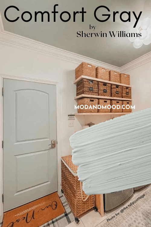
Emma from @the.tulip.cottage, also added Comfort Gray to the feature wall in this room:
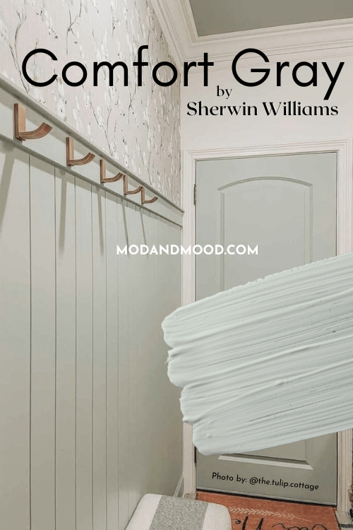
Comfort Gray on a Front Door
Again we will have to use our imaginations a little! Here we have Comfort Gray on an interior door in bright natural light:

For an exterior door, I think that Comfort Gray runs a little too light. Any color will look much lighter outside. You can see here that Oyster Bay looks just dark enough on a front door:

I would probably even go a bit darker and choose Acacia Haze, but that would be a more sage look.
To go ahead and dis-prove my point, here is Sea Salt on a front door:

I think it works here with this warm wood siding, but I dont think lighter shades like Sea Salt or Comfort Gray have enough oomph outside.
Sherwin Williams Comfort Gray vs Repose Gray
Repose Gray and Comfort Gray are both fairly gray colors with similar LRVs, but on paper, this is where similarities end.
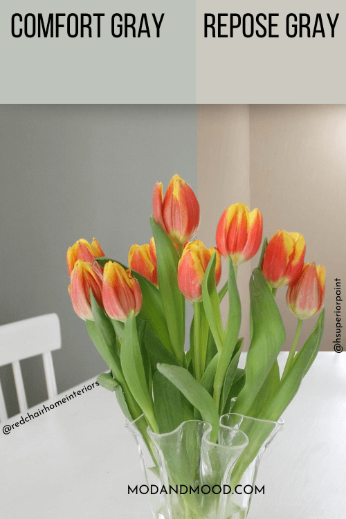
Repose Gray is technically a greige color and it most often has a warm-leaning mushroom undertone. It doesn’t have any green in it, unlike Comfort Gray.
Where things get interesting, is in real life, because Repose Gray can, on occasion, look cool gray to the point of leaning almost silvery blue.
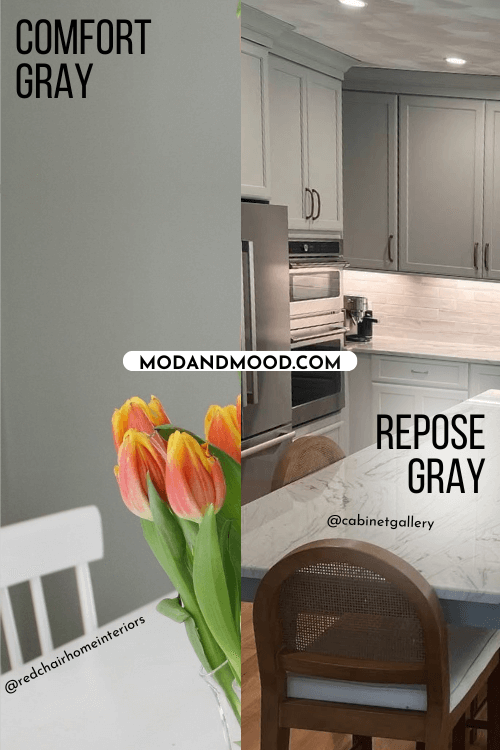
This isn’t a typical look for Repose Gray, so I certainly wouldn’t choose it hoping that it looks similar to Comfort Gray. If you like this shape-shifting qulaity, you will also love Behr Dolphin Fin.
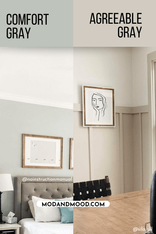
Sherwin Williams Comfort Gray vs Agreeable Gray
Agreeable Gray is a greige paint color, and not a cool gray like Comfort Gray. It also doesn’t have any blue or green undertones.
Comfort Gray Pros & Cons
I hope this helped you decide if Comfort Gray is the perfect color for you! This shade is a perfect simple wall color that you can use in any room. For exteriors or kitchen cabinets, my advice would be to go a little darker.
Not sure if it’s the one? I’ve got more!


