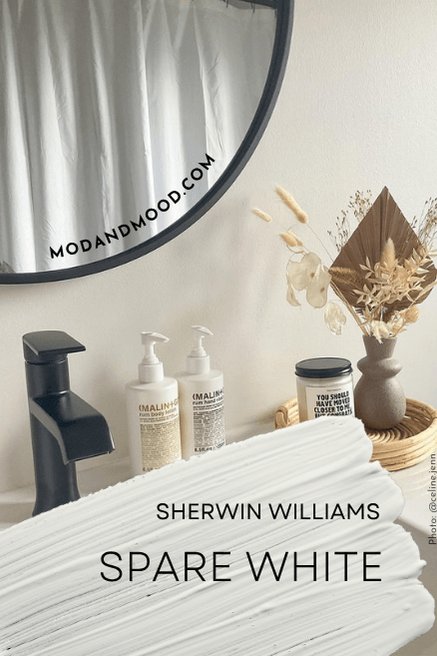
Sherwin Williams Spare White is a beautiful off-white paint color that is a perfect choice if you don’t want crisp or blinding white walls, but you also don’t want anything that is obviously creamy.
Here we will go over Spare White’s complicated undertones, see them at work in real homes, get coordinating color ideas, and find the Benjamin Moore version (as well as Spare White vs other whites).
What Color is Sherwin Williams Spare White?
Spare White is an interesting off-white that is sort of green, sort of cream, sort of gray. It can do any one of those things on the wall, or look like an interesting combination of all three.
I would not choose Spare White expecting a creamy off white, because there is an element of that, but it certainly isn’t warm all the time.
What Are the Undertones of Sherwin Williams Spare White?
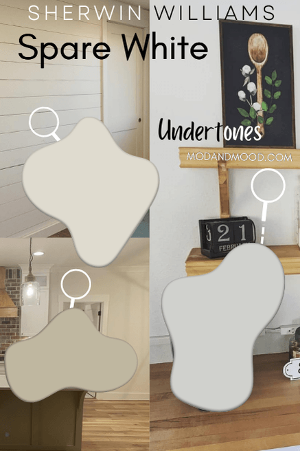
Spare White ranges in appearance from a silvery light gray to a very light warm green. This is a good example of how Spare White typically looks on walls:
On the left side of the photo above the door the color looks like a very light gray. On the right side it still looks a little gray, but warmer and creamier. (Trim is Sherwin Williams Pure White.)
It’s quite hard to capture the green undertone of Spare White, but you see it a little bit in the dining room here:
This is another great example of the different undertones because the living room looks very gray.
Spare White is an interesting color that is not consistently warm or cool. You could class this one as a neutral, but you should be okay with it looking cool and warm.
Spare White LRV
The LRV of Spare White is 77.
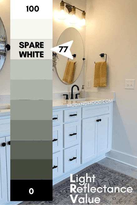
What does that even mean?
The LRV (Light Reflectance Value) of a color indicates on a scale of 0 – 100 how much light a color reflects (or doesn’t reflect). True black has an LRV of 0 and pure white has an LRV of 100.
In the paint world, we are working in a range of about 3 – 93 because no paint color is purely black or completely white.
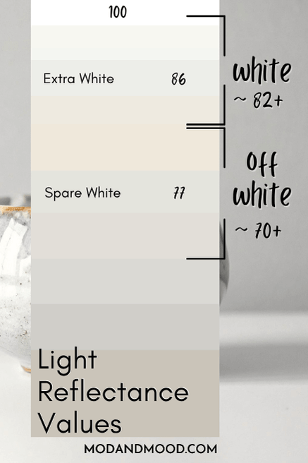
At 77, Spare White is a true off-white color. It is darker than a true white (LRV of approx 82+) but not dark enough to be considered a neutral paint color (LRV below 70).
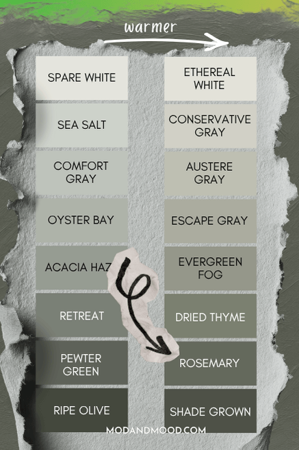
Spare White in the Sherwin Williams Color Strip
Here is the whole collection by Sherwin Williams that features Spare White:
I can’t even lie to you, I was primarily motivated to write this post because I have covered every other color from this strip! The other shades are:
It’s not that I set out to do this. These are all amazing green colors that are quite popular!
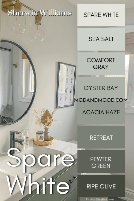
Sherwin Williams Spare White in a Color Palette
Here are some coordinating colors that look great with Spare White!
Coordinating White Paint Color for Spare White
If you want Spare White to look its creamiest and most white, I do recommend using it as your only white. As soon as you introduce a lighter true white, your eyes start to play the comparison game.
If you do want at least a little contrast between your walls and trim, try using a white paint color that is either:
- Complementary (pink/red undertone to emphasize the green) or,
- Cool toned (green or blue based white to make walls look warmer in comparison)
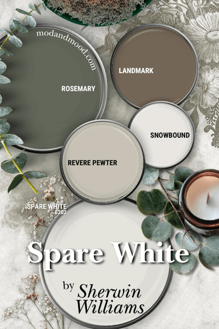
I went with Sherwin Williams Snowbound because it has a complementary undertone that emphasizes the green in Spare White. It is also a little bit gray which will help cancel some of the gray in Spare White.
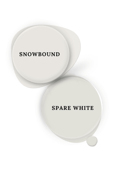
Sherwin Williams Extra White is also a great choice, I just preferred Snowbound in this palette.
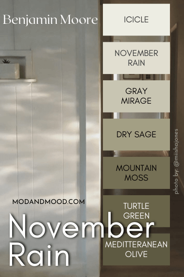
Try Spare White with Sherwin Williams Rosemary
I chose Rosemary for this color palette over one of the other shades in Spare White’s color strip, because it is just a hair warmer.
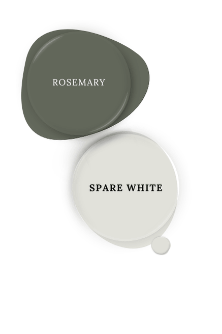
Rosemary is still quite close to a much darker version of Spare White, and from an equally popular collection, which makes it a harmonious statement green.
Neutral Paint Color to Use with Spare White
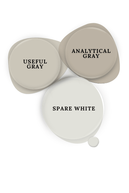
For a coordinating neutral to use with Spare White, I chose Benjamin Moore Revere Pewter:
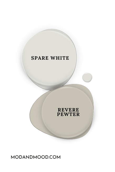
If you are less interested in the silvery side of Spare White, you do have to be a little mindful of your neutral choice. I wouldn’t go much warmer than a greige, or Spare White will start to look gray in comparison.
Revere Pewter is great because it is both warm enough, and gray enough. There isn’t a perfect Sherwin Williams version, but Useful Gray and Analytical Gray are pretty similar. (One is lighter and one is darker.)
If you are fine with the more gray look of Spare White, Sherwin Williams Landmark is a beautiful muted brown that ties together your woodland color scheme.
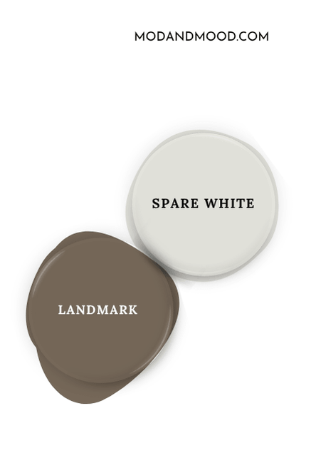
For something even more boldly chocolate, you might like Sherwin Williams Sable.
Complementary Color for Sherwin Williams Spare White
Technically the complementary color for Spare White is a light smoky purple. If you wanted it to look its absolute warmest, I suggest pairing it with a gray blue like Sherwin Williams Lakeside.
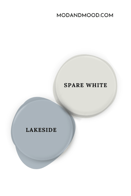
This will help your eyes see any underlying cream, because blue is opposite of cream on the color wheel.
Sherwin Williams Spare White for Your Home’s Interior
Now let’s take a look at Spare White in real homes!
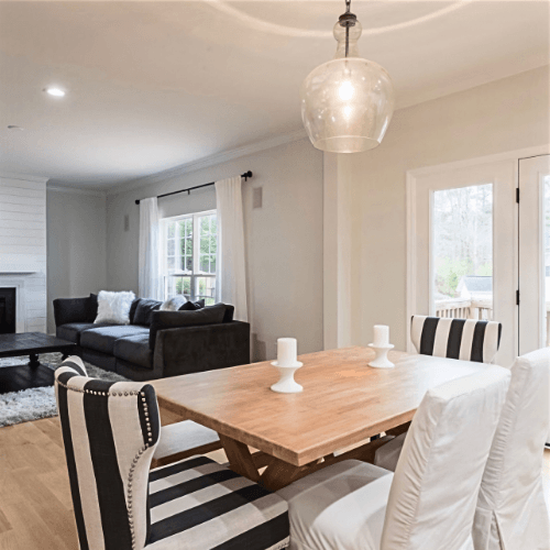
First let’s head over to Ashley’s place (@farmhouseintheboro), where she used Spare White on all of the walls throughout her home with Sherwin Williams Pure White for trim.
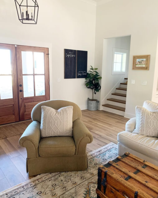
Throughout her home, Spare White does look fairly white, with just a hint of either silver, or some warmth.
Here in the dining room I do think there is a glimpse of green.
Bathrooms in Sherwin Williams Spare White
Here in the bathroom at Ashley’s place, the color doesn’t look totally white, but it doesn’t not look white either:
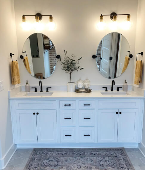
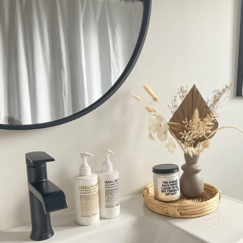
Speaking of bathrooms, Celine (@celine.jenn) also chose Spare White for her bathroom walls, and used the darker shade Retreat for the vanity.
Here is a close up where Spare White looks very neutral again:
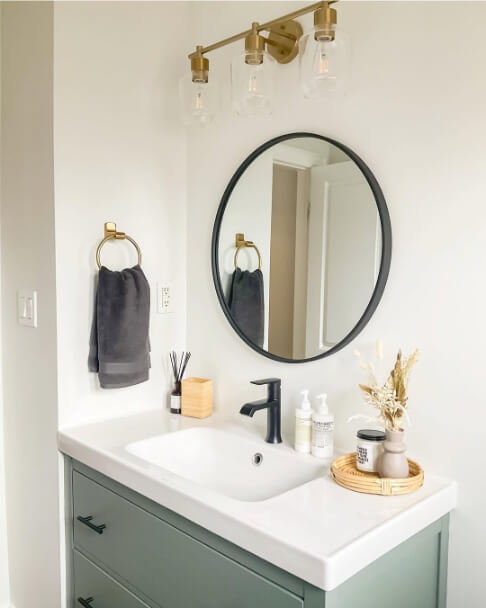
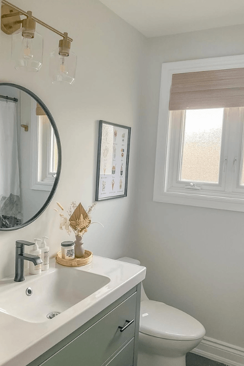
In fact most of these pictures have been Spare White looking warm to neutral, so let’s see some cooler toned looks! Starting strong in the same bathroom, here the color looks more silvery gray:
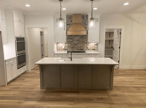
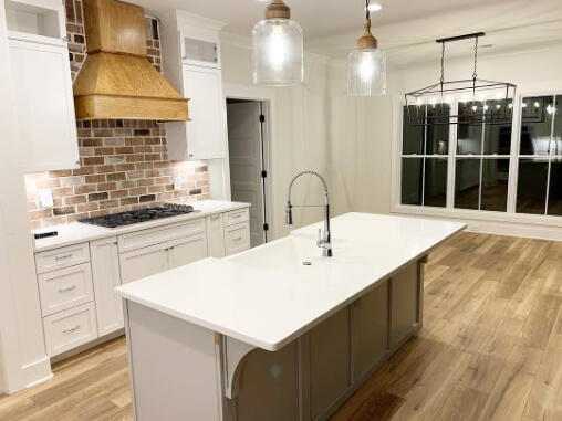
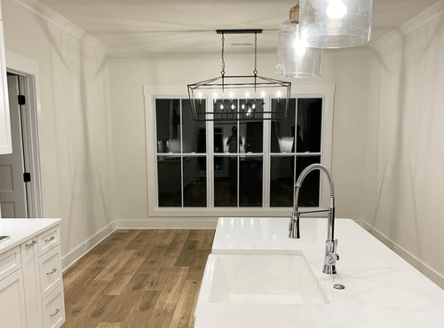
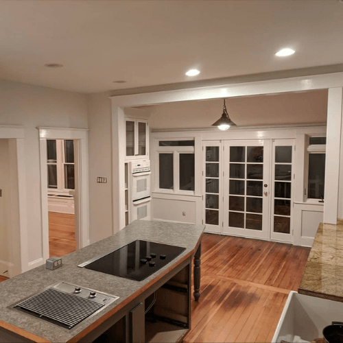
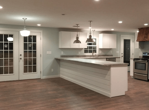
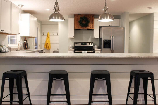
In the kitchen at Hill Creek Ranch we see Spare White again looking very gray:
Spare white is on the walls with Extra White on trim and cabinets.
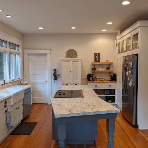
The island here is Sherwin Williams Grizzle Gray but if you like this look, you will also like Iron Ore!
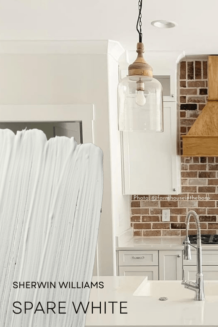
Sherwin Williams Spare White on Kitchen Cabinets
Spare White isn’t a super popular choice for cabinets, but I do have one example in a kitchen with Sherwin Williams Sea Salt:
Against Sea Salt, Spare White does look quite white.
Spare White on an Exterior
I do have one example of Spare White on an exterior by the team at True Colors Painting:
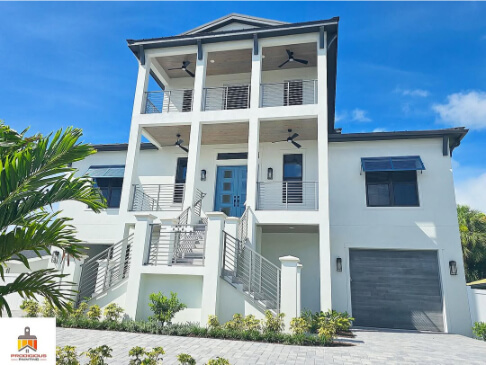
The front door and corbels are in Sherwin Williams Morning at Sea, which is similar to Whirlpool.
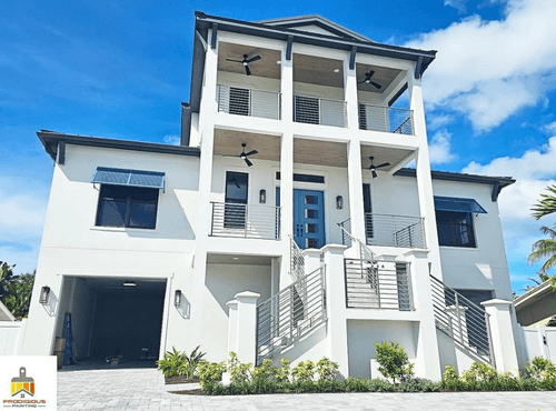
You should expect Spare White to look like a true white (or close) on an exterior because every color looks lighter outside. I also suspect the color will have a green undertone more often outside than in, because white is reflective and there is a lot of green outdoors!
Sherwin Williams Spare White Compared to Other White Paint Colors
Here is how Spare White stacks up against other colors that you may be considering!
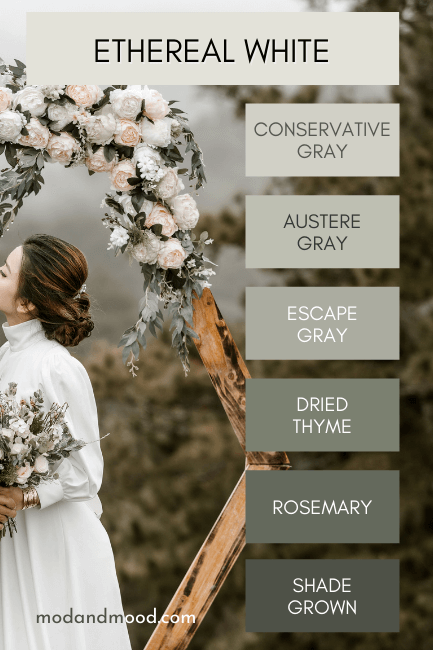
Sherwin Williams Spare White vs Ethereal White
Spare White and Ethereal White are very similar off-white paint colors by Sherwin Williams. In fact, Ethereal White is the comparable color from the rival color strip we talked about earlier that contains Rosemary.
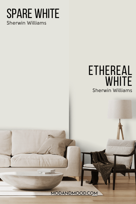
Ethereal White is warmer than Spare White, and looks creamy a bit more consistently. I actually prefer this off-white a little bit, because it is just a little cozier, but still super duper neutral. It is even on my list of Stunning White Paint Colors for Classic Brick Exteriors.
Ethereal White rarely looks totally gray, but Spare White does semi-often.
Sherwin Williams Spare White vs Shoji White
Shoji White and Spare White are both off-white paint colors, but that is about where the similarities end!
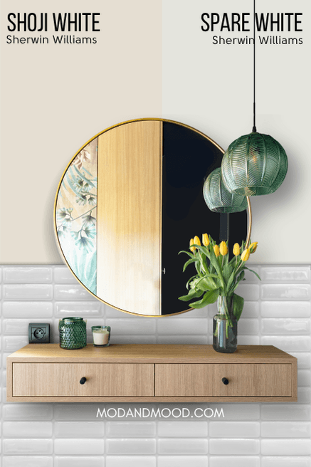
Shoji White is often referred to as a “greige” but I disagree. It almost always looks warm and creamy/beige. On a rare occasion it can look neutral, but I have not personally seen it looking gray…really ever.
Shoji White has a peach undertone and never green. It is also on my list of Sherwin Williams Paint Colors That Everyone Loves!
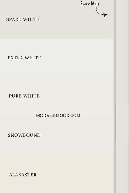
Sherwin Williams Spare White vs Alabaster
Unlike Spare White, Sherwin Williams Alabaster is technically still a true white paint color, although it does sit on the line of white and off-white.
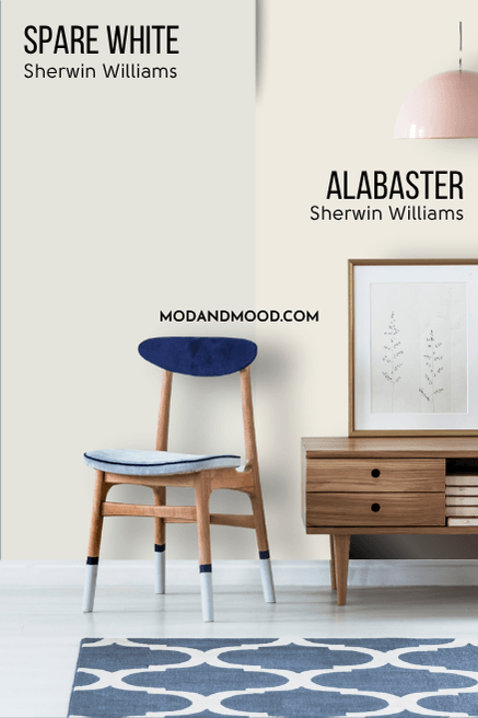
On paper, Alabaster does have some gray in it, but it is just enough to keep it neutral. You can see that Alabaster looks very creamy in comparison to Spare White and it doesn’t ever look silver.
Despite looking a bit peach against the green undertone of Spare White, Alabaster tends to have an undertone somewhere between beige and sliiightly yellow.
Sherwin Williams Spare White vs Pure White
Pure White is a true white paint color and not an off-white like Spare White.
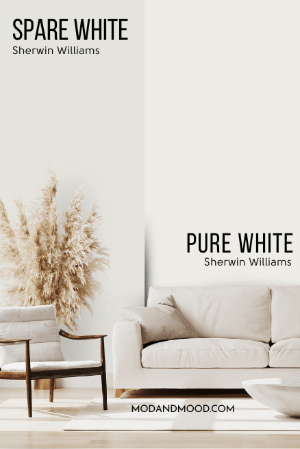
While Spare White can look like a true white on occasion, that isn’t a consistent look for it. Pure White has a subtle whiff of warmth and like Spare White, it isn’t overtly creamy.
Sherwin Williams Spare White vs Extra White
We saw these two together a little bit earlier, but here is a real comparison of Spare White and Extra White:
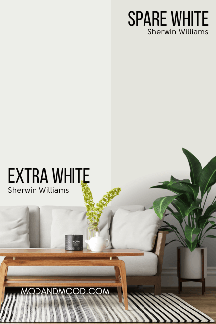
Again, Extra White is a true white and not an off-white like Spare White. Extra White is cool-toned and found in the green color family, just like Spare White is. It does not ever look warm or creamy.
Spare White in Benjamin Moore
The best color match for Spare White from Benjamin Moore is Silver Satin.
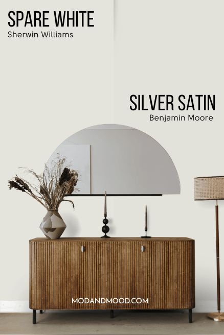
Silver Satin is actually a very popular color on its own. It is a silvery off white with subtle green undertones, just like Spare White!
Technically Silver Satin is a little warmer than Spare White, but these two are very similar.
Thank you so much for reading until the end! That really helps my blog.
I hope this helped you decide if Spare White is the perfect off-white paint color for you, or if I should “spare” you. (Har har.) Still not sure? I’ve got plenty more!